You've heard the term colour space, but what does it mean and what's its impact on your photos?

When you hear the term 'high-res' thrown about with such abandon when it comes to images for web use, have you ever stopped to think just how big or how high quality and image meant for the web needs to be?
There's an assumption that high-contrast images are more dynamic, more compelling, more inviting. Have a go at some low-contrast photography. You might surprise yourself with the results.
Balance doesn't mean symmetry; it means an internal consistency and tension within your photos. And it's a vital element of composition.
Great photos might be down to a little bit of luck, but most of that 'luck' you make yourself. Don't believe us? Read on...
As a photographer one of the first things that you need to understand is exposure, or how to control light to create an image. If you're new to photography or have just picked up a camera with manual control for the first time, we suggest that you start here. Learning how to manipulate light to achieve the shots that you want is a life-long project, but these are the foundations.
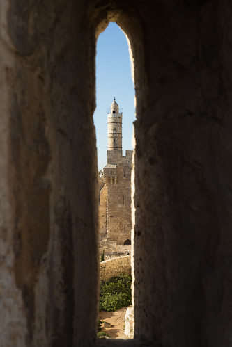
Did you go to see Wes Anderson's glorious fondant fancy of film The Grand Budapest Hotel? Did you notice how the size of the picture varied depended on the era being portrayed in the story? As the story moved between 1985, 1968, and 1932, the aspect ratio, or size of the image, jumped from 1.85:1 to 2.35:1 to 'Academy Ratio'. This was part of Anderson's story-telling technique: the aspect ratio provided viewers with a visual cue for each period of the narrative. It's also a reflection of the changes to aspect ratio that film and television have experienced over the years. But what about photographers? Where does aspect ratio come into stills?
Maybe we need to back-track and establish precisely what we mean by 'aspect ratio' first. It's the size of the image expressed as a ratio, width to height. You'll often see film-making aspect ratios expressed as a value to 1 (like to 2.35:1 and 1.85:1 mentioned earlier), whereas the most common photography aspect ratios are 3:2, 4:3, and 1:1, although there are plenty more besides. If your image has an aspect ratio of 3:2, it will be three units wide and two high. When you come to print it, you might choose a 6×4" or a 12×8" print.

Originally, these aspect ratios were as a result of our film sizes. Lots of medium format cameras produced square, or 1:1, images; 35mm cameras used film that measured 36 by 24 millimetres, giving an aspect ratio of 3:2. What's referred to in the film-making world as 'Academy Ratio' is very close to 4:3. It's also the common aspect ratio you'll find in smartphone cameras as well as Micro Four Thirds and some medium format cameras. 16:9 is usual for recording video.
While our digital sensors might preserve these aspect ratios in their physical dimensions, at the press of a button I can switch between 3:2, 4:3, 16:9, and 1:1 on my camera. And when I import an image into Lightroom or edit it in Snapseed, I can select from 1:1, 3:2, 4:3, 5:4, 7:5, 8.5:11, 16:9, or settle upon an entirely idiosyncratic free-styled aspect ratio. But why would I want to?
It's about composition, and dividing and filling your frame.
Photographers talk a lot about subject placement, about the different rules that can be used to divide the frame, and about negative space. All of these elements contribute to creating visually appealing, dynamic images that draw the eye. It follows, then, that the dimensions of the frame will have an impact on composition: on where you place your subject and how much space surrounds it and how you divide your frame.
We've already written about the square crop here on Photocritic, and how the eye has a tendency to move around a square frame, as opposed to across it, which it does with a rectangular crop. When changing between 3:2 and 4:3 crops, are there any considerations that need to be made?
At its simplest, you have more space to fill with a 3:2 frame. Depending on your style and your subject, this can mean your subject has more room to breathe compared to a 4:3 crop. But it can also mean your subject has that bit too much space and feels a touch lost. You certainly need to be aware of this when you're shooting; and indeed if you intend to have prints made.
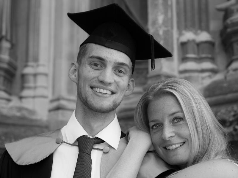
When I photographed my cousin on his graduation day, I adhered to my preferred 3:2 aspect ratio. It was how I approached filling the frame on the day and, consequently, how I processed the images afterwards. However, when my aunt had her prints made, she opted for a 24×18 canvas. I had to re-crop her favourite shot in a hurry. You can see both of them here. Can you see why I prefer the 3:2 aspect ratio in this instance? It doesn't feel nearly as squashed as the 4:3 version does.

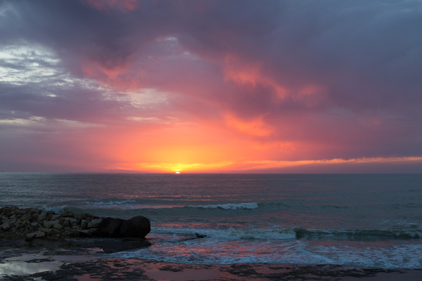
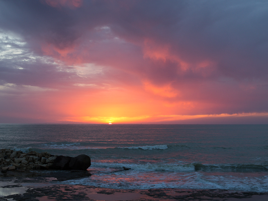
If you compare these sunset photos, you can see how much of the view the 4:3 version loses when compared with the 3:2 aspect ratio. It can prove difficult to fill the extra space in a landscape shot, but sometimes you need it, too.
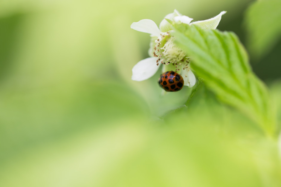
Of course, you don't have to adhere to 3:2 or 4:3 aspect ratios. I decided that 4:5 worked best for this bee enjoying the Sicilian springtime flowers. The more compact frame focused attention on the bee better than the larger 2:3 version.
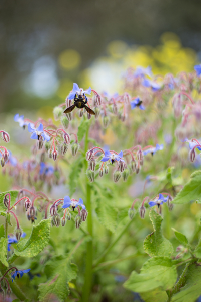
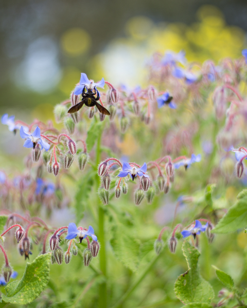
Don't forget, if you switch from landscape to portrait orientation, then the aspect ratio will alter format accordingly. Width always goes first, thus 3:2 will change to 2:3 and 4:3 becomes 3:4. Or in the case of the bee, it's 4:5.
Opting for a different aspect ratio doesn't necessarily mean that you need to use a different compositional rule; however, in some circumstances, you might find the Golden Ratio preferable to the rule of thirds. It depends on your vision for the image. But do think about how much space you need around your subject. If you're struggling to fill it, think of trying 4:3; if it looks squashed, consider 3:2. Or try something else. Try not to feel too constrained by the constraints of aspect ratio.
But I will leave you with closing thoughts from xkcd. Who could put it better?
One of the first compositional rules that we learn is the rule of thirds. It's relatively simple but definitely effective: divide the frame into three, horizontally and vertically, and use the divisions to place your subject. But rules are made to be broken—once you understand them properly, that is—or at least adapted and challenged. If you're looking to leave behind the rule of thirds but still want place your faith in geometrically validated subject-placement, try the golden triangle.
Draw an imaginary diagonal line across your frame. Now draw imaginary lines from the other two corners, which each meet the long line at right angles. It should look something like this:

Your points-of-interest are where the lines meet. Use them to place your focal point, for example the eyes in portraits, and use the lines to divide your frame and draw the eye to the focal point to help create dynamic images.
On a mundane and practical level, it's easier for some people to visualise the triangle than it is the rule of thirds. Moving towards a more creative purpose, by using triangles to compose your frame you're introducing a strong compositional shape to it with a great sense of balance pitted against a precarious point. And triangles have a nifty way of retaining the attention of the eye within the frame: the eye moves from one point to another in a continuous loop.
[gallery ids="6953,6954,6955"]
Quite specifically with the golden triangle, you give yourself a means of dividing the frame in a way that is frequently more pleasing to the eye than a horizontal or vertical split. As well as using the lines to draw the eye to focal points, the use of triangles in the frame brings balance to the image. Think of one half as blue and the other as yellow. Or shadow versus light.
By counter-poising the two points-of-interest against each other, you can enhance the sense of balance in the frame. You get dynamism and balance in one go: brilliant.
It's all very well knowing the theory - what about the practice? Try portraits with your subject leaning into the frame and the eyes on a point-of-interest. Use the rule to place bridges in your frame, and have the eye travel along them to a focal point. Just give it a try - you never know!
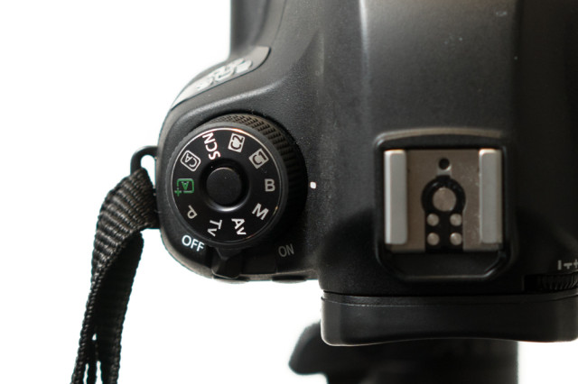
When setting your shutter speed, have you ever wound the adjustment wheel so far into long exposure that you've gone past seconds and found 'B' or 'Bulb' on your screen? Or maybe you've noticed that you have a 'B' option on your mode wheel, somewhere between Manual and Custom settings? This is bulb mode, and it allows you to control the duration of the exposure for precisely as long as you would like. It's perfect for exposures in excess of the 30 seconds that most cameras have as their longest shutter speed, or for when you need to be in control, for example if you're practising high-speed photography. First, a quick word on why it's known as 'bulb' mode. Haje has a much more thorough explanation here, but it doesn't have anything to do with light bulbs. It's from back in the day when you could control your shutter speed using an air bulb connected to your camera.
When your camera is in bulb mode, you open the shutter by depressing the shutter release button; as soon as you raise your finger off of the button, the shutter will close. Seeing as it isn't terribly convenient to stand with your finger on your shutter release button for minutes or even hours on end—and it's not fabulous for camera-shake, either—most people use bulb mode in conjunction with a remote shutter release. And a tripod, but that's probably quite obvious.
Plenty of remote shutter releases come with a locking mechanism, so that you don't need to hold your finger down there, either. However, if you go for something such as our much-beloved Triggertrap, you can select from a variety of different modes to control your super-long exposure, including a timed release that lets you set the duration of your exposure down to fractions of a second, a star-trails setting, and even a bulb-ramping option to fine-tune exposure during very long time-lapse recordings.
Even if you're shooting at night, your camera's sensor will be able to detect far more light than you think it can, especially with a very long exposure. Consequently, using a small aperture is recommended. If you're photographing during the day, you might benefit from a neutral density filter to prevent unavoidably over-exposing your images, too.
It is worth bearing in mind that using bulb mode can drain your battery enormously. Don't set off to capture star trails with a less-than-fully-charged battery. Take a spare if you have one, too. It's a complete waste to maroon yourself in the middle of nowhere with limited light pollution only for your camera to keel over halfway into the exposure.
Now that you know what bulb is, what can you do with it? Perhaps you'd like to try some long exposures of landscapes? Or maybe capture some smooth, milky-looking water tumbling from a fall. You might want to try your hand at a star trail, or have a go at light painting. You could even grab a flash adapter and have a crack at some high-speed photography and burst some water balloons. So many options presented to you with so much time from bulb mode!
We're probably all familiar with the notion of aperture controlling the depth-of-field in our photos. By using a faster aperture, you create a shallower depth-of-field. To keep more of your image in focus, you need to use a smaller aperture. But there's a whole lot more to depth-of-field than adjusting your aperture to get more or less of the scene in focus.
Let's start with setting out what we mean by depth-of-field. It's the range of distance in a photo that is considered to be 'acceptably sharp', or what we would regard as 'in focus'. Only the actual point of focus in a photograph is definitively sharp and 'in focus'; depth-of-field describes the zone of acceptable sharpness either side of it. A wider band of 'acceptable sharpness' running through an image equates to a greater depth-of-field. To introduce more blur into your photos you would want a shallower depth-of-field with a narrower band that's 'acceptably sharp'.
It's worth remembering that there's no sudden transtition from 'sharp' to 'unsharp': focus falls off gently on either side of the plane of focus, regardless of the aperture you use. It is fair to say, though, that larger apertures have a more rapid transition from in- to out-of-focus than larger apertures.
[gallery ids="6855,6856,6857"]
Controlling the depth-of-field in an image is achieved primarily by adjusting your aperture—a smaller aperture for a greater depth-of-field; a larger aperture for a shallower depth-of-field—however, there are other factors that affect it, too.
You'll often hear people say that telephoto lenses have a shallower depth-of-field than wider angled lenses. This isn’t strictly true. It’s more accurate to say that because telephoto lenses are mostly used to magnify subjects, and the subject will then fill more of the frame relative to the background, the depth-of-field appears to be shallower.
All the same, it's worth capitalising on the magnifying effect from telephoto lenses to pick out your subjects and surround them with blurred foregounds and backgrounds.
If you've ever practised macro photography, you'll appreciate how getting closer to your subject makes it harder to get it all sharp. The closer that you position your subject to your lens, the shallower your depth-of-field will be. Choose a subject further into the background and you'll find that the depth-of-field surrounding it is larger.
Depending on the focal length you use, you will find that the depth-of-field isn't divided equally in front of and behind the plane of focus. Instead, the area of acceptable sharpness behind the point of focus is generally larger than that extending in front of the focal plane. As focal length increases, so too does the distribution of the depth-of-field in front of the subject.
When you shoot with a focal length of 15mm about two thirds of the depth-of-field will be behind the subject and one third in front of it. When you get to 400mm it's closer to a fifty-fifty divide.
Depth-of-field: not just about aperture.
It is a truth universally acknowledged that landscape format pictures work more successfully in articles than their portrait format counterparts.
When I'm offering feedback on the assignments submitted by our Photography School students, one of my most frequent questions is 'Did you think about framing this vertically?' Or at least, something along those lines. Human vision is binocular, meaning that we have two eyes that happen to be positioned adjacent to rather than on top of each other. We are, therefore, predisposed to scanning things along a horizontal plane rather than a vertical one. It’s no surprise then that we’re more inclined to capture horizontally oriented pictures. The vast majority of cameras have been designed around this fact, thus have a default horizontal orientation and it's just about uncomfortable enough to rotate it that we sometimes overlook doing so.
We shouldn't be so hasty.
The long and the short of it (ahem) is that the majority of subjects that are wider than they are longer will benefit from being photographed in landscape format. You'd have to be standing an awfully long way back to fit all of the Schonbrunn Palace into a portrait format picture. Most of the time, the horizon in a landscape photo will demand to take up as much space as possible, stretching across the frame. Typically, there's more to see when you scan left-to-right than there is up-to-down. But not always.
It's hardly an accident that vertically oriented pictures are referred to as 'portraits'. Any subject that is taller than it is wider—people, trees, skyscrapers, doorways, bottles—will suit a portrait shot.
It's hardly a co-incidence that portraits are called portraits.
It's a case of letting the natural lines in the image dictate how it's framed. Don't be afraid to swing your camera through 90° and give it a go.
The entire point of this image is the vertical. Why would I shoot it horitonzally? Let the subject dictate the line.
If you stop to think about it, the majority of the time it will feel obvious whether you should be framing your subject horizontally or vertically. There will be a natural line and flow to your composition. Sometimes, however, you might be presented with a compositional dilemma or you might want to spread your creative wings.
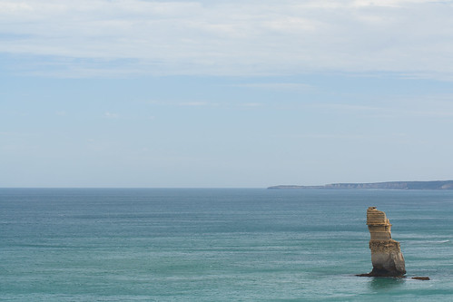
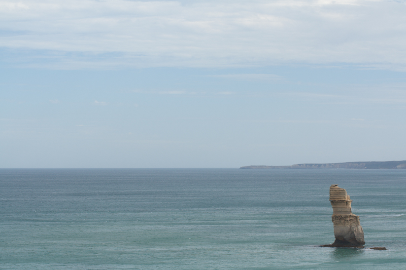
The Lonely Apostle might be a vertical feature, but it's the landscape that gives it context and the horizontal framing emphasises that.
For example, you might have a landscape that features a mountain range running off into the distance—a horizontal motivation—but with tall trees in the foreground that would enjoy the vertical emphasis of a portrait framing. Which do you go for? What you have to decide is which element do you want to be the dominant one and therefore be emphasised by your framing. There's not necessarily a right or wrong here; it's about ensuring the subject and the framing complement each other.
But portraits don't always have to be oriented vertically. A landscape format can look fabulous.
If you've time, shoot both. You've nothing to lose.
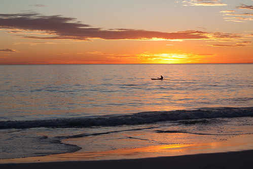
The traditional landscape format works perfectly for this sunset seascape...
It is worth trying something new and different, though, to challenge your thought processes and expectations. You don't need to be wasteful and practise obscure compositions for their own sake, but it is always worth moving and rotating and shifting and changing. Don't feel constrained by what is expected, work to produce an image that tells a story.

... but take nothing away from the vertical version.
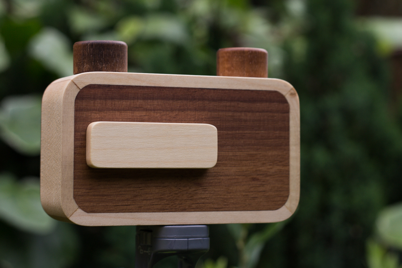
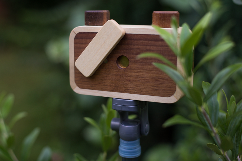
A few weeks ago I was contacted by Elvis Halilović, the man behind the ONDU Pinhole camera company, asking me if I'd like to try out one of his handmade, wooden pinhole cameras. It's not the sort of offer I'm likely to decline. Last week my entirely gorgeous 135 Pocket Pinhole arrived through the post. On Monday I took advantage of glorious sunshine and the flourishing abundance of the allotment and headed out with a few rolls of film to see what the camera could see. Today I collected an envelope of developed images from the shop in town.
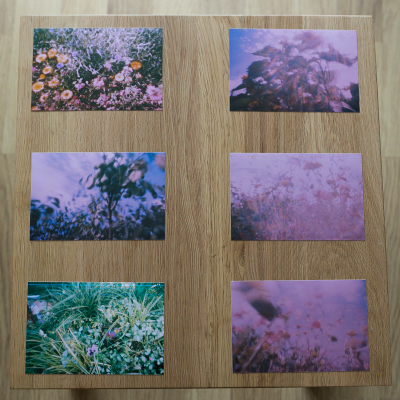
How did they turn out? Actually not all that brilliantly. The film was expired, which has resulted in all of my photos having a rose pink cast. Despite the very useful exposure guide provided by ONDU, judging shutter speed was a very hit-and-miss affair that was counted in pink elephants and almost everything is over-exposed. My little Lollipod stand is a perfect match for the ONDU pinhole, but I've not mastered opening the shutter without disturbing the camera, and of course the longer exposures means motion blur, so everything is hazy. And without a viewfinder, you're guessing at just what the camera can see, so what's in the frame isn't necessarily what I'd anticipated would be there.
But the truth is, none of that matters. What matters is that I'm proud of these pictures and that I had fun taking them. I enjoyed experimenting with exposure times and attempting to determine what the camera could see. I recalled the anticipation of my childhood, when I'd send films off to be developed and have no idea what would be sent back to me. It was, in fact, the most fun that I've had with a camera for a very long time.
I won't deny that I had a few frustrations, but they weren't enough to deter me. The ONDU requires you to tape the film onto the receiving spool and count one-and-half rotations to wind on between frames. Loading the film was a bit tricky and I succeeded in breaking one roll with a heavy-handed winding action. There were a couple of unintentional double-exposures, too. No one said this was going to be easy, or indeed fast, though.
Perhaps the best tip that I have is to head out with a notebook when you're shooting, to record the lighting conditions and exposure time for each frame. When I go out next time, if the lighting conditions are similar, I'll know to open the shutter for a fraction shorter duration. If the conditions are different, I'll be making more educated guesses. Whatever the light, I'll be having more fun.
Pinhole photography itself is intuitive, with the requirement to judge and estimate and guess. It's also visceral and plays on your emotions of surprise and vexation. The more that you practise it, the better you'll become, not just at pinhole photography, but at the general discipline of photography. It pulls you back to the founding principles of expose and compose: a simple concept but with a nuanced practice.
The opportunity that a pinhole camera gives you is to play with light in a box: photography in its most deceptively simple form. If that doesn't intrigue and inspire you, and remind you what's wonderful about taking pictures then I'm not sure what will. Get hold of a pinhole camera and go back to basics; you won't regret it.
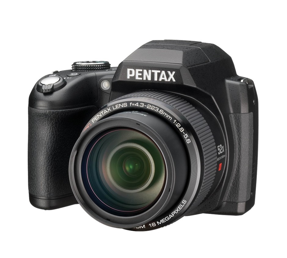
In the early hours of this morning (if you're in Europe), Ricoh announced a new bridge camera, the Pentax XG-1. But what exactly is a bridge camera, and who constitutes the target market?
It's all in the name, really. A bridge camera spans the gap from small compact cameras with fixed lenses to larger and heavier dSLRs with interchangeable lenses. They're fixed lens cameras that enjoy impressive optical zoom capabilities—in the case of the XG-1 a 52× zoom or the 35mm equivalent of 24 to 1,248mm—and the full manual control that you'd expect from a dSLR. However, although they might share a similar shape to a dSLR with its characteristic pentaprism hump, they don't share the mirror and the optical viewfinder mechanism. They function akin to compact cameras, making them smaller and lighter than their dSLR cousins.
Although a bridge camera usually comes in bigger and heavier than a compact camera, they're smaller and lighter than dSLRs; this means you get the advantages of manual control and impressive telephoto prowess but without the bulk. As the lens with all the optical zoom is built into the camera body, there aren't any expensive, bulky lenses to schlep about, either. You can switch from wide angle to telephoto with the movement of a button, rather than the inconvenience of a lens change and the potential of subjecting your sensor to dust and dirt. If you're shooting in dirty or dusty conditions, a bridge camera might be preferable to an interchangeable lens model.
Bridge cameras present you with control and magnification in a neat, cheap package. The new Pentax XG-1 is priced at £250 £280*; the Canon, Nikon, Fujifilm, and Olympus equivalents aren't too far off that mark and have generally similar specs.
My 70-200mm zoom lens doesn't extend nearly as far as the 1,248mm of the Pentax XG-1. But it does have a fixed maximum aperture of ƒ/2.8. So whether I'm zoomed in or out, I can open my aperture as wide as ƒ/2.8. This isn't usually the case with bridge cameras. At its maximum zoom, the XG-1 has a maximum aperture of ƒ/5.6. (When it is zoomed out, the XG-1 has a maximum aperture of ƒ/2.8.) While this might not be a terrible state of affairs where depth-of-field is concerned because the magnification factor is so high, it can be an issue with respect to letting in sufficient light.
With such an enormous zoom, camera shake is a big issue for bridge cameras and to help mitigate that, you need a fast shutter speed assisted by a large aperture. Most bridge cameras do have image stabilisation to help prevent camera shake making itself obvious in your photos, but that smaller aperture at maximum zoom can be problematic.
The huge zoom can you close to the action with a bridge camera, but they don't always enjoy lightning fast autofocus and the EVF can be slow to refresh if you're shooting action scenes. That might mean the difference between shot made and a shot lost, particularly if you're trying to photograph sports or anything fast-moving.
Most bridge cameras use a 1/2.3" sensor. Although that gives them more klout than many compact cameras, they aren't as well endowed as dSLRs, which come with APS-C or full-frame sensors. This can be detrimental to image quality, with noise rearing its ugly head in images.
While both bridge and EVIL cameras tend to be smaller than dSLRs, there remain significant differences that set apart the two groups. EVIL cameras come with a range of different sensor sizes, but they need separate lenses. They're also more expensive than bridge cameras, particularly when you factor in lenses, which doesn't place them in direct competition.
People who want the flexibility of manual controls, incredible zoom, and a lightweight camera are the ideal consumers for bridge cameras. They're excellent for travel, even if they can struggle in low-light and be a little slow to focus. Bridge cameras don't require an arsenal of lenses, but do get you close to your subjects. And they tend to be afforable, too.
When you tell people that image processing and manipulation isn't anything new, but is just about as old as the art of photography itself, you can get some funny looks. Many of the processes that we carry out without a second thought were equally normal for analogue developers. Depending on how proficient you are with Photoshop, compositing might be faster today, but it's not new. Think of Man Ray and his image Le Violon d'Ingres. And beautifying subjects with the help of a brush was a far from alien practice for Cecil Beaton. Yes, really.
The difference is that now the ubiquity of editing suites means that techniques that were once the preserve of skilled darkroom practitioners are accessible to anyone with a computer. The degree of skill required to complete subtle, effective, and credible edits is still high, but the mystery has gone. Or rather, the mystery has assumed a new narrative as the dark arts of the darkroom remain under wraps.
To try to set some of that record straight, here's an extensive, but not necessarily exhaustive, list of the techniques that bridge the analogue and digital divide.
Have you noticed how the crop icon is a variation on a theme, in almost every editing package you encounter? That's because it's based on the tool that would be used to crop and resize images in the darkroom.
[gallery ids="6782,6783,6784"]
The brush icon is another familiar one, whether you're in Photoshop or Pixelmator or Aperture or GIMP. Brushes were used extensively in the darkroom, to define edges or enhance details, to hand colour, to spot correct, to complete just about any task for which you might now use a digital brush.

Haje has already written an article that explains why the dodge icon resembles a lollipop and the burn one a fist. Of course, they're techniques that were used in the darkroom to lighten or darken specific areas of an image as required. The dodging 'lollipop'—or piece of black paper on a stick—could protect the photographic paper from too much light during the development process, thereby keeping the areas in question lighter in the final image. The fist would be your hand, controlling how much light got through to darken areas of your photos.
Using red to distinguish masked from unmasked elements in an image wasn't an arbitrary choice by software engineers. That too is a hangover from darkroom days. Mask an area that you don't want developed with red, gel-like rubylith and the light won't be able to penetrate it in the darkroom, so it won't be exposed. If you've ever found yourself irritated when masking a complicated outline in Photoshop, imagine what it would be like doing it with a scalpel!
Yes, there's a reason why the sharpening tool in Photoshop is called the Unsharp Mask. Again, Haje has a comprehensive explanation here, but the short answer is that images were sharpened using a not-quite-sharp positive of the image to make a mask (an unsharp mask) combined with the negative. The blurriness of the positive image should work with the negative to create a sharper final image.
Maybe you use the split-toning feature in Lightroom to create cross-processed effects, or to give a golden-hour glow to your photos, or perhaps to correct the white balance in your images. But it was originally a darkroom technique that allowed different tones to be present in the highlights and shadows of an image. Split-toning was something of a dark art, relying on the interplay of different papers and different chemical toners deployed after the standard developing and fixing process to produce different colours in the final image. Getting the balance right with your sliders might be a frustrasting experience now, but I'm sure it beats fiddling with gold-, selenium-, and sodium-based chemicals!
It might be simple to adjust the contrast in your photos on a slider in a digital darkroom, but you had at least three ways of doing so in an analogue darkroom: with graded papers, with variable contrast paper, or with filters.
Unless you're shooting with a Leica Monochrom, you can choose between colour or black and white for any given photo now, switching back and forth between them as many times as you like in a non-destructive editing package. But in the early days of film it was black and white, maybe sepia, or perhaps the vagueries of split-toning, unless you opted to hand-colour your images. Love or hate selective colouring, for some people that was all that they could afford when hand colouring was a time-consuming art form. It isn't just a Photoshop abomination.
Finally, the much-maligned airbrush. It's not just a new-fangled phenomenon that magically reduces the size of an already-stick-thin model's thighs. The airbrush has been removing undesirables from images since at least Stalin's time and Cecil Beaton was famous for slimming his subjects.
I think you'll find, then, that there is very little that's new between the red light of the darkroom and the digital glow of Photoshop.

There are three things that affect an exposure: speed, aperture, and ISO. They work in a triangle to achieve an exposure.
When you give with one you take with another to ensure that you don't over- or under-expose your shot. In your early days of setting your exposure manually, it can be a bit tricky to remember how they fit together. But if you think of exposure as a glass being filled by water from a tap, it might help. Here's how it works.
Think of aperture as how much you open the tap. The wider you open it, the more water flows into the glass. Open the aperture wider and you let more light into the camera.
If aperture is how far you open the tap, shutter speed is how long you open the tap for. If you open it for a long time, a lot of water comes out. If you open it only briefly, just a little water comes out.
The final control in the exposure triangle is ISO. From the perspective of our water-glass analogy, ISO could be described as the size of the glass. At a low ISO, the glass is a large one. At a higher ISO, the glass is smaller. In effect, if you are shooting with a high ISO, you need less water to fill the glass.
Much like filling a glass with water, getting an exposure can be achieved quickly or slowly, but you'll get there in the end. You can use a trickle of water—so that would be a small aperture—for a very long time, and the glass will eventually be filled. Alternatively, you can open the tap all the way—the equivalent of a large aperture—very briefly, and the glass will be filled.
The same is true in photography. Two different exposure settings can result in the same amount of light being recorded inside the camera.

Okay, it's a glass of beer. But that's much more fun than water.
How, then, do you put this into practice? It depends on what you want to achieve with your photo. If you're looking to secure a particular depth-of-field you'll set your aperture accordingly and then adjust the shutter speed and ISO to complete the exposure. For a long exposure shot you'll need to think about whether it needs a small or a large aperture and a low or a high sensitivity.
Drink up!
For literary types, a vignette can be either an anecdote or short story, or a illustration—often foliage-inspired—found on chapter headers. For photography types, a vignette is the gradual fall-off of light from the centre towards the edges of the frame of an image. If you enjoy Instagram or play around with Snapseed, you might know a vignette as a cool effect that you can add at will. They are, however, far more than just an effect. Thus we present to you the self-contained, but not necessarily short, Photocritic guide to vignettes, without any vines.
Photographic vignettes occur because of natural, optical, mechanical, and technical reasons and can appear whether you prefer analogue or digital technology. While we might associate vignetting with vintage, it's hardly stuck in the past. Digital sensors managed to introduce their own form of vignetting, and a great deal of it is down to lenses. What are we looking at, then?
You are most likely to see natural vignetting when you use a wide-angle lens. It's a gradual darkening of the image that happens because light reaches the sensor (or film) at different angles. As the photons need to travel further to reach the edges of the sensor, they lose their strength, hence the darkening.
Lens design is primarily responsible for optical vignetting; the lens' barrel prevents light reaching the sensor evenly, and the lens elements stacked up on top of each other can have an impact, too. Optical vignetting is more pronounced when shooting at wider apertures; stop-down a bit and you can reduce its prevalence.
If anything physical blocks the passage of light to the sensor, for example a lens hood or a filter, it can cause a vignette. This is the easiest vignette to correct: check all of your accessories are properly attached.
The pixels towards the edges of a sensor aren't always able to record light at the same intensity as those closer to its centre, mostly because of the angle at which the light hits them. This can lead to a darkening of the image towards its edges. Sensor manufacturers have caught onto this phenomenon, however, and have introduced compensations to rectify it.
If a vignette is regarded as an aberration, why would you want to add one deliberately to an image? When used reservedly, they can bring focus to your subject and draw your eye into the frame, particularly in portraits. First because they allow for fewer distractions at the edges of the frame, but also because they mimic the natural effect of the eye. We don't see sharply all the way to the edges of our vision, and a vignette's fall-off has a similar impact on our photos. They reproduce a degree of 'normality' that we can find pleasing. The essential factor in applying them is to be subtle, therefore.
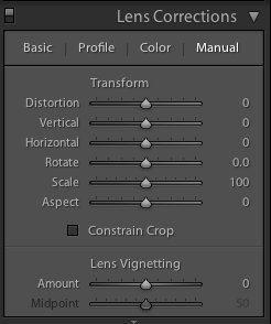
Lightroom allows you both to add artificial vignettes and to correct those produced as the result of optical or mechanical aberrations. If you need to correct a vignette, reveal the Lens Corrections panel, where you can also adjust various types of lens distortion, and nudge the Lens Vignetting sliders until your photo looks 'right'. (They sit beneath the Manual tab.) Easy!
This is also an easy means of adding a subtle vignette to a largely uncropped photo, too. It doesn't let you over-do it, which is the cardinal sin of adding vignettes, and there aren't too many factors to consider. It's sneaky, but if you're working with a cropped photo, not helpful. For a cropped photo, you need to head to the Post-Crop Vignetting options in the Effects panel.
Here, you have far more control over the vignette that you add to your image.
With three drop-down options and five sliders, it might appear as if adding a vignette is more trouble than it's worth, but it's relatively straightforward. We'll deal with those drop-down options first.
Highlight Priority, Colour Priority, or Paint Overlay? Highlight Priority allows for highlight corrections and recovery, so is good with images that have specular highlights, but it might have an adverse impact on the colours in the darker areas of your image. If you're working in black and white, colour shifts won't be an issue, so it's an easy choice.
Colour Priority won't produce such a pronounced shift the colours in the darker areas, but it won't let you recover highlights, either. Julieanne Kost, who works for Adobe, reckons it's a more subtle effect. You might want to consider this if your photo is in colour.
As for Paint Overlay, it is supposed to mimic the effects of overlaying your photo with either black or white paint.
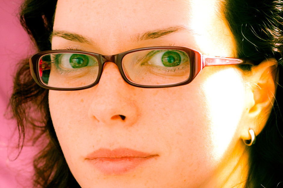
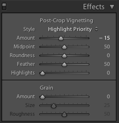
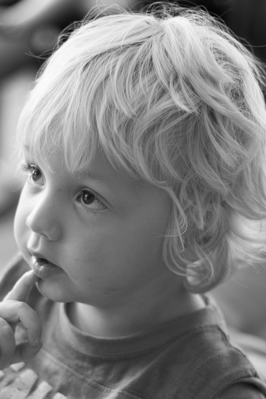
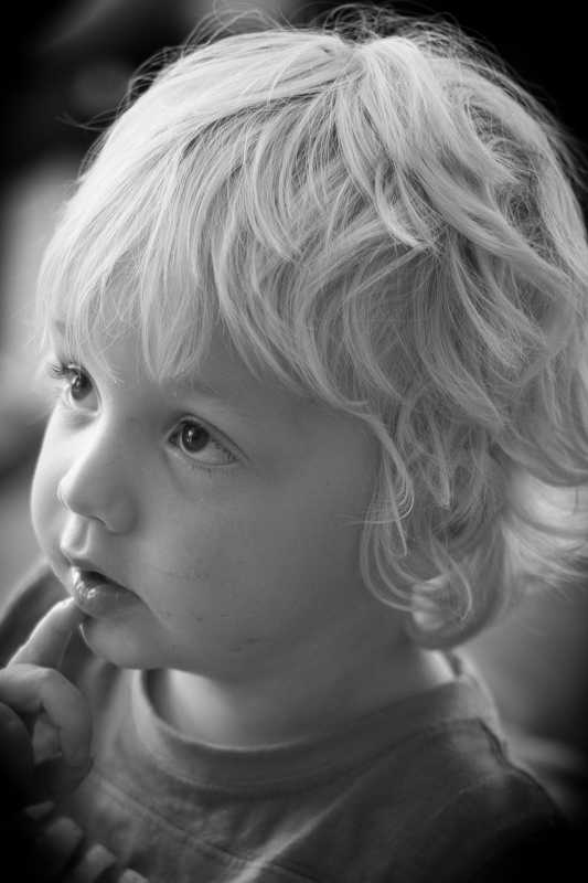
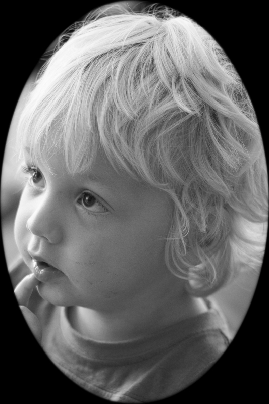
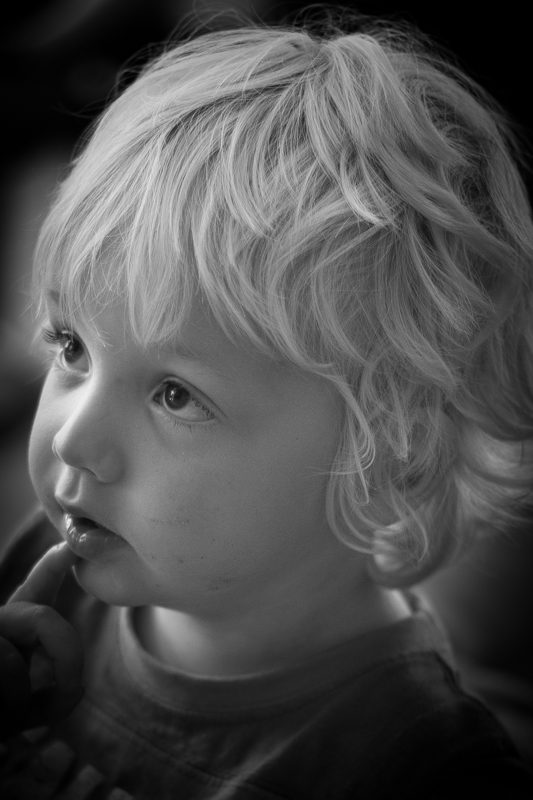
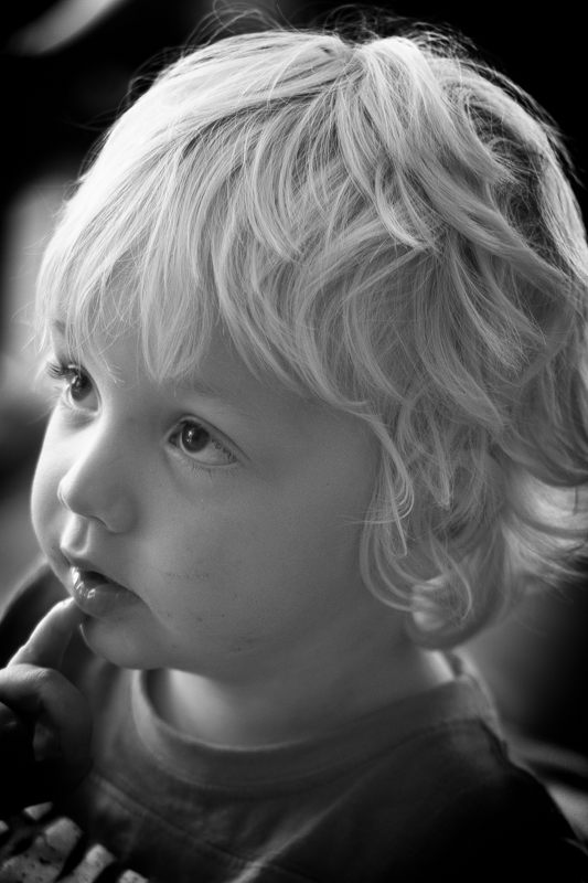
To walk through the sliders, I'm using a photo of my nephew Wil for demonstration purposes. It's been cropped, converted to black and white, and had all of its other adjustments made. The last thing on the list is the vignette. That's how you should apply one, too.
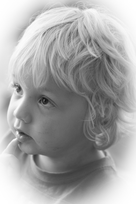
The Amount slider is the crucial slider when adding a vignette. It determines how strong the darkening or lightening of the edges of the frame will be. Set it at -100 and you'll have deep black edges; conversely, +100 will leave you with bright white edges. Without adjusting this slider, none of the other Post-Crop Vignetting sliders will have any impact on your image.
From now on, we'll look at all the other sliders having an effect with the Amount set to -100. It offers the clearest demonstration of their impact.
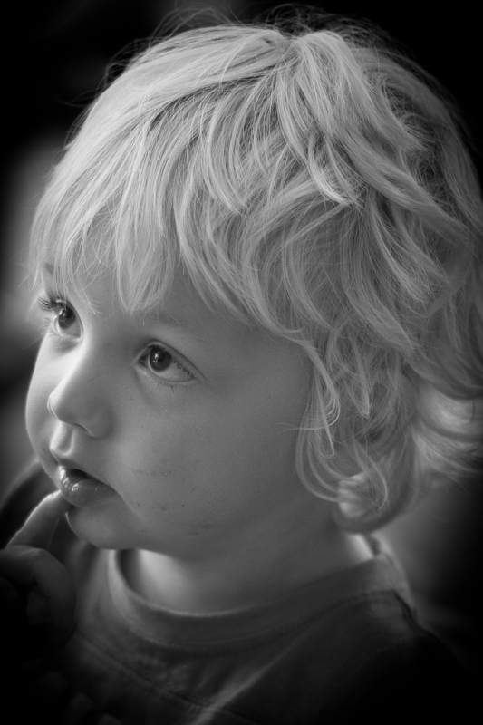
The Mid-point slider controls the size of the vignette from the centre of the frame. It naturally sits at 50 points; reduce it to 0 and you'll produce a vignette that encroaches far into the frame.
Set it at 100 points and it'll sit closer to the edges of the frame.
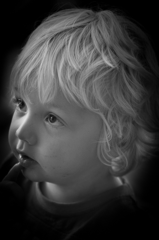
The Roundness slider controls the shape of the vignette. At 50 points, it's elliptical in shape. Push it to 100 points and you'll have a circular vignette. At 0, it's a rectangle with rounded corners. (By pushing all of the Post-crop Vignetting sliders completely to the left, you'll create a rounded-corner rectangular frame effect for your photo.)
To control the strength of the transition between the vignette and the centre of the image, adjust the Feather slider. 100 points ensures a very subtle transition; 0 points is a sharp transition with a hard edge. Its native position is 50 points; I don't often vary far from there.
Finally, we're left with the Highlights slider that starts at 0. Why might you want to increase the highlights slider? It prevents the vignette being applied too heavily to highlights in the image and helps to keep them bright. There's no hard-and-fast rule for this slider; it needs to be adjusted on the merits of each image.
It's important to note that the Post-crop Vignetting panel applies the vignette centred according to the crop. If you want to introduce a vignette that works around an off-centred subject, you'll need to do that using Radial Blur. That's a whole different article, however.
If you don't use Lightroom, you can add a vignette using plenty of other editing suites. Photoshop, of course. And Pixelmator. Or Pixlr. Under the 'Centre Focus' tab if you're in Google+. In Apple's Aperture.
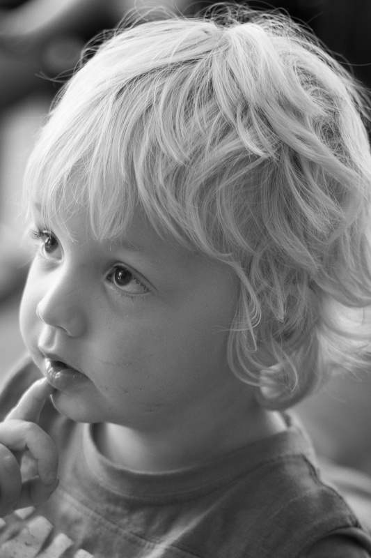
This is my final version of Wil, with a vignette Amount of -15 and a Mid-point of 75. That was it. Remember: subtle is better!
Your photography has been progressing and you've made the leap from shooting in JPEG to Raw. Along with this, you've plunged headlong into Lightroom and all of the editing marvels that it affords you. Plenty of the controls are familiar, after all you've been adjusting the white balance in your iPhone photos since you realised you could stop people looking corpse-blue with a simple slide to the right in Snapseed. A few of the others need a bit more thinking about, but they're essentially the same. And then there's the clarity slider. Clarity? What the blinking heck is that all about?
Before we wade headlong into the ocean of clarity, we need to take a step back and have a quick re-cap of contrast. Contrast is the difference between light and dark in an image. Increase contrast and an image will seem bolder; decrease contrast and it'll have a more muted feel. Adjust the contrast and it has an effect across the entirety of the photo: highlights, shadows, and mid-tones. This is where clarity comes in.
Clarity's influence over contrast happens in the mid-tones of an image; by increasing clarity, you sharpen the edge detail and definition among these tones, leading to a punchier, sharper looking image. Conversely, decrease the clarity value and you'll soften edge detail and lose definition.
The effect that the clarity slider has on your photos is likely as clear as mud until you see it in action. I have, therefore, reproduced the same image but with different clarity adjustments, to see how it looks.

Why, then, would you want to adjust the clarity in your photos? For a start, I've exaggerated the adjustments in my examples to show you precisely the impact it can have. With more subtlety, it can add definition to landscapes, or emphasise a misty, dreamy feel, and give portraits a gentler feel.
These aren't especially thrilling portraits of my cousin, Emma, but they serve the purpose of exploring the clarity slider perfectly.
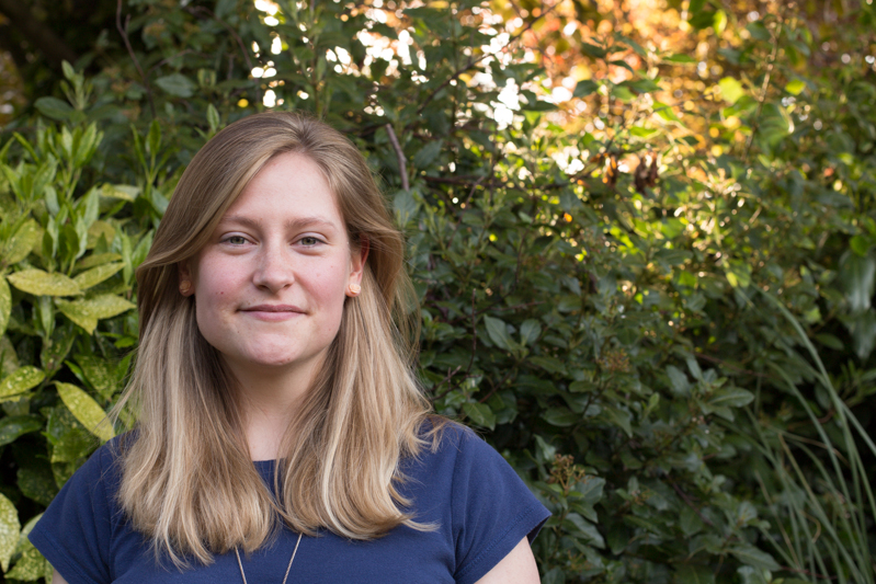
There's nothing at all wrong with the original image (it's been cropped and white balanced); but look at how Emma's skin appears softer and more even with a -15 point adjustment to clarity. The background hasn't been affected too much, but she looks better for it.

If you'd like to get even more advanced, you can use Lightroom's adjustment brush to paint softer and more even skin with a negative nudge, but bring definition to a portrait subject's hair by selecting that and giving it a positive clarity adjustment. That's what I've done here.

As with most things, subtlety is the key to clarity. Too much of it in either direction can leave your photos looking more like cartoons or watercolours than you otherwise might want. And you're not going to want to fiddle with the clarity slider on every photo, either. But at least you can have a bit more confidence about what it does and how you can make it work for you now.
Last week I was fortunate enough to attend a Q&A session with Mary Ellen Mark, winner of this year's Sony World Photography Awards' Outstanding Contribution to Photography. She was asked many pertinent questions and gave a great many eloquent answers, but it was the statement that 'Photography has to say something,' that struck the most resonant chord with me. It chimed right back to one of the very first things that I was taught when I started to wield a camera. I learned the basics of photography from my friend Daniel's mother, exploring the hedgerows around my school and attempting action shots of my classmates playing sport. Linda was patient, enthusiastic, and inventive. I was desperate to do well under her tutelage and one of the most piercing criticisms that she could give of my photos was 'But what's it a photo of, Daniela?' You see, every photo is meant to tell a story, and if your audience cannot discern what you're trying to say, then you've failed in your task as a photographer.
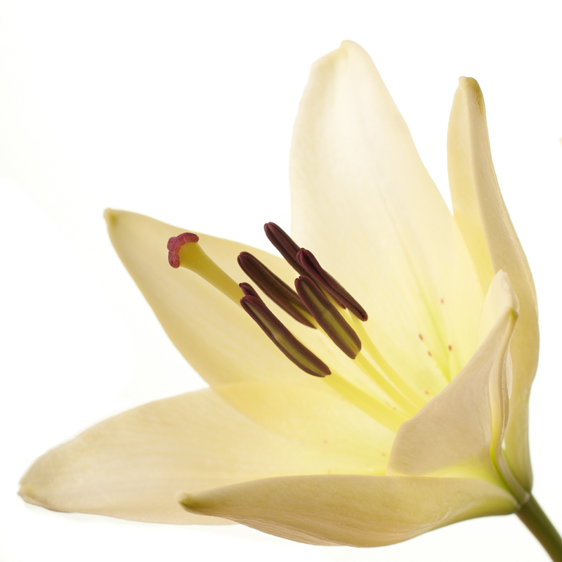
'What's the story?' is a mantra that has adhered with me for some 27 years, and it's the starting point for any critique that I give a photo, whether it's mine or it's someone else's. Even a photo of a gorgeous flower in bloom has a story to tell, and this story is the origin of all picture-taking. Your audience needs to be able to connect with your image and they will do that through its story.
When you're faced with a compelling scene, it's pointless to wave your camera about wildly, snapping at everything you think is relevant and hoping that something will come out of it. All that you'll succeed in producing will be photos as scatter-brained as your approach. Think about: there is a story there that caught your eye and you need to convey it. So think about what that story is and concentrate on narrating it through an image.

When you shoot a landscape, picking out the isolated stone house nestling in the valley will convey a sense of loneliness, or maybe peace. Catching the glint in your nephew's eye as he sneaks a biscuit out of the tin says everything about his cheeky furtiveness. It's all there for the telling.
Building further on this notion, by identifying the stories in your photos and concentrating on how you aim to tell them, your photography will improve. You will have a clearer idea of how to compose your frame and it will give you a starting point for your technical settings. You might not get it right first, or even second or third time, but you will be working in the direction of whatever it is that you're trying to say rather than fumbling in the dark. In every possible way you'll be strenghtening your photography: creatively, technically, and practically.
Before you depress the shutter button, ask yourself, what's the story and how am I going to tell it? Remember: every photograph has to say something.
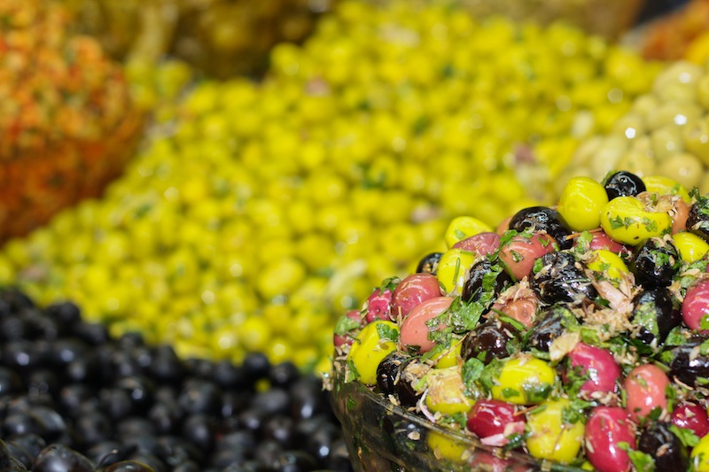
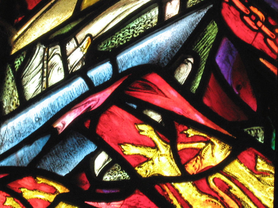
No, we don't mean black and white here. We mean all one colour. All red, all green, all yellow. All anything. Colour is one of the most powerful tools in your compositional arsenal and it can be easy to forget how striking images composed of all one colour can be; we get caught up in the idea of complementary colours and of our images having to contain enough to satisfy and intrigue their viewers. And monochromatic images can do that: the key is to have as many different varieties of one colour within an image so that it becomes an exercise in naming the different shades, tones, and tints of one hue. Colours are able to elicit strong emotions in people. It might sound terribly airy-fairy, but there are introverted—blues, greens, and some purples—colours that give a calm, even subdued feeling and there are extroverted colours, such as reds, oranges, and some yellows, that are positive and energetic. You can prompt particular responses from your audience by using particular colours in your photos.
Red is regarded as the 'strongest' colour; certainly, if you've a multi-colour image that contains just a speck of red, people's eyes will automatically be drawn to that red dot. But if you choose a monochromatic red image, be prepared for something that feels passionate, energetic, and vital. A strong colour will incite a strong response.
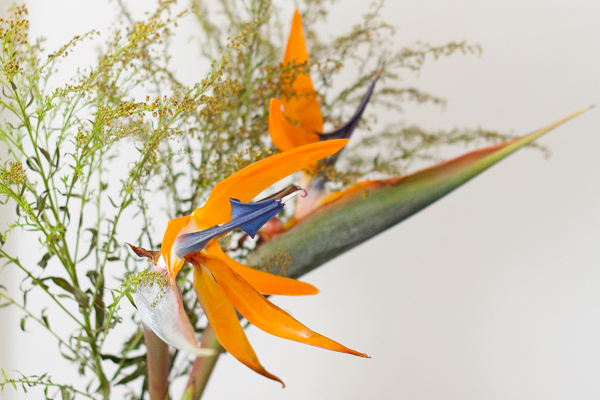
It shouldn't come as any great surprise that I have a particular fondness for orange: I'm Dutch. Daniela rather likes it, too, if how often she wears it is anything to go by. Hardly surprising, then, that we chose it as the Photocritic theme colour. There's something very inviting and reliable about it. Maybe that's because it's the colour of sunrise and sunset. You know it'll happen every day, and that you have the the chance the start over and then to put everything beind you.
Yellow is cheerful, optimistic, uplifting, vigorous: anything positive, really. And it's easy to grasp the association with the sun, with good weather, with the opposite of darkness.
It's spring here in the UK, and we're being presented with a riot of green. It is abundant, youthful, verdant, and symbolic of growth and renewal.
Ever since I can remember, my parents have painted their bedroom blue. They do it precisely because of blue's qualities: it's calming, contemplative, and restful.
You don't find that many purply tones in nature. Of course there are some, especially amongst flora, but it's rarity means that violet tends to have a mysterious and superstitious quality to it. The expense of dying fabric purple in Roman times (the dye came from murex shells) meant that it was reserved for only the highest echelons of power, which contributes to the regal and superior feeling purple has, too.
So, don't be afraid of the monochrome: embrace and experiment with it!
Colour: it's one of your most valuable compositional tools. But it's also something that we can take for granted, rather than actually considering the impact of colour in our photos. Different colours and their tones can influence how people will look at your images, so depending on what you want to achieve and how you want your viewers to respond, it's worth thinking about the colour palettes that you use in your photos.
So what can you do to enhance colours, to make them even more involved in the impact that your photos can have?
Lets start with the colour wheel, with its primary, secondary, and tertiary colours. How they interact forms the basis of colour theory, and great looking colour photos.
When we were at primary school, we were taught that the three primary colours were blue, red, and yellow. Or technically, cyan, magenta, and yellow. You can mix blue and yellow to achieve green; red with blue makes purple; yellow and red creates orange; and mix them all together and you get black. They're known as the subtractive primaries and they're used in print.

But there are three other primary colours, the additive primaries, which mix to form white. These are the 'digital' colours that are used in screens and sensors to create colours. They're blue, red, and green, and they form the 'RGB' colour wheel. There's a shock!
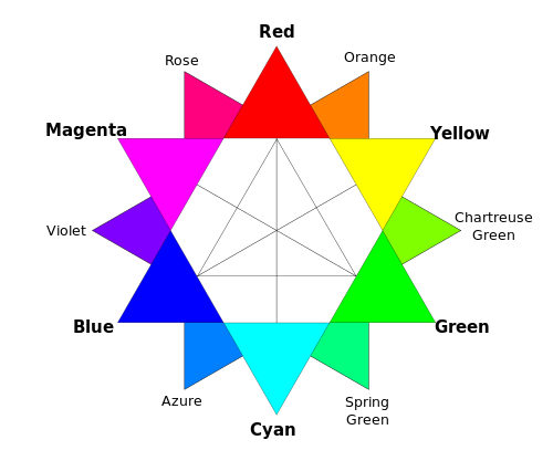
It doesn't matter which version of the colour wheel, with it primary colours you prefer, understanding it, and how the colours in it interact, will help you to produce gorgeous photos.
Combining different colours in your images can create a sense of balance or tension in them. The sense of balance that you get in a seaside picture usually comes from the contrast between the sea and sky blues and the golden-orangey sand.
Ever wondered why a pink flower on a green background looks so stunning? It's because of the inter-play of the colours. Complementary colours, or those that sit opposite each other on a colour wheel, create well-balanced images.
If you're looking for a more harmonious image, focus on combining analogous colours, or those that sit adjacent to each other on the colour wheel. Done right, it isn't boring, but inviting.

Using lots of colours simultaneouly can be overwhelming: the eye doesn't know where to focus and the image descends into a confused mess. However, it doesn't mean to say that you can't take a photo with a riot of explosive colour.
If you get it right, and people know what they're looking at, they can be vibrant successes, rather than confused failures.
Don't forget that black and white can have an impact on colour properties, too. If you place a colour against a white background, that colour will lose some of its vibrancy and appear somehow muted and dull.
It's hardly surprising that the opposite effect happens with black backgrounds: colours become brighter and emboldened. This is useful to remember for portraiture, but vital if you ever dip your toes into product photography.
By muting your colours, or 'toning them down' you can lend a calm, subdued, or even a sombre feel to your photos. If you saturate the colours in your photos, and intensify them, you can make them feel more vibrant and alive.
You might want to be careful when it comes to saturation, though. Too much of it and you can leave your photos feeling unrealistic, almost cartoon-like. It might be the effect you're looking for every now and again, but probably not all the time. People with orange skin don't tend to look so great!
Finally, beware of red. Our eyes are drawn to it and even a tiny fleck of red in a scene can be a monumental distraction.
One of the fundamental rules of photography that we're all taught early in our learning curves is to 'fill the frame'. In fact, the first lesson in the Photocritic Photography School is all about getting closer to the subject and making sure that there's nothing extraneous in the frame. You don't want it to be a tiny, practically unidentifiable blob somewhere in the image that your eye has the hunt to locate. As a consequence, the idea of 'negative space'—or the presence of nothingness in an image—probably seems counter-intuitive. Instead of seeing them as polar opposites, it might help to think of 'getting closer' and 'negative space' as two sides of the same coin that complement each other. Sometimes, a little bit of nothing is just what your subject needs.
If you have a complex subject that’s detailed and busy, contrasting it against an area of nothing will bring some balance to the composition. It helps the eye to find a point of focus and to stop the image from feeling chaotic.
Even if you’ve done all the ‘right’ things compositionally—you’ve selected the appropriate frame orientation, you’ve used the rule of thirds or the Golden Ratio, the image is balanced, there are leading lines directing the eye to the subject—sometimes an image won’t look as good as it could. By putting some negative space around the subject you give everything ‘room to breathe’ and it somehow becomes better balanced.
If you fill your frame with a recurring pattern or repeating subject, like a mosaic or a pile of fruit, and not give it any boundaries, you can create a sense of the infinite in your photos. Surrounding a solitary subject with negative space creates a similar effect.
For example, you could photograph a sailboat on a lake and include the shoreline, which limits the feeling of space. By composing your image so that you capture just the sailboat on a negative space of water—perhaps by altering you vantage point slightly, maybe by getting in a little closer, or even shooting a touch wider—it is suddenly sailing on an infinite sea.
Negative space can contribute to the atmosphere that you want to create in your photographs. Dark negative space can imply brooding or foreboding. Negative space in particular colours can lend a certain feeling to an image; blue is calming, for example, whilst yellow is uplifting. Or there's the opposite of dark and foreboding with positive and airy negative space created by light colours.
When there is nothing else to look at except the subject in an image, that’s exactly where the eye will go. Placing the subject in a sea of negative space will accentuate it. Obviously this is ideal for product photography, when you want the £50,000 diamond ring to be the centre of attention, but you can also use it to make dramatic or slightly surreal images that aren’t intended to sell something!
Achieving this sort of effect isn’t difficult. The first option is to photograph your subject on a plain background. If you don’t have a professional backdrop, a scarf or a sheet will work, too. However, you can also use lighting to surround your subject in negative space. You can either light your background so strongly that you ‘blow it out’, or over-expose it to the extent that the sensor cannot detect anything in that area; or you can light the subject significantly more strongly than the ambient light, so that it will look as if it is emerging from the darkness. Both techniques are highly effective and you can have a lot of fun experimenting with them.
Our eyes and brains are constantly roving for patterns and shapes: think about gazing up at a bright blue sky, and how we look out for cloud formations that resemble faces, animals, and countries. The interaction of positive and negative space in a photograph, especially a minimalist black and white composition, creates similar opportunities to make and look for shapes. You just have to look out for the interplay between objects or between light and shadow.
So that's something for you to try this weekend: looking for the positives in negative space.