lightroom

Sizing up split toning

Historically, split toning was used when developing photos from negatives. Two different toners would be used one after the other in order to produce different colours in the highlights and shadows of an image. For example, follow selenium with gold and you'll produce purple-blue mid-tones; or use sepia and then blue for sepia highlights, blue shadows, and green mid-tones. The effect could be altered by using different papers, too. While chemical split toning isn't an exact science, it does offer some compelling effects for your photos and can give them an entirely different feel. You can use it to add warmth or to cool down an image; you might want to introduce a blue tint, or an orange cast.

Now, split toning is more likely to be achieved using the dedicated split toning panel in Lightroom, or with a colour balance adjustment layer in Photoshop, and it is far more controllable. If you've not ventured into the split toning panel, the degree of variation that it offers you might be a little overwhelming; it can radically alter your photo in a ways that you might not anticipate. That shouldn't stop you from experimenting, and to get you started, here are some suggestions. And don't forget that if you're working in Lightroom, nothing can't be undone.

A quick introduction

If you're using Lightroom, the split toning panel allows you to select the colours that you would like to emphasise in both the highlights and the shadows, the saturation for each of these tones, and then the balance between them.

The eyedropper is likely easier to use than the sliders

If you find using the sliders to control these adjustments a little too abstract, click on the colour swatches beside 'Highlight' and 'Shadow' and use the eyedropper to select the precise colour you'd like for each.

The balance slider places more emphasis on either the highlights or shadows. Once you've selected your highlight and shadow tones, move it about a bit to see which direction, if any, you prefer.

Black and white

The straight black and white conversion is fine. But could it be warmer and have more depth?

The original black and white conversion of Willie's portrait is coming up quite grey-green in tone. By adding some muted browns—that in the shadow very pale—you can introduce a great deal more warmth to the image and bring about an almost-sepia tone.

You don't need to push the saturation or the tones too far

Willie with a sepia feel is less harsh.

Adding warmth

Would bringing some warmth produce a more golden-hour feel to the photo?

This photo was taken fairly early in the morning, on a day when the cloud didn't lift. While the light was wonderfully diffuse, it wasn't especially warm. Even after correcting the white balance, it still felt as if it needed to be brought to life. By adjusting the highlights and shadow tones, it meant I could introduce a more golden-hour feel to the photo.

The adjustments don't need to go too far

You don't need to push too far into the oranges or yellows to intensify the warmth in a photo: sticking to browns and beiges might be enough.

A warmer and more golden Willie

Of course, if you wanted to do the opposite and bring about a colder feel to a photo, you would do that by applying more silvery-blue tones, greys, greens, and even some yellows, to the shadows and highlights.

Cross-processed look

Greens in the highlights and magentas in the shadows

Until now, I've used fairly similar highlight and shadow tones in my split toning adjustments. But for a cross-processed effect, you need to select contrasting colours for your highlight and shadow tones: green and magenta, or cyan and yellow, for example. Which you apply will depend on whether you're looking for a warmer or cooler over all effect.

[gallery columns="2" ids="7128,7127"]

By reversing the shadow and highlight tones (now magenta highlights and green shadows) you can see the imapct it has

By adding a graduated filter, upping the contrast and saturation, and reducing the clarity, you can create a fake toy camera look. We've a tutorial for that, in case you'd like to give it a go.

Split tone away!

The best way to get a feel for split toning is to try it for yourself and see what you can achieve using it. Remember: if you don't like it, you can undo it.

Nothing new under the sun? The darkroom techniques we apply digitally

When you tell people that image processing and manipulation isn't anything new, but is just about as old as the art of photography itself, you can get some funny looks. Many of the processes that we carry out without a second thought were equally normal for analogue developers. Depending on how proficient you are with Photoshop, compositing might be faster today, but it's not new. Think of Man Ray and his image Le Violon d'Ingres. And beautifying subjects with the help of a brush was a far from alien practice for Cecil Beaton. Yes, really.

The difference is that now the ubiquity of editing suites means that techniques that were once the preserve of skilled darkroom practitioners are accessible to anyone with a computer. The degree of skill required to complete subtle, effective, and credible edits is still high, but the mystery has gone. Or rather, the mystery has assumed a new narrative as the dark arts of the darkroom remain under wraps.

To try to set some of that record straight, here's an extensive, but not necessarily exhaustive, list of the techniques that bridge the analogue and digital divide.

Crop

Have you noticed how the crop icon is a variation on a theme, in almost every editing package you encounter? That's because it's based on the tool that would be used to crop and resize images in the darkroom.

[gallery ids="6782,6783,6784"]

Brushes

The brush icon is another familiar one, whether you're in Photoshop or Pixelmator or Aperture or GIMP. Brushes were used extensively in the darkroom, to define edges or enhance details, to hand colour, to spot correct, to complete just about any task for which you might now use a digital brush.

dodge.jpg

Dodging and burning

Haje has already written an article that explains why the dodge icon resembles a lollipop and the burn one a fist. Of course, they're techniques that were used in the darkroom to lighten or darken specific areas of an image as required. The dodging 'lollipop'—or piece of black paper on a stick—could protect the photographic paper from too much light during the development process, thereby keeping the areas in question lighter in the final image. The fist would be your hand, controlling how much light got through to darken areas of your photos.

Masking

Using red to distinguish masked from unmasked elements in an image wasn't an arbitrary choice by software engineers. That too is a hangover from darkroom days. Mask an area that you don't want developed with red, gel-like rubylith and the light won't be able to penetrate it in the darkroom, so it won't be exposed. If you've ever found yourself irritated when masking a complicated outline in Photoshop, imagine what it would be like doing it with a scalpel!

Photoshop's Quick Mask overlay isn't red arbitrarily

Sharpening

Yes, there's a reason why the sharpening tool in Photoshop is called the Unsharp Mask. Again, Haje has a comprehensive explanation here, but the short answer is that images were sharpened using a not-quite-sharp positive of the image to make a mask (an unsharp mask) combined with the negative. The blurriness of the positive image should work with the negative to create a sharper final image.

Split-toning

Maybe you use the split-toning feature in Lightroom to create cross-processed effects, or to give a golden-hour glow to your photos, or perhaps to correct the white balance in your images. But it was originally a darkroom technique that allowed different tones to be present in the highlights and shadows of an image. Split-toning was something of a dark art, relying on the interplay of different papers and different chemical toners deployed after the standard developing and fixing process to produce different colours in the final image. Getting the balance right with your sliders might be a frustrasting experience now, but I'm sure it beats fiddling with gold-, selenium-, and sodium-based chemicals!

Split-toning isn't a new-fangled Lightroom thing

Contrast

It might be simple to adjust the contrast in your photos on a slider in a digital darkroom, but you had at least three ways of doing so in an analogue darkroom: with graded papers, with variable contrast paper, or with filters.

Colour

Unless you're shooting with a Leica Monochrom, you can choose between colour or black and white for any given photo now, switching back and forth between them as many times as you like in a non-destructive editing package. But in the early days of film it was black and white, maybe sepia, or perhaps the vagueries of split-toning, unless you opted to hand-colour your images. Love or hate selective colouring, for some people that was all that they could afford when hand colouring was a time-consuming art form. It isn't just a Photoshop abomination.

Airbrush

Finally, the much-maligned airbrush. It's not just a new-fangled phenomenon that magically reduces the size of an already-stick-thin model's thighs. The airbrush has been removing undesirables from images since at least Stalin's time and Cecil Beaton was famous for slimming his subjects.

I think you'll find, then, that there is very little that's new between the red light of the darkroom and the digital glow of Photoshop.

10 alternatives to Apple's Aperture

Now that everyone has got over their shock that Apple will be consolidating its image editing and organisation features later this year, with the result that its top-end programme Aperture will be closing up completely, people are probably beginning to think about alternatives. I've pulled together ten Aperture alternatives and sought out their positive and negative features. They're all Raw compatible, but do double-check their non-destructive capability. A standard gripe for the majority of these programmes is that they're tricky to get to learn, or that the interfaces aren't intuitive. While it is entirely possible that some of these programmes do have seriously unfriendly workflows and interfaces, it might also a case of them being different to what you know. I remember opening Lightroom for the first time and wondering if it controlled the International Space Station, too. It's all a learning curve. Still, it's probably worth bearing in mind that the open-source options don't have such pretty interfaces as the paid-for programmes.

And finally, we really don't know what Apple's plans are for its photo management and editing programmes. It's possible that Aperture's features will be integrated into whatever comes next. Or maybe they won't, if Apple is looking for a simpler, more consumer-friendly package. But it remains to be seen.

Adobe Lightroom

Lightroom is probably the most obvious option for people looking for an Aperture replacement. It's a comprehensive editing suite that sets the standard in its field. In addition to the expected functions, Lightroom includes advanced features such as brushes, gradient tools and specific lens corrections. It's my editing suite of choice that I feel offers me almost everything I want in an image editor.

However, some photographers—me included—are concerned that the option to purchase Lightroom as a stand-alone editor will be subsumed into the subscription model Creative Cloud and we'll find ourselves beholden to Adobe in perpetuity. If the potential for that bothers you, you might wish to look elsewhere.

Positives

  • Regarded as the market-leader in its class

Negatives

  • Feature-laden interface can be overwhelming
  • Some people unhappy with Adobe

Lightroom perpetual licence: £102.57 Adobe Photography CC bundle (Photoshop CC + Lightroom): £8.78 ($9.99)/month

Corel AfterShot Pro

If anyone doubted that Corel were still in business, yes, it is. And if you're wondering what happened to image editing software Bibble, it was bought by Corel... and became AfterShot Pro. The first version met with significant criticism for lack of basic features such as red eye correction and a reset button. This has been corrected for version 2, together with improved batch editing features and new noise reduction features. By all accounts, it's a pretty nippy piece of kit.

Corel has also stated that it is looking to make life as easy as possible for Aperture users who are looking for a alternative programme. It's reasonable price together with its comprehensive feature set makes AfterShot Pro a compelling option. And you can check it out for free before buying, too.

Precise control with selective editing in Corel's AfterShot Pro

Positives

  • Quick and responsive
  • Comprehensive feature set
  • Supports layers
  • Batch processing options
  • Enjoys local editing features

Negatives

  • Idiosyncratic lay-out
  • Limited plug-in selection
  • No web or email sharing capability

Corel After Shot Pro: £57.99 (usually $79.99, currently $59.99)

Cyberlink PhotoDirector Suite

PhotoDirector claims itself to be 'a unique application that combines all the features you need for photography in a single workflow – efficient photo management, complete adjustment and creative editing.' It comes with some serious editing firepower—from body-slimming tools to content aware object removal—and some sparkling reviews. You can try before you buy with a 30 day free trial. If the PhotoDirector Suite is a bit too pricey for you, have a look at PhotoDirector Ultra, instead.

Create tilt-shift effects in PhotoDirector

Positives

  • Intuitive interface
  • Comprehensive feature set
  • Facial recognition

Negatives

  • No batch processing
  • Inconsistent import times
  • No geo-tagging capability
  • Limited lens correction profiles

Cyberlink PhotoDirector: £114.99 (currently £89.99)

PhaseOne Capture One Pro

You might think of Capture One as being a medium format image processor, but it's capable of handling dSLR- and EVIL-created files, too. It's history of medium format processing means that many of the features that you're accustomed to seeing in places such as Photoshop as well as Aperture and Lightroom come as standard in Capture One. You might need to take a deep breath when you look at the price, but there is a free trial to test it out first.

Positives

  • Comprehensive feature set
  • Supports layers
  • Local adjustment tools
  • Clean and customisable interface

Negatives

  • Expensive
  • Can be sluggish

Phase One Capture One: €229 (currently €114)

Darktable

Darktable is a free, open-source image editing suite that does seem to offer the most comprehensive and user-friendly experience without having to pay for anything. While one should never judge a book by its cover, the Darktable website is the most professional looking one in the open-source category.

Darktable in action
Darktable in action

Positives

  • It's free
  • Impressive range of functions, including split toning, film emulation, watermarking
  • Tethered shooting support

Negatives

  • Interface requires refinement
  • Clumsy and confusing image filing system
  • Undo system could be better

Darktable

digiKam

The digiKam website does give me a mild headache, but plenty of people seem to like the software. In particular it includes some features that aren't available in places such as Lightroom yet, for example fuzzy search and facial recognition.

digiKam in action
digiKam in action

Positives

  • It's free
  • Map integration for geo-tagged images
  • Facial recognition and fuzzy search capabilities

Negatives

  • Can be buggy
  • Idiosyncratic workflow

digiKam

Lightzone

Once upon a time, Lightzone was a commercial enterprise under the aegis of the now-defunct Light Craft company. It went off-line unexpectedly in Sepember 2011, but resurfaced as an open-source initiative tentatively in December 2012 and then more fully in June 2013. Given it was once a commercial product, Lightzone does benefit from better-than-average-for-anope-source-project documentation.

Lightzone, with notes

Positives

  • It's free
  • Extensive functionality
  • Well documented for an open-source project
  • Intuitive layout
  • Previews effects in miniature
  • Supports layers
  • Localised adjustments

Negatives

  • Users need to register before downloading the software
  • Weak image management tools

Lightzone

Hasselblad Phocus

Hasselblad's Phocus might have started out for Hasselblad cameras, but it now supports a wide range of manufacturers' devices.

Positives

  • It's free
  • Mobile app
  • Intuitive, attractive interface

Negatives

  • Not that many people know about it or use it (maybe that's a good thing?)

Hasselblad Phocus

Photivo

Most of what I've read about Photivo suggests that it's a powerful piece of kit, but that it isn't necessarily easy to leap into it and get started. It doesn't offer any management features, just development functions, and is open about it not being for beginners.

Photivo in action
Photivo in action

Positives

  • It's free
  • Localised adjustments
  • Extensive control
  • GIMP integration

Negatives

  • Not necessarily intuitive
  • Not designed for image management

Photivo

Raw Therapee

Raw Therapee seems to offer a peculiar mix of some incredibly advanced editing capability with some serious oversights. While its demosaicing feature is super for low noise images, it's reported that it doesn't cope well with noisier photos. With today's strospheric ISOs, it might be a dciding factor.

Raw Therapee dealing with chromatic aberration

Positives

  • It's free
  • Demosaicing feature
  • RL Deconvolution sharpening tool

Negatives

  • Slow
  • Complicated workflow
  • No batch processing option
  • No localised adjustments
  • Wobbly image management interface

Raw Therapee

From light to dark: the Photocritic guide to vignettes

For literary types, a vignette can be either an anecdote or short story, or a illustration—often foliage-inspired—found on chapter headers. For photography types, a vignette is the gradual fall-off of light from the centre towards the edges of the frame of an image. If you enjoy Instagram or play around with Snapseed, you might know a vignette as a cool effect that you can add at will. They are, however, far more than just an effect. Thus we present to you the self-contained, but not necessarily short, Photocritic guide to vignettes, without any vines.

Types of vignette

Photographic vignettes occur because of natural, optical, mechanical, and technical reasons and can appear whether you prefer analogue or digital technology. While we might associate vignetting with vintage, it's hardly stuck in the past. Digital sensors managed to introduce their own form of vignetting, and a great deal of it is down to lenses. What are we looking at, then?

Natural vignetting

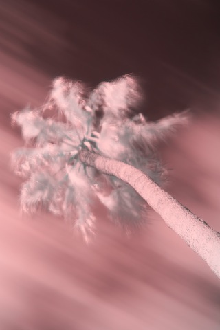
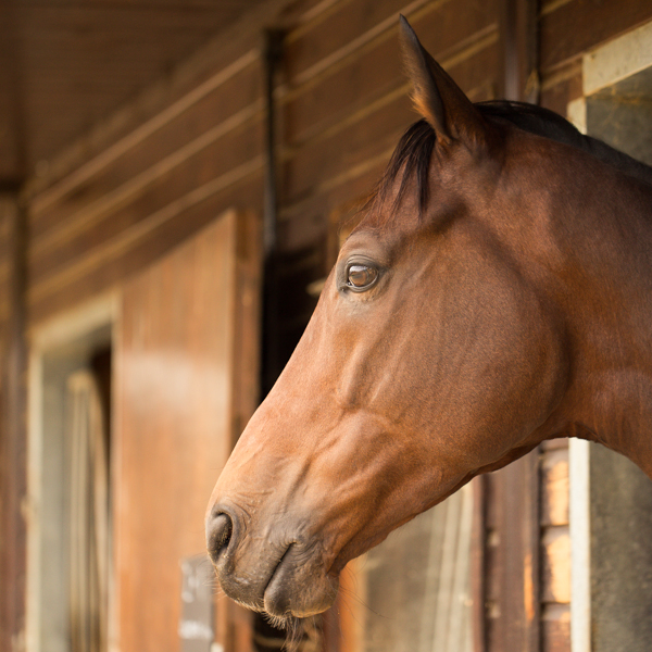
You are most likely to see natural vignetting when you use a wide-angle lens. It's a gradual darkening of the image that happens because light reaches the sensor (or film) at different angles. As the photons need to travel further to reach the edges of the sensor, they lose their strength, hence the darkening.

Optical vignetting

Lens design is primarily responsible for optical vignetting; the lens' barrel prevents light reaching the sensor evenly, and the lens elements stacked up on top of each other can have an impact, too. Optical vignetting is more pronounced when shooting at wider apertures; stop-down a bit and you can reduce its prevalence.

Mechanical vignetting

If anything physical blocks the passage of light to the sensor, for example a lens hood or a filter, it can cause a vignette. This is the easiest vignette to correct: check all of your accessories are properly attached.

Pixel vignetting

The pixels towards the edges of a sensor aren't always able to record light at the same intensity as those closer to its centre, mostly because of the angle at which the light hits them. This can lead to a darkening of the image towards its edges. Sensor manufacturers have caught onto this phenomenon, however, and have introduced compensations to rectify it.

Why add a vignette?

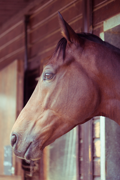
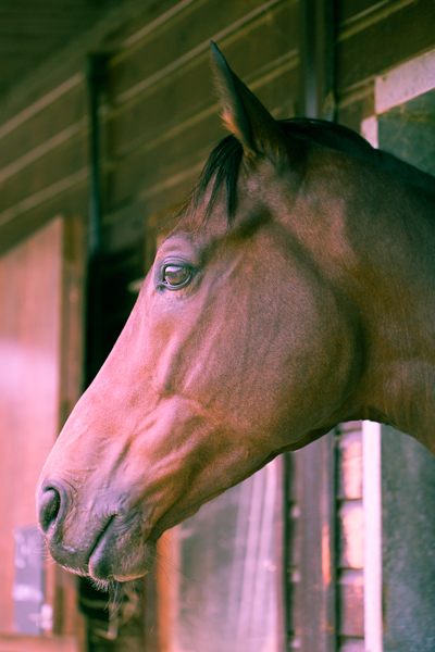
If a vignette is regarded as an aberration, why would you want to add one deliberately to an image? When used reservedly, they can bring focus to your subject and draw your eye into the frame, particularly in portraits. First because they allow for fewer distractions at the edges of the frame, but also because they mimic the natural effect of the eye. We don't see sharply all the way to the edges of our vision, and a vignette's fall-off has a similar impact on our photos. They reproduce a degree of 'normality' that we can find pleasing. The essential factor in applying them is to be subtle, therefore.

Adding a vignette

Lightroom allows you both to add artificial vignettes and to correct those produced as the result of optical or mechanical aberrations. If you need to correct a vignette, reveal the Lens Corrections panel, where you can also adjust various types of lens distortion, and nudge the Lens Vignetting sliders until your photo looks 'right'. (They sit beneath the Manual tab.) Easy!

Correct unwanted vignettes in the Lens Corrections panel (or use it to add easy vignettes to uncropped images)

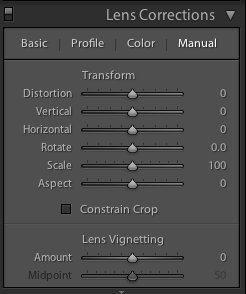
This is also an easy means of adding a subtle vignette to a largely uncropped photo, too. It doesn't let you over-do it, which is the cardinal sin of adding vignettes, and there aren't too many factors to consider. It's sneaky, but if you're working with a cropped photo, not helpful. For a cropped photo, you need to head to the Post-Crop Vignetting options in the Effects panel.

Here, you have far more control over the vignette that you add to your image.

Gently does it with the Post-crop Vignetting options

With three drop-down options and five sliders, it might appear as if adding a vignette is more trouble than it's worth, but it's relatively straightforward. We'll deal with those drop-down options first.

Highlight Priority, Colour Priority, or Paint Overlay?

Highlight Priority, Colour Priority, or Paint Overlay? Highlight Priority allows for highlight corrections and recovery, so is good with images that have specular highlights, but it might have an adverse impact on the colours in the darker areas of your image. If you're working in black and white, colour shifts won't be an issue, so it's an easy choice.

Colour Priority won't produce such a pronounced shift the colours in the darker areas, but it won't let you recover highlights, either. Julieanne Kost, who works for Adobe, reckons it's a more subtle effect. You might want to consider this if your photo is in colour.

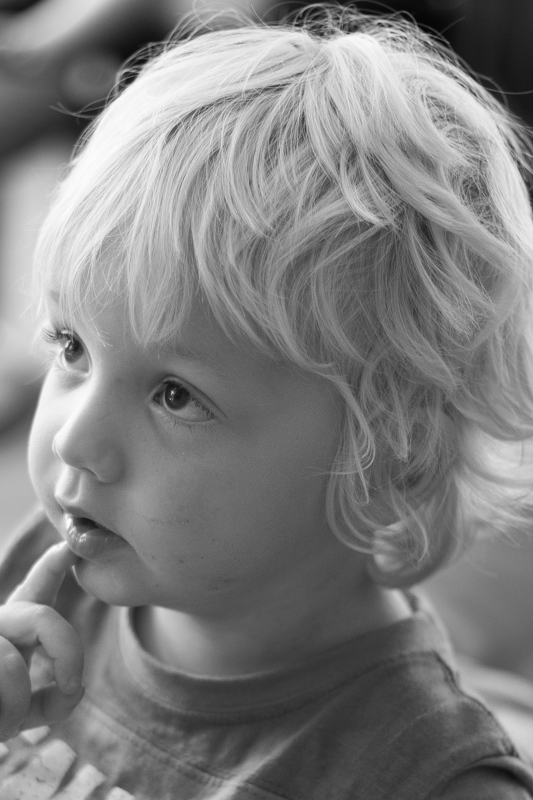
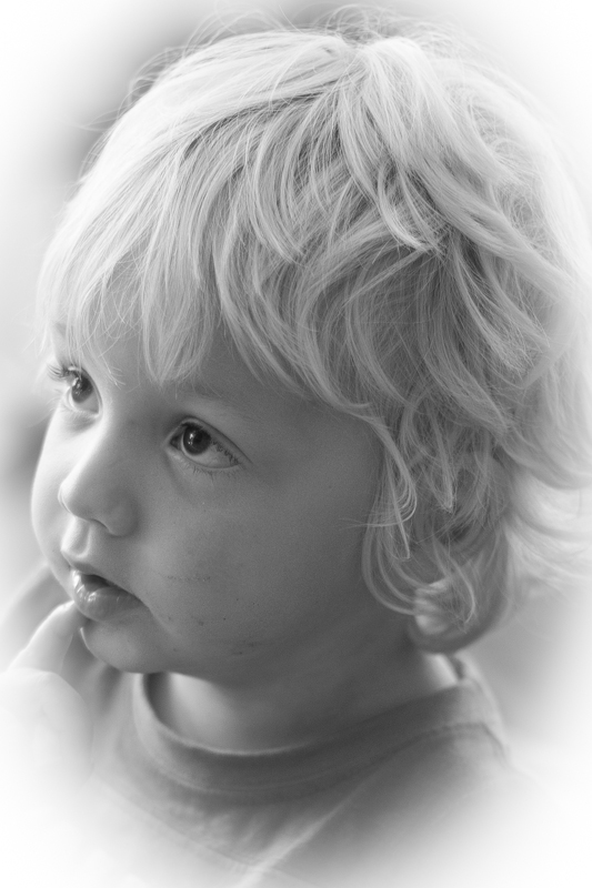
As for Paint Overlay, it is supposed to mimic the effects of overlaying your photo with either black or white paint.

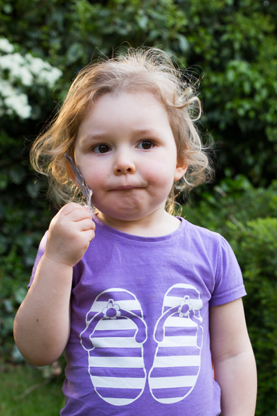
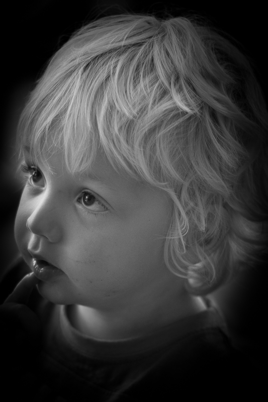
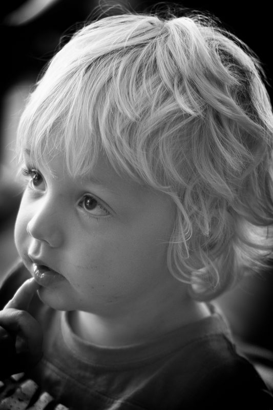
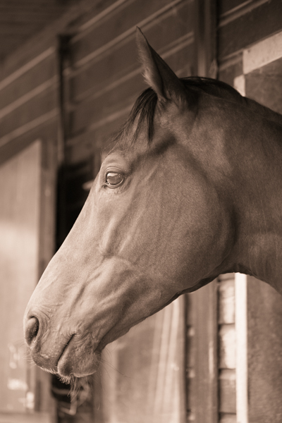
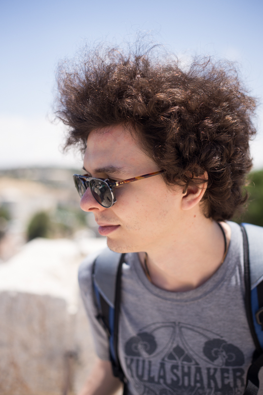
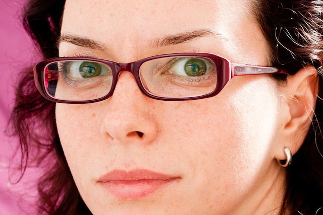
To walk through the sliders, I'm using a photo of my nephew Wil for demonstration purposes. It's been cropped, converted to black and white, and had all of its other adjustments made. The last thing on the list is the vignette. That's how you should apply one, too.
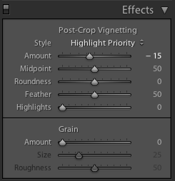
Wil, ready for his final curtain vignette

Amount

The Amount slider is the crucial slider when adding a vignette. It determines how strong the darkening or lightening of the edges of the frame will be. Set it at -100 and you'll have deep black edges; conversely, +100 will leave you with bright white edges. Without adjusting this slider, none of the other Post-Crop Vignetting sliders will have any impact on your image.

A bright white vignette with the Amount set to +100

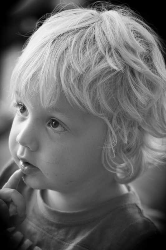
From now on, we'll look at all the other sliders having an effect with the Amount set to -100. It offers the clearest demonstration of their impact.

Amount at -100

Mid-point

The Mid-point slider controls the size of the vignette from the centre of the frame. It naturally sits at 50 points; reduce it to 0 and you'll produce a vignette that encroaches far into the frame.

Amount -100; Mid-point 25

Set it at 100 points and it'll sit closer to the edges of the frame.

Amount -100; Mid-point 75

Roundness

The Roundness slider controls the shape of the vignette. At 50 points, it's elliptical in shape. Push it to 100 points and you'll have a circular vignette. At 0, it's a rectangle with rounded corners. (By pushing all of the Post-crop Vignetting sliders completely to the left, you'll create a rounded-corner rectangular frame effect for your photo.)

Feather

To control the strength of the transition between the vignette and the centre of the image, adjust the Feather slider. 100 points ensures a very subtle transition; 0 points is a sharp transition with a hard edge. Its native position is 50 points; I don't often vary far from there.
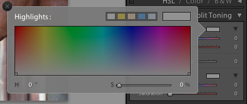
Amount -100; Feather 0

Amount -100; Feather 100

Highlights

Finally, we're left with the Highlights slider that starts at 0. Why might you want to increase the highlights slider? It prevents the vignette being applied too heavily to highlights in the image and helps to keep them bright. There's no hard-and-fast rule for this slider; it needs to be adjusted on the merits of each image.

Amount -100; Highlights 100

It's important to note that the Post-crop Vignetting panel applies the vignette centred according to the crop. If you want to introduce a vignette that works around an off-centred subject, you'll need to do that using Radial Blur. That's a whole different article, however.

Other vignette options

If you don't use Lightroom, you can add a vignette using plenty of other editing suites. Photoshop, of course. And Pixelmator. Or Pixlr. Under the 'Centre Focus' tab if you're in Google+. In Apple's Aperture.

The end product

Butter wouldn't melt in his mouth

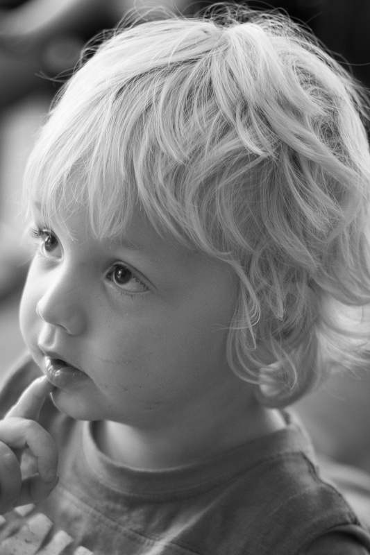
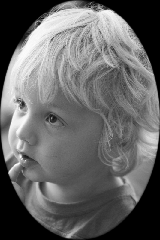
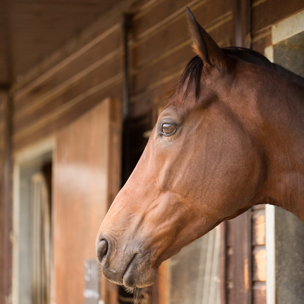
This is my final version of Wil, with a vignette Amount of -15 and a Mid-point of 75. That was it. Remember: subtle is better!

Adding some va-va-voom with vibrance

A few weeks back, we took a peruse around Lightroom's clarity slider, to see what it does to your photos and how you can get the best out of your photos by giving it a gentle nudge here and there. This week, it's the turn of the vibrance slider—clarity's bed-fellow—to come under the Photocritic microscope. With the vibrance pushed to +20, the greens look more alive, but the sweetpea petals aren't overcooked

Much the same as the clarity slider has its most pronounced effect on the mid-tones of your images, the vibrance slider is also a 'smart slider' and applies its effects selectively. Rather than adjusting the contrast in the mid-tones, a la clarity, vibrance takes hold of the more muted tones in your photo and gives them some oompf. It's a selective saturation slider, if you will.

This is where this balcony-dwelling geranium started out

With the saturation at +50, it's too much

... but with vibrance increased, the sky looks bluer while the reds aren't overdone

More often than not, vibrance will pick up on the blues and greens in a photo but go easier on the reds and oranges. This is great for bringing out the intensity of a sky or making a lawn look that bit more inviting while not letting your portrait subjects look as if they've been tangoed. I've heard some people refer to vibrance as being like 'fill light for colours'.

I've tweaked the contrast and white balance here, but vibrance and saturation are, as yet, untouched

You can see that with +60 on the saturation, my brother's skintone is odd, although the sky looks intense...

... increasing the vibrance, however, gives Josh a better skin tone and the sky a more intense colour. Much better! (Although I'd probably not go as far as +60, as I did here.)

With the exception of the sweetpea, I've not been exactly subtle with either the vibrance or the saturation in any of my examples here, but that's to give you a clear illustration of the difference between them. Usually, I'd be far more reserved and I'm sure you would be, too. But at least you know what vibrance does now, and can begin using it to intensify your colours without feeling you've chucked a red wash over your photos.

What is the clarity slider? And why might you want to use it?

Your photography has been progressing and you've made the leap from shooting in JPEG to Raw. Along with this, you've plunged headlong into Lightroom and all of the editing marvels that it affords you. Plenty of the controls are familiar, after all you've been adjusting the white balance in your iPhone photos since you realised you could stop people looking corpse-blue with a simple slide to the right in Snapseed. A few of the others need a bit more thinking about, but they're essentially the same. And then there's the clarity slider. Clarity? What the blinking heck is that all about?

Defining clarity

Before we wade headlong into the ocean of clarity, we need to take a step back and have a quick re-cap of contrast. Contrast is the difference between light and dark in an image. Increase contrast and an image will seem bolder; decrease contrast and it'll have a more muted feel. Adjust the contrast and it has an effect across the entirety of the photo: highlights, shadows, and mid-tones. This is where clarity comes in.

Clarity's influence over contrast happens in the mid-tones of an image; by increasing clarity, you sharpen the edge detail and definition among these tones, leading to a punchier, sharper looking image. Conversely, decrease the clarity value and you'll soften edge detail and lose definition.

Ramping up the examples

The effect that the clarity slider has on your photos is likely as clear as mud until you see it in action. I have, therefore, reproduced the same image but with different clarity adjustments, to see how it looks.

My original photo of a lonely Apostle off of the Victorian coast. It's been adjusted for crop and white balance.

Same image but with the clarity slider pushed to +50. Note how much more defined the waves are, and how the strata in the Apostle are clear?

With the clarity slider moved to -50, everything becomes much softer.

Why, then, would you want to adjust the clarity in your photos? For a start, I've exaggerated the adjustments in my examples to show you precisely the impact it can have. With more subtlety, it can add definition to landscapes, or emphasise a misty, dreamy feel, and give portraits a gentler feel.

Subtler examples

These aren't especially thrilling portraits of my cousin, Emma, but they serve the purpose of exploring the clarity slider perfectly.

Nothing terrible (or exciting, either, to be fair) about the original here

There's nothing at all wrong with the original image (it's been cropped and white balanced); but look at how Emma's skin appears softer and more even with a -15 point adjustment to clarity. The background hasn't been affected too much, but she looks better for it.

But a slight adjustment to the clarity slider (-15), softens Emma's skin a touch.

If you'd like to get even more advanced, you can use Lightroom's adjustment brush to paint softer and more even skin with a negative nudge, but bring definition to a portrait subject's hair by selecting that and giving it a positive clarity adjustment. That's what I've done here.

Here, I've softened Emma's skin with negative clarity, but brought out the definition in her hair with a positive clarity brush.

A cautionary conclusion

As with most things, subtlety is the key to clarity. Too much of it in either direction can leave your photos looking more like cartoons or watercolours than you otherwise might want. And you're not going to want to fiddle with the clarity slider on every photo, either. But at least you can have a bit more confidence about what it does and how you can make it work for you now.

Is Adobe's Lightroom Mobile fully embracing the mobile experience?

Adobe: purveyor of world-recogned photo editing options: some for desktop, some for mobile, and some that enable cross-over between devices, such as Photoshop Touch and Photoshop, via the Creative Cloud. That was all well and good, but what about Lightroom? When would that be available on a tablet as well as a desktop, people were wondering. What was taking so long? As of today, that wait for a mobile version of Lightroom is over. But is the Lightroom that people were expecting? For a start, it's Lightroom for iPad. There's no alternative tablet offering. You need to be using at least an iPad 2 running iOS 7 to make use of it.

Second, it isn't so much Lightroom for iPad, but Lightroom for desktop with an iPad outpost. As Adobe puts it, it's a companion app. Whatever you do on your iPad will always come back to your desktop Lightroom catalogue via the Cloud. For the majority of Lightroom users who want mobile access (and are iOS-based) this is probably how they envisioned using Lightroom mobile, as something that works in tandem with their desktop version: a manoeuvrable dinghy tethered to much bigger-engined boat. However, anyone who might have been expecting a stand-alone app independent of the desktop, however hollowed-out that might have needed to be, will be disappointed.

I'm not sure that the full fire-power of Lightroom would function on a tablet without being scaled down and refined in some way (and indeed Lightroom Mobile is a limited version of Lightroom), and making those types of sacrifices to functionality is possibly not something that Adobe wishes to contemplate or existing users would accept without having full-scale back-up, hence this iteration. Are Lightroom users the mobile-only type? Yet, I do feel as if there's a degree of reluctance to embrace a truly mobile experience on Abobe's part. The Creative Cloud is there when Adobe wishes to take advantage of it and lock users into a subscription, but not necessarily to put users' interests first and give them a workable and truly mobile-only editing option in a world that's increasingly portable.

Amongst other things, Lightroom mobile will allow users to:

  • Sync mobile edits, metadata and collection changes back to the Lightroom catalogue on a Mac or Windows computer
  • Automatically import images captured on an iPad and sync back to a Lightroom catalogue on the desktop
  • Work on images, even when the iPad is offline, for a truly portable experience
  • Sync photos between Lightroom 5 and Lightroom mobile; synced photos can also be viewed from any Web browser

And finally, the synchronisation-based architecture means that the mobile version of Lightroom is only available if you subscribe to the Creative Cloud. That means if you want the option to edit on your iPad, you need to shell out either £8.78 ($9.99) for the monthly photography subscription, or whatever Creative Cloud package takes your fancy. There's no option for stand-alone Lightroom users.

I'm not an iPad-user so there's no decision for me to make here, but I would be interested to know if you think that this version of Lightroom Mobile fulfils your needs, or if you think that Adobe has missed a trick.

Giving your pictures a toy camera makeover

In the interests of knowing how it was done and not wishing to rely on filters or presets (or on dodgy film development practices) I had a go at converting one of my self-portraits into a toy-camera looky-likey. I doubt that it's a process I'll do too often, but for the record and because I'm sure other people might be intrigued, here's how I went about it. Before you start playing with the tonal curves and adding vignettes to your photos to make them look as if they stepped out of 1976 and were bathed in the wrong chemicals, it’s useful to know what to look for in a toy camera-esque image.

  1. Exposure: the light meters in toy cameras tend to be on the inaccurate side of calibrated, leading to badly exposed images
  2. Light leaks: sealing on toy cameras is virtually non-existent, presenting you with huge streaks of light smeared across your photos
  3. Aberrations: Cheap plastic-y lenses mean distortions and vignetting
  4. Cross-processed look: processing film in the wrong chemicals will give images odd colour casts

This is my recipe for a toy-camera flavoured photo. It's fairly subtle because I'd rather not feel as if my eyes are being assaulted by a sweet shop, but you can of course ramp up the numbers to get the effect that you want. We'll start with a studio shot of me. It was part of a series I took when I was getting accustomed to wearing glasses.

1. Exposure

Go over the top with the exposure 
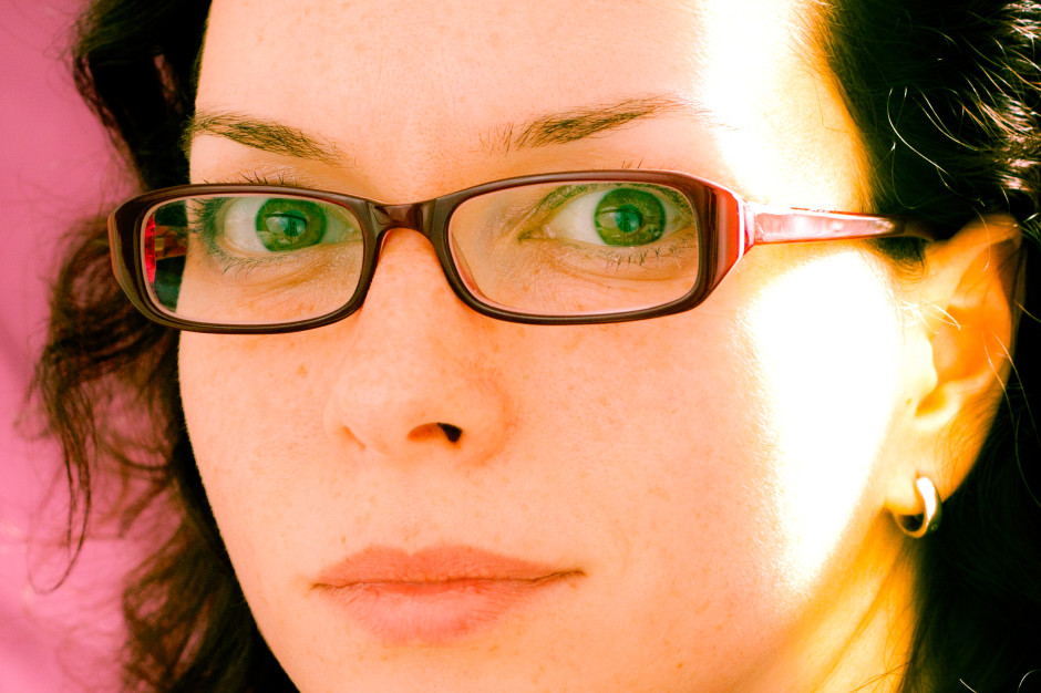
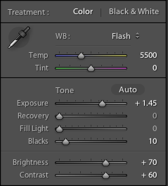
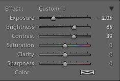
My first move is to increase the exposure, add some depth to the blacks, and then go overboard with the brightness and contrast. It'll look like a cartoon at this stage, but it's a base on which to build. My exact settings, for the record

2. Clarity

I pushed the clarity slider to -45 
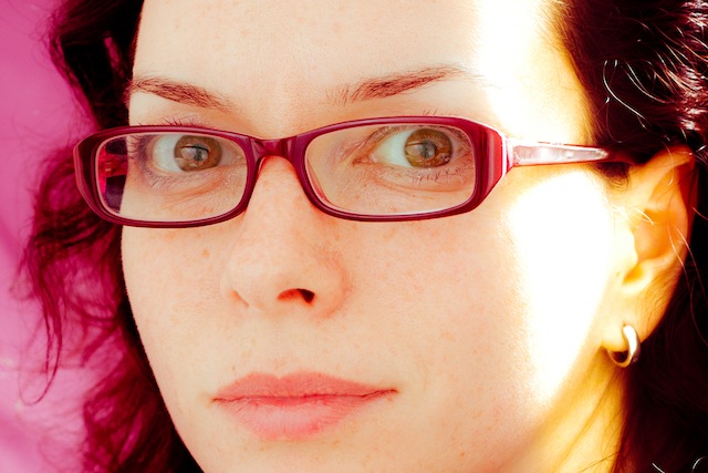
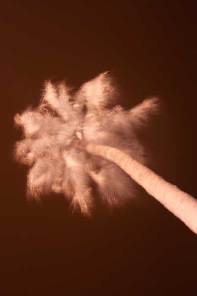
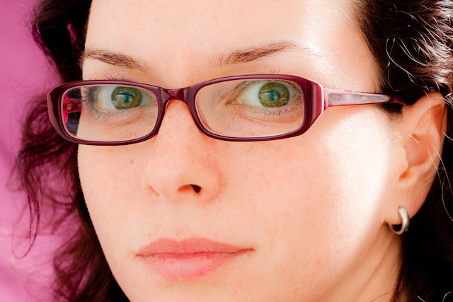
By nudging the clarity slider to the left it helps to recreate the soft mushiness of a cheap plastic lens.

3. Light leak

One light leak. Feel free to choose your own position. 
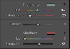
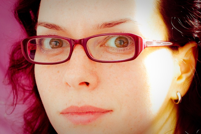
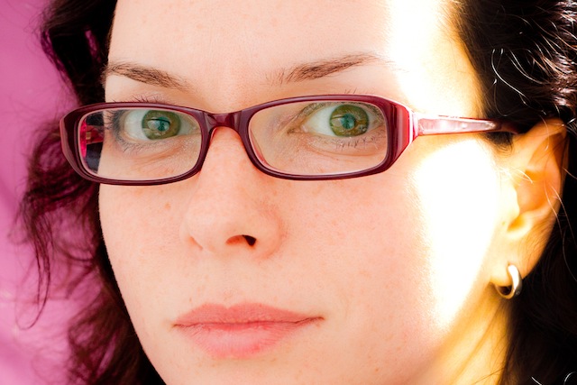
Use a pair of graduated filters to add a light leak. I placed one to the left of my ear and another right with roughly opposite settings. This produced a yellow-y smear. Settings for one graduated filter

4. Split toning

If you want, you can spend hours messing with the split toning sliders to achieve wildly varying looks that could all pass for cross-processing. It'll be a case of finding what you prefer, and placing more emphasis on the reds and purples or the greens and yellows.

My chosen split tone look

I tried this image with a yellow-y green look initially, but swapped it for a more pinky-red version. You can play around a great deal with split toning

5. Vignette

Without knocking myself over the head with a plastic picture-taking-device, I add a touch of vignette, too.

6. Grain

Finally, add a hint of grain to help recreate the film feel of a toy camera. Tah-dah!

Et voila – from studious studio self-portrait to tricksy toy camera creation.

Quick and dirty infrared photography

We're accustomed to taking photos with what is somewhat uninspiringly referred to as 'visible light', or the part of the spectrum whose wavelengths measure roughly 400 nanometres (violet) to 750 nanometres (deep red). However, there's an awful lot more to light than just the wavelengths we're able to discern with the naked eye, and it's possible to take photos using that 'invisible light'. In particular we can make use of infrared light (IR), which picks up at 750 nanometres, where visible light drops off, and stretching to approximately 20,0000 nanometres. Lots of people think that IR photography is the preserve of specialist infrared adapted cameras, with 'normal' cameras being insensitive to IR light owing to the 'hot mirror' that sits just before the sensor. However, these hot mirrors aren't 100% effective, and with the help of an IR pass filter, you can capture images made with infrared light.

The most common filter is probably the Hoya R72, which is easy to pick up in a camera shop or over the Intergoogles. It won't allow you to capture IR waves at more than 1,300 nanometres, but that should be enough to start. You can always invest in an IR-adapted camera if you find that it really floats your boat.

R72 filter

Got your IR pass filter? Want to give it a shot? Off we go!

IR photography will present you with several hurdles: focusing, exposure, and post-processing. Overcoming all of them is more a case of trial-and-error than hard-and-fast rules and to be fair, that's half of the fun!

1. Choosing a scene

Okay, so you can pretty much photograph anything in IR, provided that there's some light around. However, the most stunning IR images tend to involve foliage, which comes out as bright white, and blue skies or water, which look deeply intense. But that's all after a bit of fiddling. More on that in a moment.

Achieved by adjusting the red hue and orange luminance sliders

Whatever you choose to photograph, it's not going to be a quick process, so you need to be somewhere that won't put you in people's way or get you into mischief. And it needs to be suitable for a tripod, too.

2. Focusing

The difficulty that you’ll encounter with focusing comes as a result of the IR filter; it blocks out the majority of visible light passing through the lens, leaving you with a dark viewfinder. You don’t have anything to work with when you’re focusing your lens. This means that you have to put your camera into manual focus and set up your shot before placing the IR filter over your lens.

Setting up your shot and then placing the filter over your lens is a bit of a faff, but seeing as you’ll be using a tripod anyway (more on that in a moment), it shouldn’t be too infuriating.

3. Exposure

As for exposure, you’re going to need to use a slow shutter speed, probably between ten and 30 seconds, to allow enough IR light to reach the sensor to expose it sufficiently. This is where your tripod comes in, obviously, as you’ll never manage to hold your camera steady for that length of time. Long exposures also have a tendency to noisiness, so use as low an ISO as you can manage, too.

4. False colour

Don’t be surprised if your infrared photos emerge from your camera with strong red or magenta casts; this is known as false colour. It’s normal and it’s a simple fix in Photoshop to produce a 'traditional' looking infrared photo. If there is such a thing. It involves shifting the white balance to 2000 Kelvin and then flipping the levels in the blue and red channels. In short: open the blue channel and slide 'Red' to 100% and 'Blue' to 0%; in the red channel, 'Blue' needs to be at 100% and 'Red' at 0%. You might want to adjust the contrast and brightness, but that's the basics.

IR images come out with strong 'false colour' casts

5. You don't have to use Photoshop

After playing with the white balance 
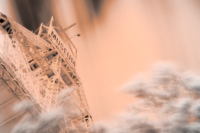
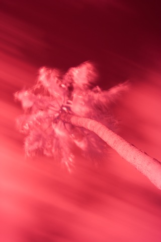
However, there's a lot of fun to be had by simply playing around with other editing packages to produce ethereal-looking images. With something like Lightroom you might want to try:

  • Fiddling with the white balance and tint sliders to produce subtle pink or flaming orange images, and everything in between
  • Playing with the hue and luminance sliders to alter the colour mix of the photo
  • Converting to black and white and using the black and white mix sliders to adjust the look of the image

Really, there's no right or wrong and the range of impact that you can have with an infrared image is enormous. It's a lot of fun.

6. Hotspots

Some lenses are prone to producing ‘hot spots’, or patches of much brighter exposure that are usually, and most inconveniently, in the centre of the image. There’s very little that you can do about this in camera except to try a different lens. Prime lenses seem to be less prone to hot spots, but there are no guarantees, and using a smaller aperture will reduce its size. It's possible to try to correct it in post-processing, too.

What are you waiting for?

Orange and red saturation adjustments

Adobe extends its Photoshop + Lightroom subscription offer to everyone

In September, Adobe announced that, for a limited time, owners of Photoshop CS3 would be eligible to sign up to a special Photoshop + Lightroom subscription that would cost them only £8.78 ($9.99) a month. I thought it read like a sweetner for the huge numbers of loyal Photoshop users who felt snubbed by the switch to Adobe's subscription-only model. However, it wasn't of any use to anyone who owned Lightroom and felt like trying Photoshop, or was just getting started with Creative Cloud. Now, if you're not too disgusted with Adobe's handling of its hacking fiasco and prepared to trust it with your credit card details, anyone can sign up for this not-bad-value offer, regardless of whether you own CS3 or later.

Photoshop + Lightroom for $9.99 a month for everyone (but sign up soon)

For £8.78 ($9.99) a month, you will have access to Photoshop, Lightroom, 20GB of cloud storage, and Behance ProSite. However, you must commit to an annual subscription and you must sign up between now and 19:59 GMT on 2 December 2013. (For CS3 owners, you still have until 31 December 2013 to sign up.)

All the details are waiting for you on Adobe's website.

What is a histogram?

H is for histogram! This week's Photography Fundamentals installment explains the graph that you can draw up on your camera for each image, or appears in the top right corner of your workspace in Lightroom or Photoshop. What does it depict and how is it useful?

It's a graph

A histogram is a graph that shows the tonal range, or the distribution of brightness, of an image's pixels. On its X-axis it runs from black to white, 0 to 255. On its Y-axis it charts the number of pixels at any brightness value.

Screen Shot 2013-07-17 at 17.21.13

Lots towards the left, but a few specular highlights, too

By looking at a histogram you'll have a feel for the exposure of an image. If the majority of the pixels are sitting in the left-hand side of the histogram, the image will have a lot of darker tones. An image with plenty of bright tones will have a histogram that's predominantly situated in the right-hand side.

A perfect histogram?

There's no such thing as a perfect histogram. Instead, you need to use it as a tool to help you judge if you've exposed your image how you want it exposed. Sure, if your image has a histogram that's concentrated towards the left, it might be under-exposed. It might also be a low-key image with predominantly dark tones.

However, the majority of images will have histograms that peak around the centre, in the mid-tones, but taper out towards the blacks and the whites.

Screen Shot 2013-07-17 at 18.52.27

A broad sweep from left to right

If you've any 'blown highlights' or catasrophically over-exposed pixels that are pure white and don't contain any detail, you'll see those peaking right up against the right-hand side. These are sometimes called 'clipped highlights'. You can expect to see some if you've the sun in the frame, or specular reflections on water or metal, so don't think that they're always a bad thing!

And contrast?

Histograms also indicate the contrast found in a scene, too. A narrow peak will mean a lower contrast image; a broader peak is indicative of an image with high contrast.

Screen Shot 2013-07-17 at 18.44.17

A narrow peak towards the right hand side - lots of brights and not much contrast

Where to find a histogram

All dSLRs and EVIL cameras will have a histogram included in their menu functions; higher end compacts often have them, too. On my Canon it's just a case of viewing an image in playback and then hitting the Info button twice.

When you're editing, the histogram is usually in the top right corner of your screen, but it will depend on your programme, obviously.

TL;DR

  • A histogram is a graph displaying the distributon in brightness of an image's pixels
  • There's no 'perfect' histogram; they're tools to help you assess exposure and contrast in an image
  • Darker images will have histograms with data concentrated towards the left hand side of the graph
  • Brighter images will have histograms with data concentrated towards the graph's right hand side
  • High contrast images will have broad peaks in their histograms; low contrast images will have narrower peak

Golden hour << Photography Fundamentals >> ISO

The wild blue yonder of straight horizons

Horizons: they are very definitely meant to be level in our photos. Whenever I see a lop-sided horizon, it sets my teeth on edge. Nature intended that they be straight, at least as far as our eyes can see, and our inner ear knows this. A wonky horizon will likely make anyone looking at it feel uncomfortable, as their eyes will be telling them one thing and their feet another, but they won't necessarily be able to pin-point why. And you definitely don't want that.

They also seem to be something that I am perenially unable to get right when I take a photo. (Unless I'm using a tripod, of course, then you use a dinky spirit cube in your hot shoe.) I know that they need to be level, so I try my utmost to make them that way, but they always need tweaking. I don't know, maybe I stand funny, or something.

The fix, however, is easy. Whether you're using a free online editing service or have the mighty power of Lightroom or Aperture behind you, there're tools to straighten photos. I've picked two as examples - one free, the other paid-for and swanky - to give you an idea.

If you use Pixlr (Pixlr.com, possibly my new free online suite of choice, following the demise of Picnik), it's very simple. Upload your JPEG photo into Pixlr Express, select Adjustment, and then Rotate. Then all you need to do is use the slider to alter the angle of the image so that the horizon comes up straight. There's even a useful grid to help you get it right.

Straight horizon


Use Lightroom 3 and you have three straighten options, all of which are found in the Crop panel on the right-hand side. The first is under the Crop tool, and you adjust the angle by eye, using a grid overlaid on the image to help you. The second uses the slider, allowing you to adjust the slant of the image by a precise number of degrees. The third is by far the easiest. Click on the Angle tool and then use it to draw on your image, following the line of the horizon. It'll correct the angle of the image to that line. Simple! (And it also works the same for vertical alignment, too, ensuring that buildings don't lean to the left, or whatever.)

Of course, if you want to deliberately set your skyline askew, there's nothing wrong with that and you can use these same tools to achieve that end. Just make sure that it's off-kilter enough that it's easily identifiable as deliberate. (And I'm reliably informed by one Haje Jan Kamps that a purposefully skewed horizon is called a 'Dutch Tilt'.)

Doing it deliberately with a Dutch Tilt

If you're now permanently unable to look at another picture without being able to spot the wonky skyline, I'm sorry. But you never have an excuse to be riding off into a crooked sunset again!

Mid-week round-up

IMG_2034

I’ve had quite a few little bits and pieces drop into my inbox over the past couple of days, from competitions to community projects. I thought that I’d round-up the best of them so that you can see what you think. Oh, and that reminds me: if there’s something photographic going on near you that you think other people might appreciate – let me know!

An Englishman in New York, at the National Portrait Gallery

There’s quite an ex-pat community in New York, and some of them have quite a big influence on its cultural scene. The photographer Jason Bell has sought out some of these movers-and-shakers, the likes of Thomas P. Campbell (Director of the Met), Zoe Heller (writer), and Simon Noonan (TV pundit), and photographed them. Go take a peek at the NPG until 17 April next year.

From Where I Stand, at the National Portrait Gallery

From Where I Stand is Mary McCartney’s first book of photographs. To celebrate its publication, the National Portrait Gallery has a free exhibition of 15 original prints from her archive on display in its Bookshop Gallery until 13 February next year. Even more, on 7 December McCartney will be there to sign copies of the book and take questions on her work at 15:00.

Images of Thanks, from Adobe

The idea for this community art project from Adobe is to share images that make you smile and bring about a bit of cheer. If you’d like to share something, or take a look at other people’s contributions, then head over to Lightroom’s FaceBook page.

Landscape Photographer of the Year Award

The winners of this competition have just been announced, and if you want to take a look at the photos in real life, and not just through the wonder that is the intergoogles, you can do so at the free exhibition running at the National Theatre, from 22 November 2010 to 16 January 2011.