When it comes to editing your photos, do you go for full-on and all-out, none at all, or somewhere in between the two?

When you hear the term 'high-res' thrown about with such abandon when it comes to images for web use, have you ever stopped to think just how big or how high quality and image meant for the web needs to be?
There's an assumption that high-contrast images are more dynamic, more compelling, more inviting. Have a go at some low-contrast photography. You might surprise yourself with the results.
Balance doesn't mean symmetry; it means an internal consistency and tension within your photos. And it's a vital element of composition.
Great photos might be down to a little bit of luck, but most of that 'luck' you make yourself. Don't believe us? Read on...
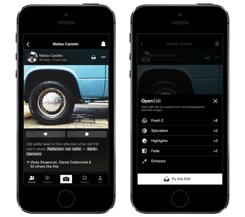
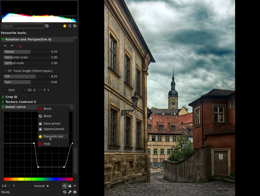
It's been a week of updates to our image-sharing programmes on social media. First Facebook introduced an auto-enhance feature, which will apply the filters that its algorithms calculate are most appropriate for your photos. Then Instagram unveiled five new filters, its first in two years. Now it's the turn of EyeEm, which brings a gaggle of new filters, fine-grained control over their application, and a new feature called Open Edit. The theory behind Open Edit is that it lays bare the post-processing path that a photographer followed to create an image, from the original to the final version. Each crop, tweak, and nudge is set out in a timeline that's made visible to the rest of the EyeEm community. If you see something that you like, you can apply the same edits to your own photos with one tap.
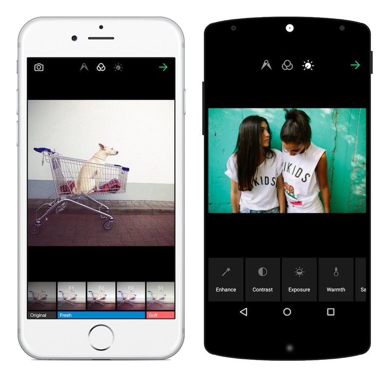
Right now, only certain photographers have the ability to open up their edits to the community, but it's something that will be rolled out to all members in time. The EyeEm team hopes that this open deconstruction of people's photos will lead to a more collaboratively minded community and one that can learn from each other and share their skills.
Can I see what EyeEm is trying to accomplish with Open Edit? Yes, definitely. Sometimes I do look at a photo and wonder precisely what sort of magic the photographer wove in order to create that particular effect. But at the same time, I'm not completely sold on it. The mystery and the secret behind someone else's photos are part of their appeal. Having the edits revealed to you can feel a little like the illusion of a magic trick being shattered when you know how it works. My curiosity means that I want to know, but the romantic in me appreciates the mystique.
From a teaching and learning perspective; I love EyeEm's enthusiasm to allow its users to share their knowledge. But I think that by going one step further, they could make this a much more valuable learning tool. How much people will actually learn from being able to see and apply other people's edits to their own photos will depend hugely on how much they're prepared to engage with the editing process and observe the kinds of impact each adjustment makes. Experimentation is such a valuable part of learning that just being able to apply someone else's workflow to your photos feels as if there's an important step in the process that's being skipped. It's not just about the what that you do to your photos, it's also about the why.
Bring a bit more dialogue to the experience—underpin the action with some explanation—and I think it could really work. Still, lots of people seem to be very excited by EyeEm 5.0, so perhaps I'm the one who's missing the trick here.
Let me know what you think.
You can download EyeEm 5.0 here.
Historically, split toning was used when developing photos from negatives. Two different toners would be used one after the other in order to produce different colours in the highlights and shadows of an image. For example, follow selenium with gold and you'll produce purple-blue mid-tones; or use sepia and then blue for sepia highlights, blue shadows, and green mid-tones. The effect could be altered by using different papers, too. While chemical split toning isn't an exact science, it does offer some compelling effects for your photos and can give them an entirely different feel. You can use it to add warmth or to cool down an image; you might want to introduce a blue tint, or an orange cast.
Now, split toning is more likely to be achieved using the dedicated split toning panel in Lightroom, or with a colour balance adjustment layer in Photoshop, and it is far more controllable. If you've not ventured into the split toning panel, the degree of variation that it offers you might be a little overwhelming; it can radically alter your photo in a ways that you might not anticipate. That shouldn't stop you from experimenting, and to get you started, here are some suggestions. And don't forget that if you're working in Lightroom, nothing can't be undone.
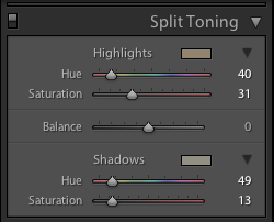
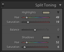
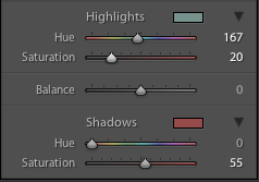
If you're using Lightroom, the split toning panel allows you to select the colours that you would like to emphasise in both the highlights and the shadows, the saturation for each of these tones, and then the balance between them.
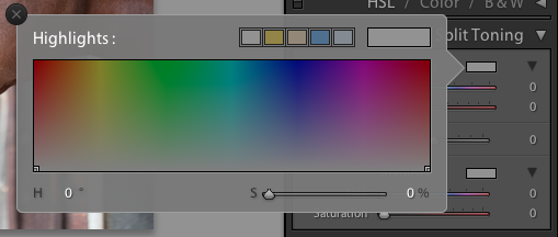
If you find using the sliders to control these adjustments a little too abstract, click on the colour swatches beside 'Highlight' and 'Shadow' and use the eyedropper to select the precise colour you'd like for each.
The balance slider places more emphasis on either the highlights or shadows. Once you've selected your highlight and shadow tones, move it about a bit to see which direction, if any, you prefer.
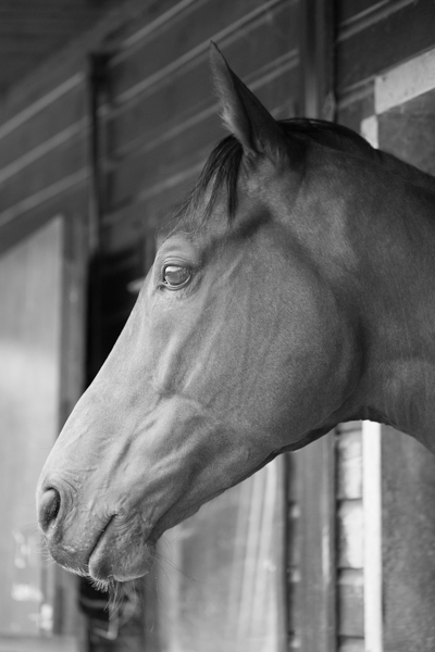
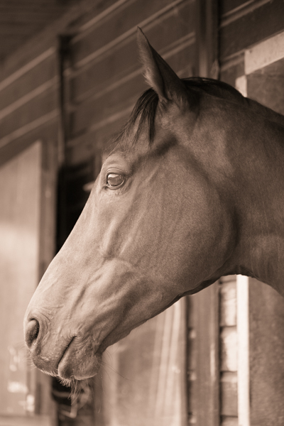
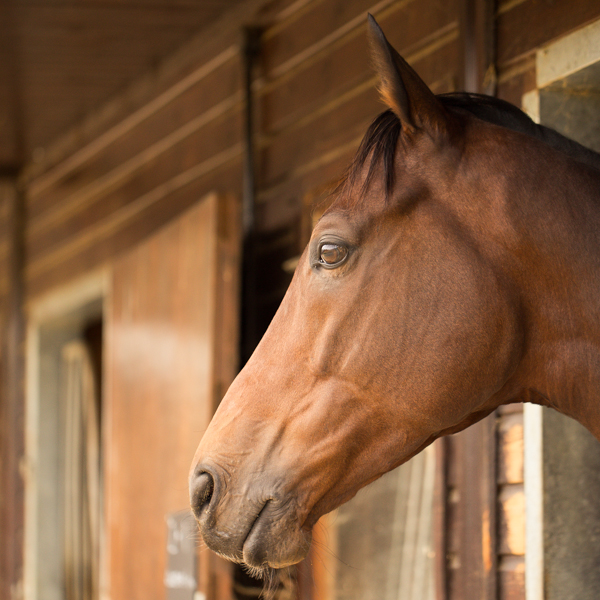
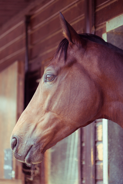
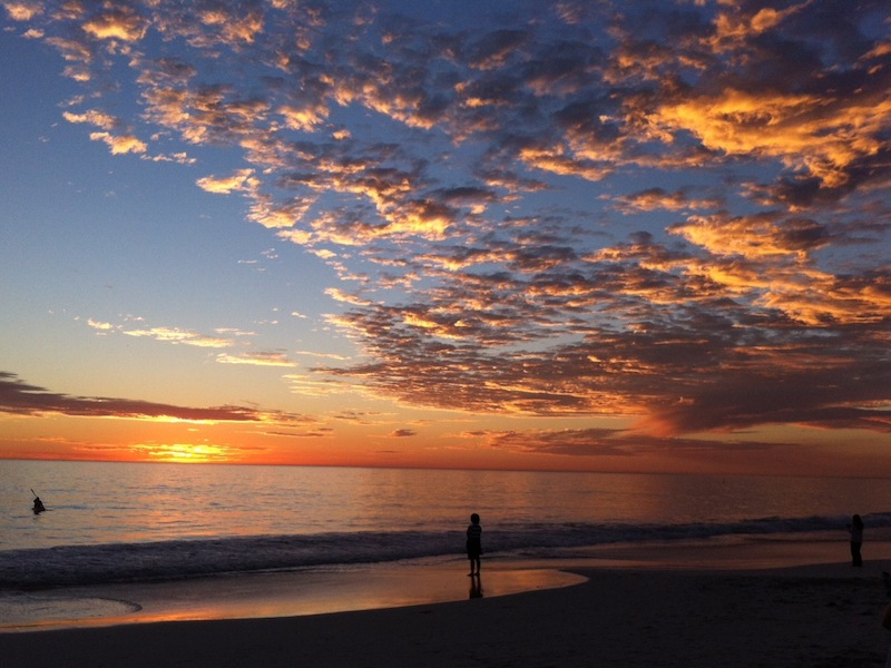
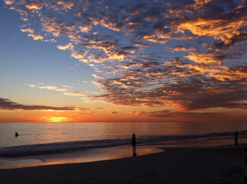
The original black and white conversion of Willie's portrait is coming up quite grey-green in tone. By adding some muted browns—that in the shadow very pale—you can introduce a great deal more warmth to the image and bring about an almost-sepia tone.
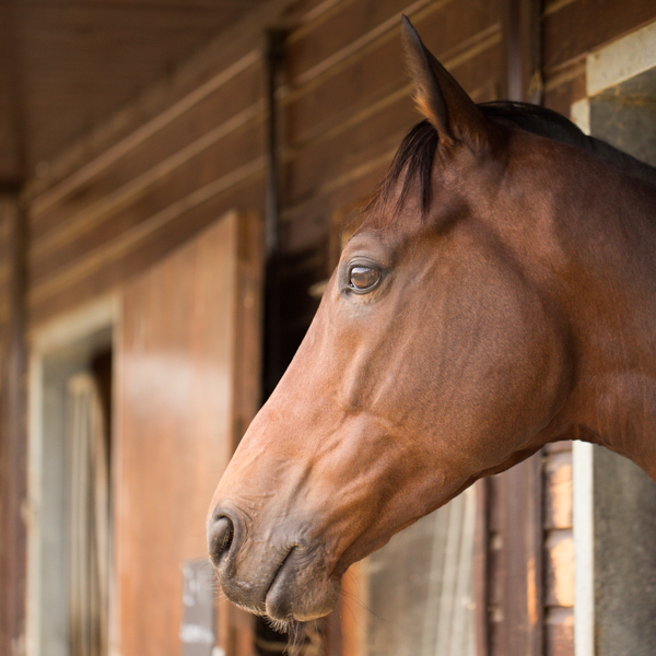
This photo was taken fairly early in the morning, on a day when the cloud didn't lift. While the light was wonderfully diffuse, it wasn't especially warm. Even after correcting the white balance, it still felt as if it needed to be brought to life. By adjusting the highlights and shadow tones, it meant I could introduce a more golden-hour feel to the photo.
You don't need to push too far into the oranges or yellows to intensify the warmth in a photo: sticking to browns and beiges might be enough.
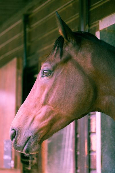
Of course, if you wanted to do the opposite and bring about a colder feel to a photo, you would do that by applying more silvery-blue tones, greys, greens, and even some yellows, to the shadows and highlights.
Until now, I've used fairly similar highlight and shadow tones in my split toning adjustments. But for a cross-processed effect, you need to select contrasting colours for your highlight and shadow tones: green and magenta, or cyan and yellow, for example. Which you apply will depend on whether you're looking for a warmer or cooler over all effect.
[gallery columns="2" ids="7128,7127"]
By adding a graduated filter, upping the contrast and saturation, and reducing the clarity, you can create a fake toy camera look. We've a tutorial for that, in case you'd like to give it a go.
The best way to get a feel for split toning is to try it for yourself and see what you can achieve using it. Remember: if you don't like it, you can undo it.
Oh dear. That was a bit awkward. Sitting on the floor at my nephew's birthday party, trying to capture pass-the-parcel photos that weren't anything other than wadges of wrapping paper thrust towards me in a multi-coloured de-forested haze, I encountered a fairly recently married and really rather belligerent woman who who wanted to berate me for the fees charged by photographers. In particular, she was infuriated that her wedding photographer wouldn't just hand over a DVD of all the original images from her big day and couldn't understand why they needed to be edited and why she couldn't have them straight away. Yes, oh dear. Despite being focused on my attempts to capture my nephew smiling and my niece not resembling a demonic, sugar-crazed monster, I did try to offer a reasonable explanation for why her wedding photographer wouldn't just hand over raw images for a flat fee. Naturally, I coined what I think is the perfect analogy when it was too late and I was on my way home. Thus for the benefit of everyone who might yet face this scenario, here it is:
Asking a photographer to hand over a memory card, USB, or DVD of raw images is akin to asking an author to present you with their book in manuscript format: unedited, unformatted, and including the paragraphs and chapters that didn't make it.
For any brides, grooms, or parents of the soon-to-be- or just-marrieds out there who might be wondering the same thing, I hope this helps.
A bundle of unedited, unprocessed images isn't the whole story, the right story, or the finished story. You have to trust the photographer to produce a final version that's just right, as right as a book is on publication, as a painting on hanging in a gallery, or as a sculpture upon exhibition. What you're paying for is the complete product, finished by the photographer and making use of all of her or his skills. While any photo needs to be properly exposed and well composed, there are adjustments and edits that need to be made in post-production. And sometimes, they look better in black and white, too. This is all a part of what a photographer does; it is an integral part of of the process of creating images.
To continue with the book/author analogy, when you purchase a book, you don't get to choose the words on the page, or the images that might illustrate it; what you do get to choose is the format in which it comes, whether that's a signed hardback copy or a digital download. When your wedding photographer has done her or his job to tell the story of your wedding day, you can select from luxury albums or USB transfer.
If you're still not sure why photography is so expensive, there are plenty of photographers who've done their best to break down their costs and explain why wedding photography starts at around £1,500. (Yes, there are people who do start cheaper, and some more expensive. It's an average figure.) We even have an article covering it here on Photocritic. However, hoping that you'll be able to reduce your costs by asking for unedited images in digital format is a misrepresnetation of your wedding photographer's job.
I don't especially want to launch into a 'you get what you pay for' tirade about the perils of hiring an inexperienced photographer and the images from your wedding day being an unmitigated disaster. I understand that some people have very restricted budgets and finding the fees requested by some photographers is beyond them. There are photographers to suit every budget; you need to be certain of what they can provide and if it meets your expectations, but you must let them do their jobs. And that job is a finished product, just like an author's book.
The shock! The horror! The blasphemy! How can we here at Photocritic, a place that purports to teach people about photography, nay has over 2,000 students in its online school, dare to utter a statement that is contrary to the received wisdom of practice making perfect and the 10,000 hours rule? How can we possibly suggest that taking fewer photos might put you on a path to being a better photographer? Quite easily, as it turns out. Upon his graduation, my cousin was gifted with a Nikon D5300 and promptly legged it to Italy where he proceeded to photograph everything in sight. While I might be prone to hyperbole, that is scarcely an exaggeration. When he returned, he asked me if I would peruse his images and advise him on improving his photography. When he told me that there were in excess of 2,000 images, I dispensed my first piece of advice: that he needs to take fewer photos. He looked at me incredulously and said: 'But I see so much that I want to photograph!' And therein lies the problem.
Memory is cheap. Images are ubiquitous. We communicate via self-destructing snaps and have developed a penchant for deliberately aged-looking photos of cups of coffee. As a consequence, there is a persistent temptation to take hundreds, if not thousands, of photographs every time that we venture out with a camera. While this might serve our most pressing needs to relay where we are and what we are doing, the act of creating an image that will stand the test of time requires a more considered approach.

If you want to improve your photography it demands that you practise it as a craft, and strive to make each photo better than the last, rather than regard images as digital currency in our social media-dominated world. It's time to step back, slow down, and take fewer of them.
All photos are about telling stories. They are about communicating something that you see to other people. This applies whether you're sharing a Snapchat chat or creating a fine art print. But if you are intent upon taking better photos, it should be at the forefront of your mind whenever you pick up your camera. Before you even raise your camera to your eye, you must ask yourself: 'What am I trying to say?' Until you have defined the story that you want to tell, don't click that shutter release button.

Without a grounding narrative, your photo will fail to convey anything of value and will, effectively, be wasted. Show some restraint and discipline at this point and you'll benefit your photo-taking skills enormously. First, you will produce a meaningful image. That's step one towards becoming a better photographer. By thinking about what you want to say instead of randomly spraying your camera in the direction of something that you hope might make an image out of one of twenty three variations on a theme, you'll have increased the chances of saying something significant.

Second, when you have identified the story you want to tell, you have to figure out how you're going to tell it. To do this, you will need to think about the light, know how best to use your camera, and consider how to manipulate light and tools to achieve your aims. That will improve your photography.
Third, I can guarantee that five miniscule variations on the same sunset scene over the Alps will not offer you any meaningful improvement on the first iteration. Of course we've all done it: taken nineteen photos of the exact same scene using focal lengths that vary over a distance of 3mm; shuffled half a pace to the left, and then switched the right; adjusted the aperture by a stop; and finally reverted to where we started. Looking back at the series of images, there's no discernible differences between them and you're left wondering which you actually prefer and which it's worth investing your time editing. If you take a moment to decide what you really want, you'll make your life easier.
[gallery columns="4" ids="7083,7084,7085,7086"]
By honing your story-telling skills, slowing down your photo-taking process, and reducing the number of photos that you take, you'll force yourself to practise your skills. If that won't make you a better photographer then I doubt much will.
All photos deserve a little editing love. This isn't about airbrushing away half of a model's thigh, but subtle tweaks that enhance rather than alter an image. You cannot turn a sow's ear into a silk purse, so you must think of editing your images as adding the final touches to turn something already good into great. You must be working with already-good raw materials. In addition to taking great photos in-camera, learning how to finish them in post-production is part of the process of becoming a better photographer.

Apart from giving yourself a better opportunity to manage this by working with fewer, higher quality raw images, you also need to be shooting in Raw. Raw format gives you the flexibility to create images as you want them to be, rather than as the camera thinks they should look. When you shoot in JPEG format, your camera makes various decisions about the final version of the image, for example contrast and colour, that you really should be making yourself. It's a case of you being able to realise your vision, rather than your camera trying to decide for you.

On a purely practical level, Raw images are significantly larger than JPEG files; you'll probably find that you need to shoot fewer images because storing them becomes a little more complicated.
Fewer photos means more time to edit and finish those you do take, helping you to create a better final product.
When you're trying to get somewhere, it helps if you know your starting point. On your (endless) journey to becoming a better photographer, you need to know how well you are doing at every given point and what you must do to improve. This is something that comes from evaluation and critique, given by both yourself and other people. Critically evaluating photos is demanding, however, and finding the stomach to do it for thousands of photos, or at least a good proportion of your catalogue, is probably overwhelming. You want to give yourself the best chance of being able to assess and to improve, and while it might sound counter-intuitive, it comes from fewer, rather than more, images.

Go back to the five miniscule variations on the sunset scene over the Alps. With so little to choose between them, when you're in post-processing being able to determine their faults and their positive points will likely be a struggle. Rather than being a distinct iterative process, you might find it's easier to stick a pin in the collection to select one. Think more carefully about one or two shots when you take them, and you'll be able to reflect on them more effectively and improve your skills as a consequence.
[gallery columns="4" ids="7089,7090,7091,7092"]
Of course, being able to play and experiment is a thoroughly important part of improving your photographic skills. What we're saying is that you need to do it in a way that actually helps you, rather than overwhelms and hinders you.
It is a truth universally acknowledged that the more you practise photography, the better the photos that you'll take. But the word 'practise' carries with it far more connotations than simply pointing your camera and depressing the shutter release button in the hope rather than the expectation that it will result in a well-exposed, beautifully composed shot that tells a meaningful story. It demands that you approach photography as a discipline: that you decide on what you are trying to say before you try to say it (or 'engage brain before opening mouth,' as my primary school teacher would say) and that you evaluate your images to establish what you are doing well and what you can do better. Then, you need to work on making those improvements.

It's a never-ending process that you'll be working on for as long as choose to take photos.

Back in the old days of film you typically had 12, 24, or 36 exposures to a roll. Even if you had multiple rolls of film in your bag having them developed was expensive, or time-consuming if you did it yourself. It meant that you took a little more care in composing and exposing each shot, because every frame cost you money. Each exposure was precious. If you're serious about improving your photography, I'd advocate placing a restriction on the number of photos you can take in one day, or over the course of a trip or excursion. It will soon instill a sense of discipline into your picture-taking!
This advice then, is not about using your camera less, it's about using it with more care, attention, and precision. It is about working to ensure that every frame you expose and develop tells the story that you want it to tell, and that you can use each image as a platform to taking a better one next time.


Earlier this week an infographic design agency, NeoMam Studios, sent us an infographic about 'smoasting' which they'd produced on behalf of print company Photobox. Once I'd got over the shock of awful elision of 'social media' and 'boast' to form the ghastly portmanteau word 'smoast', there was one particular statistic that caught my eye. Take a look at the infographic and guess which it was.
Despite the prevalence of Instagram, the host of editing features that are built into apps such as EyeEm, Facebook, and Twitter, and the plethora of free-to-download editing programmes, only 28% of photos are cropped or styled in some way? Wow! I am surprised. And it's something I think deserves remedying.
While Team Photocritic advocates getting as much right in-camera as possible—you'll certainly not be able to turn a sow's ear into a silk purse—we're not beyond a little post-processing, either. If it's good enough for Cecil Beaton and Horst, it's good enough for us, too. A snip here and a swipe there can elevate an ordinary image into something a bit more special.
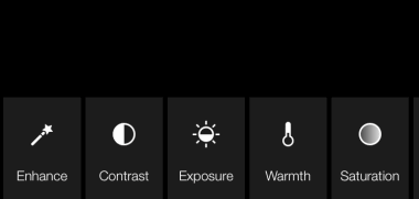
This isn't about air-brushing away half of someone's thigh, but about making minor adjustments to three specific areas: the crop, the colour, and the contrast. Here at Photocritic we call them The Three Cs. They're not complicated and they'll make a world of difference.
However well composed you think your image is, it will almost certainly benefit from having a few pixels shaved off it. It might be a case of reinforcing the rule of thirds, removing a bit of unwanted background that crept into the frame, or getting a bit closer to your subject.

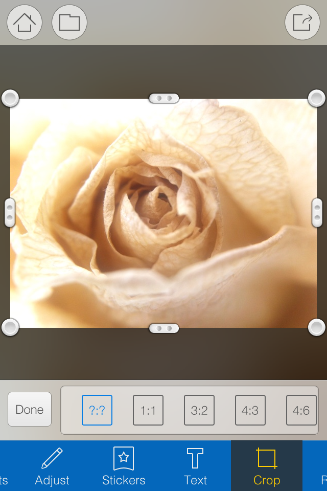
Being a purist, I tend to stick to traditional 4:3 or 3:2 ratios, but don’t feel limited by my prejudices. Select from any of the standard crops, from square to 16:9, or free-style it to adjust the crop any way you like.
At the same time as cropping, make sure to straighten your image, too. Unless you are deliberately tilting the frame for creative reasons, uprights should be upright and horizons should be level. When lines that are expected to be upright or level are wonky, it has an unpleasant impact on our sense of balance. By correcting wonky lines, you'll produce a stronger image.
Light has a temperature, and depending on the source of the light, or the time of day if it’s the sun, that temperature will vary. When the temperature varies, so does the colour of the light. As a general rule, we don’t notice the variation because our eyes cleverly adjust to the changes. Our cameras on the other hand aren’t quite so clever.

Have you ever noticed how white objects in your photos can show up with blue or yellow casts? That’s because the white balance in your photo was off.

It's a relatively easy correction to make using the 'Warmth' or 'White Balance' function in an editing programme. If you think the whites are looking a bit too blue (or if an image looks a little 'cold' over all), nudge the slider to the right. If the whites are too reddish in tone, or the photo looks a bit warm, slide it to the right. It's a case of trial and error to make the right adjustment, but the more that you practise it, the better you'll understand the shortcomings of your camera and how it reacts to different types of light.
Now if you want to intensify or tone down your colours, you can do so using the saturation slider. I don't recommend bumping up the saturation too much; it can result in a cartoon effect rather than a photo!
Contrast is the difference between the dark and light tones in your photos. Images shot on bright sunny days tend to have a lot of contrast, with dark shadows and bright highlights, but those taken in fog won’t have a great deal of tonal variation and will be low contrast. From time to time, you’ll want a low-contrast image, but, generally speaking, your photos can be improved by increasing the contrast a touch. It brings definition and depth to them.
Don’t go overboard, though, as too much of a good thing can turn bad. You’ll find that if you over-cook the contrast you’ll lose too much detail and end up with an ugly image. Subtlety beats brickbats.

If you use Snapseed to make your edits, it's worth getting to know the ambiance slider, too. I've often found that this is a preferable alternative to the contrast slider.
At this point, any other adjustments are gravy. I'm a fan of Snapseed's 'centre focus' options and often apply one of those. You might want to play with a tilt-shift effect. Or there's the waterfall of filters you can try in any programme, but you might find that you prefer your own edits to prefabricated filters, now.
Oh, and don't forget that it all starts with a decent photo, so check out our eight tips for better smartphone photos, too.
When you tell people that image processing and manipulation isn't anything new, but is just about as old as the art of photography itself, you can get some funny looks. Many of the processes that we carry out without a second thought were equally normal for analogue developers. Depending on how proficient you are with Photoshop, compositing might be faster today, but it's not new. Think of Man Ray and his image Le Violon d'Ingres. And beautifying subjects with the help of a brush was a far from alien practice for Cecil Beaton. Yes, really.
The difference is that now the ubiquity of editing suites means that techniques that were once the preserve of skilled darkroom practitioners are accessible to anyone with a computer. The degree of skill required to complete subtle, effective, and credible edits is still high, but the mystery has gone. Or rather, the mystery has assumed a new narrative as the dark arts of the darkroom remain under wraps.
To try to set some of that record straight, here's an extensive, but not necessarily exhaustive, list of the techniques that bridge the analogue and digital divide.
Have you noticed how the crop icon is a variation on a theme, in almost every editing package you encounter? That's because it's based on the tool that would be used to crop and resize images in the darkroom.
[gallery ids="6782,6783,6784"]
The brush icon is another familiar one, whether you're in Photoshop or Pixelmator or Aperture or GIMP. Brushes were used extensively in the darkroom, to define edges or enhance details, to hand colour, to spot correct, to complete just about any task for which you might now use a digital brush.

Haje has already written an article that explains why the dodge icon resembles a lollipop and the burn one a fist. Of course, they're techniques that were used in the darkroom to lighten or darken specific areas of an image as required. The dodging 'lollipop'—or piece of black paper on a stick—could protect the photographic paper from too much light during the development process, thereby keeping the areas in question lighter in the final image. The fist would be your hand, controlling how much light got through to darken areas of your photos.
Using red to distinguish masked from unmasked elements in an image wasn't an arbitrary choice by software engineers. That too is a hangover from darkroom days. Mask an area that you don't want developed with red, gel-like rubylith and the light won't be able to penetrate it in the darkroom, so it won't be exposed. If you've ever found yourself irritated when masking a complicated outline in Photoshop, imagine what it would be like doing it with a scalpel!
Yes, there's a reason why the sharpening tool in Photoshop is called the Unsharp Mask. Again, Haje has a comprehensive explanation here, but the short answer is that images were sharpened using a not-quite-sharp positive of the image to make a mask (an unsharp mask) combined with the negative. The blurriness of the positive image should work with the negative to create a sharper final image.
Maybe you use the split-toning feature in Lightroom to create cross-processed effects, or to give a golden-hour glow to your photos, or perhaps to correct the white balance in your images. But it was originally a darkroom technique that allowed different tones to be present in the highlights and shadows of an image. Split-toning was something of a dark art, relying on the interplay of different papers and different chemical toners deployed after the standard developing and fixing process to produce different colours in the final image. Getting the balance right with your sliders might be a frustrasting experience now, but I'm sure it beats fiddling with gold-, selenium-, and sodium-based chemicals!
It might be simple to adjust the contrast in your photos on a slider in a digital darkroom, but you had at least three ways of doing so in an analogue darkroom: with graded papers, with variable contrast paper, or with filters.
Unless you're shooting with a Leica Monochrom, you can choose between colour or black and white for any given photo now, switching back and forth between them as many times as you like in a non-destructive editing package. But in the early days of film it was black and white, maybe sepia, or perhaps the vagueries of split-toning, unless you opted to hand-colour your images. Love or hate selective colouring, for some people that was all that they could afford when hand colouring was a time-consuming art form. It isn't just a Photoshop abomination.
Finally, the much-maligned airbrush. It's not just a new-fangled phenomenon that magically reduces the size of an already-stick-thin model's thighs. The airbrush has been removing undesirables from images since at least Stalin's time and Cecil Beaton was famous for slimming his subjects.
I think you'll find, then, that there is very little that's new between the red light of the darkroom and the digital glow of Photoshop.
Editing, post-processing, whatever you want to call it: some people love it, some people hate it, some people are fortunate enough to work with professional retouchers, and some people just don't know where to start. There are a few businesses out there who are seeking to unite those people who feel frustrated or flummoxed by the editing process with people who can work post-processing magic, and the newest one is Spruced up! Spruced up! was founded by Rob Willingham, who used to work with photographer Rankin, and the Spruced up! team seem to be an experienced bunch, having worked on campaigns for the likes of Christian Dior and Calvin Klein and been let near photos of the Queen and Kate Moss. They're looking to provide a complete editing package for users, from simple enhancements to total overhauls.
Each image incurs a £2.49 handling fee, with simple changes—for example exposure tweaks, black and white conversions, and sharpening or softening—priced at 49p a go, rising to 99p for cosmetic changes (tooth whitening, nail colour alterations, for example), £1.99 for removals, and ending at £12.99 for a full make-over. You check out the menu and price list here.
This isn't the first time that we've looked at editing out-sourcing options. Our conclusion now isn't that much different from our conclusion then: it's not for us. It doesn't really matter if the resulting photos are good, bad, or indifferent, but that but that processing our images ourselves is important to us. It ensures that we realise our own creative visions and intentions, rather than placing them into the hands of others.
Sure, post-processing can be tricky and tiresome, but at £2.98 for a black-and-white conversion or an exposure fix, I'd be inclined to suggest that learning a few key adjustments in a free editing package such as Pixlr or Aviary (which is built in to Flickr) would be a relatively pain-free and definitely cheaper alternative. But a bit of Stalinesque airbrushing at £4.48 a time isn't too bad. If you're not in regular need of re-writing history, and don't therefore have the processing package or prowess, it makes sense to send your photos to someone who's more talented and less frustrated by the procedure, to do it for you. And that's where Spruced up! comes in.
If you've a digital copy of a vintage print that you'd like tidied up, that can be done, too.
Spruced up! is available as an iPhone and iPad app, or via the Spruced up! website.
Now that everyone has got over their shock that Apple will be consolidating its image editing and organisation features later this year, with the result that its top-end programme Aperture will be closing up completely, people are probably beginning to think about alternatives. I've pulled together ten Aperture alternatives and sought out their positive and negative features. They're all Raw compatible, but do double-check their non-destructive capability. A standard gripe for the majority of these programmes is that they're tricky to get to learn, or that the interfaces aren't intuitive. While it is entirely possible that some of these programmes do have seriously unfriendly workflows and interfaces, it might also a case of them being different to what you know. I remember opening Lightroom for the first time and wondering if it controlled the International Space Station, too. It's all a learning curve. Still, it's probably worth bearing in mind that the open-source options don't have such pretty interfaces as the paid-for programmes.
And finally, we really don't know what Apple's plans are for its photo management and editing programmes. It's possible that Aperture's features will be integrated into whatever comes next. Or maybe they won't, if Apple is looking for a simpler, more consumer-friendly package. But it remains to be seen.
Lightroom is probably the most obvious option for people looking for an Aperture replacement. It's a comprehensive editing suite that sets the standard in its field. In addition to the expected functions, Lightroom includes advanced features such as brushes, gradient tools and specific lens corrections. It's my editing suite of choice that I feel offers me almost everything I want in an image editor.
However, some photographers—me included—are concerned that the option to purchase Lightroom as a stand-alone editor will be subsumed into the subscription model Creative Cloud and we'll find ourselves beholden to Adobe in perpetuity. If the potential for that bothers you, you might wish to look elsewhere.
Lightroom perpetual licence: £102.57 Adobe Photography CC bundle (Photoshop CC + Lightroom): £8.78 ($9.99)/month
If anyone doubted that Corel were still in business, yes, it is. And if you're wondering what happened to image editing software Bibble, it was bought by Corel... and became AfterShot Pro. The first version met with significant criticism for lack of basic features such as red eye correction and a reset button. This has been corrected for version 2, together with improved batch editing features and new noise reduction features. By all accounts, it's a pretty nippy piece of kit.
Corel has also stated that it is looking to make life as easy as possible for Aperture users who are looking for a alternative programme. It's reasonable price together with its comprehensive feature set makes AfterShot Pro a compelling option. And you can check it out for free before buying, too.

Corel After Shot Pro: £57.99 (usually $79.99, currently $59.99)
PhotoDirector claims itself to be 'a unique application that combines all the features you need for photography in a single workflow – efficient photo management, complete adjustment and creative editing.' It comes with some serious editing firepower—from body-slimming tools to content aware object removal—and some sparkling reviews. You can try before you buy with a 30 day free trial. If the PhotoDirector Suite is a bit too pricey for you, have a look at PhotoDirector Ultra, instead.

Cyberlink PhotoDirector: £114.99 (currently £89.99)
You might think of Capture One as being a medium format image processor, but it's capable of handling dSLR- and EVIL-created files, too. It's history of medium format processing means that many of the features that you're accustomed to seeing in places such as Photoshop as well as Aperture and Lightroom come as standard in Capture One. You might need to take a deep breath when you look at the price, but there is a free trial to test it out first.
Phase One Capture One: €229 (currently €114)
Darktable is a free, open-source image editing suite that does seem to offer the most comprehensive and user-friendly experience without having to pay for anything. While one should never judge a book by its cover, the Darktable website is the most professional looking one in the open-source category.
The digiKam website does give me a mild headache, but plenty of people seem to like the software. In particular it includes some features that aren't available in places such as Lightroom yet, for example fuzzy search and facial recognition.
Once upon a time, Lightzone was a commercial enterprise under the aegis of the now-defunct Light Craft company. It went off-line unexpectedly in Sepember 2011, but resurfaced as an open-source initiative tentatively in December 2012 and then more fully in June 2013. Given it was once a commercial product, Lightzone does benefit from better-than-average-for-anope-source-project documentation.

Hasselblad's Phocus might have started out for Hasselblad cameras, but it now supports a wide range of manufacturers' devices.
Most of what I've read about Photivo suggests that it's a powerful piece of kit, but that it isn't necessarily easy to leap into it and get started. It doesn't offer any management features, just development functions, and is open about it not being for beginners.
Raw Therapee seems to offer a peculiar mix of some incredibly advanced editing capability with some serious oversights. While its demosaicing feature is super for low noise images, it's reported that it doesn't cope well with noisier photos. With today's strospheric ISOs, it might be a dciding factor.

For literary types, a vignette can be either an anecdote or short story, or a illustration—often foliage-inspired—found on chapter headers. For photography types, a vignette is the gradual fall-off of light from the centre towards the edges of the frame of an image. If you enjoy Instagram or play around with Snapseed, you might know a vignette as a cool effect that you can add at will. They are, however, far more than just an effect. Thus we present to you the self-contained, but not necessarily short, Photocritic guide to vignettes, without any vines.
Photographic vignettes occur because of natural, optical, mechanical, and technical reasons and can appear whether you prefer analogue or digital technology. While we might associate vignetting with vintage, it's hardly stuck in the past. Digital sensors managed to introduce their own form of vignetting, and a great deal of it is down to lenses. What are we looking at, then?
You are most likely to see natural vignetting when you use a wide-angle lens. It's a gradual darkening of the image that happens because light reaches the sensor (or film) at different angles. As the photons need to travel further to reach the edges of the sensor, they lose their strength, hence the darkening.
Lens design is primarily responsible for optical vignetting; the lens' barrel prevents light reaching the sensor evenly, and the lens elements stacked up on top of each other can have an impact, too. Optical vignetting is more pronounced when shooting at wider apertures; stop-down a bit and you can reduce its prevalence.
If anything physical blocks the passage of light to the sensor, for example a lens hood or a filter, it can cause a vignette. This is the easiest vignette to correct: check all of your accessories are properly attached.
The pixels towards the edges of a sensor aren't always able to record light at the same intensity as those closer to its centre, mostly because of the angle at which the light hits them. This can lead to a darkening of the image towards its edges. Sensor manufacturers have caught onto this phenomenon, however, and have introduced compensations to rectify it.
If a vignette is regarded as an aberration, why would you want to add one deliberately to an image? When used reservedly, they can bring focus to your subject and draw your eye into the frame, particularly in portraits. First because they allow for fewer distractions at the edges of the frame, but also because they mimic the natural effect of the eye. We don't see sharply all the way to the edges of our vision, and a vignette's fall-off has a similar impact on our photos. They reproduce a degree of 'normality' that we can find pleasing. The essential factor in applying them is to be subtle, therefore.
Lightroom allows you both to add artificial vignettes and to correct those produced as the result of optical or mechanical aberrations. If you need to correct a vignette, reveal the Lens Corrections panel, where you can also adjust various types of lens distortion, and nudge the Lens Vignetting sliders until your photo looks 'right'. (They sit beneath the Manual tab.) Easy!
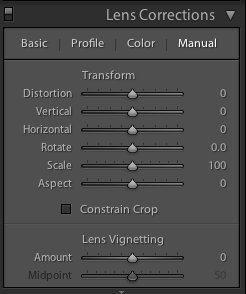
This is also an easy means of adding a subtle vignette to a largely uncropped photo, too. It doesn't let you over-do it, which is the cardinal sin of adding vignettes, and there aren't too many factors to consider. It's sneaky, but if you're working with a cropped photo, not helpful. For a cropped photo, you need to head to the Post-Crop Vignetting options in the Effects panel.
Here, you have far more control over the vignette that you add to your image.
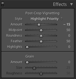
With three drop-down options and five sliders, it might appear as if adding a vignette is more trouble than it's worth, but it's relatively straightforward. We'll deal with those drop-down options first.
Highlight Priority, Colour Priority, or Paint Overlay? Highlight Priority allows for highlight corrections and recovery, so is good with images that have specular highlights, but it might have an adverse impact on the colours in the darker areas of your image. If you're working in black and white, colour shifts won't be an issue, so it's an easy choice.
Colour Priority won't produce such a pronounced shift the colours in the darker areas, but it won't let you recover highlights, either. Julieanne Kost, who works for Adobe, reckons it's a more subtle effect. You might want to consider this if your photo is in colour.
As for Paint Overlay, it is supposed to mimic the effects of overlaying your photo with either black or white paint.
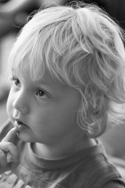
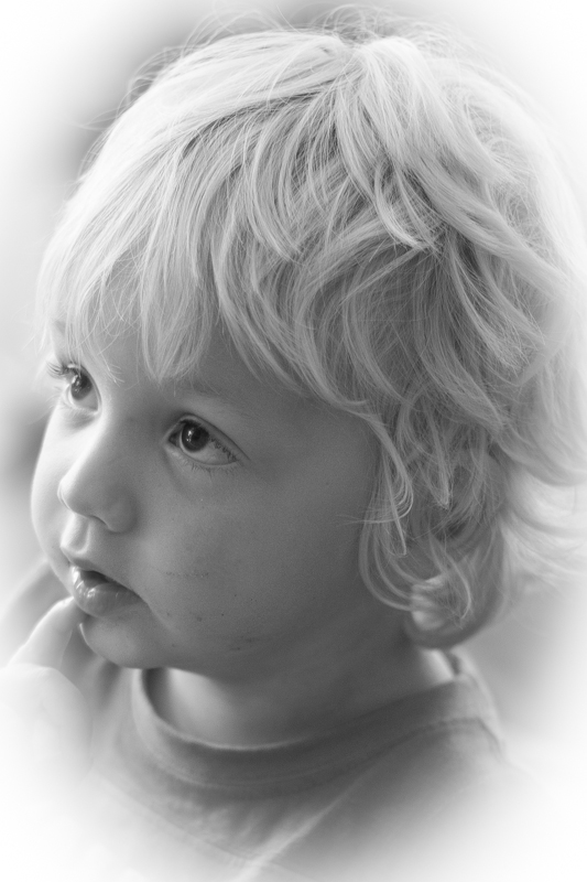
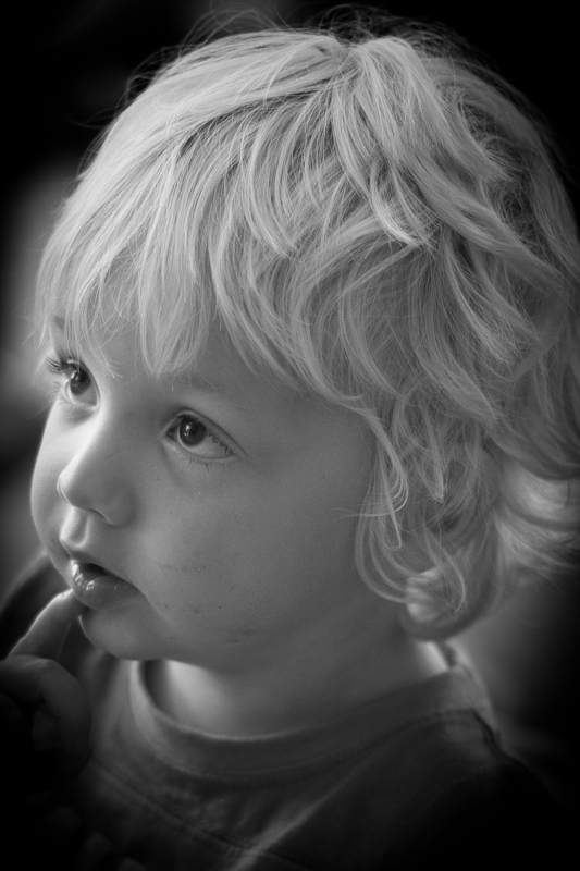
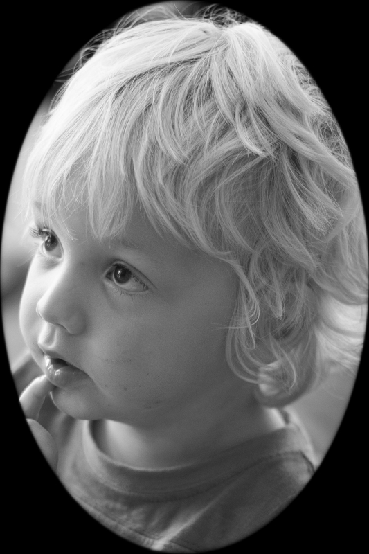
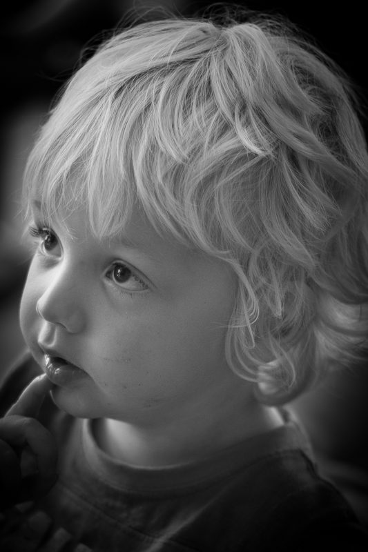
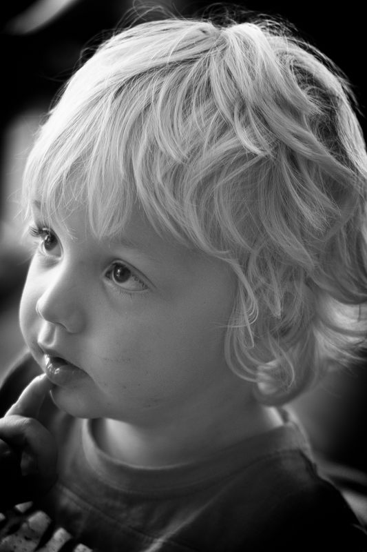
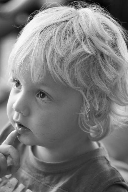
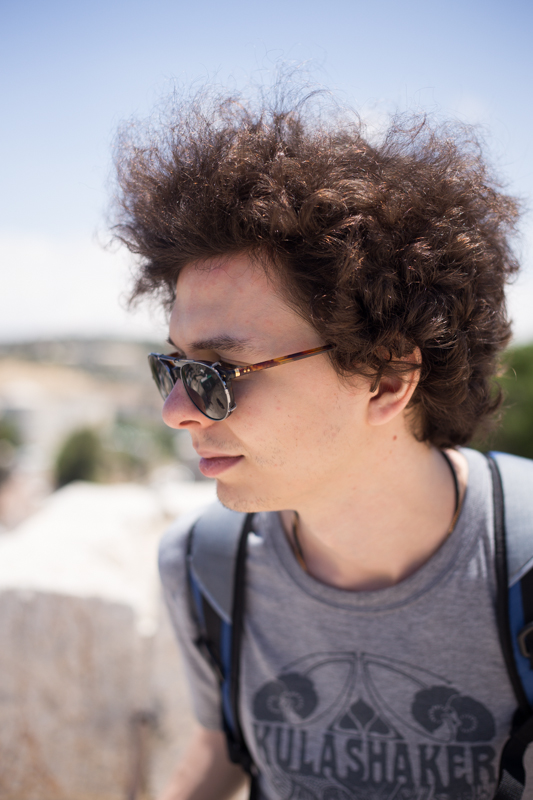
To walk through the sliders, I'm using a photo of my nephew Wil for demonstration purposes. It's been cropped, converted to black and white, and had all of its other adjustments made. The last thing on the list is the vignette. That's how you should apply one, too.
The Amount slider is the crucial slider when adding a vignette. It determines how strong the darkening or lightening of the edges of the frame will be. Set it at -100 and you'll have deep black edges; conversely, +100 will leave you with bright white edges. Without adjusting this slider, none of the other Post-Crop Vignetting sliders will have any impact on your image.
From now on, we'll look at all the other sliders having an effect with the Amount set to -100. It offers the clearest demonstration of their impact.
The Mid-point slider controls the size of the vignette from the centre of the frame. It naturally sits at 50 points; reduce it to 0 and you'll produce a vignette that encroaches far into the frame.
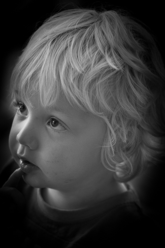
Set it at 100 points and it'll sit closer to the edges of the frame.
The Roundness slider controls the shape of the vignette. At 50 points, it's elliptical in shape. Push it to 100 points and you'll have a circular vignette. At 0, it's a rectangle with rounded corners. (By pushing all of the Post-crop Vignetting sliders completely to the left, you'll create a rounded-corner rectangular frame effect for your photo.)
To control the strength of the transition between the vignette and the centre of the image, adjust the Feather slider. 100 points ensures a very subtle transition; 0 points is a sharp transition with a hard edge. Its native position is 50 points; I don't often vary far from there.
Finally, we're left with the Highlights slider that starts at 0. Why might you want to increase the highlights slider? It prevents the vignette being applied too heavily to highlights in the image and helps to keep them bright. There's no hard-and-fast rule for this slider; it needs to be adjusted on the merits of each image.
It's important to note that the Post-crop Vignetting panel applies the vignette centred according to the crop. If you want to introduce a vignette that works around an off-centred subject, you'll need to do that using Radial Blur. That's a whole different article, however.
If you don't use Lightroom, you can add a vignette using plenty of other editing suites. Photoshop, of course. And Pixelmator. Or Pixlr. Under the 'Centre Focus' tab if you're in Google+. In Apple's Aperture.
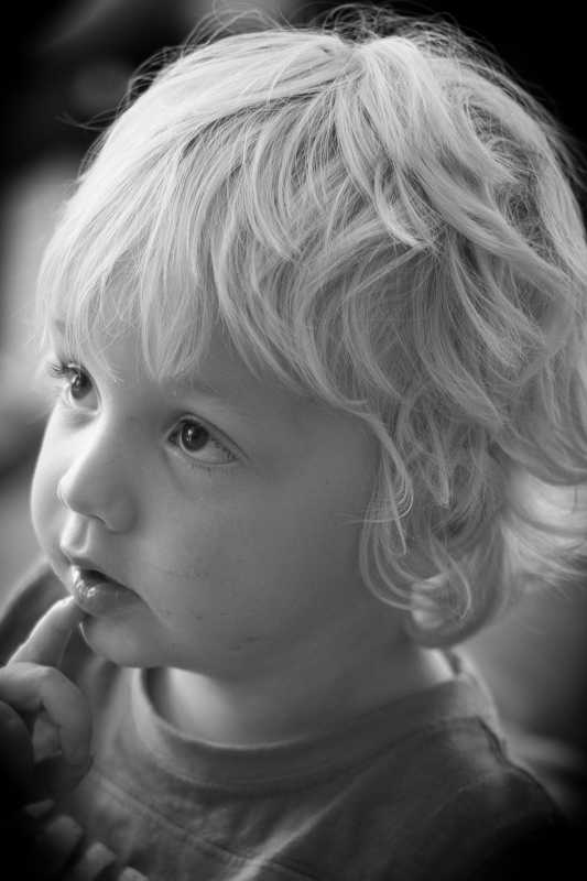
This is my final version of Wil, with a vignette Amount of -15 and a Mid-point of 75. That was it. Remember: subtle is better!
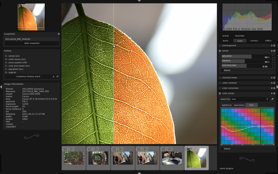
A few weeks back, we took a peruse around Lightroom's clarity slider, to see what it does to your photos and how you can get the best out of your photos by giving it a gentle nudge here and there. This week, it's the turn of the vibrance slider—clarity's bed-fellow—to come under the Photocritic microscope.
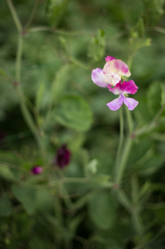
Much the same as the clarity slider has its most pronounced effect on the mid-tones of your images, the vibrance slider is also a 'smart slider' and applies its effects selectively. Rather than adjusting the contrast in the mid-tones, a la clarity, vibrance takes hold of the more muted tones in your photo and gives them some oompf. It's a selective saturation slider, if you will.
More often than not, vibrance will pick up on the blues and greens in a photo but go easier on the reds and oranges. This is great for bringing out the intensity of a sky or making a lawn look that bit more inviting while not letting your portrait subjects look as if they've been tangoed. I've heard some people refer to vibrance as being like 'fill light for colours'.


With the exception of the sweetpea, I've not been exactly subtle with either the vibrance or the saturation in any of my examples here, but that's to give you a clear illustration of the difference between them. Usually, I'd be far more reserved and I'm sure you would be, too. But at least you know what vibrance does now, and can begin using it to intensify your colours without feeling you've chucked a red wash over your photos.
When I was conducting my recent app spring clean, one of the apps that wasn't sent packing was Fotor, an editing package that I was asked to review by its makers. I've been trying it out for a few days, but the images I've edited specifically for this review I shot today, in glorious sunshine with the help of an Easy Macro band. As an editing package, Fotor offers a lot, but I think it falls short of replacing one of my current favourites. Fotor gives you the option to import photos from your camera roll or take a photo in-app. If you opt for in-app, you get a choice of three subject placement overlays: grid, golden spiral, golden triangle. Or none at all, if you prefer. Whether you take a photo in-app, import it for editing, or save it after editing, it will be stored in Fotor's photo folder, according to date.
When it comes to editing functions, features, and filters, Fotor is well endowed. You can adjust contrast and brightness and saturation and white balance and shadows and highlights, add text and stickers, apply a tilt-shift effect or a vignette, and compile a collage. There's a gamut of free filters—nine folders, ranging from 'Lomo' to 'Scratch', each with nine options—as well as some paid-for additions and 12 paid-for scenes.
Fotor includes some neat touches. Being able to assign your favourite filters to a specific folder, making them easier and faster to apply, for example. Having each photo's details (time and date, exposure, and geo-location) at a tap is great. And I appreciate having plenty of sharing options, too.
However, there are some frustrating oversights. The omission of a straighten function being top of my list. And not being able to crop a vertical image using a 4:3 aspect ratio without first rotating it to a horizontal aspect, and indeed various other aspect ratios, is a bit... odd.
I didn't find the slider that is used to control the intensity of the adjustments especially accurate: if I tried to set it to 12 points, it would easily wind up at seven or 16. Without a reset button, returning the slider to 0 was sometimes tricky. And I have to confess that I'm fond of being able to compare my adjustments with the original image, which I can't do with Fotor.
Fotor, I'm afraid, won't be making its way to the 'Photography A' folder on my phone. It doesn't offer me enough of what I need and there's too much of what I don't. But that isn't to say it won't be for you. It's free to download and available for Android and iOS, so worth a look.
If you use Snapseed to edit your smartphone photos, you might have noticed the 'Ambiance' slider under the 'Tune Image' settings. Ambiance? Isn't that the mood or feeling you get at a party, not a photographic term? Yes, exactly, and that's why I avoided it for quite a while. I just couldn't figure out how to apply it effectively to my photos. And Google, which owns Snapseed, was hardly helpful. The Google help page ambiance explanation reads:
The Ambiance control is a special type of contrast that controls the balance of light in a photo. It can be used to balance backlit photos or to accentuate contrasts throughout your photo. Swipe right for photos where the subject is darker than the background. Swipe left to increase the contrast of dark objects and create a slight glow around darker objects. This is especially helpful in photos that are slightly flat.
I wasn't aware that there was a 'special type of contrast' available to photographers, just the plain old difference between light and dark, so that was surprising. And it's all very well telling us to 'swipe right for photos where the subject is darker than the background,' but what effect will it have?
As with just about everything associated with photography, the best way to understand it is to use it. So that's how I've come to write this and present you with some compare-and-contrast examples where I have swept the slider both left and right on a series of photos and analysed its impact.
In order to create examples that are clear enough for illustrative purposes, all of the ambiance settings, whether positive or negative, have been exaggerated. Subtlety and demonstration aren't natural bedfellows; that's for the real thing.
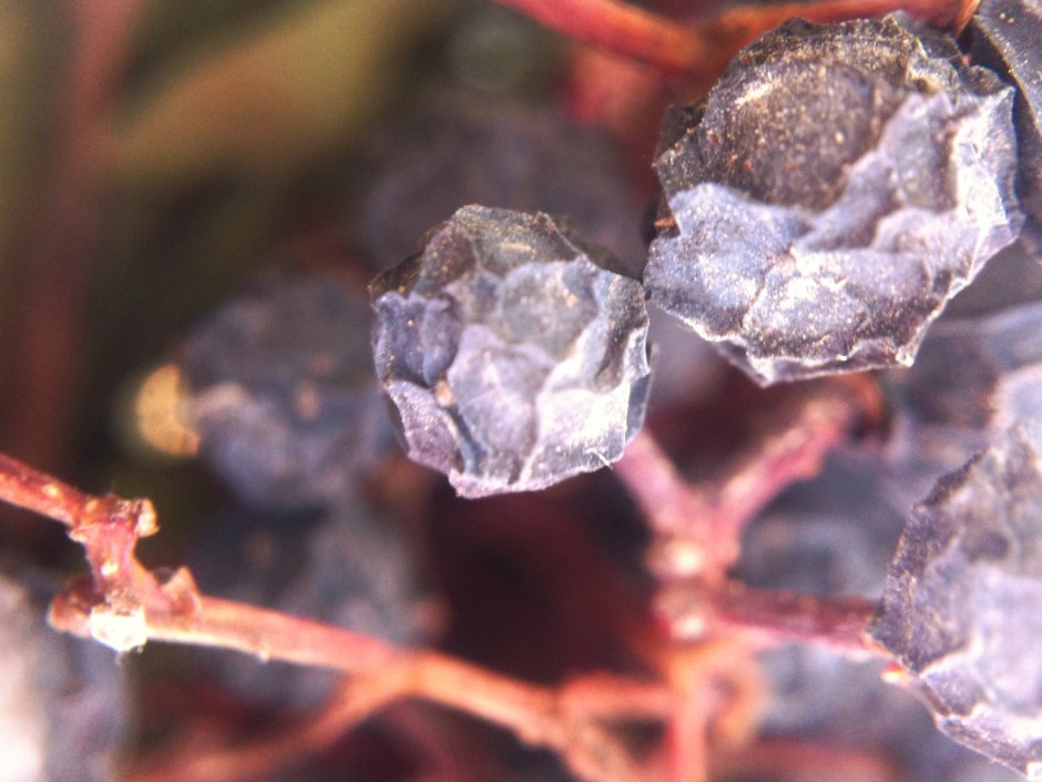
Let's start with this image of some dried berries. I've adjusted the white balance to correct for a light temperature that was out by several thousand Kelvin and cropped it marginally, but that's all. It's a good base.
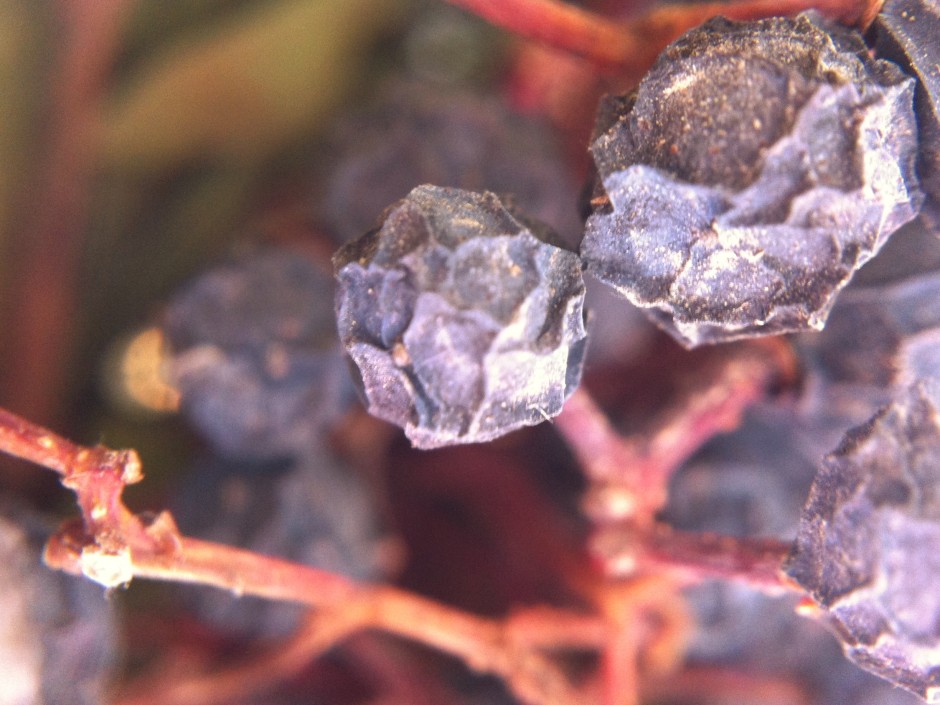
By increasing the ambiance setting by 60 points, you can see that the image has taken on a more reddish tone. The background has also been lightened, but the highlights—say those on the bottom right of the centre berry—haven't become overwhelming, as you might otherwise expect from an increase in contrast. The definition of the berries has improved, but not at expense of the highlights.
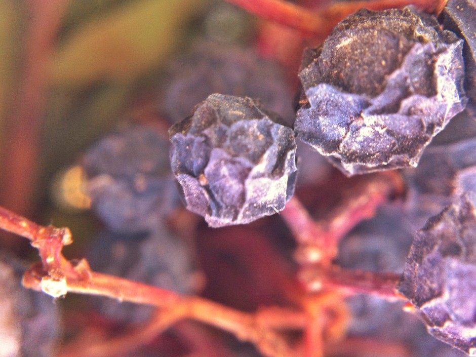
When I swiped the slider to the left and dropped the ambiance by 60 points, you can see that the background became darker, the red tone has diminished, and the berries have become softer looking and less defined. A negative ambiance setting has given the photo a softer, more muted look.
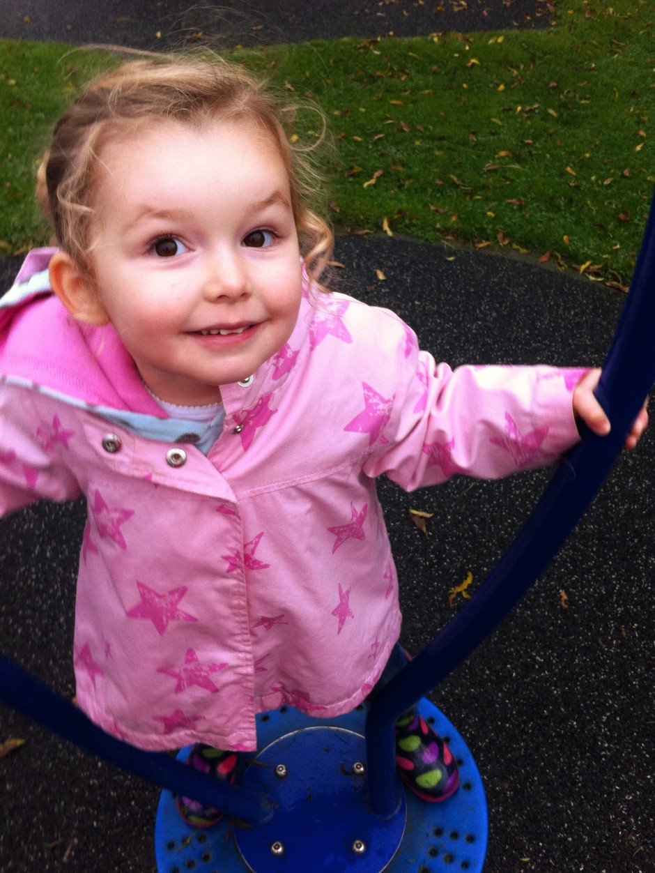
This is my niece, Eva. She's three. She's being spun (by me) on an upright-spinny-device in the park. I've adjusted the original image to correct the white balance, but that's it.
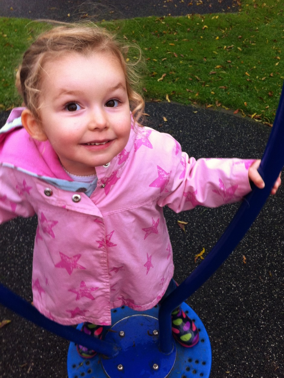
When I increased the ambiance, pushing it to +60 made Eva look as if she's been on a sunbed every day of her life since birth. It was awful. So I went for +30 instead. She still looks comically rosy-cheeked, but not horrifically so. Her coat is an unattractively bright shade of pink, her wellies are deeply saturated, but the grass looks good.
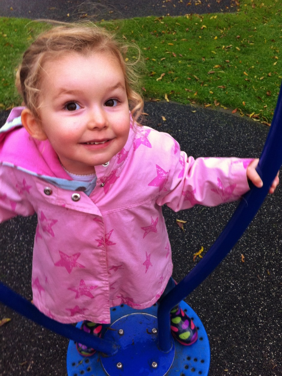
Decreasing the ambiance to -30 had a rather pleasing effect, though. Her skin became more milky and the darker background helped her to gain even prominance in the image. I reckon that decreasing it even further could make for an even better look.
Having tried increasing ambiance in Eva's portrait to unpleasant effect, I didn't even bother trying it with my self-portrait. Decreasing the ambiance, this time to -100, was effective, though. I'm not sure if I prefer the original (again, slightly cropped and heavily adjusted for white balance) image or the edited one, but it's a good demonstration of the tool and shows how it gives a more muted feel to your photos.

Having a swipe and swish with the ambiance slider is definitely something to be considered when you're fiddling with your smartphone photos. The general rule seems to be that left is great for portraits and go right a bit for still lifes. But every photo's different. And maybe 'ambiance' isn't such a terrible descriptor, either. One way is more lively and bouncy and the other more muted and moody. Just like the atmosphere can be at a party.
Google has introduced some Snapseed-like editing tools to its Android version of Google+ today, as well as what it calls 'non-destructive editing in the cloud' and new ways to view your images. The updates to the editing tools themselves are fairly basic: crop, rotate, one-touch filters, and enhancements that are familiar to Snapseed users, for example Retrolux and HDR-scape. They're the sorts of tools that you'd expect in a basic editing suite. 'Non-destructive editing in the cloud' is a touch more exciting, however. While it might be a horribly cumbersome term, 'non-destructive editing in the cloud' should make for a far more integrated photo-editing and sharing experience for Google+ users. It is designed to allow users to edit their images across different devices, and being non-destructive, start over if required. This means you can start to edit a photo on your desktop at home, continue your processing on phone on your way to work, and finish it off at your other-half's on their tablet. If you decide you don't like what you've done at any point, you can revert to the original before sharing on Google+.
As for the new ways to view images, the 'All' view allows you to see all of your photo library, whether on the device that you're using or backed up to the cloud, and you can sort them by date. If you've tens of thousands of images, you won't be seeing all of them in the 'All' view yet, but they're on their way.
Whatever you think of Google+ as a social network, it's always worth keeping it in mind as an image storage solution, especially with this integrated approach to editing and filing. You don't have to share your images there if you don't want to.
(Headsup to Engadget, further details from Todd Kennedy at Google)
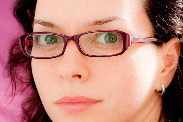
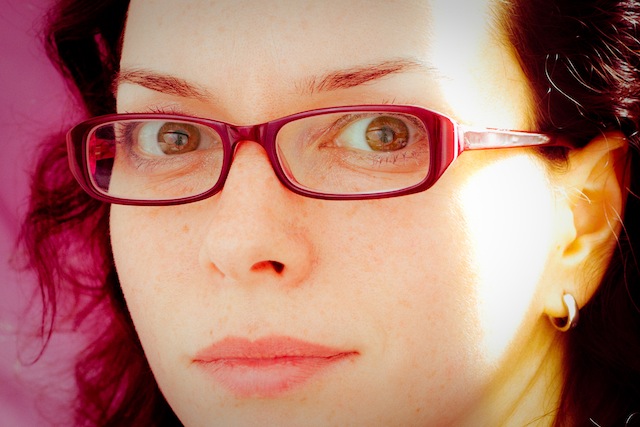
In the interests of knowing how it was done and not wishing to rely on filters or presets (or on dodgy film development practices) I had a go at converting one of my self-portraits into a toy-camera looky-likey. I doubt that it's a process I'll do too often, but for the record and because I'm sure other people might be intrigued, here's how I went about it. Before you start playing with the tonal curves and adding vignettes to your photos to make them look as if they stepped out of 1976 and were bathed in the wrong chemicals, it’s useful to know what to look for in a toy camera-esque image.
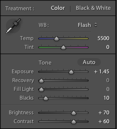
This is my recipe for a toy-camera flavoured photo. It's fairly subtle because I'd rather not feel as if my eyes are being assaulted by a sweet shop, but you can of course ramp up the numbers to get the effect that you want. We'll start with a studio shot of me. It was part of a series I took when I was getting accustomed to wearing glasses.
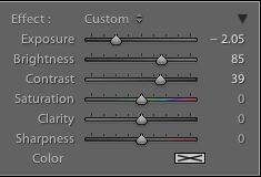
 My first move is to increase the exposure, add some depth to the blacks, and then go overboard with the brightness and contrast. It'll look like a cartoon at this stage, but it's a base on which to build.
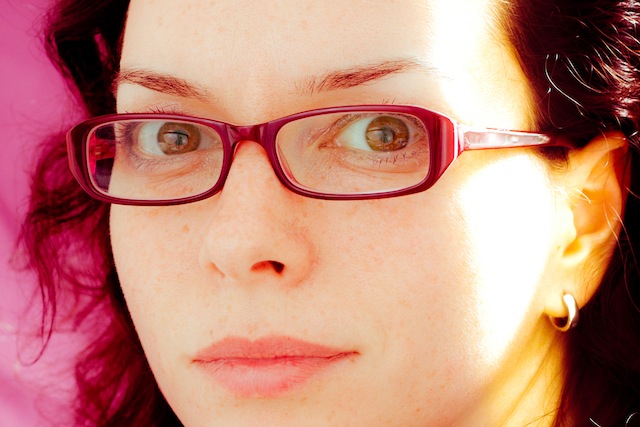
 By nudging the clarity slider to the left it helps to recreate the soft mushiness of a cheap plastic lens.
 Use a pair of graduated filters to add a light leak. I placed one to the left of my ear and another right with roughly opposite settings. This produced a yellow-y smear.
If you want, you can spend hours messing with the split toning sliders to achieve wildly varying looks that could all pass for cross-processing. It'll be a case of finding what you prefer, and placing more emphasis on the reds and purples or the greens and yellows.
I tried this image with a yellow-y green look initially, but swapped it for a more pinky-red version.
Without knocking myself over the head with a plastic picture-taking-device, I add a touch of vignette, too.
Finally, add a hint of grain to help recreate the film feel of a toy camera.
Et voila – from studious studio self-portrait to tricksy toy camera creation.
ArcSoft got in touch with me to ask if I would like to review their Portrait+ editing package. It's an automated portrait editing programme that detects upto 20 faces in any photo and allows you to apply 28 preset functions to your subjects, to apply more specific 'DIY' actions, including eye brightness, smile depth, and skin quality, and to create your own presets from these specific actions if you want. You can even apply makeup. Once you've loaded up Portrait+ you import an image, wait for the programme to detect the face, and then get to work. Unless the face is perfectly square-on in the frame, the software can have a few problems pin-pointing features, so it pays to look at where it thinks the key points are and adjust them as necessary.
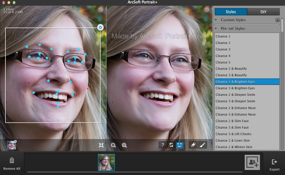
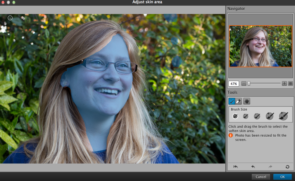
It also cannot identify faces that are in profile or at awkward angles. For these, there is no way of manually identifying the features, which means that they can't be treated in Portrait+. You can also ensure that all of the skin area is covered for adjustment, and you can paint in or paint out areas that the programme doesn't quite catch.
The first photo ran through Portrait+ was one of my mother. I was pleased with the effect of the very lightest touch (Cleanse 1) to her face, but anything above that felt excessive and unnatural. It was easy for her to slip from being elegant to plastic. This was especially true of any of the makeup packages. I'm also not the sort of person to go in for face-slimming or nose-enhancement. If you need to make use of these functions, however, they are there and you can apply them either as a part of a preset (for example, Cleanse 3 and Deepen Smile) or as a DIY action, which allows you to decide how deep you want to make the smile and then pair it with Cleanse 1 if you prefer.
A photo of my cousin was more tolerant of the more extreme preset adjustments, but it was still all too easy to push things too far and leave her looking like a Barbie doll than a living, breathing, producer of theatrical shows.
It's easy to fix spots, marks, and aberrations in skin tone with the blemish removal tool, and it works well in combination with the lighter touch presets. This is where I think Portrait+ is at its most successful. Use it to remove circles from around the eyes, fix any obvious blemishes, and gently even out skin tones, and you can produce an improved but still natural looking portrait.
While I find that some of the effects are far too extreme for my tastes and I'm not the kind of person to go in for face slimming and cheek lifting, it is an easy way to take a portrait and clean it up. The 'Remove Circles' function is a very easy fix for tired looking eyes that enhances someone's appearance without looking false. Unfortunately, I don't think that I can justify $150 for a bit of eye improvement alone.
If you take a lot of portraits, and you need a standardised and easy editing programme, you could well find Portrait+ a valuable asset in your arsenal. However, if you take a lot of portraits that involve profiles or slightly obscured faces, the inability of Portrait+ to detect them won't make it useful for you. And of course, if you prefer to keep a tight reign on your edits and make precise adjustments, it won't fulfil your needs either. It's too much of a broad brush product. The good thing is that you trial it for free and decide if Potrait+ will meet your needs, or not. Should you decide it is for you, here's a 45% discount coupon for you, too. Use the code Portrait45.
Portrait+ 3.0 is available for Windows systems, and offers even more functionality than the Mac version that I tested. That should be ready soon, though.
When you're beavering away in your editing suite, converting images to black and white, tweaking the colour balance, and adjusting the levels, how do you work? Graphics tablet? Mouse? Keyboard shortcuts? A mixture? The team behind Palette is looking to provide a new, more tactile means of making adjustments and applying presets to our images. They're hoping that Kickstarter can help bring to life their customisable, modular, hardware interface for editing. Comprising blocks that fit together like Lego, a palette allows you to edit your images using tactile controls. Different functions are assigned to different controller blocks; these include buttons, sliders, and dials.
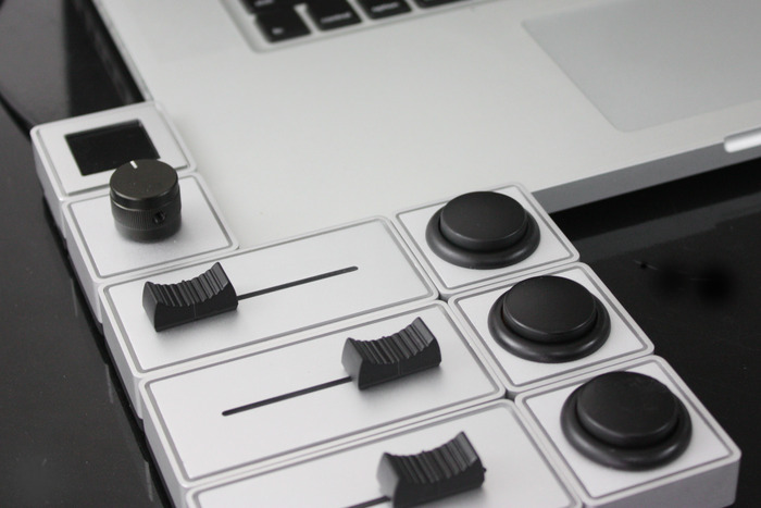
If you decide that you need to reconfigure your palette, switching your toy camera preset to a black and white preset, you can do that via the Palette web app.
The Palette team is looking for CA$100,000 in Kickstarter funding. Pledges for Palettes start at CA$99 for the brushed aluminium four module starter kit, comprising a master block, a button, a dial, and a slider. Then come six module apprentice kits and 16 module professional kits as well as some limited edition cherry wood ones, too.
Palette might not be so great for editing on the move, but I like the idea of having physical controls over my edits, rather than relying on mouse, keyboard shortcuts, and trackpad. I also find Palette's flexibility and reconfigurement and expansion capability appealing. It's also worth pointing out that Palette isn't just for photographers: the controllers can be assigned to interact with music production suites and video editing programmes; if you've another idea, get in touch with the team.
Interested? There's a heap more information on Palette's Kickstarter page!
Google gave us a few new things to think about last week, including improved photo editing and archiving tools in Google+ and an update to Snapseed, but something seems to have been overlooked. Sitting quietly in the Gallery app on Android devices running Kitkat, you'll find a new and rather tasty peach of an addition to your mobile post-production needs: a non-destructive editing programme that's equipped with some powerful tools. Developed by Nicolas Roard and his team, you can use the suite to adjust curves, apply graduated filters, make local adjustments, and fiddle with individual colour channels, as well as create your own pre-sets.
There's a demonstration video to show you even more of what it's capable of accomplishing, but nothing beats a bit of experimentation.
There's only an auto-white balance function, which is something of an oversight in my opinion, layers capability is on the way (from what I can tell), and there's no Raw support; all the same, the Google team is showing that they are growing in stature when it comes to their image editing options.
Some people have wondered how this sits alongside Snapseed and the photo editing options in Google+. For a start, Snapseed is universally available whereas the Gallery editor is Android-only. If you're an Android user, they do different things. The Gallery editor is non-destructive and lets you play around a lot more than Snapseed; Snapseed is super for making quick adjustments and applying ready-made effects. It all depends on what you want for your photos.
(Headsup to Engadget)