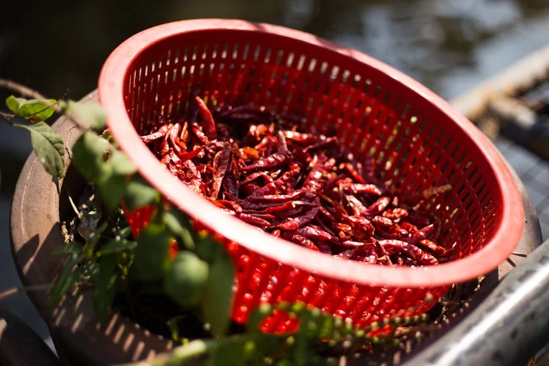
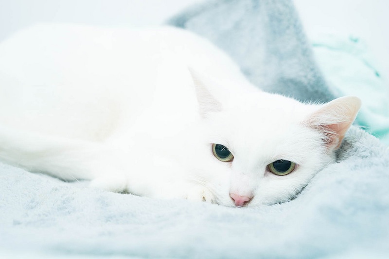
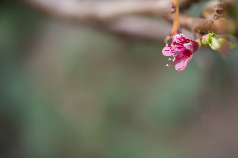
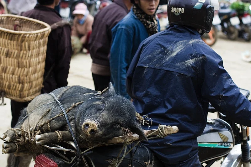
No, we don't mean black and white here. We mean all one colour. All red, all green, all yellow. All anything. Colour is one of the most powerful tools in your compositional arsenal and it can be easy to forget how striking images composed of all one colour can be; we get caught up in the idea of complementary colours and of our images having to contain enough to satisfy and intrigue their viewers. And monochromatic images can do that: the key is to have as many different varieties of one colour within an image so that it becomes an exercise in naming the different shades, tones, and tints of one hue. Colours are able to elicit strong emotions in people. It might sound terribly airy-fairy, but there are introverted—blues, greens, and some purples—colours that give a calm, even subdued feeling and there are extroverted colours, such as reds, oranges, and some yellows, that are positive and energetic. You can prompt particular responses from your audience by using particular colours in your photos.
Red
Red is regarded as the 'strongest' colour; certainly, if you've a multi-colour image that contains just a speck of red, people's eyes will automatically be drawn to that red dot. But if you choose a monochromatic red image, be prepared for something that feels passionate, energetic, and vital. A strong colour will incite a strong response.
Orange
It shouldn't come as any great surprise that I have a particular fondness for orange: I'm Dutch. Daniela rather likes it, too, if how often she wears it is anything to go by. Hardly surprising, then, that we chose it as the Photocritic theme colour. There's something very inviting and reliable about it. Maybe that's because it's the colour of sunrise and sunset. You know it'll happen every day, and that you have the the chance the start over and then to put everything beind you.
Yellow
Yellow is cheerful, optimistic, uplifting, vigorous: anything positive, really. And it's easy to grasp the association with the sun, with good weather, with the opposite of darkness.
Green
It's spring here in the UK, and we're being presented with a riot of green. It is abundant, youthful, verdant, and symbolic of growth and renewal.
Blue
Ever since I can remember, my parents have painted their bedroom blue. They do it precisely because of blue's qualities: it's calming, contemplative, and restful.
Violet
You don't find that many purply tones in nature. Of course there are some, especially amongst flora, but it's rarity means that violet tends to have a mysterious and superstitious quality to it. The expense of dying fabric purple in Roman times (the dye came from murex shells) meant that it was reserved for only the highest echelons of power, which contributes to the regal and superior feeling purple has, too.
So, don't be afraid of the monochrome: embrace and experiment with it!

