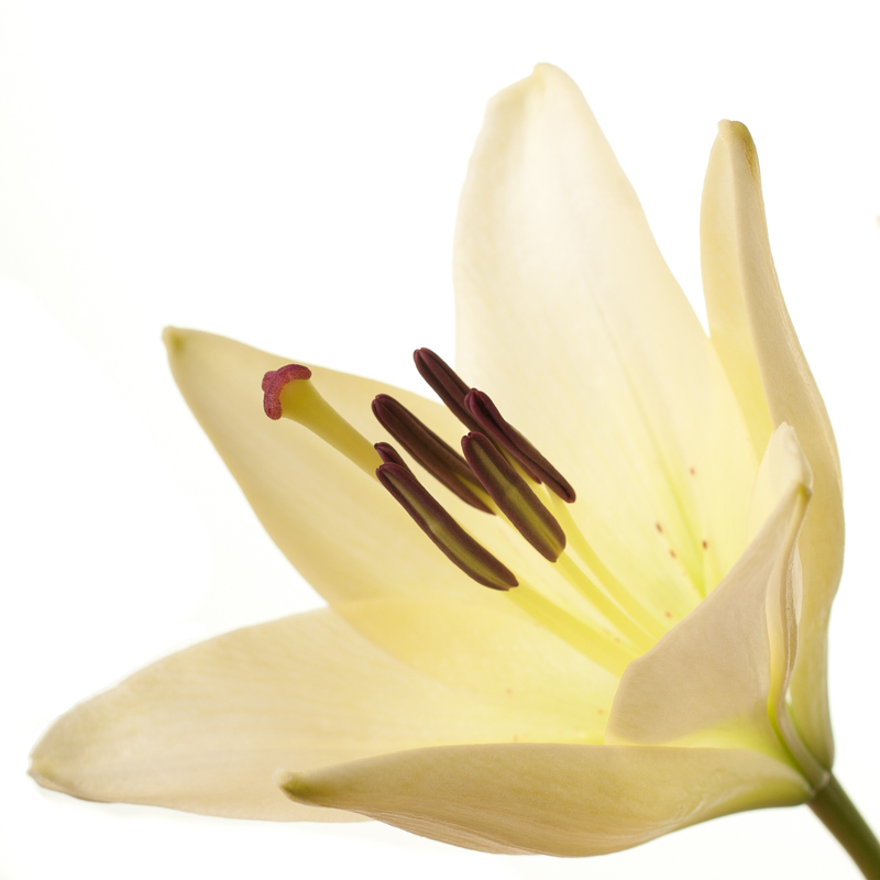
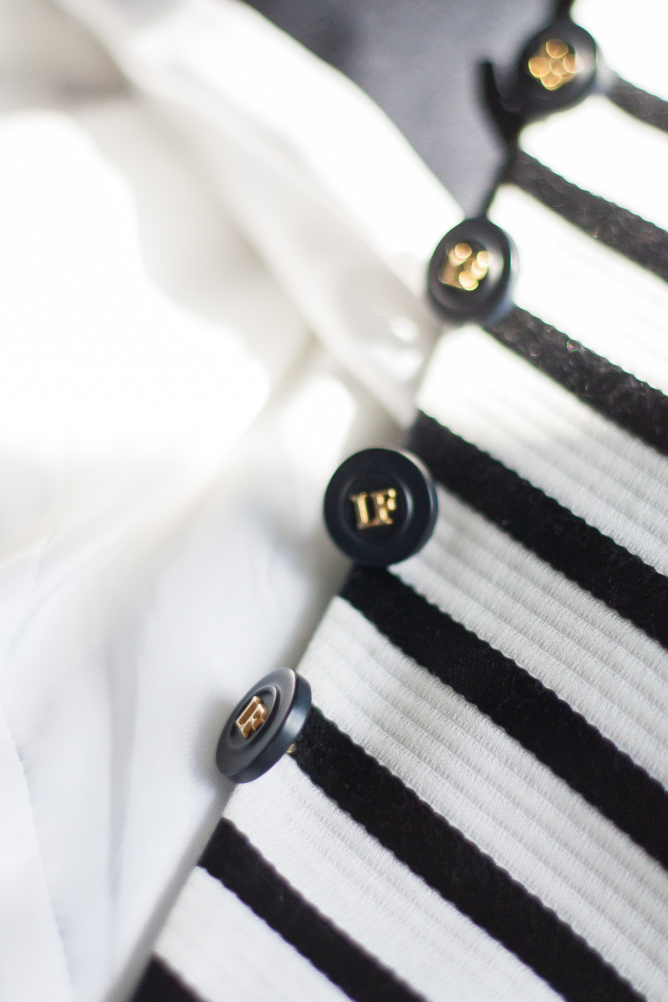
What can do you to enhance the textures in your photos?

When you hear the term 'high-res' thrown about with such abandon when it comes to images for web use, have you ever stopped to think just how big or how high quality and image meant for the web needs to be?
There's an assumption that high-contrast images are more dynamic, more compelling, more inviting. Have a go at some low-contrast photography. You might surprise yourself with the results.
Balance doesn't mean symmetry; it means an internal consistency and tension within your photos. And it's a vital element of composition.
Great photos might be down to a little bit of luck, but most of that 'luck' you make yourself. Don't believe us? Read on...
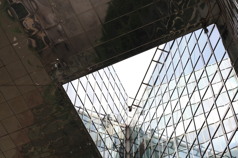
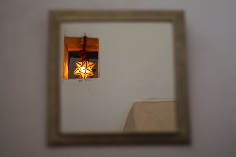
We put pictures—whether they're paintings or photos—into frames to help direct the viewer's eye. The frame is a boundary that directs the gaze: it ensures we know precisely where to look. As well as creating a border from a mounted frame and from the edges of a photo itself, it's also possible to bring focus to your subject and compositional strength and depth by using natural frames within your photos. Despite the name, a 'natural frame' doesn't have to be organic in origin, although trees, streams, and cave mouths do indeed create beautiful natural frames, rather the term describes a frame-within-the-frame. Look out for windows, doorways, and arches—in fact anything that bounces the eye back towards the subject—to act as a frame.
Primarily we appreciate images that include natural frames because they direct the eye straight to the photo's subject. As the eye travels towards the edges of the image—and especially if it contains lines that drag the gaze away from the subject—a frame helps to draw it back toward the focal point, just where you want it.
Second, they can bring a sense of perspective and three-dimensionality to an image, giving you the sense that you're looking through one layer of an image and on to another.
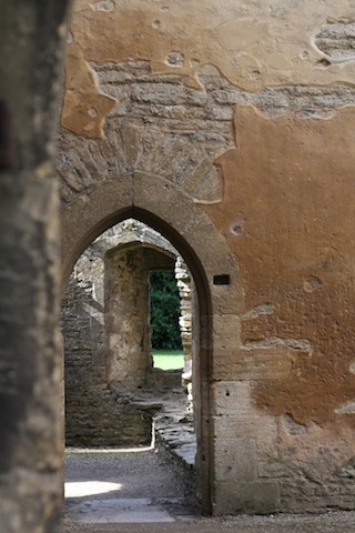
A frame can also give a sense of place or give context to your photos, for example, indoors versus outdoors or a modern area versus a historical one.
Finally, we find images that make use of natural frames attractive because it brings a sense of order to the image, in much the same way that triangles bring order to scenes with multiple subjects. They place limits on the scene and provide it with some boundaries.
Just because your scene has a terrific natural frame within it, it doesn't mean to say that you can ignore any other compositional theory. You still need to consider your use of lines, your subject placement, and the balance of the shot. Remember: combining these compositional techniques can help to elevate a good photo to a great one.
If you're planning on using a natural frame in your composition, consider if you want the frame itself to be sharp or blurred. If your subject and frame are at different distances, but you wish them both to be in focus, you'll need to use a relatively small aperture to achieve an adequate depth-of-field. Of course, having the frame in focus might prove a distraction and defeat its purpose, in which case using a larger aperture and isolating the subject using a shallow depth-of-field will work better.
If you're inside a cave or tunnel and using its natural form to provide a frame for a brightly lit sbject on its outside, you will have to meter accordingly. Spot-metering for the well-lit subject might be the easiest option. Alternatively you could dial in some negative exposure compensation should you prefer to stick with matrix (or evaluative) metering.
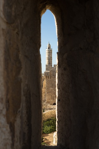
In order to capture the full dynamic range of such a scene, with its bright exterior and dark interior, you would need to shoot two differently metered images and combine them using post-processing software.
Using frames-within-a-frame is such an effective compositional tool that it's all too easy to get carried away with them and over-use them. One natural frame within a portfolio is clever; a dozen is cliché. Just because a potential natural frame exists doesn't mean it is the best way to compose the shot; it needs to bear some relationship to the main subject.
If you're not sure if a natural frame is appropriate for your photo, ask yourself: Does the frame add drama to the photo? Does it help to tell a story, add context, or give a sense of depth? Does the frame help to illustrate or enhance the focal point of the photo? If the answer is no to any of these, you might be better looking for an alternative composition.
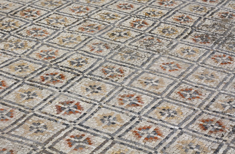
Pattern. Repetition. When you hear these words, what springs to mind? Maybe a print dress or possibly wallpaper for the former, and likely a sense of ennui for the latter? The words themselves do not necessarily evoke any sense of excitement or anticipation. The prospect of shepherd's pie for supper, every night, for the rest of your life is certainly not the kind of repetition that sets the mouth watering. But the senses are, actually, rather fond of both pattern and repetition. The ear appreciates rhyme, assonance, and alliteration. The eye favours rhythm, flow, and stability, too. By introducing them to your compositions, you have the opportunity to create appealing, compelling images.
The act of deliberately watching out for patterns to photograph might feel a little, or even a lot, contrived, but once you start you might find it a little difficult to stop. Patterns present themselves both organically and synthetically, from flower petals and fruit peels to tyre-treads and architectural work.

Get in close or shoot from far away; come down low or climb up high and you can pick out patterns wherever you are.
By isolating a pattern from its background, it's possible to imbue it with a sense of the infinite. With no evident beginning or end, for all the viewer knows the pattern extends interminably. Creating this sort of indefinite image is relatively easy: identify a pattern and get in close using either a telephoto or macro lens. By adjusting the aperture of your lens, you can choose a shallow depth of field with the pattern blurring into infinity, or one that's sharper across the frame.
Spot a break in a pattern, make it the focus of your image, and you have a great photo. Look for the red apple in the pile of green, the solitary shoe facing in the wrong direction on the shoe stall at the market, or the silk scarf in the row of woollen ones. Wherever there is an aberrance in a flow, there is a photo.
If you've decided to fill your frame with a single colour, or variations on a particular colour, you might find that it's patterns that give the photo interest.
You'll often find that the constituent parts of the pattern create the compositional imperative for your photo: lines will point in a particular direction and dictate frame orientation or an aberration in a row will set a natural point of focus.

What you need to do is use these indicators to create tension and balance in the frame. Try setting the point of focus off-centre—think of the rule of thirds—and angling lines on the diagonal to prevent them from presenting as flat or confrontational.
Most important is to be certain of what you are trying to convey in your photo—from the feeling of the infinite, the odd one out, to the sense of consistency—to design the strongest image possible.
Remember: pattern and repetition does not have to be boring.
Did you go to see Wes Anderson's glorious fondant fancy of film The Grand Budapest Hotel? Did you notice how the size of the picture varied depended on the era being portrayed in the story? As the story moved between 1985, 1968, and 1932, the aspect ratio, or size of the image, jumped from 1.85:1 to 2.35:1 to 'Academy Ratio'. This was part of Anderson's story-telling technique: the aspect ratio provided viewers with a visual cue for each period of the narrative. It's also a reflection of the changes to aspect ratio that film and television have experienced over the years. But what about photographers? Where does aspect ratio come into stills?
Maybe we need to back-track and establish precisely what we mean by 'aspect ratio' first. It's the size of the image expressed as a ratio, width to height. You'll often see film-making aspect ratios expressed as a value to 1 (like to 2.35:1 and 1.85:1 mentioned earlier), whereas the most common photography aspect ratios are 3:2, 4:3, and 1:1, although there are plenty more besides. If your image has an aspect ratio of 3:2, it will be three units wide and two high. When you come to print it, you might choose a 6×4" or a 12×8" print.

Originally, these aspect ratios were as a result of our film sizes. Lots of medium format cameras produced square, or 1:1, images; 35mm cameras used film that measured 36 by 24 millimetres, giving an aspect ratio of 3:2. What's referred to in the film-making world as 'Academy Ratio' is very close to 4:3. It's also the common aspect ratio you'll find in smartphone cameras as well as Micro Four Thirds and some medium format cameras. 16:9 is usual for recording video.
While our digital sensors might preserve these aspect ratios in their physical dimensions, at the press of a button I can switch between 3:2, 4:3, 16:9, and 1:1 on my camera. And when I import an image into Lightroom or edit it in Snapseed, I can select from 1:1, 3:2, 4:3, 5:4, 7:5, 8.5:11, 16:9, or settle upon an entirely idiosyncratic free-styled aspect ratio. But why would I want to?
It's about composition, and dividing and filling your frame.
Photographers talk a lot about subject placement, about the different rules that can be used to divide the frame, and about negative space. All of these elements contribute to creating visually appealing, dynamic images that draw the eye. It follows, then, that the dimensions of the frame will have an impact on composition: on where you place your subject and how much space surrounds it and how you divide your frame.
We've already written about the square crop here on Photocritic, and how the eye has a tendency to move around a square frame, as opposed to across it, which it does with a rectangular crop. When changing between 3:2 and 4:3 crops, are there any considerations that need to be made?
At its simplest, you have more space to fill with a 3:2 frame. Depending on your style and your subject, this can mean your subject has more room to breathe compared to a 4:3 crop. But it can also mean your subject has that bit too much space and feels a touch lost. You certainly need to be aware of this when you're shooting; and indeed if you intend to have prints made.
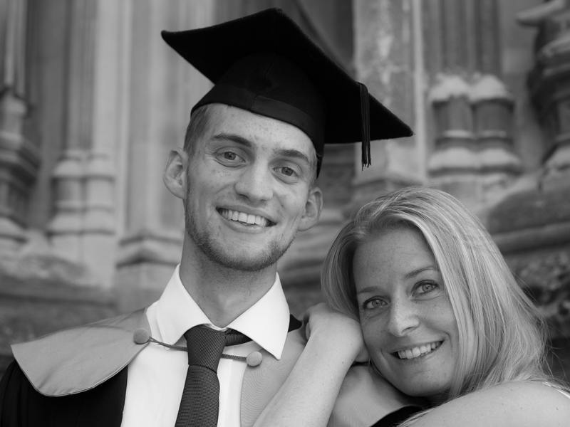
When I photographed my cousin on his graduation day, I adhered to my preferred 3:2 aspect ratio. It was how I approached filling the frame on the day and, consequently, how I processed the images afterwards. However, when my aunt had her prints made, she opted for a 24×18 canvas. I had to re-crop her favourite shot in a hurry. You can see both of them here. Can you see why I prefer the 3:2 aspect ratio in this instance? It doesn't feel nearly as squashed as the 4:3 version does.

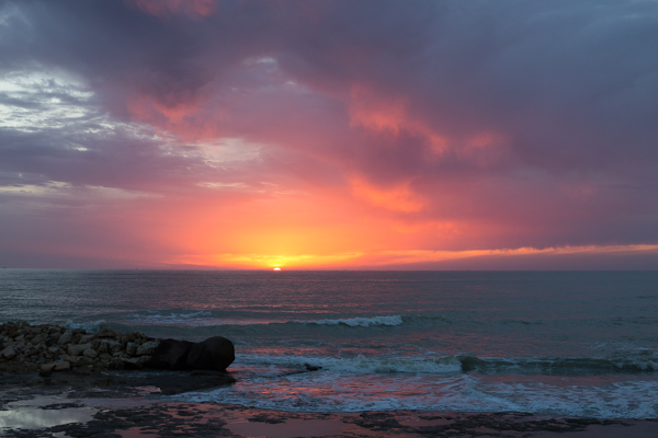
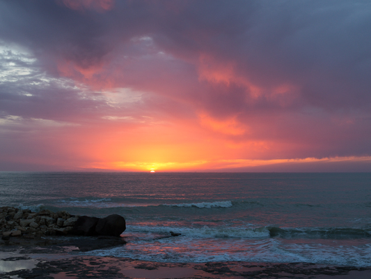
If you compare these sunset photos, you can see how much of the view the 4:3 version loses when compared with the 3:2 aspect ratio. It can prove difficult to fill the extra space in a landscape shot, but sometimes you need it, too.
Of course, you don't have to adhere to 3:2 or 4:3 aspect ratios. I decided that 4:5 worked best for this bee enjoying the Sicilian springtime flowers. The more compact frame focused attention on the bee better than the larger 2:3 version.
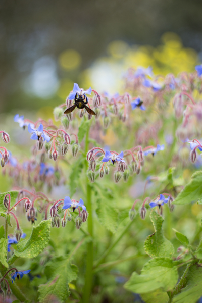
Don't forget, if you switch from landscape to portrait orientation, then the aspect ratio will alter format accordingly. Width always goes first, thus 3:2 will change to 2:3 and 4:3 becomes 3:4. Or in the case of the bee, it's 4:5.
Opting for a different aspect ratio doesn't necessarily mean that you need to use a different compositional rule; however, in some circumstances, you might find the Golden Ratio preferable to the rule of thirds. It depends on your vision for the image. But do think about how much space you need around your subject. If you're struggling to fill it, think of trying 4:3; if it looks squashed, consider 3:2. Or try something else. Try not to feel too constrained by the constraints of aspect ratio.
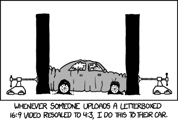
But I will leave you with closing thoughts from xkcd. Who could put it better?
One of the first compositional rules that we learn is the rule of thirds. It's relatively simple but definitely effective: divide the frame into three, horizontally and vertically, and use the divisions to place your subject. But rules are made to be broken—once you understand them properly, that is—or at least adapted and challenged. If you're looking to leave behind the rule of thirds but still want place your faith in geometrically validated subject-placement, try the golden triangle.
Draw an imaginary diagonal line across your frame. Now draw imaginary lines from the other two corners, which each meet the long line at right angles. It should look something like this:

Your points-of-interest are where the lines meet. Use them to place your focal point, for example the eyes in portraits, and use the lines to divide your frame and draw the eye to the focal point to help create dynamic images.
On a mundane and practical level, it's easier for some people to visualise the triangle than it is the rule of thirds. Moving towards a more creative purpose, by using triangles to compose your frame you're introducing a strong compositional shape to it with a great sense of balance pitted against a precarious point. And triangles have a nifty way of retaining the attention of the eye within the frame: the eye moves from one point to another in a continuous loop.
[gallery ids="6953,6954,6955"]
Quite specifically with the golden triangle, you give yourself a means of dividing the frame in a way that is frequently more pleasing to the eye than a horizontal or vertical split. As well as using the lines to draw the eye to focal points, the use of triangles in the frame brings balance to the image. Think of one half as blue and the other as yellow. Or shadow versus light.
By counter-poising the two points-of-interest against each other, you can enhance the sense of balance in the frame. You get dynamism and balance in one go: brilliant.

It's all very well knowing the theory - what about the practice? Try portraits with your subject leaning into the frame and the eyes on a point-of-interest. Use the rule to place bridges in your frame, and have the eye travel along them to a focal point. Just give it a try - you never know!
One of the fundamental rules of photography that we're all taught early in our learning curves is to 'fill the frame'. In fact, the first lesson in the Photocritic Photography School is all about getting closer to the subject and making sure that there's nothing extraneous in the frame. You don't want it to be a tiny, practically unidentifiable blob somewhere in the image that your eye has the hunt to locate. As a consequence, the idea of 'negative space'—or the presence of nothingness in an image—probably seems counter-intuitive. Instead of seeing them as polar opposites, it might help to think of 'getting closer' and 'negative space' as two sides of the same coin that complement each other. Sometimes, a little bit of nothing is just what your subject needs.
If you have a complex subject that’s detailed and busy, contrasting it against an area of nothing will bring some balance to the composition. It helps the eye to find a point of focus and to stop the image from feeling chaotic.
Even if you’ve done all the ‘right’ things compositionally—you’ve selected the appropriate frame orientation, you’ve used the rule of thirds or the Golden Ratio, the image is balanced, there are leading lines directing the eye to the subject—sometimes an image won’t look as good as it could. By putting some negative space around the subject you give everything ‘room to breathe’ and it somehow becomes better balanced.
If you fill your frame with a recurring pattern or repeating subject, like a mosaic or a pile of fruit, and not give it any boundaries, you can create a sense of the infinite in your photos. Surrounding a solitary subject with negative space creates a similar effect.
For example, you could photograph a sailboat on a lake and include the shoreline, which limits the feeling of space. By composing your image so that you capture just the sailboat on a negative space of water—perhaps by altering you vantage point slightly, maybe by getting in a little closer, or even shooting a touch wider—it is suddenly sailing on an infinite sea.
Negative space can contribute to the atmosphere that you want to create in your photographs. Dark negative space can imply brooding or foreboding. Negative space in particular colours can lend a certain feeling to an image; blue is calming, for example, whilst yellow is uplifting. Or there's the opposite of dark and foreboding with positive and airy negative space created by light colours.
When there is nothing else to look at except the subject in an image, that’s exactly where the eye will go. Placing the subject in a sea of negative space will accentuate it. Obviously this is ideal for product photography, when you want the £50,000 diamond ring to be the centre of attention, but you can also use it to make dramatic or slightly surreal images that aren’t intended to sell something!
Achieving this sort of effect isn’t difficult. The first option is to photograph your subject on a plain background. If you don’t have a professional backdrop, a scarf or a sheet will work, too. However, you can also use lighting to surround your subject in negative space. You can either light your background so strongly that you ‘blow it out’, or over-expose it to the extent that the sensor cannot detect anything in that area; or you can light the subject significantly more strongly than the ambient light, so that it will look as if it is emerging from the darkness. Both techniques are highly effective and you can have a lot of fun experimenting with them.
Our eyes and brains are constantly roving for patterns and shapes: think about gazing up at a bright blue sky, and how we look out for cloud formations that resemble faces, animals, and countries. The interaction of positive and negative space in a photograph, especially a minimalist black and white composition, creates similar opportunities to make and look for shapes. You just have to look out for the interplay between objects or between light and shadow.
So that's something for you to try this weekend: looking for the positives in negative space.
This week's Photography Fundamentals column digs into composition, and one of the most-cited 'rules' of the discipline: the rule of thirds. Even if you don't know what it is, you've probably heard of it. We are, therefore, here to explain what it is and why it's useful. And then when you understand the rule and you know how to implement it, you can go ahead and break it properly. We have a natural tendency to place our subjects in the centre of the frame. It makes sense, logically, to have our point of focus right in the middle, being gloried by its surroundings and utterly unavoidable to the eye. Except that centred subjects don’t really make for very interesting images. There’s an unmistakable flat and dull quality to them. Compare this:
With this:

Next time you’re watching a film or TV, notice where the heads and the eyes of the people doing the talking are. I’ll bet they’re not in the centre of the frame.
Instead, they’ll be positioned slightly to one side. They’ll probably be making use of what’s called the rule of thirds.
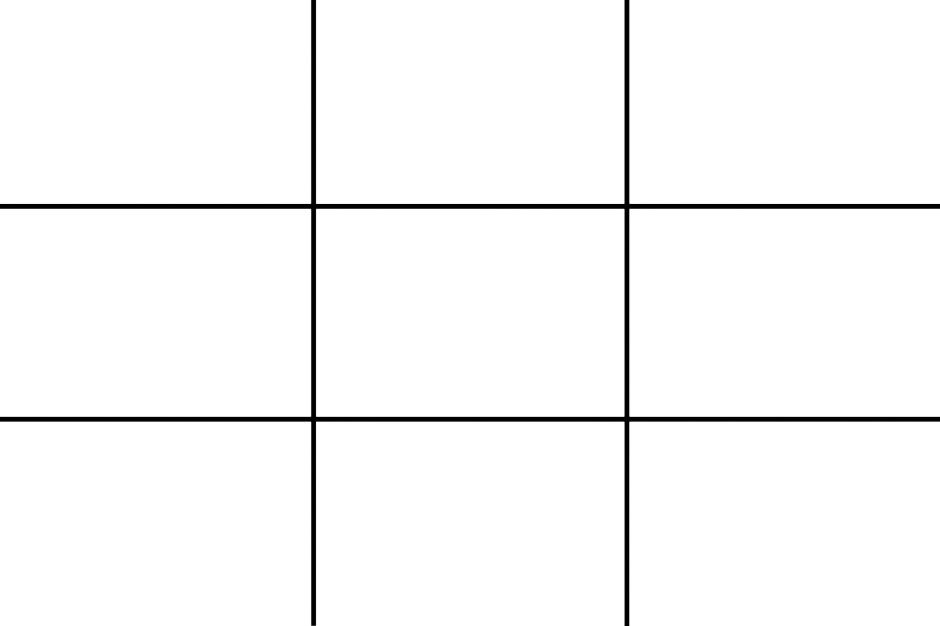
Imagine that your frame is divided by four lines: two running horizontally and two vertically. They are equally spaced and split the frame into nine smaller rectangles. The points at which the four lines intersect create four ‘points of interest’. This grid is your guide for composing an image.
Aim to position subjects that run upright through your image along one of the vertical tri-lines. Lines running across the image—especially skylines and horizons—should run along a horizontal tri-line. (Definitely not through the centre with a horizon.)
Aim to place anything that’s of particular significance to the composition, for example the eyes in a portrait and the sun in a sunset scene, on one of the points of interest.
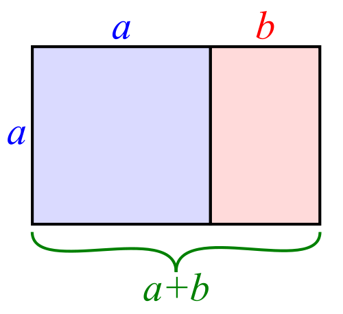
I often find that rather than using the rule of thirds to place my subjects, I have a natural predeliction for the Golden Rectangle. It's based on the mathematical princple of the Golden Ratio: an irrational number equal to approximately 1.618. It's also known as Phi (φ). If you want the technical explanation, it's
If you divide a line unevenly into two sections a (longer) and b (shorter), the ratio of these two sections will equal φ if a divided by b is equal to the sum of a plus b divided by a.
Yes. Ahem.
Rather than divide your frame using three equally spaced lines along each edge, as you would with the rule of thirds, you have two longer sections (a) either side of a shorter section (b). The ratio of the longer side to the shorter is the golden ratio.
It looks like this:
If you're using a square crop for any of your photos, you might find that the rule of thirds doesn't produce the sort of dynamic image that you're used to with a rectangular frame. That's because the eye tends to move around a square photo, rather than across it. For this reason, centred subjects often work effectively in square frames. Or try dividing the frame into triangles, and using those for balance.

Quality vs quantity << Photography Fundamentals >> Speed
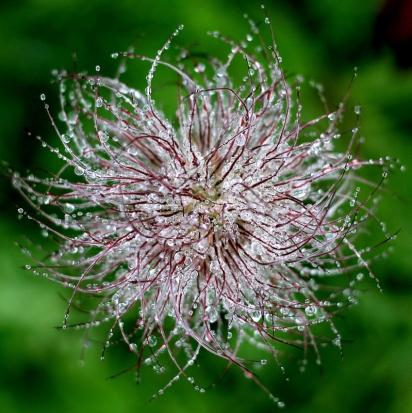
There were a host of cracking entries for May's competition; choosing a winner took a great deal of back-and-forth discussion to work out just which one we thought deserved to walk away with the victory spoils. The victory spoils being an entry into the Small Aperture Hall of Fame and a wonderful 12 inch Fracture.
Eventually, we settled on Prairie_Girl76's wonderful Pulsatilla Seed Head. We thought that the composition was spot-on, that the depth-of-field gave it plenty of interest, and that it was beautifully exposed. Well done!
However, we'd also like to give a couple of honourable mentions, too. We don't do this very often, but it illustrates precisely how highly we thought of the entries.
Joakim Jalden's Seeds was a very close second:

Previous winner Hooker771's Curly Q Refraction is just fabulous: 
We also enjoyed the concept behind Tana Gandhi's Rose Petals Organised Neatly.
You made it really hard for us: thank you!
June's competition is still rocking and rolling and we're looking for photos of fun. So get going with pictures of snowball fights, celebrating taking wickets, and playing with the dog. We want to feel the fun oozing out of them when we judge them!
When I'm asked what I do for a living, the responses that I get range from the infuriating: 'You must have a really great camera' to the inane: 'People write books about photography?' as well as the interesting. One of the interesting ones landed my way the other evening when I was chatting to someone whose wife enjoys taking photos.
'What one thing can my wife do to improve her photos?'
My answer was immediate, and pretty simple: 'Evaluate them.'
If you want to get better at taking photos, it's all very well being told that you need to practise, practise, practise, but you need to do a little bit more than that. You see, unless you critically assess your photos to work out what worked, what didn't, and why, all that practising will just result in a harddrive full of images that suffer from the same flaws and foibles. So you need to evaluate them: the good, the bad, and the what should I do differently.
Haje has written a very helpful guide to practical photo evaluation. His approach is both creative and technical and I would definitely recommend it for people whose photographic knowledge is above average and are serious about improving. But if you're just starting out, or if you just want to know how to make your holiday snaps that bit better, it might be a touch too complex.
So here's a simpler version.
If you follow this process for every photo that you take, you'll quickly discover that you probably have certain photographic strengths and particular photographic weaknesses. By identifying them, you'll be able to build on what you do well, and make adjustments and improvements to remedy the areas where you struggle. With time, you should notice that you're taking better photos all round, and maybe even that what you're good at and what you find less easy, change.
Then, as you learn more, you can progress to far more thorough photo evaluations, and grow even more advanced!

Congratulations tvsshenoy!
We asked for foodie photos throughout December and wow did you give us some treats. There were lots of photos of fruit, quite a few of fish, and fair bit of cake, too. Some even had Haje and me salivating. But the winner stood out from the crowd, with its colourful sparkle and lovely composition.
Congratulations to tvsshenoy for a beautiful bowl of pomegranates. You've just won yourself a 12" Fracture.
Details of our January competition will be going up later today.
Huzzah for improved functionality! When Apple updates iOS 4 to iOS 5 this autumn, gone will be the days of having to unlock your iPhone’s screen in order to snap a photo. Nope, no more fumbling, just use the volume-up button to release the shutter.
You’ll get grid lines, if you want them, for Rule of Thirds-alicious composition and by tapping the screen you can lock your focus and exposure on one subject. Then you’ll be able to crop, rotate, remove evil red-eye, and organise your images into albums using the new Photos app.
What with your photos being pushed directly from your iPhone to any other device via the fluffy new iCloud, it’s just a touch groovy.
 What is this? - In our NewsFlash section, we share interesting tidbits of news. Think of it as our extended twitter feed: When we find something that get our little hearts racing, we'll share it with you right here! Loving it? Great, we've got lots more News Flash articles - and, of course, we're still on Twitter as well, for even shorter news tidbits.

People have been obsessing over composition – and the theory and maths behind it – for thousands of years. Pythagoras discussed it, Ancient Greek architects used it, and Fibonacci sequenced it. But what does it actually mean for you and me when we take a photograph?
Essentially, the resulting rules of composition help us to create pictures that please the eye and are easy to understand. Composition can make or break a picture, but is so often overlooked. Let’s look at some of the main ideas people are using.
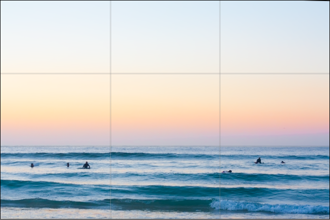
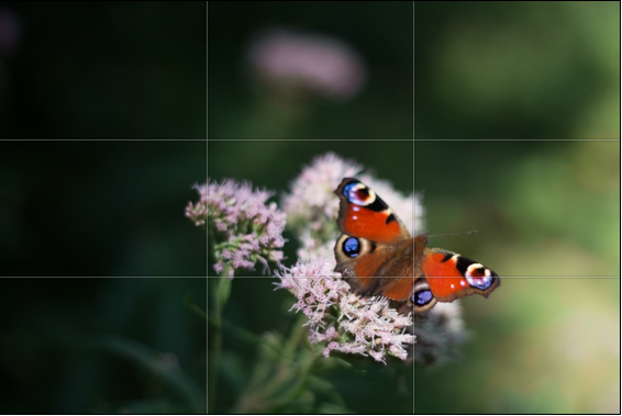
One of the oldest rules in of composition is known as the rule of thirds. It’s easiest to understand if you imagine a grid across your picture, splitting it into nine equal rectangles.
Basically, the rule says that placing your subject(s) on any of these lines will make for a better composition. Let’s look at some examples of the rule of thirds to help explain it:

The rule of thirds applies to landscapes...

...and to portraits
Roughly speaking, the horizon is placed on the bottom of the two horizontal lines (although it also works on the top) and lined up the subject with one of the verticals. You can also place extra emphasis on focal points of the picture by positioning them where the lines cross, such as the girl’s face in the second photo.
Maybe try imagining these lines next time you look through the viewfinder, and adjust your shot to see if it works better. It doesn’t have to be exact!
Almost the polar opposite of the rule of thirds, symmetry can change a photo from ordinary to extraordinary, especially when used in unexpected ways. Using symmetry in portraiture can be very unsettling, but also very effective! To get perfect symmetry in your photos, it’s probably easiest to use a tripod to frame the picture exactly as you want it to appear (and remember, a little ‘cheating’ in image editing software can also help you along the way).

Sharp Symmetry, by Scintt

Place of Contemplation, by Martin Gommel
Leading lines are exactly what they sound like – they cut through the image, drawing your eye down them and into the picture. These are often used in landscape and architectural photography, and a favourite technique for photos of roads and railings. Often used to great effect when leading to a vanishing point, and frequently combined with symmetry, this can also have very dramatic results. Again, a tripod will help give you set up your shot for the composition you want.

Airport Symmetry, by Doris Hausen
Vanishing Point, by Luigi Caterino
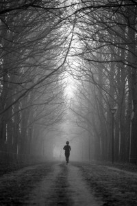
I’ve only scraped the surface of the different techniques used by photographers to give their pictures the composition they want. Try using elements in the composition to frame the subject (such as the trees in the picture with the runner), and maybe try different techniques on the same picture – it might be the easiest way to find the one that works.
The theory behind what makes a ‘good picture’ can certainly be off-putting for many. After all, isn’t a good photo about how it makes you feel rather than how perfect it is? Possibly. But understanding conventions helps us decide when to follow them, but also when to break them for dramatic effect. So go experiment with unusual crops, dead-centre subjects and skewed horizons – you might just discover something amazing!
All photos used in this article are used according to Creative Commons licences. If you have strong reservations against your photos appearing on Small Aperture, please contact us, and we’ll get them taken down. Please support the artists creating these photos by clicking on the photos to take a closer look at their work!
I spend a lot of time giving feedback on photos. One of the comments that pops up again and again is that I’ll feel as if an image is framed awkwardly.
Some times, I’ll find that an image is nigh-on perfect, but it fails to make the mark because it’s difficult to understand the motivation of the photographer: What are they trying to achieve with this photo?
It’s true for all photography, of course, but it’s more complicated with portraiture, as it isn’t necessarily very intuitive. How, after all, can you connect a story to the way a portrait is framed?
This is not a tutorial. Hell, it isn’t even much of a rant. Just some thoughts. Use of it what you will, and ignore (with great prejudice and much glee) everything you deem to be complete and utter bollocks. There will probably be some of both.
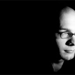
In this image (of myself. because I’m too lazy to dig through my backlog of umpteen million photos to find another one), the subject is dead centre in the image. The quality of the photo itself is unimpressive, and the lighting needs work, but that’s beside the point – we’re talking about framing here.

Framed dead centre. Not very attractive. Nor is the framing.
In this image, the vast blackness on both sides of my ugly mug means that I’m surrounded by… something. But we can’t see it If I had a fear-struck look on my face, instead of looking smug, this composition may have helped to hint at something I was afraid of. perhaps something lurking in the shadows. But I’m looking vaguely content, so that doesn’t make any sense. In fact, the image has very little impact at all.

Cropped so I am looking 'into' the frame.
For my next book, I'll probably use something like this as my author photo. Because I've come a long way as a portrait photographer since my 'steeped in blackness' mysterious stranger days. (clicky for bigger)
So instead. it is recropped like this. Suddenly. I’m looking across a vast nothingness. Into… into what? I’m looking at something just outside the frame, lire image doesn’t hint at movement, nor does it show any particular emotion, so whatever is off frame isn’t engaging me.
Perhaps I’m watching television. Or I may just be at ease with myself. Due to the framing, the image has very little tension, and serves only to show off my face – great for the jacket-cover of that book I wrote, perhaps (Lo and behold, this is actually the photo I ended up using in my macro book.
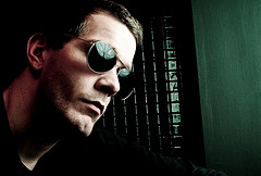
This image is vaguely better than the one above. because it has some purpose. It draws the eyes the left, but simultaneously leaves you wondering what it is I’m looking at – And why it is so far away from me.

Well will you look at that, miss moneypenny! This time, I'm on the right of the picture! It's pure unadulterated magic. MAGIC, I TELL YOU!
In this image, suddenly something else happens. I’m closer to the edge. Closer to action. Am I about to move towards the light? Am I dead, moving towards the light? At the very least, I appear more curious. And I’ve left a wasteland of darkness behind me. Or perhaps I’m just the first one to step out of the shadows?
This image has the sense of movement, somehow – a dynamic property, which wasn’t there in the previous image – even though the only difference is a net of black pixels.
Well, the main message, I suppose, is test it out, and keep the rule of thirds in the back of your mind.
Take an image, crop it in different ways. See how it impacts the photo, and see if it becomes more interesting. Think about what message you are trying to convey, and see if the image is actually supporting that message. If it is: Great! flit isn’t, perhaps a re-crop, or even a re-shoot would solve the problem.
Do you enjoy a smattering of random photography links? Well, squire, I welcome thee to join me on Twitter - Follow @Photocritic
© Kamps Consulting Ltd. This article is licenced for use on Pixiq only. Please do not reproduce wholly or in part without a license. More info.