Model releases are important, but they aren't always necessary. We explain the whys and wherefores.

When you hear the term 'high-res' thrown about with such abandon when it comes to images for web use, have you ever stopped to think just how big or how high quality and image meant for the web needs to be?
There's an assumption that high-contrast images are more dynamic, more compelling, more inviting. Have a go at some low-contrast photography. You might surprise yourself with the results.
Balance doesn't mean symmetry; it means an internal consistency and tension within your photos. And it's a vital element of composition.
Great photos might be down to a little bit of luck, but most of that 'luck' you make yourself. Don't believe us? Read on...
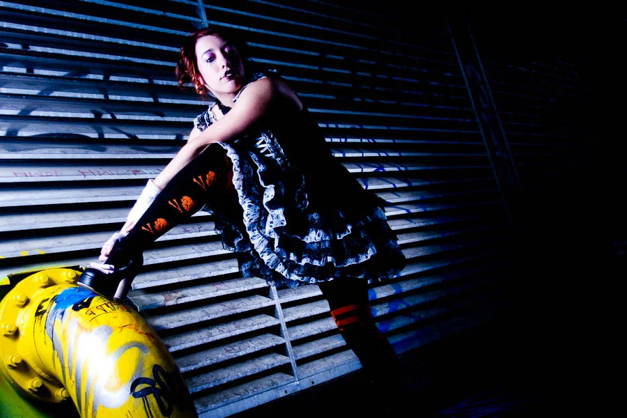
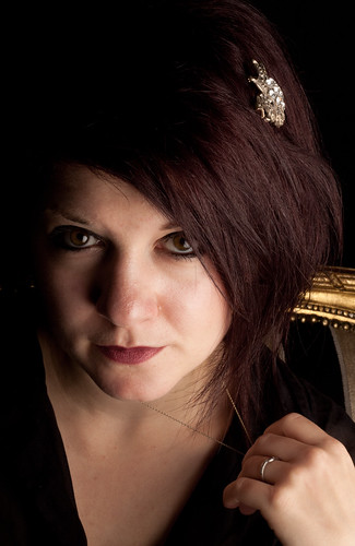
Have you ever had someone take a photo of you and a friend, only to find out later that they cut off the tops of your heads? It looks ridiculous, and if someone’s head 'sticks out' of the composition, your photo is ruined. In other words, it’s not hard to imagine where the don’t-crop-people’s-heads rule came from. When you are working with people and portraits you will soon learn that there are good ways to crop people, and others that are not so good. Cropping heads is at the top of the naughty list. Don’t do it!
Except that, sometimes, cropping heads can be highly effective.
When can you break this rule-of-rules? When you've got in close—really close—to your subject. If your composition is focused only on somebody’s face, it can improve the shot to crop in close.
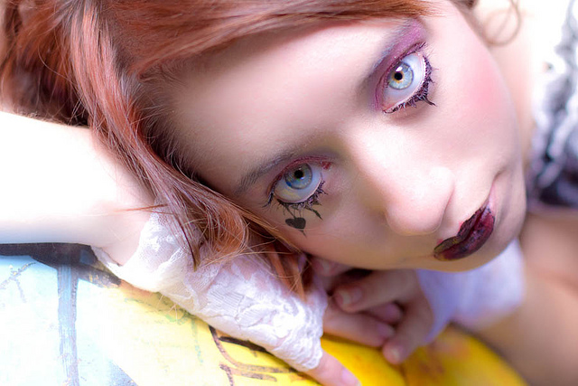
Don't be afraid to break the rule and crop in close and slice something off of the top, bottom, or sides of the head when the features of the face are the focal point of your composition. The reasoning is this: if you’re going to get in close, get in really close. By filling the frame completely with someone’s face it can make cropping her or his head unavoidable, but it also doesn’t look unnatural.
The key is to decide whether your composition is mainly about the body, upper body (shoulders and above), head, or just the face. Each type of shot has a different purpose, and only the face shots will look natural if you decide to crop the head. Otherwise it merely looks like you failed to plan your shot.
But in-keeping with the adage that if you're going to break the rules, break them properly, if you are going to crop into somebody’s head, make sure that you do it properly. A composition where only a thin sliver of someone’s head is cut off looks accidental. If you go even closer and cut them off across their forehead, the composition looks a lot more powerful, and at least nobody is left wondering whether or not you did it by accident!
Be bold!
 More unusual ways of looking at things, remembering rules, and then breaking those rules, are in my lovely book, The Rules of Photography and When to Break Them. It's available as an e-book and in a dead tree version (UK, US).
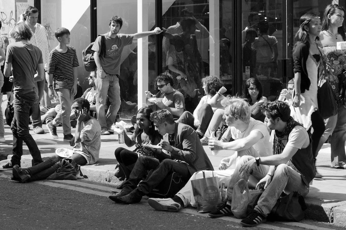
It is a truth universally acknowledged that landscape format pictures work more successfully in articles than their portrait format counterparts.
When I'm offering feedback on the assignments submitted by our Photography School students, one of my most frequent questions is 'Did you think about framing this vertically?' Or at least, something along those lines. Human vision is binocular, meaning that we have two eyes that happen to be positioned adjacent to rather than on top of each other. We are, therefore, predisposed to scanning things along a horizontal plane rather than a vertical one. It’s no surprise then that we’re more inclined to capture horizontally oriented pictures. The vast majority of cameras have been designed around this fact, thus have a default horizontal orientation and it's just about uncomfortable enough to rotate it that we sometimes overlook doing so.
We shouldn't be so hasty.
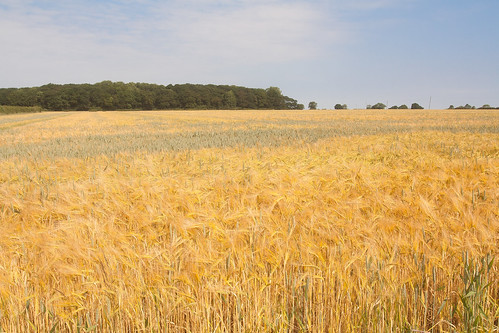
The long and the short of it (ahem) is that the majority of subjects that are wider than they are longer will benefit from being photographed in landscape format. You'd have to be standing an awfully long way back to fit all of the Schonbrunn Palace into a portrait format picture. Most of the time, the horizon in a landscape photo will demand to take up as much space as possible, stretching across the frame. Typically, there's more to see when you scan left-to-right than there is up-to-down. But not always.
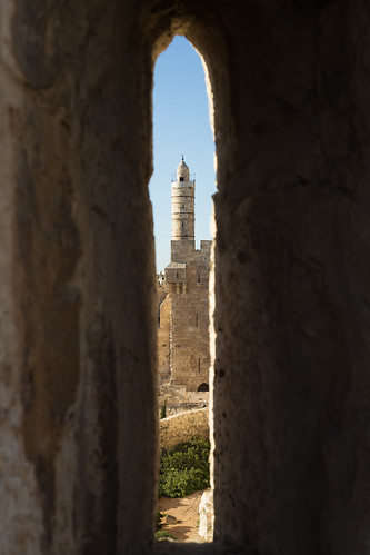
It's hardly an accident that vertically oriented pictures are referred to as 'portraits'. Any subject that is taller than it is wider—people, trees, skyscrapers, doorways, bottles—will suit a portrait shot.
It's hardly a co-incidence that portraits are called portraits.
It's a case of letting the natural lines in the image dictate how it's framed. Don't be afraid to swing your camera through 90° and give it a go.
The entire point of this image is the vertical. Why would I shoot it horitonzally? Let the subject dictate the line.
If you stop to think about it, the majority of the time it will feel obvious whether you should be framing your subject horizontally or vertically. There will be a natural line and flow to your composition. Sometimes, however, you might be presented with a compositional dilemma or you might want to spread your creative wings.
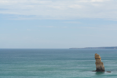
The Lonely Apostle might be a vertical feature, but it's the landscape that gives it context and the horizontal framing emphasises that.
For example, you might have a landscape that features a mountain range running off into the distance—a horizontal motivation—but with tall trees in the foreground that would enjoy the vertical emphasis of a portrait framing. Which do you go for? What you have to decide is which element do you want to be the dominant one and therefore be emphasised by your framing. There's not necessarily a right or wrong here; it's about ensuring the subject and the framing complement each other.
But portraits don't always have to be oriented vertically. A landscape format can look fabulous.
If you've time, shoot both. You've nothing to lose.
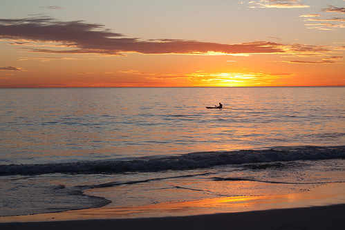
The traditional landscape format works perfectly for this sunset seascape...
It is worth trying something new and different, though, to challenge your thought processes and expectations. You don't need to be wasteful and practise obscure compositions for their own sake, but it is always worth moving and rotating and shifting and changing. Don't feel constrained by what is expected, work to produce an image that tells a story.

... but take nothing away from the vertical version.
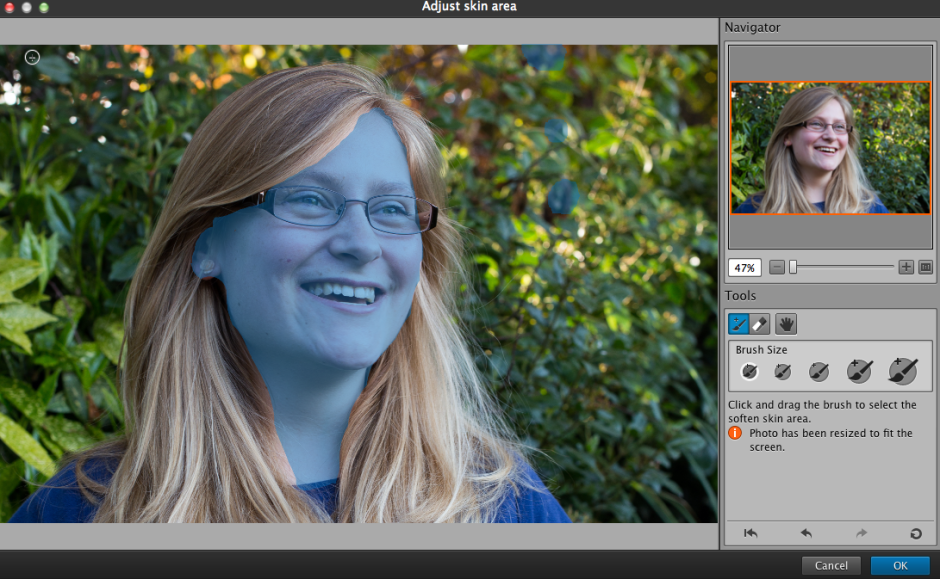
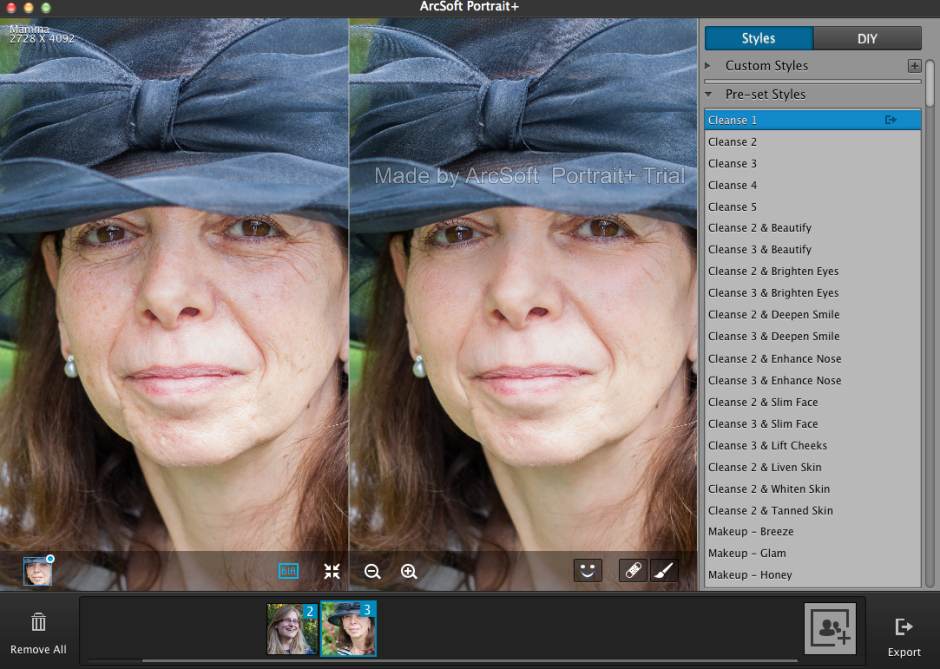
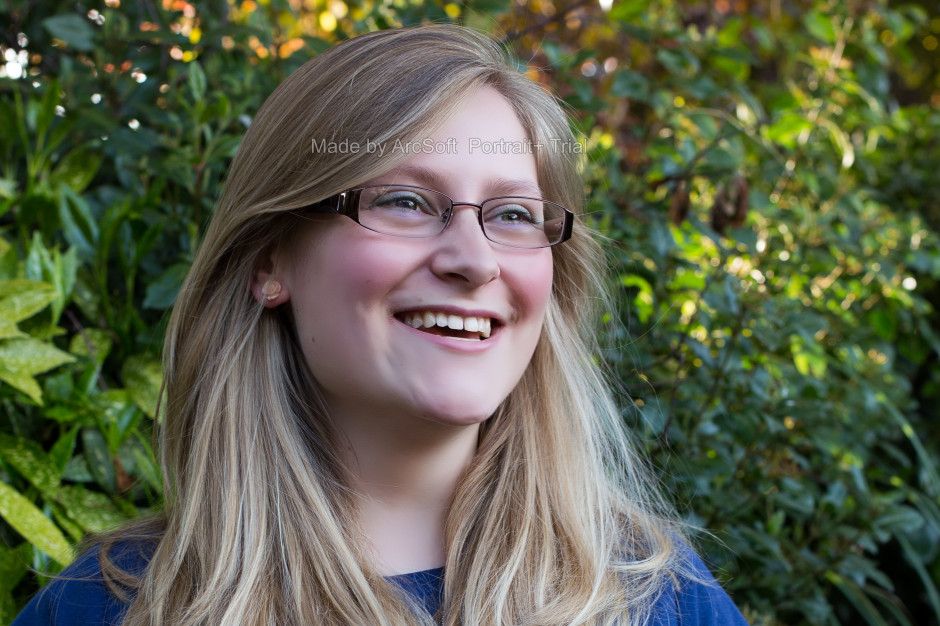
ArcSoft got in touch with me to ask if I would like to review their Portrait+ editing package. It's an automated portrait editing programme that detects upto 20 faces in any photo and allows you to apply 28 preset functions to your subjects, to apply more specific 'DIY' actions, including eye brightness, smile depth, and skin quality, and to create your own presets from these specific actions if you want. You can even apply makeup. Once you've loaded up Portrait+ you import an image, wait for the programme to detect the face, and then get to work. Unless the face is perfectly square-on in the frame, the software can have a few problems pin-pointing features, so it pays to look at where it thinks the key points are and adjust them as necessary.
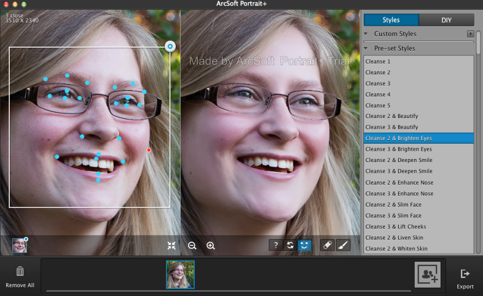
It also cannot identify faces that are in profile or at awkward angles. For these, there is no way of manually identifying the features, which means that they can't be treated in Portrait+. You can also ensure that all of the skin area is covered for adjustment, and you can paint in or paint out areas that the programme doesn't quite catch.
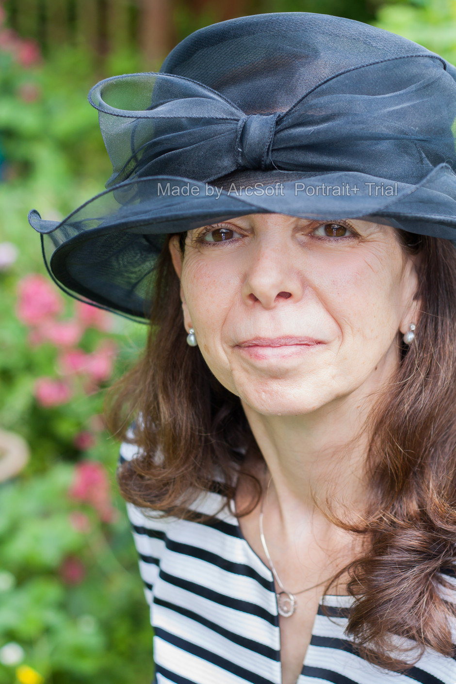
The first photo ran through Portrait+ was one of my mother. I was pleased with the effect of the very lightest touch (Cleanse 1) to her face, but anything above that felt excessive and unnatural. It was easy for her to slip from being elegant to plastic. This was especially true of any of the makeup packages. I'm also not the sort of person to go in for face-slimming or nose-enhancement. If you need to make use of these functions, however, they are there and you can apply them either as a part of a preset (for example, Cleanse 3 and Deepen Smile) or as a DIY action, which allows you to decide how deep you want to make the smile and then pair it with Cleanse 1 if you prefer.
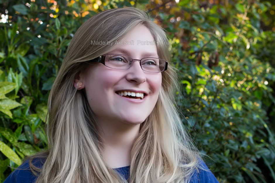
A photo of my cousin was more tolerant of the more extreme preset adjustments, but it was still all too easy to push things too far and leave her looking like a Barbie doll than a living, breathing, producer of theatrical shows.
It's easy to fix spots, marks, and aberrations in skin tone with the blemish removal tool, and it works well in combination with the lighter touch presets. This is where I think Portrait+ is at its most successful. Use it to remove circles from around the eyes, fix any obvious blemishes, and gently even out skin tones, and you can produce an improved but still natural looking portrait.
While I find that some of the effects are far too extreme for my tastes and I'm not the kind of person to go in for face slimming and cheek lifting, it is an easy way to take a portrait and clean it up. The 'Remove Circles' function is a very easy fix for tired looking eyes that enhances someone's appearance without looking false. Unfortunately, I don't think that I can justify $150 for a bit of eye improvement alone.
If you take a lot of portraits, and you need a standardised and easy editing programme, you could well find Portrait+ a valuable asset in your arsenal. However, if you take a lot of portraits that involve profiles or slightly obscured faces, the inability of Portrait+ to detect them won't make it useful for you. And of course, if you prefer to keep a tight reign on your edits and make precise adjustments, it won't fulfil your needs either. It's too much of a broad brush product. The good thing is that you trial it for free and decide if Potrait+ will meet your needs, or not. Should you decide it is for you, here's a 45% discount coupon for you, too. Use the code Portrait45.
Portrait+ 3.0 is available for Windows systems, and offers even more functionality than the Mac version that I tested. That should be ready soon, though.
I had just opened up a new compose window to write my review of this year's Taylor Wessing Portrait Prize exhibition (in short: uninspiring and hackneyed) when someone sent me a link to this BBC article. Suddenly, my lamentation of a rather bland competition exhibition took on a new complexion. This year's Taylor Wessing Portrait Prize was won by Spencer Murphy for his photo of mud-spattered jockey Katie Walsh at Kempton Park racecourse. When I first saw it, I felt quite non-plussed by the image; it didn't seem to convey any of the energy or determination that I know fires jockeys. They're steely people, but they're driven by adrenaline. Even when they're exhausted, they still buzz. If you can convince one to sit still, or you can capture one in motion, jockeys are great subjects. It was an image that I knew I should have loved but I didn't; somehow it fell short.
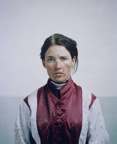
Murphy said that he wanted Walsh's portrait to convey 'both her femininity and the toughness of spirit she requires to compete against the best riders in one of the most demanding disciplines in horse racing.' National Hunt jockeys are extraordinarily tough and to portray this along with Walsh's feminity would have made for a glittering image. My interpretation of the portrait, though, was that Walsh appeared nothing more than miserable. It was a lovely picture and there is a gorgeous depth to it that Murphy had hoped to achieve by using a medium format camera, but I wasn't convinced by its characterisation. Now, I'm wondering if one line in that BBC article explains it. Walsh hadn't ridden at Kempton the day the photograph was taken. It's made to look as if she's just unsaddled and weighed-in, but that doesn't seem to be the case. 'Spencer Murphy took the shot of jump jockey Walsh at Kempton Park, although she had not raced there that day.'
So is the mud, the rosy cheeks, and the skid-lid hair nothing more than a contrivance? My friend who sent me the link to the BBC article felt very strongly that Murphy should not have been awarded the £12,000 prize. I don't want to put words into his mouth, but I was under the impression that he felt in some way deceived by the image. It wasn't telling the story that it purported to tell. A portrait of a jockey in silks is one thing; but a portrait of a jockey in mud-spattered silks that makes it look as if they've just ridden a driving finish on soft ground, when they haven't, is another.
This is potentially problematic for a major prize, depending on what's expected by the judges. Should the judges want nothing more than a beautiful image that tells a story, it might not matter how it's achieved. If the photograph is meant to be telling the subject's story, we might be venturing into more difficult territory with respect to portraiture and prizes when an image has been staged. I don't wish to state if Murphy's photo should be eligible or ineligible for the prize: I'm insufficiently familar with the competition's rules to make that judgement. But having seen the portrait of Walsh in the flesh and not been especially moved by it, I think that it might be more problematic for the art of portraiture.
When I was wandering around the exhibition this morning with Gareth, we commented on how many of the photos' subjects felt more akin to puppets in the thrall of the photographer, rather than as people being photographed. When you looked at these images, it felt as if they were lacking a crucial element, a certain something that was able to elevate them from being 'a picture of a person' to being a portrait. Portraiture is about capturing spirit. It's about distilling the essence of an individual into pictorial form. When a photograph moves away from capturing someone's spirit to something more manipulated by the photographer, is it still a portrait? Perhaps I set too much stall in the notion that a portrait isn't just a photograph that happens to have a person as its subject. I believe that it's meant to be more than that.
Photos are meant to make you feel something; a portrait needs to leave you feeling what the subject feels, too. I'm left wondering if it were the contrivance behind Murphy's portrait of Walsh that left me feeling hollow.
If you'd like to explore the exhibition for yourself and decide if I'm being nothing more than a cynical and overly-pricipled misery, it runs until 9 February 2014 at the National Portrait Gallery, London.
The chances are that you've heard of the golden hour (or magic hour, it's sometimes known as that, too), and you know that photos taken during this magical time slot are blessed with a sizzling, glowing quality that gives them a spectacular edge. But when exactly is it? And what makes it so special? This week's Photography Fundamentals is here to explain all!

First up, golden hour can last between 45 and 90 minutes, and it happens twice day, around sunrise and sunset. The closer that you are to the equator, the shorter the period it lasts. Yes, it does mean that at the Poles, at certain times of the year, the Golden Hour can last nearly all day, too. I suppose that the 'Golden 90 minutes to three hours, or sometimes even all day' doesn't sound quite so catchy, does it?
When the sun appears to be closest to the horizon, its lightwaves have to travel further than when they're overhead, as happens during the middle of the day. This softens and diffuses them, as they bounce around more and don't hit their subjects directly. You're left with gorgeous soft lighting, gentle, long shadows, and less chance of over-exposing your highlights.
Golden Hour light is typically much warmer in hue, too. The blue light waves are scattered further, leaving your subjects to pick up more of the red and orange tones, and bask in their warmth.

All of this means that just about any type of photography you can accomplish outdoors will benefit from the Golden Hour: portraits, landscapes, architectural, and street.
Portraits will take on gorgeous, even skin tones and there won't be any harsh shadows appearing beneath your subjects' eyes and nose, which is never really an attractive look, I'm sure that you'll agree.

Landscapes sizzle with soft light, unusual shadows, and saturated colours.
Buildings look as if they're glowing during the Golden Hour, especially stone ones. It appears that rather than reflect harsh midday light, they absorb the softer early morning or late afternoon rays.

You won't benefit from just the glowing stone of the Leaning Tower of Pisa if you capture it early in the morning, you'll avoid the crowds, too.
And somehow, during the Golden Hour, even the most insalubrious of streets can appear a touch more charming than they really are, whilst anyone or anything in them will be flattered by the sun's golden tones.
To help you go forth a shoot beautiful, radiant images, there's even a handy golden hour calculator.
Focal length << Photography Fundamentals >> Histogram