


Don't feel constrained by one of the best known rules in photography. If you've a clear idea of where your subject needs to be in the frame, go ahead and place it there!

When you hear the term 'high-res' thrown about with such abandon when it comes to images for web use, have you ever stopped to think just how big or how high quality and image meant for the web needs to be?
There's an assumption that high-contrast images are more dynamic, more compelling, more inviting. Have a go at some low-contrast photography. You might surprise yourself with the results.
Balance doesn't mean symmetry; it means an internal consistency and tension within your photos. And it's a vital element of composition.
Great photos might be down to a little bit of luck, but most of that 'luck' you make yourself. Don't believe us? Read on...
One of the first compositional rules that we learn is the rule of thirds. It's relatively simple but definitely effective: divide the frame into three, horizontally and vertically, and use the divisions to place your subject. But rules are made to be broken—once you understand them properly, that is—or at least adapted and challenged. If you're looking to leave behind the rule of thirds but still want place your faith in geometrically validated subject-placement, try the golden triangle.
Draw an imaginary diagonal line across your frame. Now draw imaginary lines from the other two corners, which each meet the long line at right angles. It should look something like this:

Your points-of-interest are where the lines meet. Use them to place your focal point, for example the eyes in portraits, and use the lines to divide your frame and draw the eye to the focal point to help create dynamic images.
On a mundane and practical level, it's easier for some people to visualise the triangle than it is the rule of thirds. Moving towards a more creative purpose, by using triangles to compose your frame you're introducing a strong compositional shape to it with a great sense of balance pitted against a precarious point. And triangles have a nifty way of retaining the attention of the eye within the frame: the eye moves from one point to another in a continuous loop.
[gallery ids="6953,6954,6955"]
Quite specifically with the golden triangle, you give yourself a means of dividing the frame in a way that is frequently more pleasing to the eye than a horizontal or vertical split. As well as using the lines to draw the eye to focal points, the use of triangles in the frame brings balance to the image. Think of one half as blue and the other as yellow. Or shadow versus light.

By counter-poising the two points-of-interest against each other, you can enhance the sense of balance in the frame. You get dynamism and balance in one go: brilliant.

It's all very well knowing the theory - what about the practice? Try portraits with your subject leaning into the frame and the eyes on a point-of-interest. Use the rule to place bridges in your frame, and have the eye travel along them to a focal point. Just give it a try - you never know!

This week's Photography Fundamentals column digs into composition, and one of the most-cited 'rules' of the discipline: the rule of thirds. Even if you don't know what it is, you've probably heard of it. We are, therefore, here to explain what it is and why it's useful. And then when you understand the rule and you know how to implement it, you can go ahead and break it properly. We have a natural tendency to place our subjects in the centre of the frame. It makes sense, logically, to have our point of focus right in the middle, being gloried by its surroundings and utterly unavoidable to the eye. Except that centred subjects don’t really make for very interesting images. There’s an unmistakable flat and dull quality to them. Compare this:

With this:

Next time you’re watching a film or TV, notice where the heads and the eyes of the people doing the talking are. I’ll bet they’re not in the centre of the frame.
Instead, they’ll be positioned slightly to one side. They’ll probably be making use of what’s called the rule of thirds.
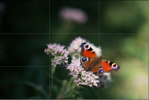
Imagine that your frame is divided by four lines: two running horizontally and two vertically. They are equally spaced and split the frame into nine smaller rectangles. The points at which the four lines intersect create four ‘points of interest’. This grid is your guide for composing an image.

Aim to position subjects that run upright through your image along one of the vertical tri-lines. Lines running across the image—especially skylines and horizons—should run along a horizontal tri-line. (Definitely not through the centre with a horizon.)
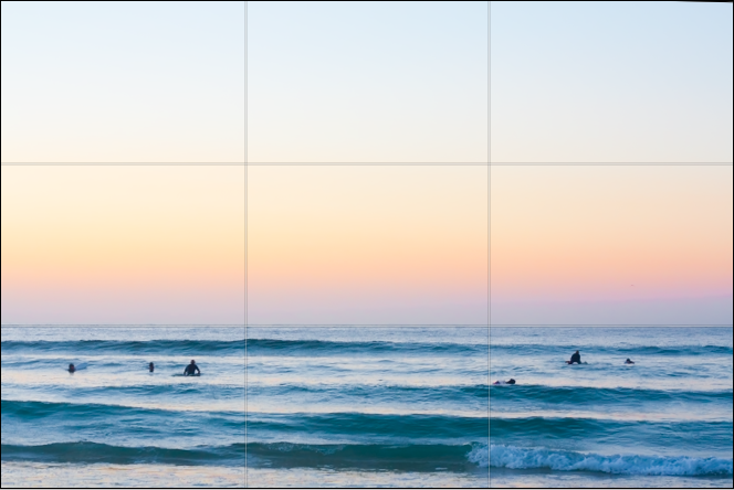
Aim to place anything that’s of particular significance to the composition, for example the eyes in a portrait and the sun in a sunset scene, on one of the points of interest.
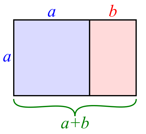
I often find that rather than using the rule of thirds to place my subjects, I have a natural predeliction for the Golden Rectangle. It's based on the mathematical princple of the Golden Ratio: an irrational number equal to approximately 1.618. It's also known as Phi (φ). If you want the technical explanation, it's
If you divide a line unevenly into two sections a (longer) and b (shorter), the ratio of these two sections will equal φ if a divided by b is equal to the sum of a plus b divided by a.
Yes. Ahem.
Rather than divide your frame using three equally spaced lines along each edge, as you would with the rule of thirds, you have two longer sections (a) either side of a shorter section (b). The ratio of the longer side to the shorter is the golden ratio.
It looks like this:
If you're using a square crop for any of your photos, you might find that the rule of thirds doesn't produce the sort of dynamic image that you're used to with a rectangular frame. That's because the eye tends to move around a square photo, rather than across it. For this reason, centred subjects often work effectively in square frames. Or try dividing the frame into triangles, and using those for balance.

Quality vs quantity << Photography Fundamentals >> Speed
There are many ways to learn photography - one of the easiest ways is to learn a set of 'rules' that work like a shortcut toward getting awesome photos. You'll have heard of a lot of them before; there's the Rule of Thirds, for example, the golden mean, or simpler rules, too: Such as "get your photos in focus" and all the rules-of-thumb to do with equivalent exposures etc.
Do you know of any other “rules” for photography? Which rules to you stick to most of the times, and what rules do you love to break for best effect? Leave a comment below!
![]()
There was speculation galore as to what exactly Apple would be revealing at its iPhone announcement yesterday. Whilst some people were disappointed that there was only an iPhone 4S and no iPhone 5 (come on people, it’s a phone, I don’t think that anyone needs to be disappointed by it), the camera spec and app development is a bit interesting. Here’s a quick run down of what Apple’s crammed into its glass and stainless steel body.
So that’s that. Did you know that it can make phone calls, too?
(More info from Apple, of course.)
Huzzah for improved functionality! When Apple updates iOS 4 to iOS 5 this autumn, gone will be the days of having to unlock your iPhone’s screen in order to snap a photo. Nope, no more fumbling, just use the volume-up button to release the shutter.
You’ll get grid lines, if you want them, for Rule of Thirds-alicious composition and by tapping the screen you can lock your focus and exposure on one subject. Then you’ll be able to crop, rotate, remove evil red-eye, and organise your images into albums using the new Photos app.
What with your photos being pushed directly from your iPhone to any other device via the fluffy new iCloud, it’s just a touch groovy.
 What is this? - In our NewsFlash section, we share interesting tidbits of news. Think of it as our extended twitter feed: When we find something that get our little hearts racing, we'll share it with you right here! Loving it? Great, we've got lots more News Flash articles - and, of course, we're still on Twitter as well, for even shorter news tidbits.

The internet is absolutely full of guides about things you should and shouldn’t do to take ‘good photos’. Don’t over-expose. Remember the rule of thirds. Don’t cut people’s heads off. Watch your background. Use a shallow DOF in portraits to throw the backgrounds out of focus. 3-point lighting for portraiture, etc.
A lot of us just take all these rules for given, as if they are hard-and-fast rules that you have to stick to, because if you don’t, you’ll fail as a photographer. Break these rules, and you won’t take a good photo in your life. Your cat will die, your children will hate you, and your significant other will divorce you.
Truth, as you might expect, is slightly different. Don’t get me wrong, most of the time the ‘rules’ (which in any case should be seen as mere guidelines) make a lot of sense. Of course it looks silly if you cut people’s heads off. Of course your photos won’t look conventional if they are harshly over- or under-exposed.

Grossly over-exposing a photo doesn't have to mean it won't look good. (click for bigger on Flickr)
Read the sentence above. That’s all I really wanted to say with this article. So if you’re in a rush, or you think I use too many words to say something simple, then read that sentence a few times, and go check out XKCD for a while.
What I’m trying to say is that while the guidelines are there to help you, there’s no point in following any rules or guidelines unless you fully understand (or grok, if you’re geeky and/or well-read enough to be familiar with that concept) why.
The best reason to understand why a rule is there, is to break it. Some times, you might find that your photos actually come out more interesting – better, even, perhaps – when you break the rules. Other times, you’ll try to take the same photo twice; once whilst following the rule, and once whilst breaking it, and you’ll realise why it’s a good idea.
Just remember: Never follow a rule just because you’ve read somewhere that it’s the ‘right’ thing to do. Follow it because you understand it, and because you know what happens when you don’t.

Contrary to popular belief, your foreground doesn't have to be in focus (clicky for bigger)

DO cut their heads off at the top if it makes for more interesting and intimate photos (click for bigger on Flickr)

The Carlsberg Express: Of course your horizon doesn't have to be straight, if a non-straight horizon gives you better results! (click for bigger on Flickr)

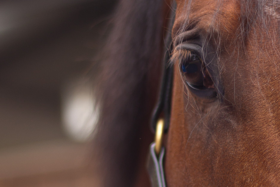
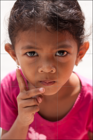
Sometimes, getting in closer makes a photo more intimate. Don't be afraid to crop into people's faces.

The horizontals aren't horizontal. The verticals aren't vertical. The background is a mess. How could this photo ever be any good? But it is... (click for bigger on Flickr)

White balance? Hah? I spit on your white balance. (click for bigger)

Some times, the background adds to a photo - don't throw it out of focus on principle just because you have a nice, fast lens.
Do you enjoy a smattering of random photography links? Well, squire, I welcome thee to join me on Twitter - Follow @Photocritic
© Kamps Consulting Ltd. This article is licenced for use on Pixiq only. Please do not reproduce wholly or in part without a license. More info.
