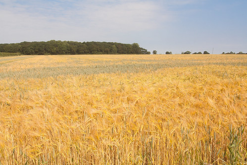
It is a truth universally acknowledged that landscape format pictures work more successfully in articles than their portrait format counterparts.
When I'm offering feedback on the assignments submitted by our Photography School students, one of my most frequent questions is 'Did you think about framing this vertically?' Or at least, something along those lines. Human vision is binocular, meaning that we have two eyes that happen to be positioned adjacent to rather than on top of each other. We are, therefore, predisposed to scanning things along a horizontal plane rather than a vertical one. It’s no surprise then that we’re more inclined to capture horizontally oriented pictures. The vast majority of cameras have been designed around this fact, thus have a default horizontal orientation and it's just about uncomfortable enough to rotate it that we sometimes overlook doing so.
We shouldn't be so hasty.
The case for horizontal
The long and the short of it (ahem) is that the majority of subjects that are wider than they are longer will benefit from being photographed in landscape format. You'd have to be standing an awfully long way back to fit all of the Schonbrunn Palace into a portrait format picture. Most of the time, the horizon in a landscape photo will demand to take up as much space as possible, stretching across the frame. Typically, there's more to see when you scan left-to-right than there is up-to-down. But not always.

The case for vertical
It's hardly an accident that vertically oriented pictures are referred to as 'portraits'. Any subject that is taller than it is wider—people, trees, skyscrapers, doorways, bottles—will suit a portrait shot.

It's hardly a co-incidence that portraits are called portraits.
It's a case of letting the natural lines in the image dictate how it's framed. Don't be afraid to swing your camera through 90° and give it a go.

The entire point of this image is the vertical. Why would I shoot it horitonzally? Let the subject dictate the line.
Creative choices
If you stop to think about it, the majority of the time it will feel obvious whether you should be framing your subject horizontally or vertically. There will be a natural line and flow to your composition. Sometimes, however, you might be presented with a compositional dilemma or you might want to spread your creative wings.

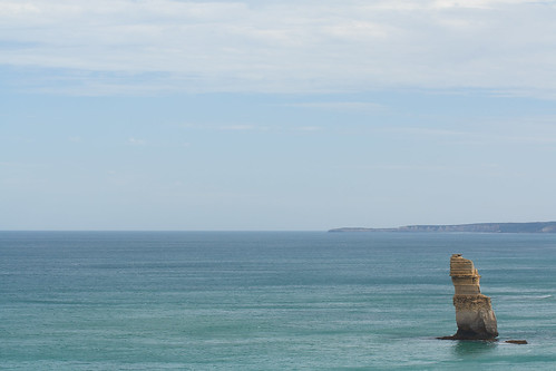
The Lonely Apostle might be a vertical feature, but it's the landscape that gives it context and the horizontal framing emphasises that.
For example, you might have a landscape that features a mountain range running off into the distance—a horizontal motivation—but with tall trees in the foreground that would enjoy the vertical emphasis of a portrait framing. Which do you go for? What you have to decide is which element do you want to be the dominant one and therefore be emphasised by your framing. There's not necessarily a right or wrong here; it's about ensuring the subject and the framing complement each other.

But portraits don't always have to be oriented vertically. A landscape format can look fabulous.
If you've time, shoot both. You've nothing to lose.

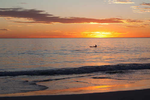
The traditional landscape format works perfectly for this sunset seascape...
It is worth trying something new and different, though, to challenge your thought processes and expectations. You don't need to be wasteful and practise obscure compositions for their own sake, but it is always worth moving and rotating and shifting and changing. Don't feel constrained by what is expected, work to produce an image that tells a story.

... but take nothing away from the vertical version.


