You've heard the term colour space, but what does it mean and what's its impact on your photos?

When you hear the term 'high-res' thrown about with such abandon when it comes to images for web use, have you ever stopped to think just how big or how high quality and image meant for the web needs to be?
There's an assumption that high-contrast images are more dynamic, more compelling, more inviting. Have a go at some low-contrast photography. You might surprise yourself with the results.
Balance doesn't mean symmetry; it means an internal consistency and tension within your photos. And it's a vital element of composition.
Great photos might be down to a little bit of luck, but most of that 'luck' you make yourself. Don't believe us? Read on...
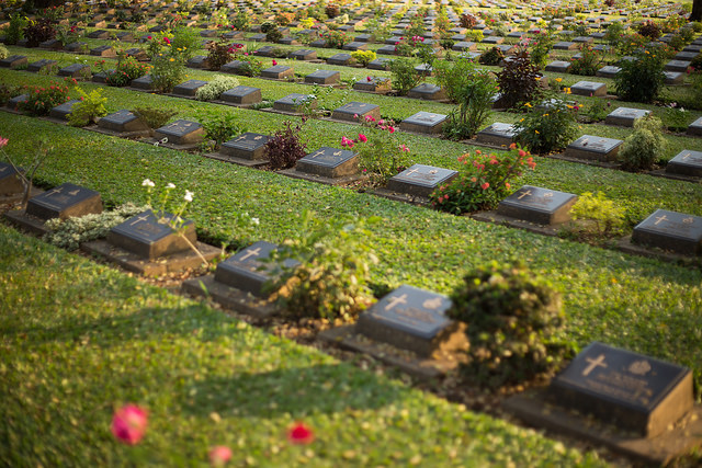
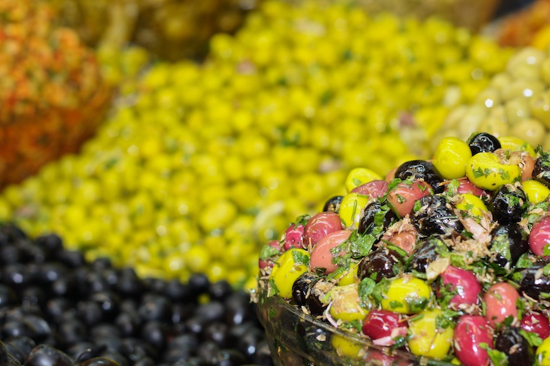
Pattern. Repetition. When you hear these words, what springs to mind? Maybe a print dress or possibly wallpaper for the former, and likely a sense of ennui for the latter? The words themselves do not necessarily evoke any sense of excitement or anticipation. The prospect of shepherd's pie for supper, every night, for the rest of your life is certainly not the kind of repetition that sets the mouth watering. But the senses are, actually, rather fond of both pattern and repetition. The ear appreciates rhyme, assonance, and alliteration. The eye favours rhythm, flow, and stability, too. By introducing them to your compositions, you have the opportunity to create appealing, compelling images.
The act of deliberately watching out for patterns to photograph might feel a little, or even a lot, contrived, but once you start you might find it a little difficult to stop. Patterns present themselves both organically and synthetically, from flower petals and fruit peels to tyre-treads and architectural work.
Get in close or shoot from far away; come down low or climb up high and you can pick out patterns wherever you are.
By isolating a pattern from its background, it's possible to imbue it with a sense of the infinite. With no evident beginning or end, for all the viewer knows the pattern extends interminably. Creating this sort of indefinite image is relatively easy: identify a pattern and get in close using either a telephoto or macro lens. By adjusting the aperture of your lens, you can choose a shallow depth of field with the pattern blurring into infinity, or one that's sharper across the frame.
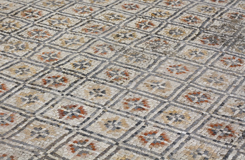
Spot a break in a pattern, make it the focus of your image, and you have a great photo. Look for the red apple in the pile of green, the solitary shoe facing in the wrong direction on the shoe stall at the market, or the silk scarf in the row of woollen ones. Wherever there is an aberrance in a flow, there is a photo.
If you've decided to fill your frame with a single colour, or variations on a particular colour, you might find that it's patterns that give the photo interest.
You'll often find that the constituent parts of the pattern create the compositional imperative for your photo: lines will point in a particular direction and dictate frame orientation or an aberration in a row will set a natural point of focus.
What you need to do is use these indicators to create tension and balance in the frame. Try setting the point of focus off-centre—think of the rule of thirds—and angling lines on the diagonal to prevent them from presenting as flat or confrontational.
Most important is to be certain of what you are trying to convey in your photo—from the feeling of the infinite, the odd one out, to the sense of consistency—to design the strongest image possible.
Remember: pattern and repetition does not have to be boring.

Earlier this week an infographic design agency, NeoMam Studios, sent us an infographic about 'smoasting' which they'd produced on behalf of print company Photobox. Once I'd got over the shock of awful elision of 'social media' and 'boast' to form the ghastly portmanteau word 'smoast', there was one particular statistic that caught my eye. Take a look at the infographic and guess which it was.
Despite the prevalence of Instagram, the host of editing features that are built into apps such as EyeEm, Facebook, and Twitter, and the plethora of free-to-download editing programmes, only 28% of photos are cropped or styled in some way? Wow! I am surprised. And it's something I think deserves remedying.
While Team Photocritic advocates getting as much right in-camera as possible—you'll certainly not be able to turn a sow's ear into a silk purse—we're not beyond a little post-processing, either. If it's good enough for Cecil Beaton and Horst, it's good enough for us, too. A snip here and a swipe there can elevate an ordinary image into something a bit more special.
This isn't about air-brushing away half of someone's thigh, but about making minor adjustments to three specific areas: the crop, the colour, and the contrast. Here at Photocritic we call them The Three Cs. They're not complicated and they'll make a world of difference.
However well composed you think your image is, it will almost certainly benefit from having a few pixels shaved off it. It might be a case of reinforcing the rule of thirds, removing a bit of unwanted background that crept into the frame, or getting a bit closer to your subject.

Being a purist, I tend to stick to traditional 4:3 or 3:2 ratios, but don’t feel limited by my prejudices. Select from any of the standard crops, from square to 16:9, or free-style it to adjust the crop any way you like.
At the same time as cropping, make sure to straighten your image, too. Unless you are deliberately tilting the frame for creative reasons, uprights should be upright and horizons should be level. When lines that are expected to be upright or level are wonky, it has an unpleasant impact on our sense of balance. By correcting wonky lines, you'll produce a stronger image.
Light has a temperature, and depending on the source of the light, or the time of day if it’s the sun, that temperature will vary. When the temperature varies, so does the colour of the light. As a general rule, we don’t notice the variation because our eyes cleverly adjust to the changes. Our cameras on the other hand aren’t quite so clever.

Have you ever noticed how white objects in your photos can show up with blue or yellow casts? That’s because the white balance in your photo was off.

It's a relatively easy correction to make using the 'Warmth' or 'White Balance' function in an editing programme. If you think the whites are looking a bit too blue (or if an image looks a little 'cold' over all), nudge the slider to the right. If the whites are too reddish in tone, or the photo looks a bit warm, slide it to the right. It's a case of trial and error to make the right adjustment, but the more that you practise it, the better you'll understand the shortcomings of your camera and how it reacts to different types of light.
Now if you want to intensify or tone down your colours, you can do so using the saturation slider. I don't recommend bumping up the saturation too much; it can result in a cartoon effect rather than a photo!
Contrast is the difference between the dark and light tones in your photos. Images shot on bright sunny days tend to have a lot of contrast, with dark shadows and bright highlights, but those taken in fog won’t have a great deal of tonal variation and will be low contrast. From time to time, you’ll want a low-contrast image, but, generally speaking, your photos can be improved by increasing the contrast a touch. It brings definition and depth to them.
Don’t go overboard, though, as too much of a good thing can turn bad. You’ll find that if you over-cook the contrast you’ll lose too much detail and end up with an ugly image. Subtlety beats brickbats.

If you use Snapseed to make your edits, it's worth getting to know the ambiance slider, too. I've often found that this is a preferable alternative to the contrast slider.
At this point, any other adjustments are gravy. I'm a fan of Snapseed's 'centre focus' options and often apply one of those. You might want to play with a tilt-shift effect. Or there's the waterfall of filters you can try in any programme, but you might find that you prefer your own edits to prefabricated filters, now.
Oh, and don't forget that it all starts with a decent photo, so check out our eight tips for better smartphone photos, too.
When you tell people that image processing and manipulation isn't anything new, but is just about as old as the art of photography itself, you can get some funny looks. Many of the processes that we carry out without a second thought were equally normal for analogue developers. Depending on how proficient you are with Photoshop, compositing might be faster today, but it's not new. Think of Man Ray and his image Le Violon d'Ingres. And beautifying subjects with the help of a brush was a far from alien practice for Cecil Beaton. Yes, really.
The difference is that now the ubiquity of editing suites means that techniques that were once the preserve of skilled darkroom practitioners are accessible to anyone with a computer. The degree of skill required to complete subtle, effective, and credible edits is still high, but the mystery has gone. Or rather, the mystery has assumed a new narrative as the dark arts of the darkroom remain under wraps.
To try to set some of that record straight, here's an extensive, but not necessarily exhaustive, list of the techniques that bridge the analogue and digital divide.
Have you noticed how the crop icon is a variation on a theme, in almost every editing package you encounter? That's because it's based on the tool that would be used to crop and resize images in the darkroom.
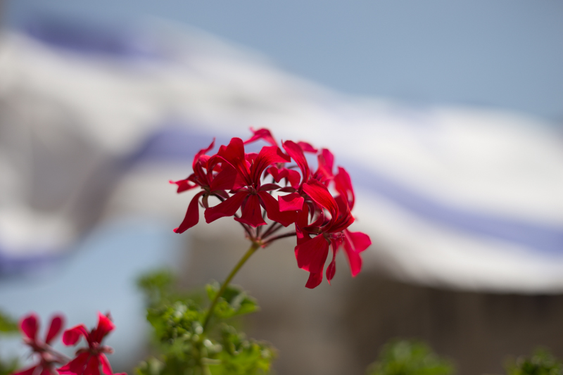
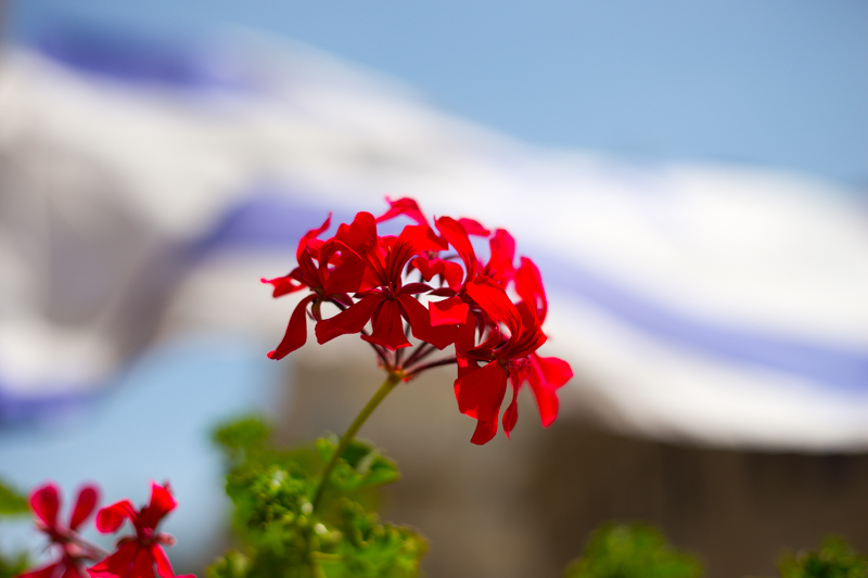
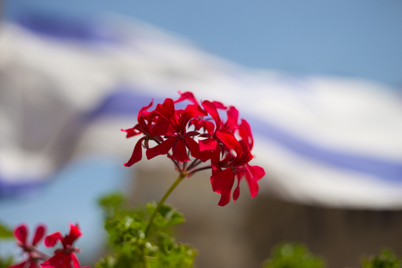
[gallery ids="6782,6783,6784"]
The brush icon is another familiar one, whether you're in Photoshop or Pixelmator or Aperture or GIMP. Brushes were used extensively in the darkroom, to define edges or enhance details, to hand colour, to spot correct, to complete just about any task for which you might now use a digital brush.

Haje has already written an article that explains why the dodge icon resembles a lollipop and the burn one a fist. Of course, they're techniques that were used in the darkroom to lighten or darken specific areas of an image as required. The dodging 'lollipop'—or piece of black paper on a stick—could protect the photographic paper from too much light during the development process, thereby keeping the areas in question lighter in the final image. The fist would be your hand, controlling how much light got through to darken areas of your photos.
Using red to distinguish masked from unmasked elements in an image wasn't an arbitrary choice by software engineers. That too is a hangover from darkroom days. Mask an area that you don't want developed with red, gel-like rubylith and the light won't be able to penetrate it in the darkroom, so it won't be exposed. If you've ever found yourself irritated when masking a complicated outline in Photoshop, imagine what it would be like doing it with a scalpel!
Yes, there's a reason why the sharpening tool in Photoshop is called the Unsharp Mask. Again, Haje has a comprehensive explanation here, but the short answer is that images were sharpened using a not-quite-sharp positive of the image to make a mask (an unsharp mask) combined with the negative. The blurriness of the positive image should work with the negative to create a sharper final image.
Maybe you use the split-toning feature in Lightroom to create cross-processed effects, or to give a golden-hour glow to your photos, or perhaps to correct the white balance in your images. But it was originally a darkroom technique that allowed different tones to be present in the highlights and shadows of an image. Split-toning was something of a dark art, relying on the interplay of different papers and different chemical toners deployed after the standard developing and fixing process to produce different colours in the final image. Getting the balance right with your sliders might be a frustrasting experience now, but I'm sure it beats fiddling with gold-, selenium-, and sodium-based chemicals!
It might be simple to adjust the contrast in your photos on a slider in a digital darkroom, but you had at least three ways of doing so in an analogue darkroom: with graded papers, with variable contrast paper, or with filters.
Unless you're shooting with a Leica Monochrom, you can choose between colour or black and white for any given photo now, switching back and forth between them as many times as you like in a non-destructive editing package. But in the early days of film it was black and white, maybe sepia, or perhaps the vagueries of split-toning, unless you opted to hand-colour your images. Love or hate selective colouring, for some people that was all that they could afford when hand colouring was a time-consuming art form. It isn't just a Photoshop abomination.
Finally, the much-maligned airbrush. It's not just a new-fangled phenomenon that magically reduces the size of an already-stick-thin model's thighs. The airbrush has been removing undesirables from images since at least Stalin's time and Cecil Beaton was famous for slimming his subjects.
I think you'll find, then, that there is very little that's new between the red light of the darkroom and the digital glow of Photoshop.
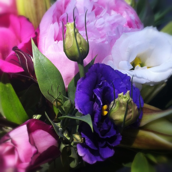
A few weeks back, we took a peruse around Lightroom's clarity slider, to see what it does to your photos and how you can get the best out of your photos by giving it a gentle nudge here and there. This week, it's the turn of the vibrance slider—clarity's bed-fellow—to come under the Photocritic microscope.
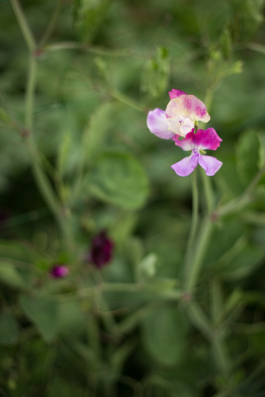
Much the same as the clarity slider has its most pronounced effect on the mid-tones of your images, the vibrance slider is also a 'smart slider' and applies its effects selectively. Rather than adjusting the contrast in the mid-tones, a la clarity, vibrance takes hold of the more muted tones in your photo and gives them some oompf. It's a selective saturation slider, if you will.
More often than not, vibrance will pick up on the blues and greens in a photo but go easier on the reds and oranges. This is great for bringing out the intensity of a sky or making a lawn look that bit more inviting while not letting your portrait subjects look as if they've been tangoed. I've heard some people refer to vibrance as being like 'fill light for colours'.


With the exception of the sweetpea, I've not been exactly subtle with either the vibrance or the saturation in any of my examples here, but that's to give you a clear illustration of the difference between them. Usually, I'd be far more reserved and I'm sure you would be, too. But at least you know what vibrance does now, and can begin using it to intensify your colours without feeling you've chucked a red wash over your photos.
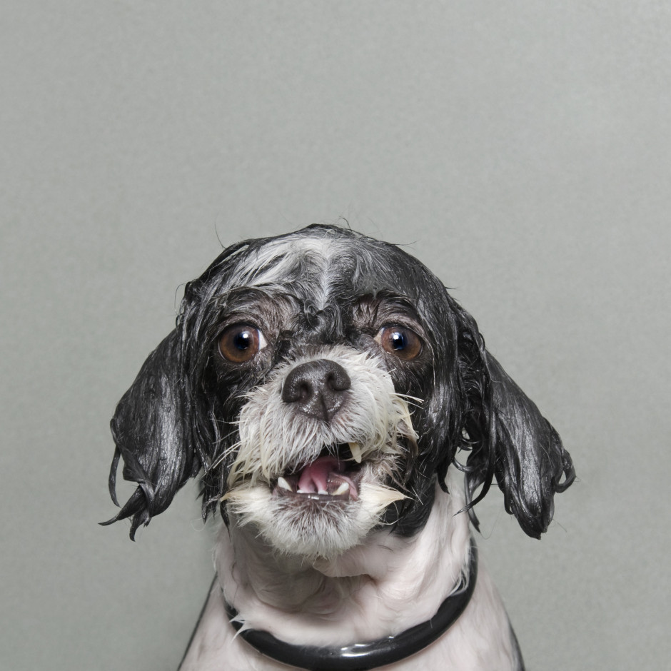
After my slightly disappointing press view of the Sony World Photography Awards exhibition, when I didn't have the opportunity to take in the photos, I made a return trip to Somerset House yesterday to rectify this situation. I had much more time to wander through both the East and West Wings, admiring the images and pontificating on the judges' choices. Visiting an exhibition that has cherry-picked from vast numbers of photos submitted from across the globe by both amateur and professional photographers gives you the chance to look for trends and fashions, garner some inspiration, and importantly, look through a window into other people's worlds. I enjoyed my saunter through the rooms and Sara Naomi Lewkowicz's l'Irs d'Or winning series Shane and Maggie stands out a mile. I loved Sophie Gamand's wet dogs, which won the portrait prize, Guy Martin's photos from the Gezi Square protests told a defiant story, and I was drawn to the deep and dark photos in Salvatore Di Gregorio's series An Old Fight, which won the sport prize.
What, though, were my overwhelming thoughts and questions as I left the exhibition?
The professional category was dominated by black and white images. That is a comment made as neither praise nor criticism, merely as an observation. It is worth noting, however, that l'Iris d'Or winning series comprised colour images and that the photos that have stuck with me are those shot in colour. Maybe it is because they were my preferred shots, or perhaps it is because their colour makes them stand out amongst the monochrome, but it does pay to be different.
Writing of daring to be different, I think I might've reached Indonesian cow-racing photo saturation point. It's a stunning spectacle that produces stunning images, but there have been examples in the professional or open categories for at least the last three years. It's almost as if their inclusion has become obligatory. I'd appreciate being able to gaze upon something new in future years.
Finally, I was surprised by the profusion of manipulated images in the open category. From HDR, to composites, to painterly-type blending, it had it all, and this extended beyond the 'Enhanced' division, which is devoted to manipulated images. As the author of a book on surreal photography, this might be regarded as an unusual comment, but it does present some important questions. First, how much manipulation is too much manipulation? Second, to what degree is photo-manipulation now regarded as an acceptable element of photography? And consequently, at which point does a comeptition become one of photo-manipulation rather than photography? All of these are questions for another day, but ones to ponder.
The exhibition runs until Sunday (18 May), and if you have to be in London or its environs, it's worth an hour or so to take it in. I'd love to know what you think.
Sony World Photography Awards exhibition, Somerset House, London, until 18 May 2014.
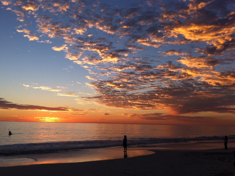
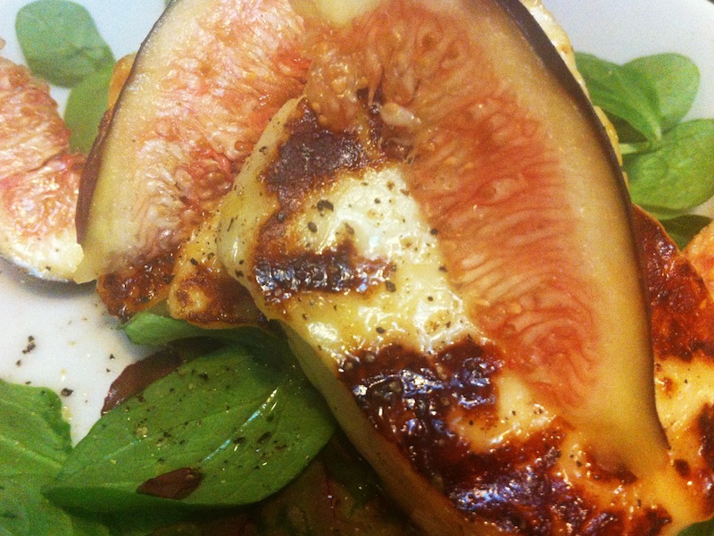
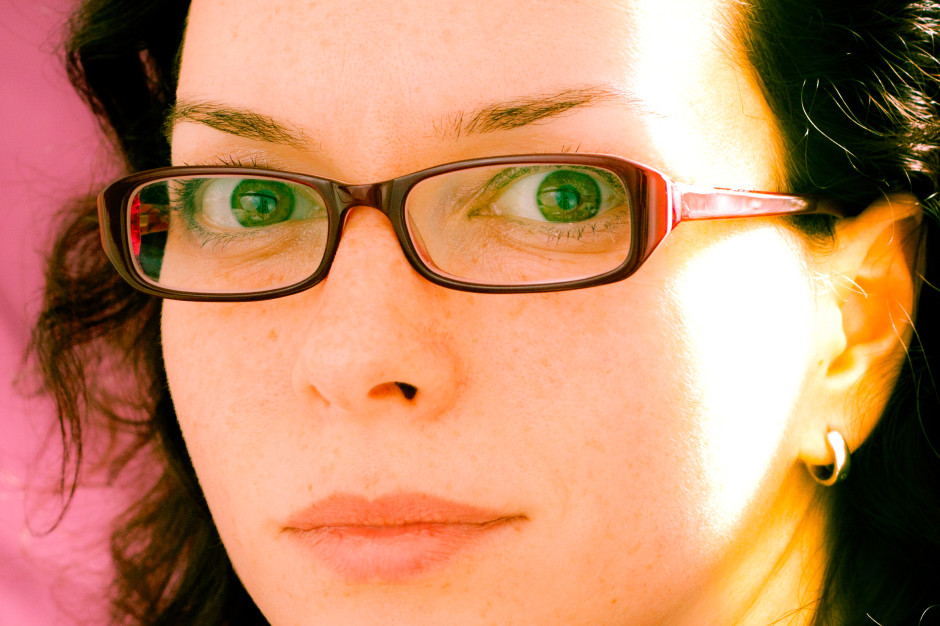
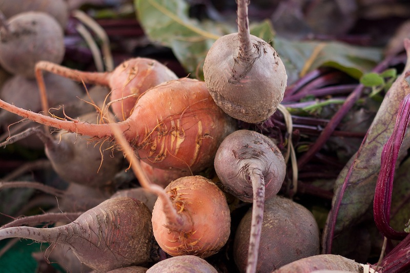
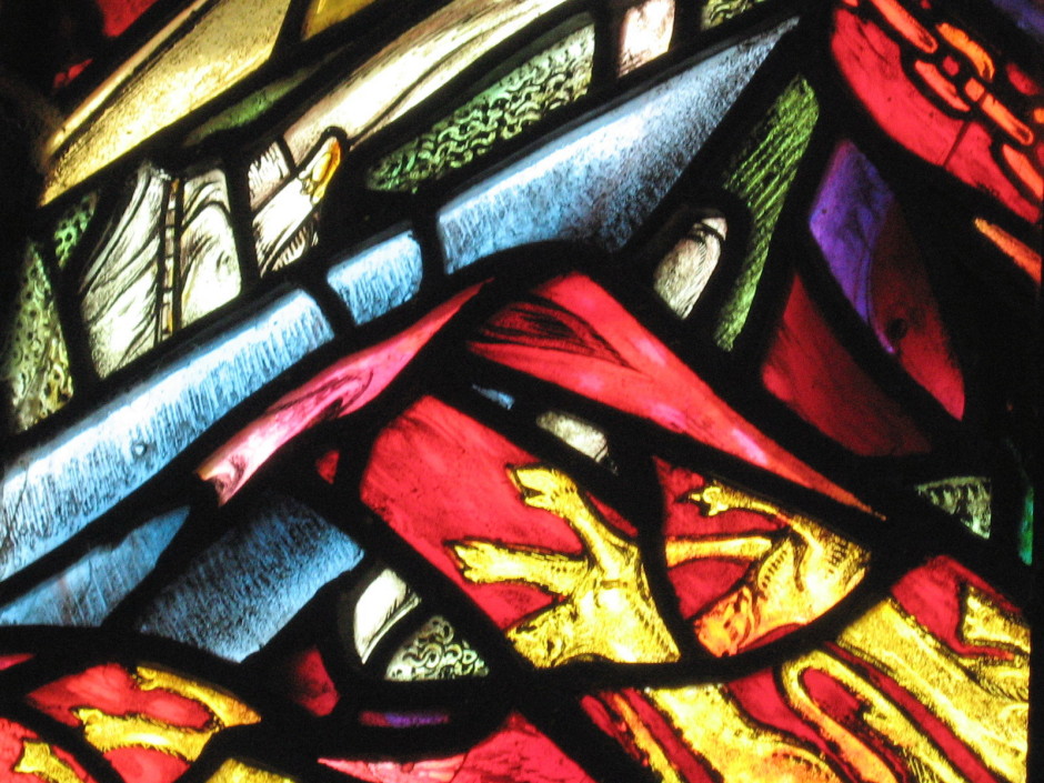
No, we don't mean black and white here. We mean all one colour. All red, all green, all yellow. All anything. Colour is one of the most powerful tools in your compositional arsenal and it can be easy to forget how striking images composed of all one colour can be; we get caught up in the idea of complementary colours and of our images having to contain enough to satisfy and intrigue their viewers. And monochromatic images can do that: the key is to have as many different varieties of one colour within an image so that it becomes an exercise in naming the different shades, tones, and tints of one hue. Colours are able to elicit strong emotions in people. It might sound terribly airy-fairy, but there are introverted—blues, greens, and some purples—colours that give a calm, even subdued feeling and there are extroverted colours, such as reds, oranges, and some yellows, that are positive and energetic. You can prompt particular responses from your audience by using particular colours in your photos.
Red is regarded as the 'strongest' colour; certainly, if you've a multi-colour image that contains just a speck of red, people's eyes will automatically be drawn to that red dot. But if you choose a monochromatic red image, be prepared for something that feels passionate, energetic, and vital. A strong colour will incite a strong response.
It shouldn't come as any great surprise that I have a particular fondness for orange: I'm Dutch. Daniela rather likes it, too, if how often she wears it is anything to go by. Hardly surprising, then, that we chose it as the Photocritic theme colour. There's something very inviting and reliable about it. Maybe that's because it's the colour of sunrise and sunset. You know it'll happen every day, and that you have the the chance the start over and then to put everything beind you.
Yellow is cheerful, optimistic, uplifting, vigorous: anything positive, really. And it's easy to grasp the association with the sun, with good weather, with the opposite of darkness.
It's spring here in the UK, and we're being presented with a riot of green. It is abundant, youthful, verdant, and symbolic of growth and renewal.
Ever since I can remember, my parents have painted their bedroom blue. They do it precisely because of blue's qualities: it's calming, contemplative, and restful.
You don't find that many purply tones in nature. Of course there are some, especially amongst flora, but it's rarity means that violet tends to have a mysterious and superstitious quality to it. The expense of dying fabric purple in Roman times (the dye came from murex shells) meant that it was reserved for only the highest echelons of power, which contributes to the regal and superior feeling purple has, too.
So, don't be afraid of the monochrome: embrace and experiment with it!
Colour: it's one of your most valuable compositional tools. But it's also something that we can take for granted, rather than actually considering the impact of colour in our photos. Different colours and their tones can influence how people will look at your images, so depending on what you want to achieve and how you want your viewers to respond, it's worth thinking about the colour palettes that you use in your photos.
So what can you do to enhance colours, to make them even more involved in the impact that your photos can have?
Lets start with the colour wheel, with its primary, secondary, and tertiary colours. How they interact forms the basis of colour theory, and great looking colour photos.
When we were at primary school, we were taught that the three primary colours were blue, red, and yellow. Or technically, cyan, magenta, and yellow. You can mix blue and yellow to achieve green; red with blue makes purple; yellow and red creates orange; and mix them all together and you get black. They're known as the subtractive primaries and they're used in print.

But there are three other primary colours, the additive primaries, which mix to form white. These are the 'digital' colours that are used in screens and sensors to create colours. They're blue, red, and green, and they form the 'RGB' colour wheel. There's a shock!
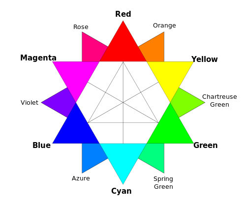
It doesn't matter which version of the colour wheel, with it primary colours you prefer, understanding it, and how the colours in it interact, will help you to produce gorgeous photos.
Combining different colours in your images can create a sense of balance or tension in them. The sense of balance that you get in a seaside picture usually comes from the contrast between the sea and sky blues and the golden-orangey sand.
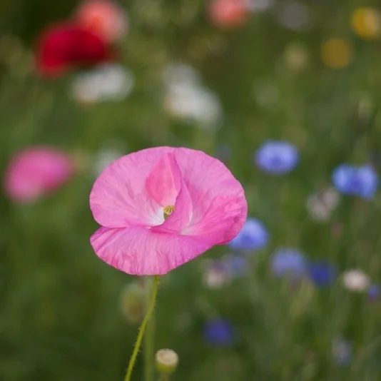
Ever wondered why a pink flower on a green background looks so stunning? It's because of the inter-play of the colours. Complementary colours, or those that sit opposite each other on a colour wheel, create well-balanced images.
If you're looking for a more harmonious image, focus on combining analogous colours, or those that sit adjacent to each other on the colour wheel. Done right, it isn't boring, but inviting.
Using lots of colours simultaneouly can be overwhelming: the eye doesn't know where to focus and the image descends into a confused mess. However, it doesn't mean to say that you can't take a photo with a riot of explosive colour.
If you get it right, and people know what they're looking at, they can be vibrant successes, rather than confused failures.
Don't forget that black and white can have an impact on colour properties, too. If you place a colour against a white background, that colour will lose some of its vibrancy and appear somehow muted and dull.
It's hardly surprising that the opposite effect happens with black backgrounds: colours become brighter and emboldened. This is useful to remember for portraiture, but vital if you ever dip your toes into product photography.
By muting your colours, or 'toning them down' you can lend a calm, subdued, or even a sombre feel to your photos. If you saturate the colours in your photos, and intensify them, you can make them feel more vibrant and alive.
You might want to be careful when it comes to saturation, though. Too much of it and you can leave your photos feeling unrealistic, almost cartoon-like. It might be the effect you're looking for every now and again, but probably not all the time. People with orange skin don't tend to look so great!
Finally, beware of red. Our eyes are drawn to it and even a tiny fleck of red in a scene can be a monumental distraction.
This is a guest post by Danny Groner, who is the manager of blogger partnerships and outreach at Shutterstock. Here in the northern hemisphere, autumn is upon us, which means that we've already started to see some of the red, orange, and yellow colours of the season crop up. Marketers and advertisers know how to appeal to our autumnal eye, sprinkling these bright colours everywhere possible. For photographers looking to cover the autumn season, that poses a challenge: How do you shoot these natural settings in new, innovative, and vibrant ways? Here are five suggestions for how to add some flavour to the autumn season:
Keep close to what is proven to work this time of year, but adapt your style to show these colours in another way. For instance, a row of houses, instead of forestry, might offer the same feelings of seasonal foliage without leaves piling up. It's about the season after all. Discover an urban forest beyond the trees.
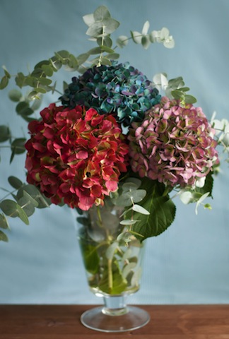
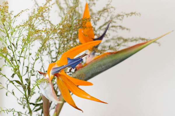
Flowers and plantlife may grow predominately outdoors, but that doesn't mean that you can't bring their vivacity inside. A well-placed bouquet, taken with the right light and proper angle, can give the same punch as inside its more natural setting. Moreover, solid colored walls can complement the flowers, adding a nice backdrop to your pictures.
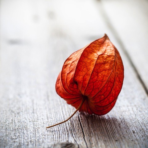
If you do decide to use leaves to help tell your story, you don't have to do it with so many. Sometimes, less is more. In this case, you can see more expression from a lone leaf than you may find inside of a pile of them. It's a living being, and focusing on one will help convey some emotion that can get lost in transit otherwise.
Your favourite colours can go further if you allow them to blend and dance. Inside pieces of artwork, there's more flexibility and movement than what is naturally created. Reds and oranges can look and feel remarkably louder when paired with some darker colors. Art and photography have a similar relationship worth exploring.
Nature has so much more to offer than the most traditional colours. Surprise your audience with some other colours, like purples, that show up this time of year but may take a little more digging. It's worth pursuing a shot through a slightly different lens. Even if you don't know what you're looking for as you trudge through piles of leaves, you'll recognise it when you see it. It may not look as familiar at first, but it'll surely be at peace with the season at hand.