


Colour: it's one of your most valuable compositional tools. But it's also something that we can take for granted, rather than actually considering the impact of colour in our photos. Different colours and their tones can influence how people will look at your images, so depending on what you want to achieve and how you want your viewers to respond, it's worth thinking about the colour palettes that you use in your photos.
So what can you do to enhance colours, to make them even more involved in the impact that your photos can have?
The colour wheel
Lets start with the colour wheel, with its primary, secondary, and tertiary colours. How they interact forms the basis of colour theory, and great looking colour photos.
Additive and subtractive primary colours
When we were at primary school, we were taught that the three primary colours were blue, red, and yellow. Or technically, cyan, magenta, and yellow. You can mix blue and yellow to achieve green; red with blue makes purple; yellow and red creates orange; and mix them all together and you get black. They're known as the subtractive primaries and they're used in print.

But there are three other primary colours, the additive primaries, which mix to form white. These are the 'digital' colours that are used in screens and sensors to create colours. They're blue, red, and green, and they form the 'RGB' colour wheel. There's a shock!
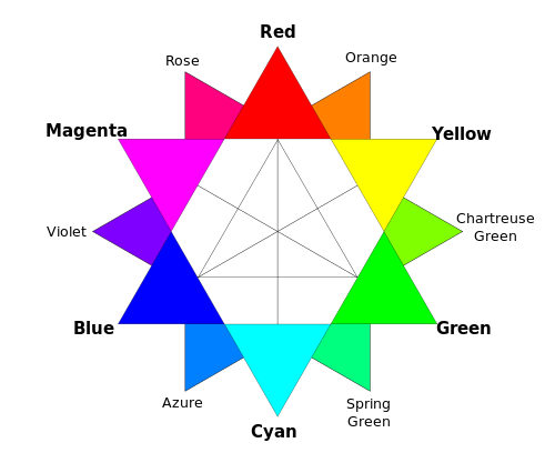
It doesn't matter which version of the colour wheel, with it primary colours you prefer, understanding it, and how the colours in it interact, will help you to produce gorgeous photos.
Balancing colours
Combining different colours in your images can create a sense of balance or tension in them. The sense of balance that you get in a seaside picture usually comes from the contrast between the sea and sky blues and the golden-orangey sand.
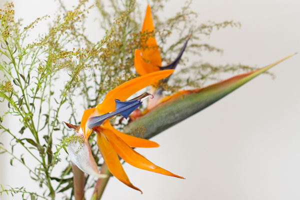
Ever wondered why a pink flower on a green background looks so stunning? It's because of the inter-play of the colours. Complementary colours, or those that sit opposite each other on a colour wheel, create well-balanced images.
If you're looking for a more harmonious image, focus on combining analogous colours, or those that sit adjacent to each other on the colour wheel. Done right, it isn't boring, but inviting.

Combining colours
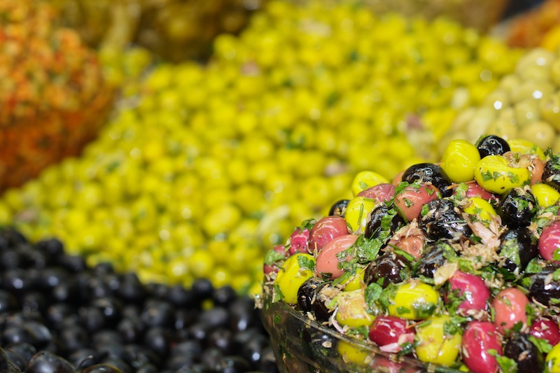
Using lots of colours simultaneouly can be overwhelming: the eye doesn't know where to focus and the image descends into a confused mess. However, it doesn't mean to say that you can't take a photo with a riot of explosive colour.

If you get it right, and people know what they're looking at, they can be vibrant successes, rather than confused failures.
Enhancing colours
Don't forget that black and white can have an impact on colour properties, too. If you place a colour against a white background, that colour will lose some of its vibrancy and appear somehow muted and dull.
It's hardly surprising that the opposite effect happens with black backgrounds: colours become brighter and emboldened. This is useful to remember for portraiture, but vital if you ever dip your toes into product photography.
Muting and saturating colours
By muting your colours, or 'toning them down' you can lend a calm, subdued, or even a sombre feel to your photos. If you saturate the colours in your photos, and intensify them, you can make them feel more vibrant and alive.
You might want to be careful when it comes to saturation, though. Too much of it and you can leave your photos feeling unrealistic, almost cartoon-like. It might be the effect you're looking for every now and again, but probably not all the time. People with orange skin don't tend to look so great!
Beware of red
Finally, beware of red. Our eyes are drawn to it and even a tiny fleck of red in a scene can be a monumental distraction.