saturation

Adding some va-va-voom with vibrance

A few weeks back, we took a peruse around Lightroom's clarity slider, to see what it does to your photos and how you can get the best out of your photos by giving it a gentle nudge here and there. This week, it's the turn of the vibrance slider—clarity's bed-fellow—to come under the Photocritic microscope. With the vibrance pushed to +20, the greens look more alive, but the sweetpea petals aren't overcooked

Much the same as the clarity slider has its most pronounced effect on the mid-tones of your images, the vibrance slider is also a 'smart slider' and applies its effects selectively. Rather than adjusting the contrast in the mid-tones, a la clarity, vibrance takes hold of the more muted tones in your photo and gives them some oompf. It's a selective saturation slider, if you will.

This is where this balcony-dwelling geranium started out

With the saturation at +50, it's too much

... but with vibrance increased, the sky looks bluer while the reds aren't overdone

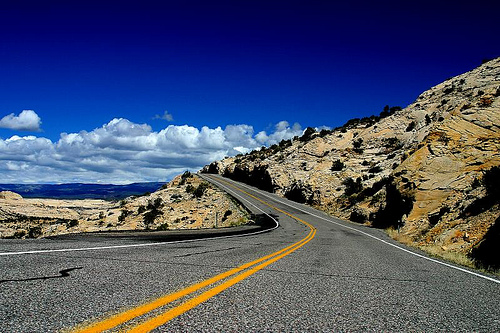
More often than not, vibrance will pick up on the blues and greens in a photo but go easier on the reds and oranges. This is great for bringing out the intensity of a sky or making a lawn look that bit more inviting while not letting your portrait subjects look as if they've been tangoed. I've heard some people refer to vibrance as being like 'fill light for colours'.

I've tweaked the contrast and white balance here, but vibrance and saturation are, as yet, untouched

You can see that with +60 on the saturation, my brother's skintone is odd, although the sky looks intense...

... increasing the vibrance, however, gives Josh a better skin tone and the sky a more intense colour. Much better! (Although I'd probably not go as far as +60, as I did here.)

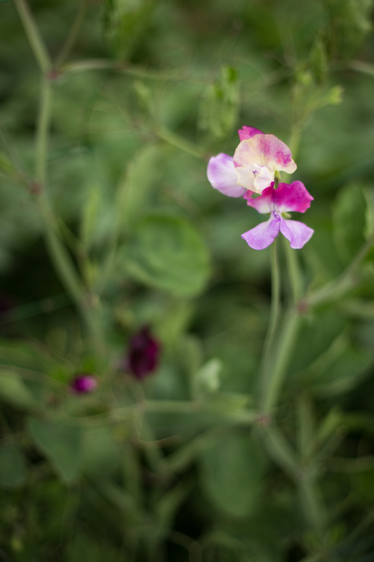
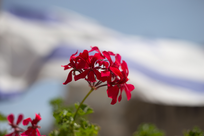
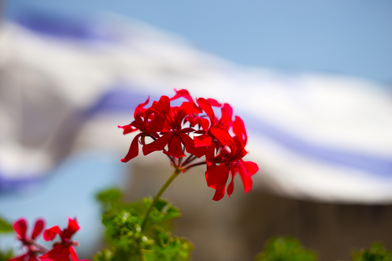
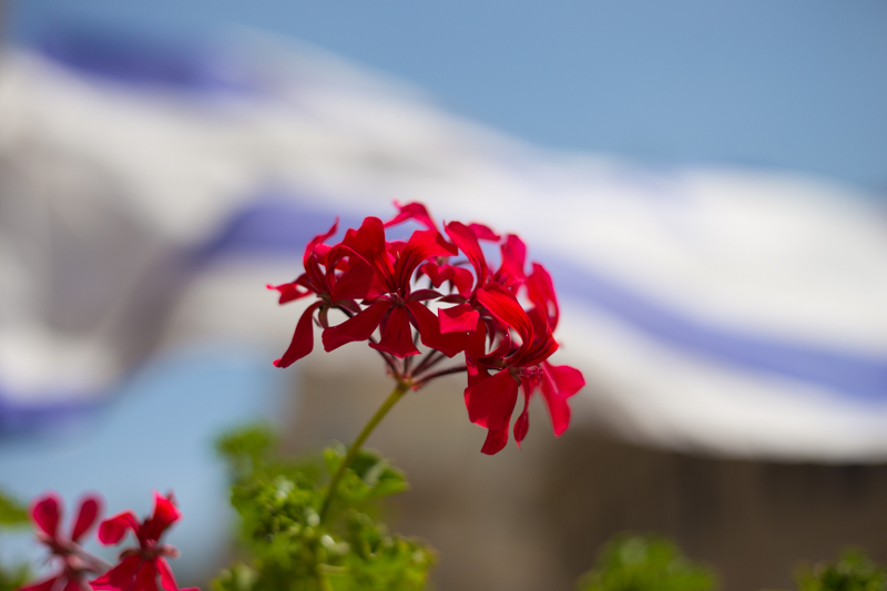
With the exception of the sweetpea, I've not been exactly subtle with either the vibrance or the saturation in any of my examples here, but that's to give you a clear illustration of the difference between them. Usually, I'd be far more reserved and I'm sure you would be, too. But at least you know what vibrance does now, and can begin using it to intensify your colours without feeling you've chucked a red wash over your photos.

Picfull - a playful, if frustrating, photo filter site

Picfull

Any compact camera released within the past year comes with a dizzying array of filters as standard. It seems to be the current battle-ground of the point-and-shoots. If you can’t sepia tone, posterise, or Warhol-esque your pictures at the click of a button without the tedium of transfering your images from memory card to computer, then why bother? There need to be star filters, cross-processing look-a-likes, and over-saturation options at your fingertips.

But what if you don’t have a camera with such a crazy selection of toys, but you’d like to play? And what if you’re not the sort of camera-owner to have a snazzy post-processing programme waiting to crop, rotate, and adjust the colour and contrast of your images? There are quite a few online, and free, filter-adding options out there. One of them is Picfull.

This is me made to look glow-tastic

Picfull offers 18 different effects that you can apply to your photos, for free. You upload an image, you select which filter you want to apply, you fiddle around with it until you’re happy, and then you save and either download or share it with your adoring fans by email, Twitter, or Facebook. Or you can undo eveyrthing and start again. Or you can apply another filter over the top of the first one.

It’s a really simple concept, if you’re into vintage-looking portraits or pen-and-ink sketches. But I didn’t find the user-interface all that friendly.

How about in ghastly two-tone?

It’s great that it offers you the option to adjust the contrast on your yellowed image, or control just how much blur there is on your blurred effect, but it doesn’t show you how much of an effect your adjustments are having as you move the slider. You have to wait for the effect to be applied. And if you don’t like it, you can’t just undo the move without undoing every previous action, not unless you can remember exactly at what value the contrast used to be, or where the saturation levels were initially.

If you’re making adjustments to the colours in an image, this inability to remember previous values, or undo just one action, is not helpful.

Or there's me looking vintage (in jeans)

I know, Picfull’s a free toy that’s meant to be a bit of fun. In all honesty, I shouldn’t complain. I’m spoiled by the control I have in Lightroom and when do I ever make my photos look as if they were taken on a Holga? But it feels that bit of a waste if you’ve gone to the trouble of developing a site specifically to play with photos, and it isn’t quite as easy as it should be.

I wanted to be able to play with Picfull. Instead I found it a touch on the frustrating side.

The Illusion of Colour

6-desaturateHave you ever wished that you could make it look as if your black and white photos were in colour? Well, through the magical powers of chromatic adaptation, you can!

Someone posted a really cool optical illusion on Reddit, and one of the commenters was wondering how it is done.

As it turns out, it’s really quite easy, so I decided to tap out a quick little tutorial. Here is how...

Creating a Chromatic Adaptation image

Start with the original image:

Arizona 2003 Arizona 2003 by Photocritic on Flickr

Upping the saturation will help your image seem more, er, saturated (clicky for bigger)

Upping the saturation will help your image seem more, er, saturated (clicky for bigger)

Inverse it in an image editing package like Photoshop or the Gimp (in Photoshop: Image → Adjustments → Invert).

Next, increase the saturation a little bit (this will help with the colour perception – in Photoshop, Image → Adjustments → Hue & Saturation).

Finally, blur the photo a little. This will ensure that you concentrate on colour, rather than the texture. In Photoshop, I used Filter → Blur → Gaussian Blur, with a setting of 2px, but experiment to see what looks best.

That’s your first picture:

5-blurred-image

For the second picture, simply desaturate your original photo. If you want, you can up the contrast a little bit, or even sharpen it further.

6-desaturate

The final result? Check out the video below. To see the effect, simply start the video and stare at the horizon. After 20 seconds, the image will change, and you’ll be able to see the optical illusion:

The effect isn’t very strong in this particular photo, but that’s because it’s such a gradient and vibrant photo to begin with. You may find that man-made, simpler structures (buildings etc) have a stronger effect. Experiment away, and if you make a particularly awesome one, post it in the comments!

Cheerio!