flickr

The winners of our Patience is a virtue long exposure competition are...

It took some serious deliberation. There were a lot of emails between us. There was even the odd expletive. Finally, however, Haje, Tom, and I have selected our five favourite photos from the Photocritic Long Exposure Competition. In no particular order I present to you the winners of Patience is a Virtue:

Set Fire to the Rain by Cybjorg

Sunrise at Botany Bay, Edisto Island by Luke Robinson

Tower Bridge traffic by Nick Jackson

Blades of Light by Paul Shears

and Cairngorm Panorama by Ian Appleton

Many congratulations to the five of you! I shall be in contact presently to enable to you claim your Triggertrap gift card prizes!

We'd also like to say thank you to everyone who entered and made our lives a little bit tricky when it came to selecting a winner. As Haje said when we first sat down to draw up a shortlist of our favourites: 'There's some serious talent there!' Please do go look at the selection in the Flickr pool: there are some inspiring images.

Last call for the Photocritic long exposure competition!

British Summer Time ends this weekend&Mdash;at 02:00 on Sunday, to be exact—which means that time is running out for you to submit your long exposure photos to our competition. We won't be accepting any more entries after the clocks move back, so if you want to be in with a chance of winning a £40 gift card for the Triggertrap shop, you'd better get your skates on. Late night in East London

All of the competition's rules and regulations, not that there are many of them, can be found on the Flickr pool page, the same place to which you need to submit your entries. There've been some cracking shots submitted so far, but we'd really love to see more in the pool!

Good luck!

Top 3 edits you should make to every photograph

Earlier this week an infographic design agency, NeoMam Studios, sent us an infographic about 'smoasting' which they'd produced on behalf of print company Photobox. Once I'd got over the shock of awful elision of 'social media' and 'boast' to form the ghastly portmanteau word 'smoast', there was one particular statistic that caught my eye. Take a look at the infographic and guess which it was.

Despite the prevalence of Instagram, the host of editing features that are built into apps such as EyeEm, Facebook, and Twitter, and the plethora of free-to-download editing programmes, only 28% of photos are cropped or styled in some way? Wow! I am surprised. And it's something I think deserves remedying.

While Team Photocritic advocates getting as much right in-camera as possible—you'll certainly not be able to turn a sow's ear into a silk purse—we're not beyond a little post-processing, either. If it's good enough for Cecil Beaton and Horst, it's good enough for us, too. A snip here and a swipe there can elevate an ordinary image into something a bit more special.

This isn't about air-brushing away half of someone's thigh, but about making minor adjustments to three specific areas: the crop, the colour, and the contrast. Here at Photocritic we call them The Three Cs. They're not complicated and they'll make a world of difference.

Crop

However well composed you think your image is, it will almost certainly benefit from having a few pixels shaved off it. It might be a case of reinforcing the rule of thirds, removing a bit of unwanted background that crept into the frame, or getting a bit closer to your subject.

The original isn't that bad

Being a purist, I tend to stick to traditional 4:3 or 3:2 ratios, but don’t feel limited by my prejudices. Select from any of the standard crops, from square to 16:9, or free-style it to adjust the crop any way you like.

But a crop does make it better

At the same time as cropping, make sure to straighten your image, too. Unless you are deliberately tilting the frame for creative reasons, uprights should be upright and horizons should be level. When lines that are expected to be upright or level are wonky, it has an unpleasant impact on our sense of balance. By correcting wonky lines, you'll produce a stronger image.

Colour

Light has a temperature, and depending on the source of the light, or the time of day if it’s the sun, that temperature will vary. When the temperature varies, so does the colour of the light. As a general rule, we don’t notice the variation because our eyes cleverly adjust to the changes. Our cameras on the other hand aren’t quite so clever.

Notice how the sheet and Cookie's white fur has a blue tinge?

Have you ever noticed how white objects in your photos can show up with blue or yellow casts? That’s because the white balance in your photo was off.

Corrected by nudging the white balance slider to the right

It's a relatively easy correction to make using the 'Warmth' or 'White Balance' function in an editing programme. If you think the whites are looking a bit too blue (or if an image looks a little 'cold' over all), nudge the slider to the right. If the whites are too reddish in tone, or the photo looks a bit warm, slide it to the right. It's a case of trial and error to make the right adjustment, but the more that you practise it, the better you'll understand the shortcomings of your camera and how it reacts to different types of light.

Now if you want to intensify or tone down your colours, you can do so using the saturation slider. I don't recommend bumping up the saturation too much; it can result in a cartoon effect rather than a photo!

Contrast

Contrast is the difference between the dark and light tones in your photos. Images shot on bright sunny days tend to have a lot of contrast, with dark shadows and bright highlights, but those taken in fog won’t have a great deal of tonal variation and will be low contrast. From time to time, you’ll want a low-contrast image, but, generally speaking, your photos can be improved by increasing the contrast a touch. It brings definition and depth to them.

The original looks good enough to eat

Don’t go overboard, though, as too much of a good thing can turn bad. You’ll find that if you over-cook the contrast you’ll lose too much detail and end up with an ugly image. Subtlety beats brickbats.

But increasing the contrast can bring some depth

If you use Snapseed to make your edits, it's worth getting to know the ambiance slider, too. I've often found that this is a preferable alternative to the contrast slider.

Anything else?

At this point, any other adjustments are gravy. I'm a fan of Snapseed's 'centre focus' options and often apply one of those. You might want to play with a tilt-shift effect. Or there's the waterfall of filters you can try in any programme, but you might find that you prefer your own edits to prefabricated filters, now.

Oh, and don't forget that it all starts with a decent photo, so check out our eight tips for better smartphone photos, too.

Flickr has announced Curated Connections, but what exactly is it?

When Flickr and Getty announced earlier this year that they'd not be renewing their licensing deal, I suggested that it might not be long before Flickr unveiled its own in-house licensing project. With well in excess of five billion images on its servers, Flickr has a huge stock library waiting for exploitation: easy sales for Flickr users and a cut for Yahoo! is a win-win situation. We had a four-and-half month wait for the grand reveal: today, Flickr announced its Curated Connections project. Well, I say it was a grand reveal, it was more of a swift overview.

Sign-up! Sign-up! Although it's mostly a wait for information now.

What is Flickr offering photographers who sign up to the Curated Connections project? It's a good question that doesn't have an especially solid answer, for the announcement is curiously light on specifics. The Flickr blog post tells us that they are: 'excited to introduce a new way for you to partner with photo agencies, editors, bloggers and other creative minds who are seeking original content like yours.' But there's no indication of what this new system is or how it will operate.

Flickr's curatorial team will be there to 'provide assistance, outreach and connectivity to help you get your photos licensed!' But it doesn't detail what this will entail. It's hardly surprising that with such a vague outline of what they're planning there isn't any significant information concerning such trivialities that interest photographers, namingly licensing terms. We're told that they'll be transparent and easy, although as things stand the terms remain mythical beasts.

The sign-up page tempts users with suggestions that their images might be used by media behemoths including the BBC, Gizmodo, the New York Times, and Reuters. There's even a mention of previous licensing-partner Getty. As you might expect from a Yahoo! owned company, there is potential for your images to be used on other Yahoo! owned, sites, too. Part of the 'outreach and connectivity' that Flickr hopes to offer are opportunities to complete commissions and assignments. Flickr's definitely talking the talk here.

Being able to share your images and make them available for licensing in one place is appealing—and it's something that other photo-sharing sites, for example 500px and EyeEm are also beginning to entertain—but so much of that appeal is going to depend on how the deals are cut and the terms under which images are released. Allowing Flickr to deal with the tedium of bureaucracy might not be suitable compensation if the remuneration is insufficient. Will it walk the walk?

Cake Can we have a baked and iced cake, please, Flickr? It beats a half-remembered recipe.

So do tell us, Flickr: what exactly are you proposing here? There's a lot of ethereal chatter and not much substance. I'm sure that you're excited by your new project and you want us to be excited about it, too, but it rather helps if you share with us the pertinent facts. It's something of a half-baked non-announcement at the moment. We've no idea if the cake's carrot or chocolate or something else entirely. Provide us with an actual announcement that you've baked and iced and we might be slightly more enthusiastic. Or not. Depending on what you suggest (I prefer lemon, for reference).

If you are interested in Flickr's Curated Connections, you can sign up here.

The handy-dandy social media photo sharing guide

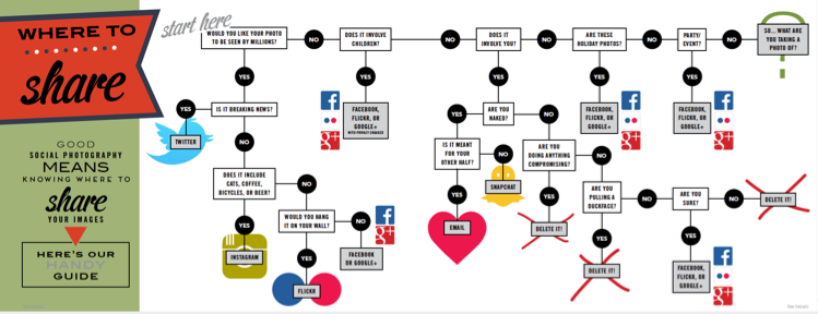
One photo, so many options. Where on this huge web of interconnected social media outlets are we best sharing our quick snaps, our painstakingly created works of art, and our selfies? Really, it all comes down to whom you want to see them. The chances are that different people follow you in different social media spaces, and if Twitter's mostly a work thing for you, selfies on the beach aren't all that appropriate a posting there. You're probably best putting those on your friends- and family-only Facebook account. It only takes a few moments of thought, really, but if you're new to the social media fandango, seeing all those apps lined up on your phone can be a little overwhelming. For a bit of fun, I drew up (quite literally, it involved an enormous sheet of paper and felt-tipped pens) this handy-dandy guide to sharing your photos via social media. Of course it isn't meant to be taken deadly seriously, but it's a pretty useful starting point all the same.

Click for bigger!

You can find it looking even more beautiful in print in the delicious-looking Social Photography, which is available now, either in print or to download!

Flickr 3.0 for iOS and Android is unveiled

At the end of March I noticed that Flickr 3.0 for iOS and Android seemed to be in the works. Today, it has been unleashed on the world. Well, I say 'unleashed on the world' but it's more like a steady trickle out to users. I've not an update for my phone yet. The updated app offers 14 live preview filters, so that you see what a photo will look like under their influence before you take it, and record 30 seconds of HD video using one of them, too. There's also a suite of editing tools that ranges from click-to-select filters, vignettes, and auto-enhance to more sophisticated tools like colour balance, levels, and exposure.

Apply filters as you shoot

Auto-sync, which automatically backed-up photos from iOS phones to Flickr, is now available across the board, letting you make easier use of that 1TB of storage space and keep images safe.

There's also meant to be a new and improved search function that lets you sift through images faster and easier that can define images based on when and where they were taken and what features in them and an enhanced information screen that lets you find out more about where a photo was taken as well as which camera and lens were used to create it.

Easier image organisation

Finally, sharing photos to other networks such as Tumblr, Twitter, and Facebook just got easier.

Colour me intrigued to know what it'll look like.

Update: You'll need to be running iOS 7 for the update to reach your iPhone.

Flickr's product chief Markus Spiering joins EyeEm to promote its US development

Markus Spiering, who until Monday was Head of Product at Flickr, has announced he's joined Berlin-based photo-sharing community EyeEm, where he'll be focused on expanding the app into the US market and developing the product team. While Spiering is currently sitting at a desk in Berlin, he will be opening up a San Francisco EyeEm office later this year.

Spiering was named as one of Silicon Valley's top 40 players under the age of 40 in 2013, and was seen as instrumental in halting a decline in Flickr's decline after its sale to Yahoo!, so to some leaving a Wall Street-listed company for a Berlin-based start-up might seem like an unusual move. However, it's the challenge of raising EyeEm's US profile to which Spiering is looking forward, having watched the progression of the company since its inception. And EyeEm has been making waves of its own recently, having announced both its Market, where its members can sell their images, as well as a deal that will allow its users to licence their mobile photos through Getty Images.

Florian Meissner, EyeEm's CEO welcomed Spiering to their team: 'We feel honored and are understandably excited to have Markus on our team. We have been consistently impressed with his accomplishments across product and design during his tenure at Flickr. With his vast experience in product, mobile applications and design, as well as his network in North America, Markus will be crucial in realizing EyeEm´s visions about the future of photography.'

EyeEm is going places, and with Spiering on board, it could be getting there a whole lot faster.

Flickr's implemented its new photo page

In October last year, Flickr implemented a beta version of a new photo page. It was only a beta version, users could opt out, and they were invited to provide feedback on the new-look page, but inevitably there was considerable discontent with the proposed changes. I saw lots of frothing and foaming at the mouth in the feedback forum, some of it sadly lacking in articulated, constructive criticism. And in truth, the beta version did have plenty of bugs, omissions, and oversights that desperately needed rectifying. Flickr's venture into the realms of the new was along a rather rocky path and needed quite a bit of work. A little under six months after implenting the beta, and it seems that Flickr has rolled-out the new-look photo page for everyone. Or at least, I was using the old-style page, and now I'm suddenly not, and my 'Return to the old-style page' button has disappeared. The toddler-type tantrums of 'I don't like it' on the feedback page don't seem to have made much of an impact. And to be fair, neither have the calmer, cooler, and more considered objections to the new layout. The new-look page is here, whether users like it or not. Now it's time to see how many of the niggles have been addressed and kinks ironed out.

I was using the old-style photo page. Now I'm not.

I'm pleased to say that the Flickr team has listened to quite a few of the gripes. For example: you can now see who 'favorited' your photos, rather than there being just a number of 'favorites'. Rich EXIF data are available. Tags have returned to being unhastagged. You can add a photo to a set from the photo page. Lots of the functionality that Flickr users knew and used didn't make it over in the initial beta release. That's been steadily remedied and things are looking more familiar, if different.

Tags are un-hastagged and most of the functionality has returned

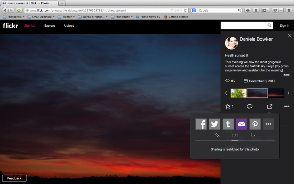
But not everything is yet hunky-dory. A particularly significant bug from my perspective involves sharing preferences. Mine are turned off in my settings. No one looking at my photos should be able to share them via social media or embed them into their blogs. Except that when I look at Flickr logged out of my account, my photos can still be shared and embedded. I'd like to see that fixed sharpish. And it would seem that Flickr's usual location services are still in the process of being ported properly. My map has disappeared and I'd like it back. That's irritating as opposed to concerning.

That shouldn't be happening. At least, not according to my preferences

While I'm not especially concerned by being able to accompany my images with significant pieces of text, I favour short explanations, I know some people who feel aggrieved that the text box is so squashed and insignificant now. For them, being able to use words and pictures in tandem was a favourite feature of Flickr that has been marginalised.

Thankfully, there's a feedback button on every photo page. I shall be making use of it.

As for the new photo page itself, I'm not too bothered by it. My persistence in using the old page was primarily a result of the lack of functionality in the beta version and most, although not all, of those concerns have been addressed. What remains to be seen is how those who initially reacted so negatively to the redesign respond to the changes. Have they grown accustomed to it or have their complaints been addressed? Are the changes unpleasant enough or sufficiently significant in their eyes to see them walk away from one terabyte of free storage together with the network that they've built there? And if there is mass dissent amongst users, what will the impact be on Flickr? Even if, at worst, I'm ambivalent towards the new look Flickr page, what sort of effect will it have on my use of the site if people whom I follow and with whom I interact begin to desert it? I know of some users who feel the changes keenly, and if they choose to quit, my Flickr experience will be the poorer for it. A social network that steadily loses its sociability doesn't have a great deal of value.

Has Flickr really been made awesome again?

The Flickr-Getty deal is no more. What now?

A communication sent to all photographers who have licensed their photos using the Flickr-Getty partnership has leaked, detailing that the agreement between the image sharing site and the stock house has reached its term and will not be renewed. For five years, editors from Getty have been able to trawl Flickr looking for photos that they think might sell and contact their photographers directly, giving them the option to license their images through Getty. The contract is now up, and while it won't be renewed, Getty hasn't ruled out working with Flickr again:

Our original agreement reached its end, and while we continue to be open to working with Yahoo!/Flickr, we do not have a new agreement at this time. We will continue to work with the tens of thousands of contributors and license the existing content.

So what does this mean for Flickr contributors who've licensed images through Getty, and what does it mean for Flickr?

Nothing changes for Flickr photographers whose images are licensed through Getty already. Just because the Flickr-Getty contract has concluded, the photographer-Getty contracts won't be terminated. The Flickr collection will be renamed 'Moment' and will include images from Getty's new iPhone app of the same name. Combined with its freshly signed agreement with EyeEm, Getty looks to be venturing deeper into the mobile photography market.

As for Flickr, and by extension Yahoo!, this presents them with the possibility of licensing images themselves. Yes, this is pure speculation on my part, but it isn't beyond the realms of imagination. An easy licensing option administered by Flickr or Yahoo! based on an archive of in excess of five billion images might be attractive to its users, attractive to image buyers, and offers Yahoo! the chance of some much-needed income. It would take more than feather to knock me down if Flickr announced an in-house licensing deal for its users within the near future.

(Headsup to Amateur Photographer)

Flickr has a new embed feature. Expect uproar.

In another update that aims to make Flickr a more fully web-integrated photo-sharing experience, it has rolled out a revised photo embed function. This one should make it easier to add full-bleed Flickr photos and videos to external sites. Any embedded photo will automatically be displayed with its full title and its owner's Flickr name. Flickr's stats feature will also track the number of views your photos embedded into external sites are generating, to give you an idea of their popularity and reach.

Before anyone and everyone starts to yell that Flickr is being irresponsible, is encouraging copyright infringement and image theft, and doesn't have the best interests of its users and their images at heart: you can disable embedding. You do this in Settings, under privacy and sharing. It will also prevent other users from tweeting or pinning your photos at the same time. This doesn't stop you from being able to tweet, pin, and Facebook-share your own images, though. But if you're using the new photo experience beta (which I'm not), it doesn't look as if you can embed your own images into external sites when sharing is restricted. Self-embedding is still possible with share-restricted photos in the old layout though.

Here: I've embedded my own image straight from Flickr, but every Tom, Dick, Harry, Annie, Melanie, and Madge doesn't have the ability to do this because I've disabled the feature for them.

Whether this is by accident or deign on Flickr's part I'm not sure, but I have mentioned it to them. It's a useful feature for me, but I prefer to retain as much control over the use of my images as I can.

Flickr embed screen shot

If you share a photo privately, either with your Flickr friends and family or through a guest pass, it can't be embedded by those people who are privileged to see it. It remains a privilege.

As a reminder, you can also restrict who is able to download your images from Flickr, too. Of course, if someone really wants to use your image, they will, because any image that can be seen on a screen can suffer from copyright infringement. There are tools available to help you protect them, however.

Enabling better image embedding isn't just about spreading the beauty of Flickr users' gorgeous photos; it's also about spreading the Flickr brand, too. Easy embedding will encourage people to use the feature and encourage people who're seeing embedded Flickr images on external sites to visit Flickr itself and to see more of a user's Flickr photostream. Flickr doesn't wish to remain an isolated realm of internalised image sharing, it has a world to take on.

Share joy with #Flickr12Days

What does joy mean to you? The people over at Flickr would like to know. And in return for sharing your holiday images of joy, you could win up to £3,100. (Or US $5,000.) Flickr12Days

From today, the 12 December, you can enter as many images as you have portraying festive joy to the #Flickr12Days competition. Every day the judging panel will look for one photo that's creative, original, and conveys the sense of the season. Out of the 12 daily winners, who'll each claim a £310 prize, a grand prize winner will also be selected. She or he will be awarded £3,100 and the the warm fuzzy feeling of knowing their image summarised holiday joy.

Entering isn't hard: you need to share your photo on Flickr, publicly, and it needs #Flickr12Days in its title. The Flickereenos have provided step-by-step instructions, too, and as always, please do check the terms and conditions to make sure you're not signing away your soul or similar. You'll find those here.

Get snapping, and enjoy!

Flickr launches Yahoo PIcture of the Day

Flickr is home to billions of pictures and the stories that they go with them. There are glimpses into different lives, snapshots of the everyday and the mundane, and insights into the curious, beautiful, and wonderful. By teaming up with Yahoo's picture editors and the Yahoo News site, Flickr is hoping to reveal more of these stories to an audience larger than just the Flickr community with its Picture of the Day project. From 9 December, Yahoo News will be featuring a Picture of the Day on its French, German, Italian, Middle Eastern, South African, and UK sites. Anyone who submits one of their images to the Yahoo Picture of the Day pool on Flickr can be in with a chance of seeing it, and its story, shared with Yahoo News' readers. The plan is to expand it to other countries with time.

Sunrise over Edinburgh on my birthday

As well as submitting your image to the Yahoo Picture of the Day pool on Flickr, it'll need to be titled meaningfully and carry a description that outlines its story adequately. After that, it's down to the Yahoo picture editors.

The chances of seeing your photo on Picture of the Day? Slim-to-none, at a guess. But it's good to dream. And it's another way for Yahoo! to get more eyeballs on Flickr, too.

Photo books from Flickr

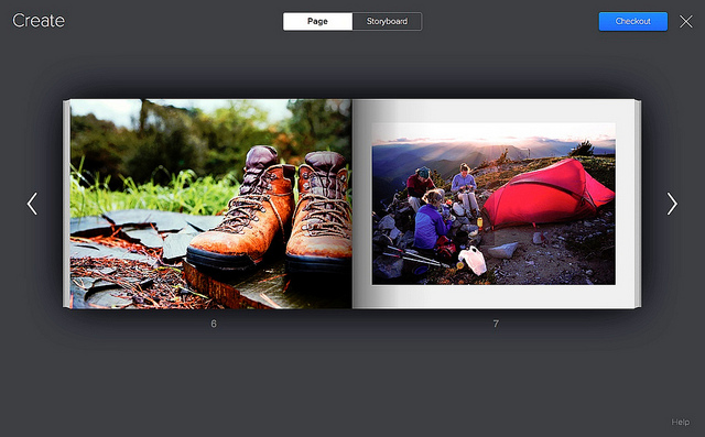
Flickr's been offering prints, courtesy of Snapfish, for quite some time. Click on the 'More' button and you can turn your images into prints in a variety of sizes. There are options to create canvases, calendars, and collages, too. It's relatively simple, without any faffing around uploading pictures that you've already uploaded to a print site. From today, you can create a photo book straight from a Flickr set: you can send an existing set straight to print, or you can create a new set especially for book binding. There aren't any decisions about paper or bindings to be made: Flickr has done that for you. Books start with twenty pages of premium white lustre-finish proPhoto paper. You can choose between full bleed printing (that's images taking up the entirety of a page) or images with a margin, and it's bound in a hardcover with a matching dust jacket.

Simple to make photo books from Flickr

Books measure 11 inches by 8.5 inches and cost $34.95 for 20 pages. Add $0.50 for each additional page. At the moment they're only shipping to US addresses, but that should be changing soon.

Naturally, I had to go and have a play around to see what the process was like. It's ludicrously easy. Head to your Sets, choose the set you want to make into a book, hover over it, and click on the book icon. Then you get to rearrange your images into the order you want. When you're happy, hit the checkout button and everything should be good to go.

There aren't decisions about book sizes and paper type to be made, and there are no captioning options, either. The Flickr tools automatically crop and position your images, but you can choose rearrange them or zoom in or out. You know, I quite like those decisions being made for me. Choice is good, but too much choice can be overwhelming, especially when you don't know about the technicalities. I've an odd feeling that this, along with the photos already being uploaded, will make me more likely to create a photo book and not less. But I'll have to wait.

I did, however, encounter a problem: there was a note telling me that my images weren't of print quality. Thinking this was very odd—all of the photos in the sets I'd tried to turn into photo books had been taken with a dSLR and were definitely of sufficient resolution—I dropped a quick email to the Flickr team. They've suggested that it's because I have some iPhone images in my photo stream and it shouldn't be a problem.

Anyway, you can check out the Flickr Photo Book video yourself, if you fancy:

Flickr's new automatic features: upload and straighten

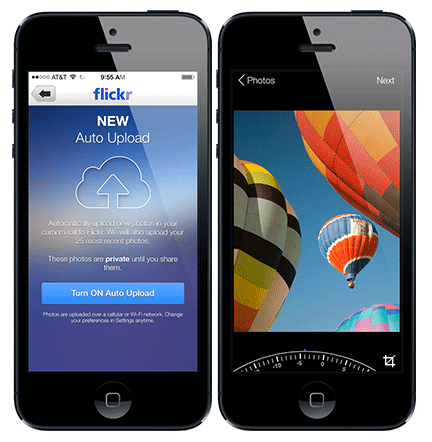
Flickr has taken another step along its path to the epiphany that the future is mobile by introducing an automatic upload feature to its iOS app. You do have to be using iOS 7, though. It'll upload your iPhone images to Flickr and keep them private until you've edited them and are ready to share them with the world. Or you could use it as a private archive of your naughty selfies. Naturally this comes a week after I've made other arrangements for my iPhone image library and deleted approximately 1,000 photos from my camera roll. (Yes, okay, I'm refusing to update to iOS 7 for battery life reasons, but that's by-the-by.)

Flickr's new toys: auto-upload and auto-straighten

I was impressed with the Flickr app's straighten feature when it was overhauled recently (not so much the crop feature), but it's now added an automatic straighten function. Take a photo, open the crop/straighten function, select straighten, et voila! If you're not happy with Flickr's straightening prowess, you can put your own powers to the test and over-ride it.

So it's not all about automation, thankfully.

Flickr confirms: 'Pro' memberships can be retained

It seems as if creating a fuss can sometimes reap rewards. One of my, and just about every other 'Pro' user of Flickr's, concerns regarding the site overhaul and changes to its business model has been clarified. 'Pro' members do now have the chance to renew their membership at the existing price (about $25 for a year) and retain its benefits, with no plans to do away with it just yet. You won't have the luxury of allowing your membership to lapse, however, so if you're intent on keeping it, best sign up for recurring renewal. You can future-proof your subscription by heading to your Settings. It's right there under Personal Information. And all the details about retaining 'Pro' status are here in this FAQ.

(Headsup to Engadget)

The Flickr Spectaculr: what's right, and what's wrong

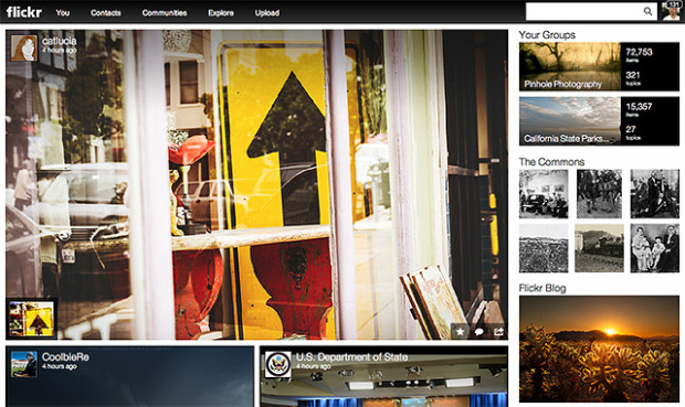
Flickr front page 'Make Flickr awesome again.' That was the Internet's message to Marissa Mayer when she was appointed CEO of Yahoo! last year. Last night's announcement of a new-look Flickr with a new business model was her, and her team's, response to that claxon. But are the changes all that awesome?

To summarise, 'New Flickr' has done away with the divide between 'Free' and 'Pro' accounts. Before, 'Free' membership meant limited image display that was supported by ads. 'Pro' accounts cost about $25 a year, enjoyed unlimited storage, provided statistical analysis, and were ad-free. Now, everyone has one terabyte of storage for free and photos are undoubtedly the heart-and-soul of the newly designed site.

The new-look moasic-style photostream

If you want to enjoy Flickr ad-free and have access to statistics, you need to pay $50 a year. For $500 a year, you can buy a Doublr account and double your storage space.

Understandably, the split between the 'Wow' and the 'Grr' reactions seems to fall along the divide between ordinary members and 'Pro' members. For ordinary members—those who didn't pay about $25 a year for unlimited uploads, statistical analysis, and no ads—it's a win. One terabyte of storage for free, full-resolution display, and some of the organisational tools that were previously the preserve of 'Pro' members: what's to complain about?

There are two primary complaints that Flickr needs to solve, and quickly. The first is the treatment of its old 'Pro' members. I paid for Pro membership because I wanted the unlimited storage, I appreciated the statistical analysis, and I liked the ad-free experience. 'Pro' exists no longer, and instead there is a great deal of confusion as to which old 'Pro' members will be grandfathered in to the new deal on their old terms. It seems as if some might, and some won't. Apart from not being able to determine easily if our previous contracts will be honoured, why the differentiation at all? Flickr's 'Pro' membership was a relatively small percentage of its overall membership; giving all these loyal users the benefit of the doubt seems only fair.

The old 'Pro' members were the old Flickr stalwarts, who stuck by the site when it felt as if Yahoo! had put it out to seed, but continued to pay them their money and keep the community alive with images and conversation. What could have been a positive transition, with clear communication and recognition for their loyalty, feels more like a shafting. It is, however, an easy fix.

The new-look sets lay-out

Second, can Flickr please fix its metadata-stripping antics? Display an image online and you run the risk of it being purloined and used without permission; that's a fact of life. However, there are measures that many of us take to protect our images. Some of us use watermarks, some of us only upload small versions of our images, I've disabled the downloading function on Flickr, and most of us append metadata to our pictures. Metadata are a bit like a dogtag, identifying who took an image, where, and when. Unfortunately, Flickr strips images of their metadata, (or takes the collar off of the dog, if you like) so if someone does manage to download one of your pictures, its owner can't be identified. Now that pictures are being displayed bigger and brighter and bolder on Flickr, this is more important than ever. Ensuring that metadata aren't separated from images really would be awesome.

In terms of the look and the feel of the new Flickr: I love it. If the images can't do the talking, then why bother? And the new moasic layouts and easy enlargement options make it all about the images. When Yahoo! addresses the issues that people are finding troubling, Mayer might've answered the Internet's request.

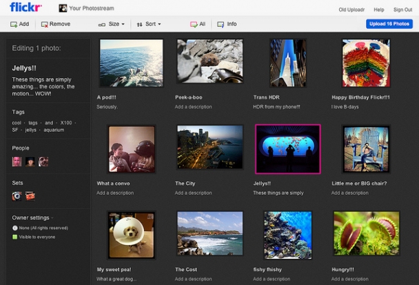
Flickr's new Uploadr


Serendipity. I'll put it down to serendipity.

Only yesterday I was uploading some photos to Flickr and lamenting a) how slow it was (but being marooned in a north Perth suburb might have something to do with that); b) that my images didn't appear in the order that I selected them, which would mean a trip to the set editing function when they'd finally crawled their way onto Flickr's servers; and c) that everything would be appearing in my photostream before I'd had the opportunity to organise them, tag them, change the titles (rarely do I call something in my files the same as it's titled on Flickr), and all of the other bits and pieces that I do with my photos.

Low and behold I awake this morning to find that Flickr has just announced a brand new shiny Uploadr.

By the wonder that is HTML5, you will now be able to drag-and-drop your images into the Uploadr, see thumbnail previews, and then reorder your pictures before they see the light of day in your photostream. There's also the ability to zoom, rotate, or sort your photos by title.

That bundle responded to one of my most serious gripes and in all honesty I would have been content knowing that the Flickr-dudes are doing some actually useful product development, rather than just treading water or silly stuff, but there's more. Tagging, arranging into sets, and identifying people in your photos can all be done from the Uploadr, and so can amending your licensing options and a few other bits of advanced jiggery-pokery.

Files sizes have now been increased to a whopping 50MB for Pro subscribers and 30MB for free users. Everything should also be uploading faster. I'll reserve judgement on that, but it's good to know.

Flickr has promised even more new features that it'll be rolling out soon. No word on what they are yet, but some actual movement with the product is at least a little promising after all those lay-offs at Yahoo! and some really dud introductions over the past few years.

As ever with Flickr, not everyone will have access to these new toys immediately; they'll be rolled out over the coming weeks. I'm looking forward to trying them!

Compact cameras: down, but not out


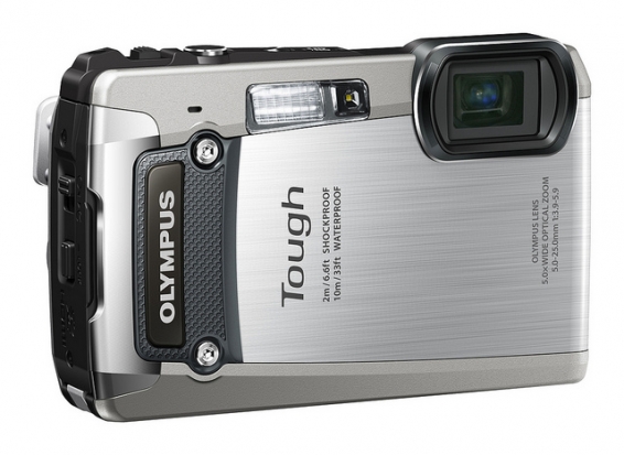
The Olympus TG820: waterproof, shockproof, crushproof, freezeproof, and it takes photos.

It's an inescapable, plaintive cry: the compact camera is in decline! You can scarcely go a week without hearing someone lament that sales of compact cameras are falling; that the ubiquity of camera phones is eclipsing the point-and-shoot; that on Flickr there are more photos taken with iPhones than anything else. And all of these statements are true. Compact camera sales fell by roughly 30% in 2011 compared to 2010 figures (and they were down in 2010 on 2009 sales). Annie Liebovitz pulled out an iPhone on Rock Center and recommended it as a snapshot camera. And the iPhone 4 topped the list of popular cameras in Flickr's January 2012 stats. But none of this means that the compact camera is dead. Not quite yet, anyway.

Over the past two weeks Canon, Nikon, Olympus, Pentax, and Sony have all released new compact cameras. We're not talking about piddling little things that they're rolling out because they've some peculiar obligation to the format; some of these are highly specced shooters with a distinct market in mind: considered pieces of kit that are being produced because they fulfil a demand from photographers. I'll grant you that a few of the gimmicks on some of the cameras do reek of desperate attempts to convince a generation of iPhoneographers that they need a compact, but that is to be expected. They're in the business of making money and they're going to try their hardest to poach back the market from Apple, Nokia, Samsung, et al. But whilst the camera phone definitely fulfils the photographic expectations of a swathe of people who need nothing more than a handy-dandy picture-snapper in their pocket, it doesn't provide for everyone who wants an easily-accessible camera.

Without exception, all of those manufacturers with new releases in the past two weeks have included a camera in the lineup that is waterproof and shockproof. In Nikon's case it was only waterproof to three metres and didn't enjoy the most flamboyant functionality ever, whilst Olympus' TG820 can cope with being crushed by upto 100kg as well as temperatures down to -10 degrees Celsius, water to depths of 10 metres, and being dropped from two metres; but they highlight a particular target market.

For people who love to snowboard, snorkel, and rockclimb, and take photos whilst they're at it, they want a camera that can withstand at least some of the perils that might befall it but still deliver photos that do justice to their fantastic pursuits. They want a decent optical zoom and a reasonably sized sensor, they might even want full manual control, and they want it to be small, easy-to-use, and all in one place. Changing lenses on a Nikon V1 whilst clinging to a mountain face isn't ideal, no matter how small it is, and the digital zoom on an iPhone 4S is never going to be as sharp as the 5× optical zoom on the Olympus TG820. It's the compact rugged camera that offers them what they need - photographically and practically - so that they can take photos they can hang on their walls with a camera they can also dip into water, throw onto snow, drag through a sandstorm, or drop onto rocks.

For my money, Sony is on to something with its TX200V. When you read the spec, you get the impression that it's a relatively competent compact; it has a touch-screen, 18 megapixel sensor, 5× optical zoom, HD video, and a gamut of other toys. That it's waterproof to five metres, freezeproof to -10 degrees Celsius, and dustproof are almost after-thoughts in its design. But it's a clear indication of a purpose that the compact camera fulfils: they should be able to go anywhere and take a half-way decent picture in the process.

I started taking photos when I was young, around five years old, using my Ma's Olympus Trip. When I was seven, my parents bought me my own camera; it was an Agfamatic that took 110 film cartridges, had a push-pull wind-on mechanism, and a telephoto lens that slid across the normal lens for closer-up goodness. Until it was replaced about three years later with a far more sophisticated Pentax compact, it was my pride and joy. Having my own camera from such a young age taught me something valuable about photography - and it wasn't just about the principles of light and focus and perspective. It was that photography is a craft; a camera is a specialist tool and it demands specialist skills to get the most out of it.

Compact cameras fulfil this incredibly important need: they provide young photographers with the opportunity to learn and develop with dedicated equipment, but equipment that simultaneously doesn't have to cost a prince's ransom and won't overwhelm them. I might let my niece play around with my SLR whilst I'm standing there, but I wouldn't dream of letting her walk off with it alone, if for no other reason than it's damn heavy for her. Would I prefer that she learned about proper focusing and the rudiments of manual control on a real camera: of course I would! As for being able to wander off by herself and explore her photographic creativity: hell yes! Everyone has to start somewhere, and compact cameras are ideal nurseries for novice photographers; they're definitely not to be sneered at.

Aside from the practical, there's a philosophical element to learning photography with a proper camera: it allows new photographers to gain an appreciation for photography as an art-form, not as something that's a bolt-on to a ubiquitous piece of gadgetry. I want photography to be universally appreciated and accessible, and camera phones allow for that; they're also a fantastic first step into the photographic waters for some people. But in between iPhones and inerchangeable lenses, we need something else, and that something else is the compact.

I use my iPhone to take photos; I also use my compact camera; and I use my dSLR. Sometimes I even drag out a film camera. My iPhone hasn't replaced my compact camera as a picture-taking device; rather, it has augmented my photographic arsenal. It's one more way that I'm able to paint with light. When you think about that in terms of volume of photos taken, it's easy to see that with so many devices out there taking so many photos, camera phones will be topping the league tables of most-used photo-taking device, given that almost everyone has one. Furthermore, when you remember that the total number of photos being taken is now divided amongst four major categories of camera - phone, compact, EVIL, and SLR - the proportions are going to have changed from the days when just compacts and SLRs were the cameras of choice.

Right now, my compact camera does things that my iPhone is only dreaming of, and coupled with its size, that's why I have it. And just as the technology that's in a camera phone will continue to develop, so will other cameras. Consequently, I can't see the day just yet that I'll be relinquishing the compact that I keep in my bag. Of course, that sort of logic won't apply to everyone, and more people will reach a point when they can abandon their compacts for their camera phones, but having all of these choices is no bad thing.

There's also this idle thought that occasionally comes to entertain me when I think about the development of camera phones. Would it be possible that their evolution will eventually come full-circle? As they become increasingly powerful and versatile, will their primary function cease to be that of a phone, and will they essentially morph into a compact camera again? That's probably a long way off, but I wouldn't place it beyond the realms of possibility.

Yes, the compact camera market is declining; no, I don't think it's terminal. The compact camera is another choice for people who want to take photos, and in some respects, it's a choice that satisfies some important gaps in the market. For some people, it's precisely the camera that they need. So they might be down; but they're definitely not out.

Our high-key photo competition winner is announced!

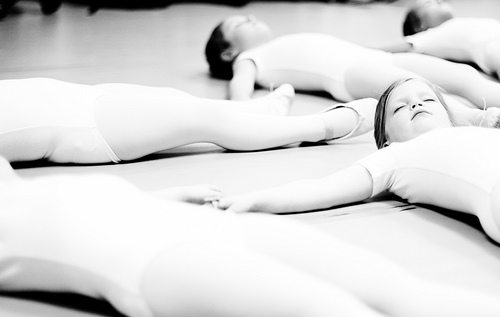
For January, we were looking for bright, airy, and positive high-key images to kick off the new year. This was the entry that made both Haje and me go 'Yes!' It's calm, delicate, and gorgeous.

1st year of ballet

Congratulations, Hooker771 (he doesn't give his real name on Flickr), for your charming First Year of Ballet. You've just won yourself a 12" Fracture.

Details of our February competition will be going up very soon!