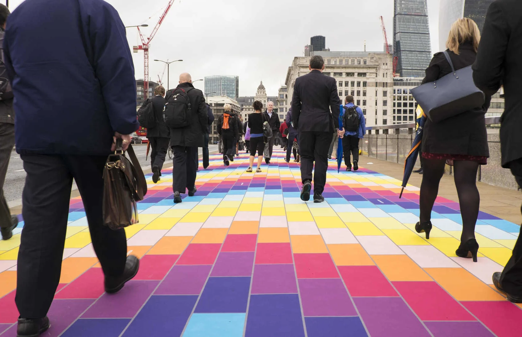
There are photo opportunities everywhere; you just need to be alert to them!
Top 3 edits you should make to every photograph
Earlier this week an infographic design agency, NeoMam Studios, sent us an infographic about 'smoasting' which they'd produced on behalf of print company Photobox. Once I'd got over the shock of awful elision of 'social media' and 'boast' to form the ghastly portmanteau word 'smoast', there was one particular statistic that caught my eye. Take a look at the infographic and guess which it was.
Despite the prevalence of Instagram, the host of editing features that are built into apps such as EyeEm, Facebook, and Twitter, and the plethora of free-to-download editing programmes, only 28% of photos are cropped or styled in some way? Wow! I am surprised. And it's something I think deserves remedying.
While Team Photocritic advocates getting as much right in-camera as possible—you'll certainly not be able to turn a sow's ear into a silk purse—we're not beyond a little post-processing, either. If it's good enough for Cecil Beaton and Horst, it's good enough for us, too. A snip here and a swipe there can elevate an ordinary image into something a bit more special.
This isn't about air-brushing away half of someone's thigh, but about making minor adjustments to three specific areas: the crop, the colour, and the contrast. Here at Photocritic we call them The Three Cs. They're not complicated and they'll make a world of difference.
Crop
However well composed you think your image is, it will almost certainly benefit from having a few pixels shaved off it. It might be a case of reinforcing the rule of thirds, removing a bit of unwanted background that crept into the frame, or getting a bit closer to your subject.
Being a purist, I tend to stick to traditional 4:3 or 3:2 ratios, but don’t feel limited by my prejudices. Select from any of the standard crops, from square to 16:9, or free-style it to adjust the crop any way you like.
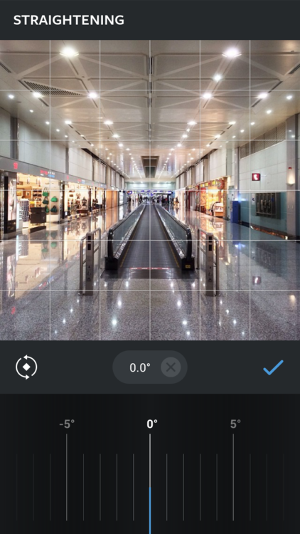
At the same time as cropping, make sure to straighten your image, too. Unless you are deliberately tilting the frame for creative reasons, uprights should be upright and horizons should be level. When lines that are expected to be upright or level are wonky, it has an unpleasant impact on our sense of balance. By correcting wonky lines, you'll produce a stronger image.
Colour
Light has a temperature, and depending on the source of the light, or the time of day if it’s the sun, that temperature will vary. When the temperature varies, so does the colour of the light. As a general rule, we don’t notice the variation because our eyes cleverly adjust to the changes. Our cameras on the other hand aren’t quite so clever.
Have you ever noticed how white objects in your photos can show up with blue or yellow casts? That’s because the white balance in your photo was off.
It's a relatively easy correction to make using the 'Warmth' or 'White Balance' function in an editing programme. If you think the whites are looking a bit too blue (or if an image looks a little 'cold' over all), nudge the slider to the right. If the whites are too reddish in tone, or the photo looks a bit warm, slide it to the right. It's a case of trial and error to make the right adjustment, but the more that you practise it, the better you'll understand the shortcomings of your camera and how it reacts to different types of light.
Now if you want to intensify or tone down your colours, you can do so using the saturation slider. I don't recommend bumping up the saturation too much; it can result in a cartoon effect rather than a photo!
Contrast
Contrast is the difference between the dark and light tones in your photos. Images shot on bright sunny days tend to have a lot of contrast, with dark shadows and bright highlights, but those taken in fog won’t have a great deal of tonal variation and will be low contrast. From time to time, you’ll want a low-contrast image, but, generally speaking, your photos can be improved by increasing the contrast a touch. It brings definition and depth to them.
Don’t go overboard, though, as too much of a good thing can turn bad. You’ll find that if you over-cook the contrast you’ll lose too much detail and end up with an ugly image. Subtlety beats brickbats.
If you use Snapseed to make your edits, it's worth getting to know the ambiance slider, too. I've often found that this is a preferable alternative to the contrast slider.
Anything else?
At this point, any other adjustments are gravy. I'm a fan of Snapseed's 'centre focus' options and often apply one of those. You might want to play with a tilt-shift effect. Or there's the waterfall of filters you can try in any programme, but you might find that you prefer your own edits to prefabricated filters, now.
Oh, and don't forget that it all starts with a decent photo, so check out our eight tips for better smartphone photos, too.
Social Photography on sale in the US!
I've heard a rumour that my newest—and possibly prettiest—book, Social Photography is now on sale in the US! Naturally I'm incredibly biased (although my father probably wins the prize for most enthusiastic cheerleader), but I am very proud of it. In a nutshell, it's a guide to making the most out of your smartphone, from taking better pictures to sharing them astutely.
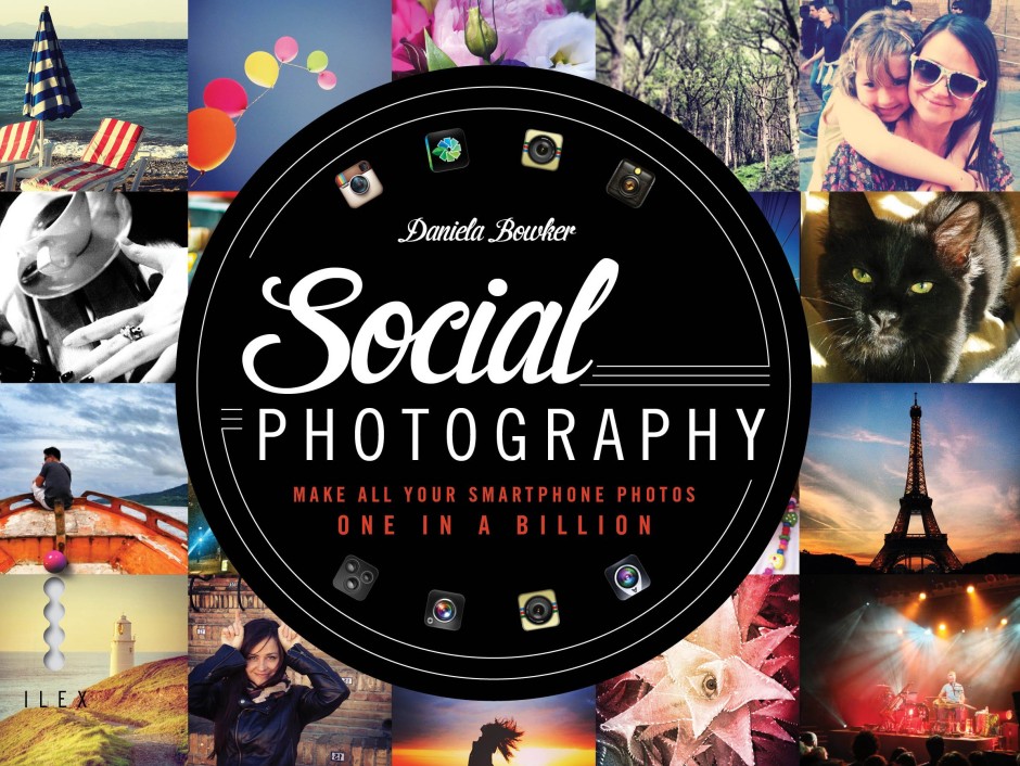
You can go into a bricks-and-mortar store to purchase it, use your preferred online retailer, or download it as an ebook.
For people in the UK wanting to lay their hands on a physical copy, they'll be here next month. Of course I'll be sure to tell you when! That would be now! Woohoo!
The palm-sized Projecteo Instagram projector
I have a new favourite toy. It's palm-sized, it's battery-powered, and it's a projector for Instagram images. It's called a Projecteo. Projecteo was conceived by the same people who make my favourite image-emblazoned edible snacks, Boomf marshmallows. This time, instead of selecting nine of your Instagram images to have printed onto bite-sized puffs of sugar, you choose nine images to have made into a miniature projection wheel comprising a single frame of 35mm slide film. Or 18 to have made into two wheels. Or 27 for three wheels. You get the picture.
One projector and one wheel of images costs $34.98, including world-wide shipping. Extra wheels cost $8.99 each. Mine arrived within a few days of being ordered.
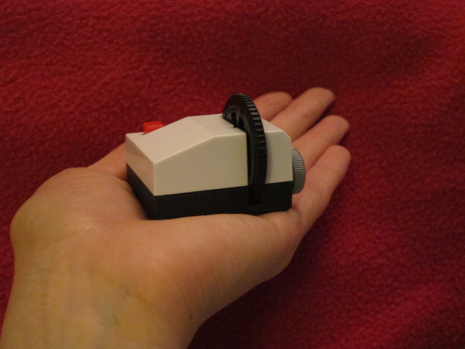
It was rather fiddly to insert the batteries into the projector, in fact I needed to get someone else to remove the battery case, but otherwise it was easy to insert the wheel, turn on the light, and start projecting images onto the walls, ceiling, blinds, doors, or floor, using the focusing ring to render them crisply. I spent most of yesterday evening shining peaches and bees and the Queen Elizabeth II bridge onto any flat surface I could find.

Just as with the marshmallows, dark photos don't come out very well, but bright ones look great. At $35 a go, a Projecteo is too expensive for a wedding favour, but it does make a fantastic little present. I'm off to see where else I can shine my images.
From 0 to 200 million users in 3.5 years. Instagram, of course.
From a Foursquare-like check-in app that wasn't really going anywhere to a photo-sharing site holding very nearly 20 billion images via a Facebook buy-out worth $1 billion, Instagram announced today that it's surpassed 200 million users. Or rather, it thanked its users in a blog post for making Instagram great. As a quick reminder, here's how far it has come:
October 2010: Instagram launches December 2010: Instagram clocks one million users (yes, it only took three months) September 2011: 11 months and 10 million users, and it's still iOS only April 2012: 1 million users sign up for the Android version of the app in the space of 24 hours March 2014: Instagram announces it has 200 million users, 50 million of whom signed up within the past six months
A speedier Android Instagram experience
Instagram has pushed out an update to the Android version of its app, making it smoother, sleeker, and speedier, whatever Android device you're using. From giant sized handsets to more compact and slightly less well specced devices, Instagram should load faster and be responsive. The profile screen should load twice as fast and with an app that's been halved in size, overall performance should be faster, too.
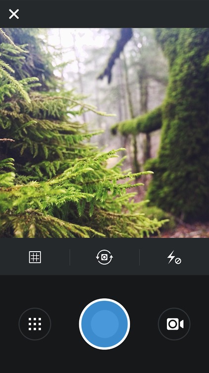
As well as functioning more speedily, it should look sleeker, with simplified visuals that make better use of screen space on smaller handsets and keep navigation easy with a rearranged layout. Instead of just being nice to use for people with the latest handsets, Instagram looks to be pushing its global appeal.
Instafax: BBC news via Instagram video
Here in the UK, you'll hear the BBC referred to as 'Auntie'. There are a few different explanations flying around for the moniker, but the consensus is it derives from the slightly prudish and reserved, 'Auntie knows best' attitude that the corporation had in its early days and well into the 1950s. Now, 'Auntie' is far more a term of endearment, and it can't really be said that the Beeb doesn't innovate. Over the next month the BBC is experimenting with delivering news via Instagram, a venture it's calling 'Instafax', a reference to the late departed text news service, Ceefax. Three times a day it'll post a 15 second video to its BBC News Instagram account.
The videos feature news footage overlaid with text and a music backing. Even if you can't listen, you can still access the salient issues before following through to the full story on the BBC website, or moving on to the next image in your Instagram feed. I've noticed some commenters have found the text a distraction from the footage and would prefer a more news-dense voice-over. I'm going to whisper this because it probably makes me some kind of new media pariah, but I'm not a fan of video content as I find it instrusive. The Instafax hybrid seems to be compromise and one that I like. As BBC person put it:
The idea behind not having a voiceover is that you don't have to have the sound on to understand the video. Additionally, it significantly cuts down on the amount of time the videos take to produce. If we decide to continue producing these after one month, we may consider having both a voiceover and on-screen text.
Why three videos a day? No one wants a feed overwhelmed with BBC news stories.
Doubtless someone, somewhere will be lamenting the demise of longform journalism and decrying the dumbing down of the news, but I'm rather impressed by the BBC's diversification and willingness to embrace social media. It's a pilot that I'd like to see taken up. You can keep up to date by following the BBC's Instagram feed.
(Headsup to DesignTaxi)
Who wants to conform? Choosing an app for rectangular Instagram images
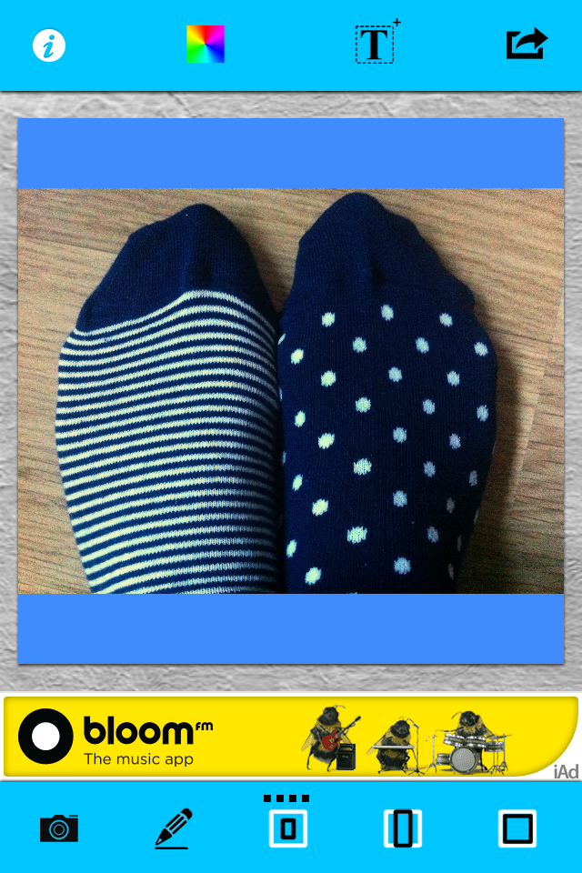
Instagram images are distinctive because of their filters and their square crops. They're the first two elements on the Instagram Spotter's Guide. But who wants to be forced to conform and always have to slice off the sides of your photos and submit a perfect square? Exactly! An entire industry has grown up around the Instagram phenomenon, encompassing everything from postcards to marshmallows, and it includes a goodly selection of apps that add a border to your rectangular photos that'll ensure they look square when imported to Instagram. (And if you choose a coloured border, it empahsises how the image is, in fact, square.)
I road-tested five of these apps. If I had the choice of a paid or a free version, I always went for the free one, which meant that one of my judging criteria was how intrusive or distracting the ads were. Otherwise, I was looking for an intuitive interface and something that didn't run too slowly. Thus, in order of preference, I present the Oblong Collective.

=1. Instacrop
iOS-only, free
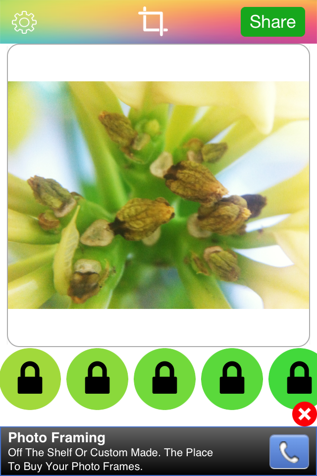
With no frills and a desperately simple interface, Instacrop comes joint top of my list. Tap to select a photo from your camera roll, hit share to select from Instagram or EyeEm, and you're done. If you're so inclined you can select from paid-for border colours. There are banner ads at the bottom of the screen and a pop-up ad before you can share your photo, but I didn't find them too instrusive.
=1. Instasize
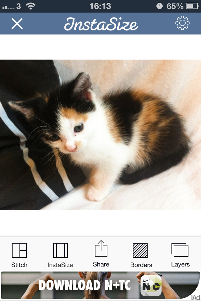
As well as allowing you to post rectangular images to Instagram (and Facebook and Twitter), Instasize allows you to create diptychs and triptychs, overlay a filter or text, and choose from a huge variety of borders. I didn't find the ads too distracting and the app didn't run too slowly, either. It shares top spot because if you're looking for a bit more functionality than just rectangular images, it has it.
3. #NoCrop
As with Instacrop, it's a case of tapping to import an image from your camera roll and then tapping to share to Instagram, Facebook, or Twitter. You can email or save the image, too. #NoCrop gives you the option to adjust your border size using a pinch-to-zoom motion or to reposition your image in the frame. This one is also ad-supported and they pop-up every now and again.

4. Squaready
iOS-only, free; Squaready Pro, £1.49
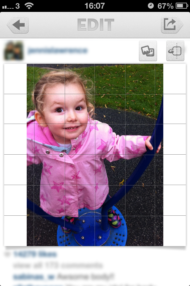
Squaready gives you lots of options to borderise your images: let it do it for you with an instant adjustment, choose from three different sized borders, or pinch-to-zoom to alter it yourself, and then select a border colour. There're are options to edit your images with Camera+ or three other programmes, too. All of this sounds great, but I didn't find the interface as simple to use as Instasize and it was much slower, too.


5. Squaregram
iOS-only, free (There is a SquareGram for Android, but it's developed by a different company.)
My first encounter with Squaregram did not end well: I closed it in a fit of frustration. Apart from it running very slowly with lots of intrusive ads, the interface wasn't especially intuitive. I couldn't figure out how to remove a text box when I'd been experimenting with adding one, which really bothered me. I did give it another go, and I liked that I was able to choose a border colour and corner curvature, but it ddn't make up for how disappointing it was first time around.
If you've any pet apps for sharing non-square images to Instagram, let us know down there!
How adverts will appear on Instagram
Instagram has released a preview of how the advertisements that its users will soon be seeing—as soon as next week if you're in the US—will appear. This is a one-time ad from Instagram to serve as a taster. Real ads will start with those from a select few brands that already make use of the service.

Advertisements will be identifiable by a 'Sponsored' label in the top right corner, where the timestamp would normally be. So that Instagram can determine what works and what isn't so successful in terms of adverts, you can tap on the '...' button to hide an advert and explain what made it unappealing.
I've already made the case for adverts on Instagram; this example looks tasteful enough but of course you can't be sure what any other company will come up with. They are, however, easy enough to identify as adverts.
Headsup to TechCrunch
Instagram, meet Windows
It has only taken three years since Instagram's launch and 18 months since the Android app was released, but people using Windows phones will no longer have to indulge in techno-shenanigans or work via third party apps, some of which pushed Instagram's patience, to access Instagram. The news was made public at the Nokia World conference in Abu Dhabi earlier today and then confirmed by Instagram. According to Instagram's CEO, Kevin Systrom, 'Our ultimate goal is to bring Instagram to everyone who wants to use it.' As a consequence, an Instagram app will be rolled out to Windows phones users in the next few weeks.
With Windows phones being all dressed up in terms of cameras but having fewer photo sharing parties to go to, Nokia and Microsoft had been pushing for Instagram compatibility with their devices for quite some time. As far as they were concerned, the lack of access was something that gave iOS and Android platform phones a significant edge. How much this changes anything with respect to numbers and sales figures remains to be seen, but Nokia and Microsoft are certainly feeling quite happy about this right now.
(Headsup to the Verge)
Instagram is introducing ads. And that's okay.
Oh the humanity! Anyone might've thought, by looking at the streams of disappointment, consternation, and even vitriol spewing forth in the comments sections of tech sites such as Engadget, TechCrunch, and the the Verge this morning, that the team behind Instagram had been responsible for the flaying of puppies and drowning of kittens in their own private pleasuredome. The revelation was in fact far more mundane than that: Instagram has announced that it will be introducing advertisements into its subscribers' feeds on a phased basis. Given that we knew this was coming, it was hardly revelatory. And indeed, contrary to wails and huffs of some of its subscribers, it's a perfectly acceptable course of action. A few of the commenters appear convinced that the move to include 'a small number of beautiful, high-quality photos and videos from a handful of brands that are already great members of the Instagram community,' is entirely the responsibility of the nefarious Facebook, which bought Instagram for $1 billion last year. While the specifics of the advertising programme might well have been the brainchild of members of Facebook's staff as opposed to Instagram's, and Instagram would have needed to prove itself profitable to justify the sale, it could hardly have remained either free or ad-free as an autonomous entity. It would have been forced to monetise its platform through some means. Its developers cannot sustain themselves on airballs and its servers do need to function. This requires cash, with or without Facebook.
What then, are the options to raise these funds, aside from advertising? First, Instagram could have opted for a subscription-only model, which would almost certainly have been corporate suicide. Or second, it could have implemented a freemium model, more on which later.
Rather than ask its users to part with their money directly, it's asking companies to part with their cash in order to place their brand in front of Instagrammers' eyeballs. This is sensible. The particular benefit of switching to an ad-supported revenue model is that apart from the aesthetics of the interface, nothing changes for the user. There are no forms to be filled out and importantly, no money needs to be exchanged. From Instagram's perspective, advertising means that it doesn't need to determine an appropriate subscription price-point that makes it attractive to subscribers but simultaneously sustainable.
Presented with the choice of the occasional advertisement appearing in your feed and having to do nothing to continue posting photos of your cats to your legions of followers, or having to pay up front to use a service that has heretofore been free, what's easier and more appealing? Unless you are heavily invested in your Instagram feed, you might think quite carefully about subscribing. A great many people will decide that it isn't worth their money, others will simply not be bothered to get out their credit cards; either way, it would be disastrous for Instagram. Advertisements might deter a few embittered users, but inertia will be the dominant force.
This then, brings me to the freemium model: advertisements for those who aren't prepared to pay at all, and a fee for those who'd prefer their Instagram experience to be ad-free. It's possible this is something that Instagram might consider implementing when advertisements have been rolled-out world-over (at present they're US-only), but if it hasn't, it should.
Instagram, if you're listening, there are plenty of people out there who do understand that you can't survive on hope and feathers. We're generally fine with advertisements, provided that it's obvious they are advertisements and it's easy for us to ignore them. We would, however, prefer to be able to pay a minimal yearly subscription fee or a slightly larger one-off payment in order to avoid the ads. We're reasonable and appreciate the virtues of hot dinners, running water, and rooves over our heads.
For anyone who's disgusted by the notion of Instagram including advertisements, please pause for thought. How do you expect the service to sustain itself without an income? And what are your proposals for an alternative model?
How exciting is the iOS 7 camera app?
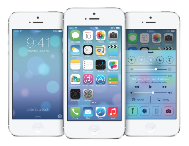 Whilst everyone else is arguing about whether the new flat design and Crayola coloured icons that comprise iOS 7 are genius or travesty, shall we take a look at what's been updated, reshuffled, and introduced camera-wise?
Taking on an iPhotos feel, photos are now automatically organised into 'moments'. It's a twee name for a fairly neat concept: images are sorted and labelled geographically and temporally using their metadata. This will let you search photos you've taken in one particular location by date. It's a more sophisticated digital version of having holiday albums sorted by year and place, with each photo captioned; you can see all the photos from one place organised by date, too.
Airdrop will allow you to drop an image into someone else's iPhone over the same wi-fi network. If we can Airdrop to other devices, for example a MacBook Air, that'd be neat.
Photo Stream already allowed you to share with your friends and for you to comment on their streams; now you can insert your photos into their shared streams, creating a collective album.
Moving between camera, video, panorama mode, and the square crop feature is managed by a swipe. Yes, you read that right, there's a square shooting mode built into the camera app, along with a range of filters. It feels like a dreadful disease that afflicts smartphones. With any luck, it's a childhood illness and everyone will grow out of it soon.
The conclusion? There's nothing revolutionary or even exceptionally exciting here. It feels more like a consolidation of features and in some respects even a game of catch up. That's not to say that sharing images via Airdrop isn't a welcome addition, it's just that it isn't setting alblaze the world of mobile photography.


