Team Photocritic has already had its paws on a Cosyspeed Camslinger. What about the Streetomatic?

When you hear the term 'high-res' thrown about with such abandon when it comes to images for web use, have you ever stopped to think just how big or how high quality and image meant for the web needs to be?
There's an assumption that high-contrast images are more dynamic, more compelling, more inviting. Have a go at some low-contrast photography. You might surprise yourself with the results.
Balance doesn't mean symmetry; it means an internal consistency and tension within your photos. And it's a vital element of composition.
Great photos might be down to a little bit of luck, but most of that 'luck' you make yourself. Don't believe us? Read on...
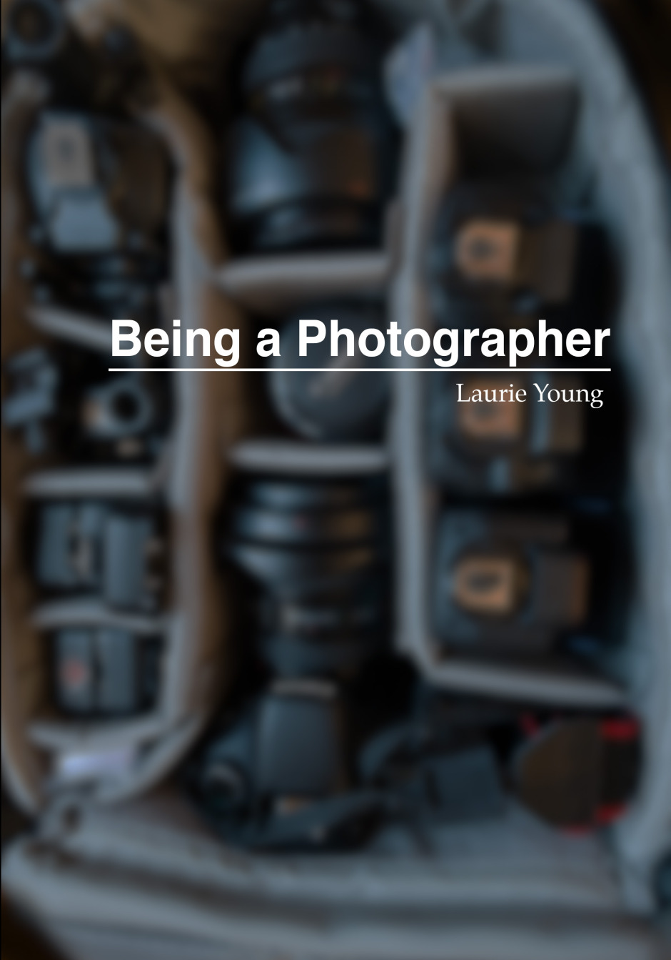
How do you 'be' a photographer? This question, posed by Laurie Young in his book Being a Photographer, isn't about the technical considerations of aperture and your intimate knowledge of ISO, but rather your intent every time that you pick up a camera. For whom are you taking photos and what is it in these photos that your viewers will appreciate?
The book starts with two questions:
They're good questions. You should ask yourself them now. Why do you take photos? Whom are you expecting to look at them? Every time that you pick up your camera, what are you intending to accomplish with it, because if you take a photo to which nobody pays any attention, isn't that a waste? If that's the case it falls on you as a photographer to ask yourself 'Why would anyone look at my images?' The point of the book is that you must have intent whenever you take a photo: what impact do you want your photo to have on someone when she or he looks at it?
These two initial questions are developed into two themes that run throughout the book: first, unless you pick up your camera with a posit, there is no point in picking it up at all; and second, that your intention does not have to be the same for every photo that you take and every viewer you try to engage. In fact, being able to identify your viewers and their different expectations is part of what helps you to 'be' a photographer.
Knowing this, however, is all very well. How do you put it into practice into to make you a better photographer? The book does this by building on these two questions, introducing a series of projects, with a different audience at the heart of each. It starts with you and progresses to your family, your friends, to strangers, and finally to people whom might pay you for your work. Each project is aimed at helping you take the right photos for each of these groups of people by focusing on your intent and their expectations.
Being a Photographer isn't a long read, but it is a valuable one. It forces you to consider the relationship between you and your photos' viewers, that's bridged by your photos. By helping you to identify for whom you are taking photos and what they want from them, it helps you to take better photos, and to 'be' a photographer. The book is available in hard copy format or as a digital download from Laurie's website, Wildfalcon. Laurie's worth following on Twitter, too, where he's @lry_photo.
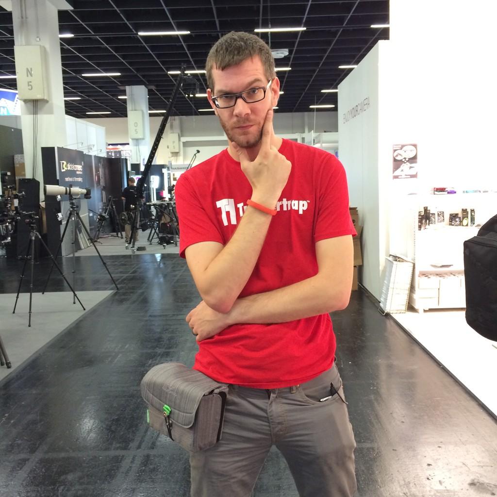
I'm not known for my physical exercising prowess - in fact, thinking of going to the gym sends me into cold sweats, which means that I felt I've exercised, so I don't go. When I realised I was going to have to spend six days straight at Photokina, on my feet, demoing demoing my little heart out for my day job, it served as a great reminder for why I stopped carrying a full-size SLR camera: Less weight = less exercise. Perfect. At Photo Plus back in October, I first saw the Sony A7, and I fell a little bit in love. I traded in my Canon 6D in favour of a Sony A7, and I haven't looked back - to my particular photography needs (I travel a lot, I want high quality photos, I don't really do sports, and I don't need fast auto-focus), the A7 is a perfect camera.
However the A7 is still an expensive piece of kit, and carrying it around safely for six days straight was always going to be a challenge: I need it to be easily available for demoing Triggertrap to people, but I also need it to be safely stashed away. That's where Cosyspeed Camslinger 160 comes in.

Cosyspeed is a relatively new company, and they're focusing on making product especially for mirrorless cameras (hence the name - Cosy, I'm going to guess, is short for Compact System, which is one of the names that didn't quite stick for mirrorless cameras, alongside 'EVIL' - short for Electronic Viewfinder, Interchangeable Lens). The camera bag comes in two sizes, the slightly smaller 105, and the larger 160. Both of them are designed to wear at the hip - and it does make you feel a little bit like a cowboy wearing them.
I've tried a great many carrying systems in my life; some of them - especially Peak Design's offerings - are fantastic for large SLR cameras with honking great lenses attached. But the one problem all other carrying systems have, is that you have to keep your camera exposed to the world: Unprotected from rain or bumps. Of course, with a full-size camera, you don't really have the option of protecting it - but surely, these kinds of innovations are precisely why we are looking at more compact cameras in the first place?
I was amazed by the Cosyspeed Camslinger bag - I wore it for 6 days, 12-16 hours per day, and I was constantly demoing, so I found myself accessing the bag hundreds of time per day. It's a great quick-draw solution, meaning that your camera can stay protected whenever you don't need it - and easily available when you do need it.
At this point, I briefly have to sing the praises of the closing mechanism...

I've never seen these kind of pushbuttons used on a camera bag before, but they're brilliant. To close it, you simply push down, but at that point, the bag is securely closed (you can also use the bungee cord to add a second layer of security on top). It takes a little bit of time to get used to, but it's a fantastic system, meaning I can have my hands free, then suddenly just magic my camera out of the bag to show someone something (or to take a photo, of course).
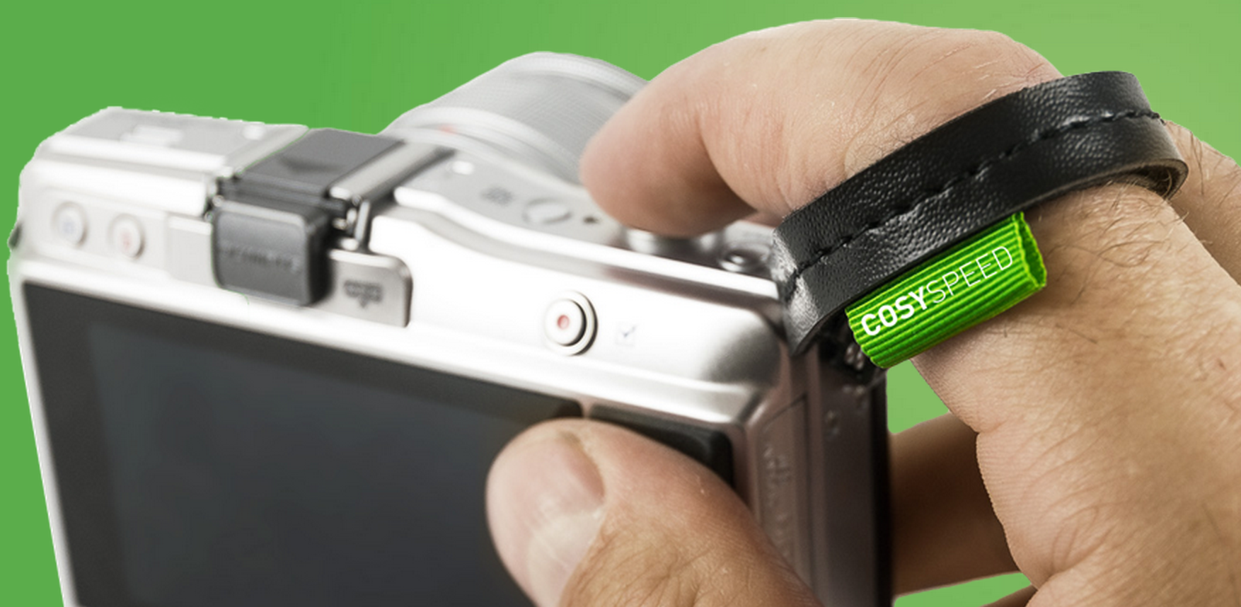
With the bag, it doesn't really make sense to use a camera strap - good job, then, that the guys have also created a finger-strap. I think in the longer term perhaps a proper hand-strap might be a better way go to, but in the couple of weeks I've used the fingerstrap, I've grown to love it - it's small and simple, and just means you have a second chance in case someone bumps into you and you drop the camera - another advantage of the mirrorless cameras, of course: Try trying to save a full-size camera with one finger!
All in all - if you shoot with a compact SLR or a mirrorless camera, I think it's very much worth giving the Cosyspeed bags a closer look - They are by far the best camera bags for mirrorless cameras out there - They're well designed, well made, and I'll certainly be using mine for many years to come - it's a perfect match with my Sony A7 and the way I like to shoot.
Editing, post-processing, whatever you want to call it: some people love it, some people hate it, some people are fortunate enough to work with professional retouchers, and some people just don't know where to start. There are a few businesses out there who are seeking to unite those people who feel frustrated or flummoxed by the editing process with people who can work post-processing magic, and the newest one is Spruced up! Spruced up! was founded by Rob Willingham, who used to work with photographer Rankin, and the Spruced up! team seem to be an experienced bunch, having worked on campaigns for the likes of Christian Dior and Calvin Klein and been let near photos of the Queen and Kate Moss. They're looking to provide a complete editing package for users, from simple enhancements to total overhauls.
Each image incurs a £2.49 handling fee, with simple changes—for example exposure tweaks, black and white conversions, and sharpening or softening—priced at 49p a go, rising to 99p for cosmetic changes (tooth whitening, nail colour alterations, for example), £1.99 for removals, and ending at £12.99 for a full make-over. You check out the menu and price list here.
This isn't the first time that we've looked at editing out-sourcing options. Our conclusion now isn't that much different from our conclusion then: it's not for us. It doesn't really matter if the resulting photos are good, bad, or indifferent, but that but that processing our images ourselves is important to us. It ensures that we realise our own creative visions and intentions, rather than placing them into the hands of others.
Sure, post-processing can be tricky and tiresome, but at £2.98 for a black-and-white conversion or an exposure fix, I'd be inclined to suggest that learning a few key adjustments in a free editing package such as Pixlr or Aviary (which is built in to Flickr) would be a relatively pain-free and definitely cheaper alternative. But a bit of Stalinesque airbrushing at £4.48 a time isn't too bad. If you're not in regular need of re-writing history, and don't therefore have the processing package or prowess, it makes sense to send your photos to someone who's more talented and less frustrated by the procedure, to do it for you. And that's where Spruced up! comes in.
If you've a digital copy of a vintage print that you'd like tidied up, that can be done, too.
Spruced up! is available as an iPhone and iPad app, or via the Spruced up! website.
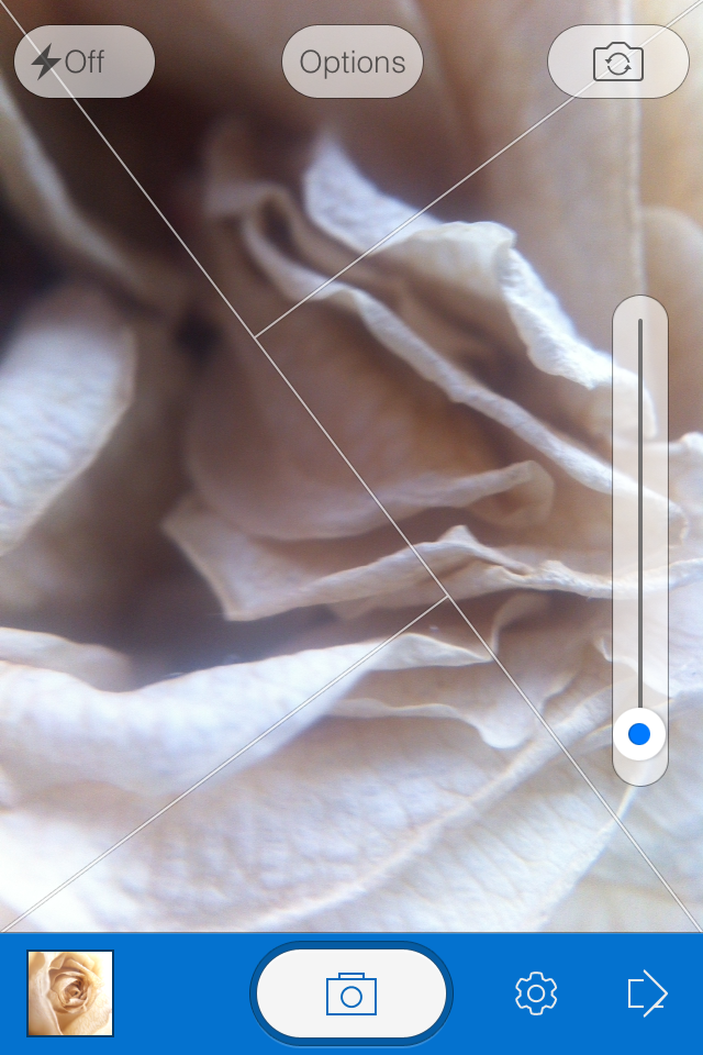
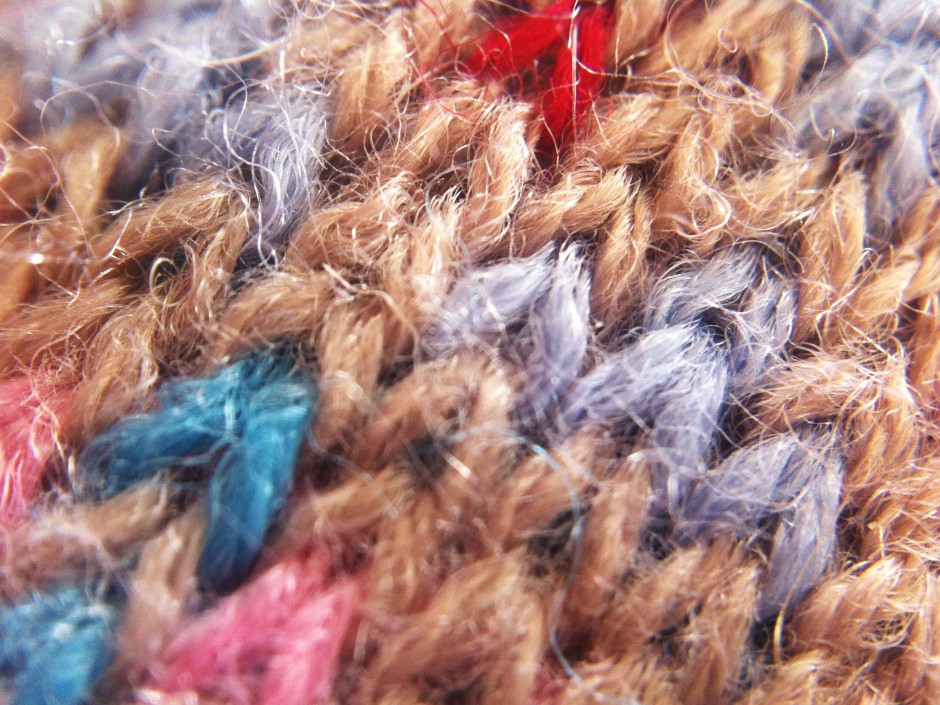
When I was conducting my recent app spring clean, one of the apps that wasn't sent packing was Fotor, an editing package that I was asked to review by its makers. I've been trying it out for a few days, but the images I've edited specifically for this review I shot today, in glorious sunshine with the help of an Easy Macro band. As an editing package, Fotor offers a lot, but I think it falls short of replacing one of my current favourites. Fotor gives you the option to import photos from your camera roll or take a photo in-app. If you opt for in-app, you get a choice of three subject placement overlays: grid, golden spiral, golden triangle. Or none at all, if you prefer. Whether you take a photo in-app, import it for editing, or save it after editing, it will be stored in Fotor's photo folder, according to date.
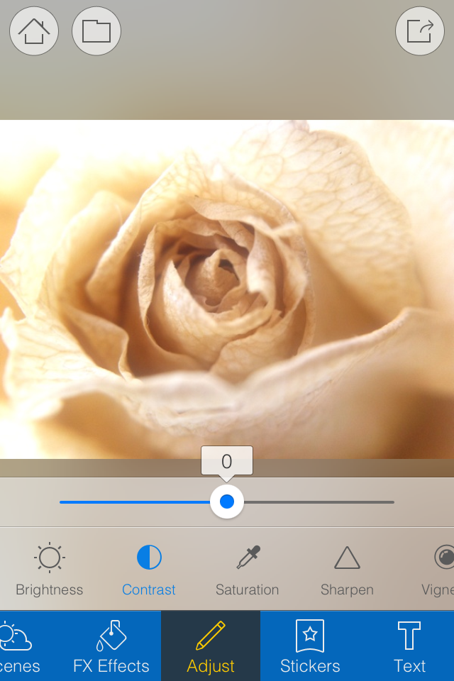
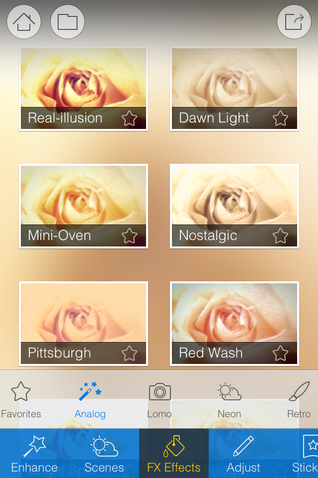
When it comes to editing functions, features, and filters, Fotor is well endowed. You can adjust contrast and brightness and saturation and white balance and shadows and highlights, add text and stickers, apply a tilt-shift effect or a vignette, and compile a collage. There's a gamut of free filters—nine folders, ranging from 'Lomo' to 'Scratch', each with nine options—as well as some paid-for additions and 12 paid-for scenes.
Fotor includes some neat touches. Being able to assign your favourite filters to a specific folder, making them easier and faster to apply, for example. Having each photo's details (time and date, exposure, and geo-location) at a tap is great. And I appreciate having plenty of sharing options, too.
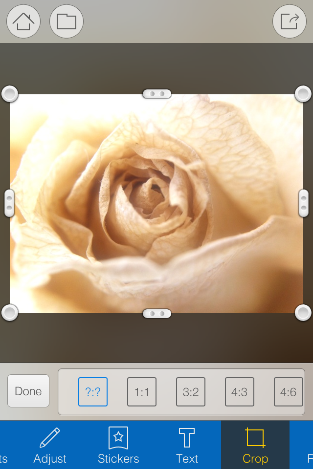
However, there are some frustrating oversights. The omission of a straighten function being top of my list. And not being able to crop a vertical image using a 4:3 aspect ratio without first rotating it to a horizontal aspect, and indeed various other aspect ratios, is a bit... odd.
I didn't find the slider that is used to control the intensity of the adjustments especially accurate: if I tried to set it to 12 points, it would easily wind up at seven or 16. Without a reset button, returning the slider to 0 was sometimes tricky. And I have to confess that I'm fond of being able to compare my adjustments with the original image, which I can't do with Fotor.
Fotor, I'm afraid, won't be making its way to the 'Photography A' folder on my phone. It doesn't offer me enough of what I need and there's too much of what I don't. But that isn't to say it won't be for you. It's free to download and available for Android and iOS, so worth a look.
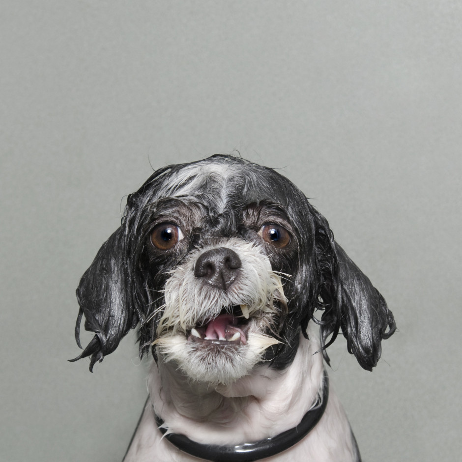
After my slightly disappointing press view of the Sony World Photography Awards exhibition, when I didn't have the opportunity to take in the photos, I made a return trip to Somerset House yesterday to rectify this situation. I had much more time to wander through both the East and West Wings, admiring the images and pontificating on the judges' choices. Visiting an exhibition that has cherry-picked from vast numbers of photos submitted from across the globe by both amateur and professional photographers gives you the chance to look for trends and fashions, garner some inspiration, and importantly, look through a window into other people's worlds. I enjoyed my saunter through the rooms and Sara Naomi Lewkowicz's l'Irs d'Or winning series Shane and Maggie stands out a mile. I loved Sophie Gamand's wet dogs, which won the portrait prize, Guy Martin's photos from the Gezi Square protests told a defiant story, and I was drawn to the deep and dark photos in Salvatore Di Gregorio's series An Old Fight, which won the sport prize.
What, though, were my overwhelming thoughts and questions as I left the exhibition?
The professional category was dominated by black and white images. That is a comment made as neither praise nor criticism, merely as an observation. It is worth noting, however, that l'Iris d'Or winning series comprised colour images and that the photos that have stuck with me are those shot in colour. Maybe it is because they were my preferred shots, or perhaps it is because their colour makes them stand out amongst the monochrome, but it does pay to be different.
Writing of daring to be different, I think I might've reached Indonesian cow-racing photo saturation point. It's a stunning spectacle that produces stunning images, but there have been examples in the professional or open categories for at least the last three years. It's almost as if their inclusion has become obligatory. I'd appreciate being able to gaze upon something new in future years.
Finally, I was surprised by the profusion of manipulated images in the open category. From HDR, to composites, to painterly-type blending, it had it all, and this extended beyond the 'Enhanced' division, which is devoted to manipulated images. As the author of a book on surreal photography, this might be regarded as an unusual comment, but it does present some important questions. First, how much manipulation is too much manipulation? Second, to what degree is photo-manipulation now regarded as an acceptable element of photography? And consequently, at which point does a comeptition become one of photo-manipulation rather than photography? All of these are questions for another day, but ones to ponder.
The exhibition runs until Sunday (18 May), and if you have to be in London or its environs, it's worth an hour or so to take it in. I'd love to know what you think.
Sony World Photography Awards exhibition, Somerset House, London, until 18 May 2014.
There's been quite a bit of love for Litely over the past few days, following its release as an iOS app earlier this month. Developed by Cole Rise, one of the engineers behind Instagram filters Amaro, Hudson, Sierra, Sutro, Mayfair, Willow, and Rise, it's a photo editing app that offers a range of subtle filters and simple tools. When Sarah Perez of TechCrunch declared that Litely is the best new photo-filtering application for iOS, I decided that I needed to commandeer my parents' iPad, download it, and give it a whirl. The best new photo-filtering app for iOS is high praise and with my expectations set to stratospheric, I was anticipating something revolutionary. To give Litely its dues, it does have a lovely interface, the filters are subtle, and being able to adjust their intensity is much appreciated. But I think that it requires a little more fine-tuning before it can justify the unmitigated praise that's being heaped upon it.
My most fervent criticism concerns the crop function. Given my dislike for the Flickr app's crop utility, I must be a stickler for them. I don't mind only having the choice between the original and a square aspect ratio, but I'd quite like to be able to actually crop an image and get closer to my subject. Litely lets you do this on-screen using the pinch function, but it doesn't seem to apply the crop after you've selected the 'Tick' icon. Please don't tempt me and then deny me. It's cruel. And if I can't crop, at least let me straighten.
The editing functions comprise exposure, sharpen, vibrancy, and vignette. All of these are useful and easy to apply, but I'd still appreciate a white balance correction (even if I am meant to be adding a filter), a contrast slider, and maybe a tilt-shift option too. Does this make me greedy? Maybe, but I think this is Litely's biggest stumbling block.
Having started out as a collection of pre-sets for Lightroom, Photoshop, Aperture, and Camera Raw, Litely wasn't about actual editing. Those programmes offered all of that functionality with spades. In its transference to an iOS app, it has lost that purity. It's neither a one-stop-editing-shop nor an app devoted to filtering, and neither is there an inherent photo-sharing community, like Instagram or EyeEm.
By offering a few editing tools and nine filters for free, with a further 36 filters available at a price, it is falling between two stools. If it gave me all of the editing tools I want and need, it could possibly tempt me to augment the filters and stick with it. But I'm just not that bothered by a half-baked editing app with a few filters on the side. Equally, would I care to download just a bunch of filters? I'm not likely to, but I know people who are. Without a community to keep me coming back, it doesn't do enough to justify my interest, however delightful the interface or subtle the filters.
In conclusion, I've not fallen in love with Litely the same way that others have, but I do feel that it has potential. Now it must decide what it wants to be.
Litely is available to download for free from the App Store (nine filters plus basic editing fnctions), with three further sets of filters available for $1.99 each.
I have a new favourite toy. It's palm-sized, it's battery-powered, and it's a projector for Instagram images. It's called a Projecteo. Projecteo was conceived by the same people who make my favourite image-emblazoned edible snacks, Boomf marshmallows. This time, instead of selecting nine of your Instagram images to have printed onto bite-sized puffs of sugar, you choose nine images to have made into a miniature projection wheel comprising a single frame of 35mm slide film. Or 18 to have made into two wheels. Or 27 for three wheels. You get the picture.
One projector and one wheel of images costs $34.98, including world-wide shipping. Extra wheels cost $8.99 each. Mine arrived within a few days of being ordered.
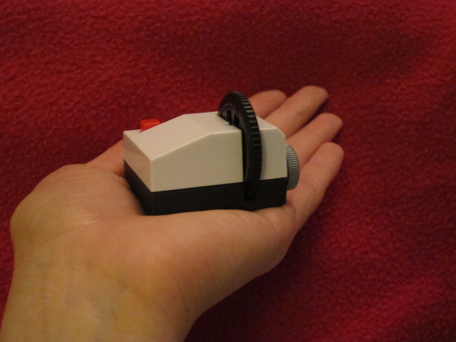
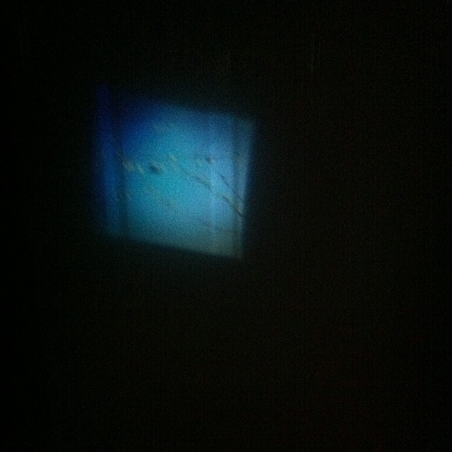
It was rather fiddly to insert the batteries into the projector, in fact I needed to get someone else to remove the battery case, but otherwise it was easy to insert the wheel, turn on the light, and start projecting images onto the walls, ceiling, blinds, doors, or floor, using the focusing ring to render them crisply. I spent most of yesterday evening shining peaches and bees and the Queen Elizabeth II bridge onto any flat surface I could find.
Just as with the marshmallows, dark photos don't come out very well, but bright ones look great. At $35 a go, a Projecteo is too expensive for a wedding favour, but it does make a fantastic little present. I'm off to see where else I can shine my images.
Sometime in September last year I pledged a modest sum of money to Easy-Macro's Kickstarter project. I'd heard about Easy-Macro before then—a magnifying lens set into a rubber band that wraps around your smartphone and sits over its lens—but the new and improved 4× magnication factor in the Kickstarter-funded project made it seem like a great bet. Some 4,106 other people agreed with me and Easy-Macro surpassed its goal with plenty in hand. For me, the appeal of the Easy-Macro wasn't just that it was a fun addition to my smartphone, or that it was cheap, but that it meshed with the ideals of smartphone photography: discreet and easy. It sits my wallet and can be placed around any phone. I don't have to worry about it getting crushed or dropped in a bag and it won't become obsolete if I upgrade my device.
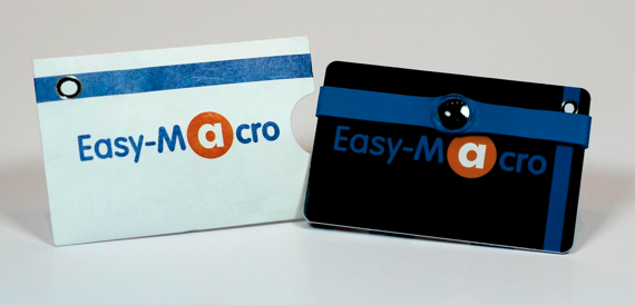
All I needed was for it to be any good. Well, just before Christmas my bright blue band arrived and I'm happy to say that I've been having fun with it ever since.
You use the Easy Macro just as would manually focus a lens set to infinity: by getting as close as you feasibly can to your subject and then moving your smartphone steadily backwards until your subject comes into sharp focus. It does require patience and a steady hand—remember, keep your elbows pushed into your sides to help stabilise yourself—but I've been pleased with the results so far.
Of course it is never going to compete with my 100mm macro on my Canon 6D, but it's not meant to. For a $15 gadget that I can keep in my wallet, what's not to like?
If you missed out on the Kickstarter campaign but are tempted by one, fear not, because you can pick up an Easy-Macro from the Easy-Macro website.
In one of life's odd little turns, I found myself pitching up at the Fujifilm X-T1 press conference in Bangkok this lunchtime. Yes, today was meant to be a rest day between excursions, but I couldn't resist the invitation to join Daniel, the editor of ThemePhoto, just around the corner from where I'm staying. There were a few X-T1 bodies with different lenses floating around, plenty of tea and coffee, and I had the opportunity to play around with Fujifilm's newest addition: weather-sealed, dSLR-look-alike, and 16 megapixel APS-C sensored. After all that pre-amble, what did I think? Mostly, that I enjoyed getting to know it, albeit briefly, and I would appreciate being able to spend more time with it. Without a dedicated mode dial you alter the sensitivity and shutter speed dials independently, selecting 'A' on each if you want it in automatic, and switch between automatic and manual on the aperture ring to control your exposure. If you want to shoot aperture priority but manually control the ISO, you set the shutter speed dial to 'A' and the adjust the other two as required.

There's an exposure compensation dial on top of the camera, beside the shutter speed dial, and a front-facing dial that gives you more refined control over your shutter speed. Without the standard mode dial giving you 'Sport' and 'Portrait' options, it makes you think that this is a photographer's camera. Yes, there are soft-focus and toy camera options, but they're hidden away and not obvious.
However, I did find it quite tricky to adjust the shutter speed dial while holding the camera to my eye. Unless this is something that I could get used to (I'm not sure) it could get trying very quickly. I found the rings to switch between metering modes (beneath the shutter speed dial) and drive modes (beneath the ISO dial) a little awkward to adjust, too. Your milage may vary.
The four-way controller gives you control over your most-used functions, for example white balance, macro mode, and Fujifilm's film replication effects. You can make it into the camera that you want it to be.
Did I notice any lag with the EVF? Well, yes. But, it is possible to select whether you shoot EVF-only, EVF+LCD screen, or LCD-only. I thought it felt faster and less laggy in EVF-only mode. You know what I did like, though? That when you shift orientation from landscape to portrait, the information that appears on the EVF re-orients itself, too.
I tried out the 18-55mm kit lens, which handled very well, the gorgeous XF56mm ƒ/1.2, and the 55-200mm telephoto lens. I found that last one had a fairly stiff, not very smooth zoom ring, but some people might prefer that. At launch, there's no weather-sealed lens to go with the weather-sealed camera, which is a shame, but the X-mount range is growing and the weather-resistant 18-135mm is scheduled to arrive in summer this year, to be followed by two more later in 2014.
When I had the opportunity to chat with Somkiat Narattanakulkitti, Fujifilm's General Manager of Marketing and Sales in Thailand, apart from him asking me if I weren't put off by the protests, he was keen to point out how Fujifilm thinks it's important to innovate, and the X-T1 is a part of that. People want a camera that looks stylish, performs well, but isn't a cumbersome brute. Okay, so he didn't use the words 'cumbersome brute', but the X-T1 is about form and function and Fujifilm's direction is definitely to keep on keeping on. No, I couldn't get him to confirm if a full-frame camera is coming next, but it wouldn't surprise me.
At £1099 body-only, the X-T1 is a compelling piece of kit. I won't be trading in my current camera for it any time soon, but I can certainly see how some people would be tempted by it, and I wouldn't mind it for an extended stay!
Just before Christmas the lovely guys at Lollipod sent me an ice blue version of their lightweight, compact, multi-functional support device to test. The Lollipod can't withstand anything that weighs more than 420g, but that makes it perfect for mobile phone photography and compact cameras, and it can be used a sound boom, too. I've given it a go with my Canon S95, which attaches to the Lollipod directly, and my iPhone 4, which attaches using Lollipod's additional spring-loaded adapter. (You can use a Joby Griptight, too.)

The Lollipod really is light. I took the liberty of plonking it on the kitchen scales and it weighed in around 275g, or 9oz. So much of the appeal of smartphone or compact camera photography is that it's convenient. You don't want heaps of weighty (and expensive) kit when your camera fits in your pocket. However, there are occasions when you want to be able to steady your picture-taking device, for example when you're taking night shots, or self-portraits. Schlepping around something designed to take a dSLR might be overkill, but the Lollipod isn't.

When it's fully retracted, the Lollipod isn't any more than 33cm (just over one foot) long. That's small enough to put in a daypack, a messenger bag, or even one of my larger handbags. Combined with its light weight, that makes the Lollipod supremely portable.
I was also impressed by the screw mechanism that secured your compact camera or the mobile adapter to the Lollipod. It's integrated into the Lollipod, so there's no ferreting around to find something to screw a plate into the camera or adapter, or even a plate to lose.

Extending and retracting the Lollipod is quick and easy. There are no locking mechanisms: everything just slides in and out. Despite my initial concerns that this could result in the Lollipod retracting into itself, that never happened. After all, neither my camera or phone were that heavy and you're not meant to put anything weighing more than 420g on a Lollipod.

Being so light means that the Lollipod isn't always as stable as it could be, especially when it's fully extended. Unless I set the self-timer on my compact camera it was quite difficult to capture an image without camera-shake. I had much more success with my iPhone, though. It is possible to weight down the Lollipod—you use the carrying case that comes with it, and something like a water bottle or handy rock—but I'd still be apprehensive about using it in windy weather. Without independently adjustable feet, it wouldn't be stable on uneven ground, either.
If you're accustomed to the flexibility of motion in a standard tripod head, you might feel restricted by the Lollipod's limited movement. It can only move through one axis, so you'll need to decide between setting your device so that you can switch between portrait and landscape, or so that you can tilt it. Tilting with a camera on the Lollipod wasn't a problem at all, but I didn't feel that my iPhone was sufficiently secure in its adapter for that.
When you're accustomed to a heavy-weight tripod with a head that moves in almost any direction imaginable, the Lollipod feels incredibly limited and restrictive. But that's comparing apples with oranges, really. The Lollipod has been designed as a lightweight, flexible support, and it fulfils that brief. If you need to stop your camera from shaking when taking photos in the dark, it'll do the job. If you want something to have a go at self-portraiture with your phone, it's great. If you need a lightweight and portable support for a small camera or smartphone, that's exactly what it is. Just don't try it out in a force nine gale.
Lollipods are available direct from Lollipod and cost £30.
Instagram images are distinctive because of their filters and their square crops. They're the first two elements on the Instagram Spotter's Guide. But who wants to be forced to conform and always have to slice off the sides of your photos and submit a perfect square? Exactly! An entire industry has grown up around the Instagram phenomenon, encompassing everything from postcards to marshmallows, and it includes a goodly selection of apps that add a border to your rectangular photos that'll ensure they look square when imported to Instagram. (And if you choose a coloured border, it empahsises how the image is, in fact, square.)
I road-tested five of these apps. If I had the choice of a paid or a free version, I always went for the free one, which meant that one of my judging criteria was how intrusive or distracting the ads were. Otherwise, I was looking for an intuitive interface and something that didn't run too slowly. Thus, in order of preference, I present the Oblong Collective.
iOS-only, free
With no frills and a desperately simple interface, Instacrop comes joint top of my list. Tap to select a photo from your camera roll, hit share to select from Instagram or EyeEm, and you're done. If you're so inclined you can select from paid-for border colours. There are banner ads at the bottom of the screen and a pop-up ad before you can share your photo, but I didn't find them too instrusive.
As well as allowing you to post rectangular images to Instagram (and Facebook and Twitter), Instasize allows you to create diptychs and triptychs, overlay a filter or text, and choose from a huge variety of borders. I didn't find the ads too distracting and the app didn't run too slowly, either. It shares top spot because if you're looking for a bit more functionality than just rectangular images, it has it.

As with Instacrop, it's a case of tapping to import an image from your camera roll and then tapping to share to Instagram, Facebook, or Twitter. You can email or save the image, too. #NoCrop gives you the option to adjust your border size using a pinch-to-zoom motion or to reposition your image in the frame. This one is also ad-supported and they pop-up every now and again.
iOS-only, free; Squaready Pro, £1.49
Squaready gives you lots of options to borderise your images: let it do it for you with an instant adjustment, choose from three different sized borders, or pinch-to-zoom to alter it yourself, and then select a border colour. There're are options to edit your images with Camera+ or three other programmes, too. All of this sounds great, but I didn't find the interface as simple to use as Instasize and it was much slower, too.

iOS-only, free (There is a SquareGram for Android, but it's developed by a different company.)
My first encounter with Squaregram did not end well: I closed it in a fit of frustration. Apart from it running very slowly with lots of intrusive ads, the interface wasn't especially intuitive. I couldn't figure out how to remove a text box when I'd been experimenting with adding one, which really bothered me. I did give it another go, and I liked that I was able to choose a border colour and corner curvature, but it ddn't make up for how disappointing it was first time around.
If you've any pet apps for sharing non-square images to Instagram, let us know down there!
Seeing as half the world and their spouses appear to be producing some variation on 2013 In Review articles, videos, and compilations, I thought I'd go for a variation on the variation of 2013 In Review. I've made a sneak peek Flipagram of some of the photos that will be appearing in my Social Photography book, which is due to be released in spring 2014. It's a prospective retrospective, I suppose.
As for Flipagram, it's a rather nifty app that I discovered when a photographer whom I follow on Instagram compiled her best bits of 2013 into a slick looking video. (Thanks, Natalie Norton!) It allows you to hook up to Instagram to make a digital flipbook of your favourite photos, or if you're not of the Instagram persuasion, to do it from your smartphone's camera roll.
Once you've selected your images you can arrange them in your preferred order, crop them to fit Flipagram's square format, duplicate them for added impact, decide between a 15 second or 30 second video playtime, and choose a soundtrack if you fancy. After that, you hit the button and Flipagram compiles your video for you. Then you can share to Instagram, Facebook, Twitter, Pinterest, or YouTube, or you can email it away. There's no option to embed your videos from the Flipagram site, but if you upload them to YouTube, you can embed from there.
I was impressed by how easy it was to compile a little video and finish it the way that I wanted it finished. At the moment you can't return to edit a saved video, but Flipagram has developments in the pipeline, so that might be one of them. And useful it would be, too.
Flipagram is free, nothing to do with Flipboard, available for Android and iOS, and worth a download for a bit of fun.
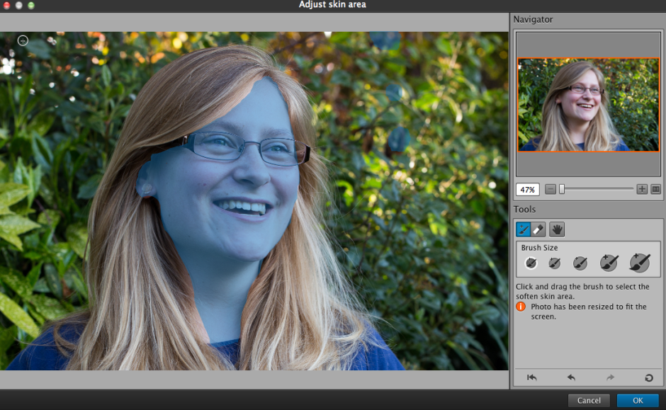
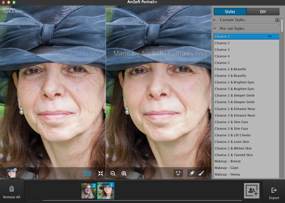
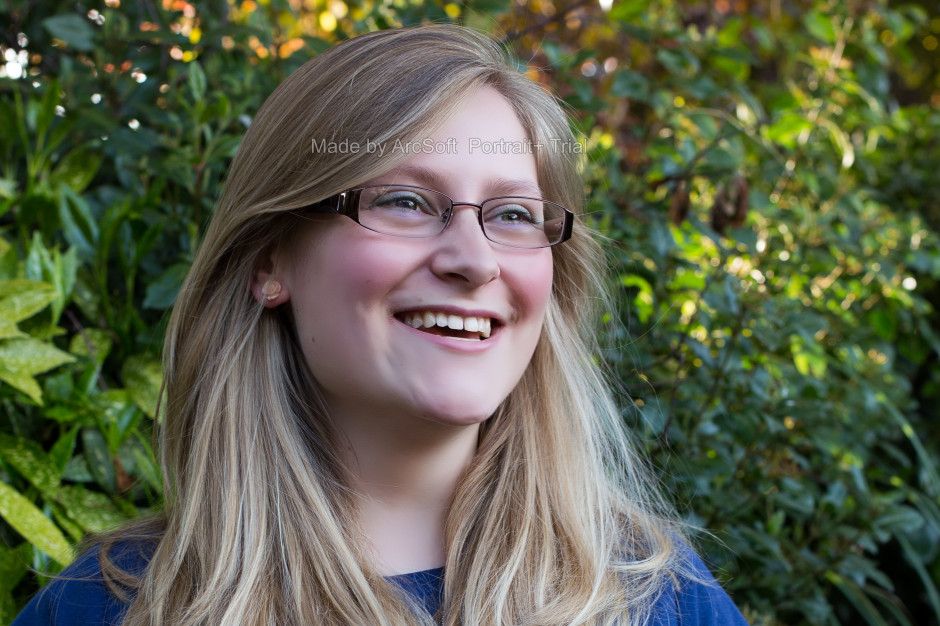
ArcSoft got in touch with me to ask if I would like to review their Portrait+ editing package. It's an automated portrait editing programme that detects upto 20 faces in any photo and allows you to apply 28 preset functions to your subjects, to apply more specific 'DIY' actions, including eye brightness, smile depth, and skin quality, and to create your own presets from these specific actions if you want. You can even apply makeup. Once you've loaded up Portrait+ you import an image, wait for the programme to detect the face, and then get to work. Unless the face is perfectly square-on in the frame, the software can have a few problems pin-pointing features, so it pays to look at where it thinks the key points are and adjust them as necessary.
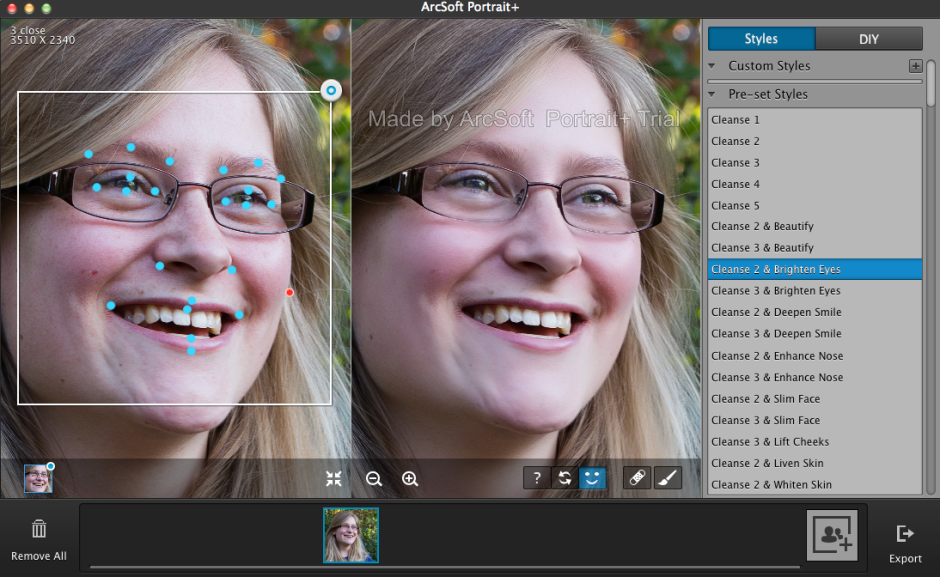
It also cannot identify faces that are in profile or at awkward angles. For these, there is no way of manually identifying the features, which means that they can't be treated in Portrait+. You can also ensure that all of the skin area is covered for adjustment, and you can paint in or paint out areas that the programme doesn't quite catch.
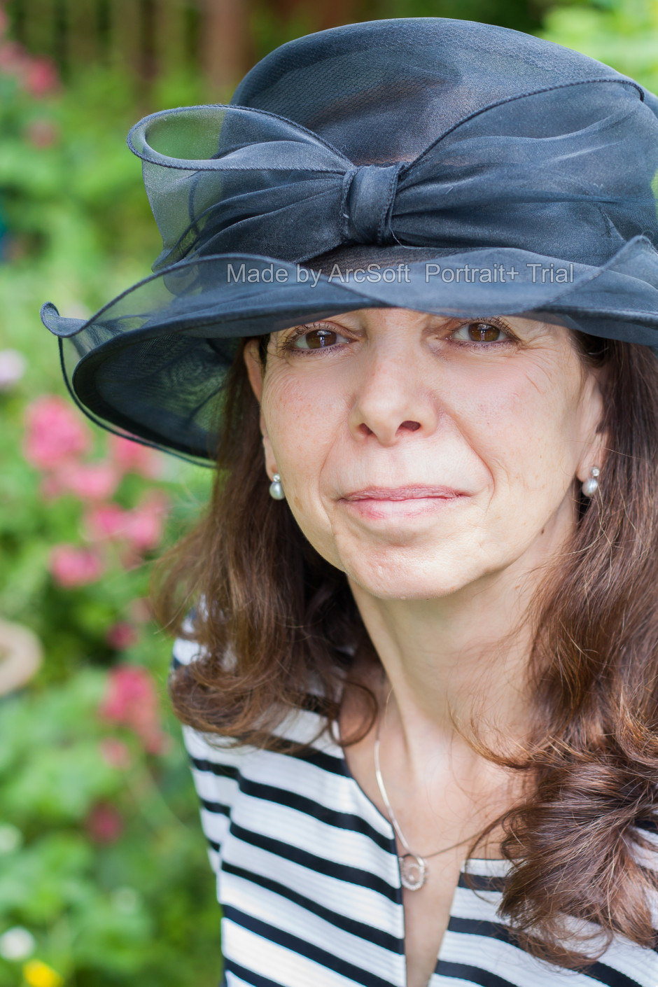
The first photo ran through Portrait+ was one of my mother. I was pleased with the effect of the very lightest touch (Cleanse 1) to her face, but anything above that felt excessive and unnatural. It was easy for her to slip from being elegant to plastic. This was especially true of any of the makeup packages. I'm also not the sort of person to go in for face-slimming or nose-enhancement. If you need to make use of these functions, however, they are there and you can apply them either as a part of a preset (for example, Cleanse 3 and Deepen Smile) or as a DIY action, which allows you to decide how deep you want to make the smile and then pair it with Cleanse 1 if you prefer.
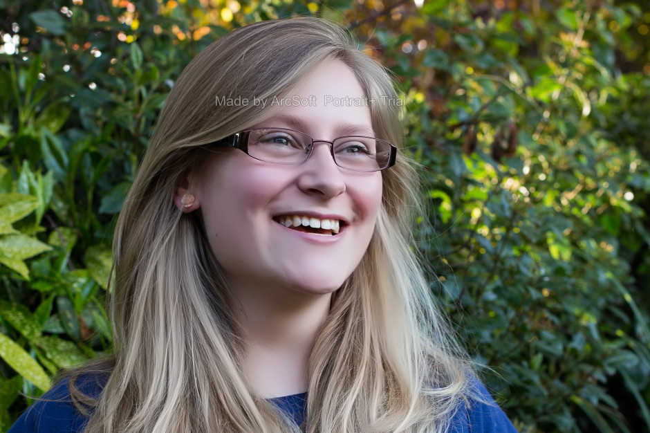
A photo of my cousin was more tolerant of the more extreme preset adjustments, but it was still all too easy to push things too far and leave her looking like a Barbie doll than a living, breathing, producer of theatrical shows.
It's easy to fix spots, marks, and aberrations in skin tone with the blemish removal tool, and it works well in combination with the lighter touch presets. This is where I think Portrait+ is at its most successful. Use it to remove circles from around the eyes, fix any obvious blemishes, and gently even out skin tones, and you can produce an improved but still natural looking portrait.
While I find that some of the effects are far too extreme for my tastes and I'm not the kind of person to go in for face slimming and cheek lifting, it is an easy way to take a portrait and clean it up. The 'Remove Circles' function is a very easy fix for tired looking eyes that enhances someone's appearance without looking false. Unfortunately, I don't think that I can justify $150 for a bit of eye improvement alone.
If you take a lot of portraits, and you need a standardised and easy editing programme, you could well find Portrait+ a valuable asset in your arsenal. However, if you take a lot of portraits that involve profiles or slightly obscured faces, the inability of Portrait+ to detect them won't make it useful for you. And of course, if you prefer to keep a tight reign on your edits and make precise adjustments, it won't fulfil your needs either. It's too much of a broad brush product. The good thing is that you trial it for free and decide if Potrait+ will meet your needs, or not. Should you decide it is for you, here's a 45% discount coupon for you, too. Use the code Portrait45.
Portrait+ 3.0 is available for Windows systems, and offers even more functionality than the Mac version that I tested. That should be ready soon, though.
Did you hear of Instacanvas? It was a canvas printing company devoted entirely to Instagram images. You could link your Instagram account to their website and choose your favourite filtered, square-cropped photo to hang on your wall. Or, you could establish your own gallery and let other people wander through your photos and select your Madagascan sunset to adorn their living room. The idea was that it freed people from the tyranny of mass-produced images supplied by Swedish furnishing behemoths and instead provided them with the opportunity to choose from millions of photos created by people like them. Matt Munson and Instacanvas' other co-founders wanted to let people buy and sell images without a curatorial middleman. Smartphones have brought photography to everyone; why can't everyone benefit from the plethora of photos?
Plenty of people agreed with that sentiment.
Instacanvas has grown enormously since those first heady days when it went public in May 2012. Its range of products has grown, although your public gallery remains Instagram-only you can upload photos from other sources to print for yourself, and the number of photos on its books is in the region of 30 million. It's perhaps this achievement, and the potential that it holds, that has led to Instacanvas' next steps.
It's now called Twenty20 and it is venturing into the stock image market. With a book of images to rival Fotolia or Shutterstock, how are things shaping up for this 13-person operation based in Santa Monica?
I have to say that my first experience with Twenty20's website didn't get off to the greatest of starts. For anyone who lives in a cricket-playing country, your first Google hits for 'Twenty20' will be about the limited overs form of the game. Don't forget to modify 'Twenty20' with 'canvas' and things should be better. When you hit the splash page you're faced with something attractive, but utterly uninformative. There's no mission statement or suggestion as to what it is or does, there's no 'About Us' link or 'Contact us' option, and there's no indication as to how to access what lies beneath. How frustrating!
Eventually, I learned that in order to be able to find out what Twenty20 is all about or just to peruse its wares, I needed to register. My gut reaction to this was that it felt in someway deceptive; now I'm more inclined to perceive it as absurd. Why actively try to prevent people from learning more about your company by demanding information from them? I persevered because of professional interest, but would someone who's casually looking for wall art?
Taking this a stage further, would someone who's looking for stock imagery be bothered to sign up and then navigate to the stock pages when you can rock up at Shutterstock, Fotolia, or iStock, type your desired subject into the search box on the front page and be presented with pages of findings immediately?
Munson told me that forcing people to register is a recognised tactic to encourage interaction on social media sites and it's something that other social media sites employ, for example, Twitter. It's an interesting theory, but I'm not sure it's quite the right approach for Twenty20. For a start, Twitter's splash page isn't link-less or a desert of information, and Twitter is rather more well known than Twenty20. When your aim is to convince people to part with their money, you need to do everything that you can to lure them in, rather than push them away. Twenty20 might have its roots in social networking, but ultimately it's about sales and this has to be as easy as possible.
Once people have been lured in, selling products via Twenty20 is refreshingly simple. Signing up with Instagram means that your images are there, ready and waiting to be made into prints or prisms to hang on your own walls, or to be curated into a gallery ready for anyone else to peruse and transform into something to hang on their walls. You don't set your own fees, they're standardised, which makes it easy for buyers and you know that you'll always take a 20% cut of the sale.
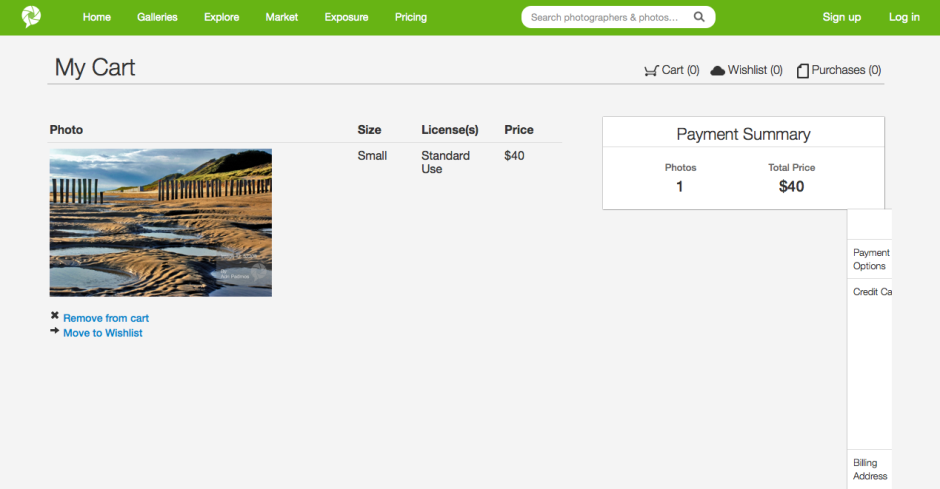
Although the pricing structure for digital image files is uncomplicated: $20 per image, with discounts for bulk buys, acquiring them isn't quite as easy. You need to contact the Twenty20 team to proceed. I'm hoping that this is merely a teething problem in Twenty20's new venture. First because it puts it on the back foot when compared with other stock houses; second because this is where I think that Twenty20 could excel. Imagine how much easier it would be to buy and sell news-oriented Instagram images via Twenty20, rather than have them used fee-free by news publications? Wouldn't it be great if your skinny-no-foam-latte photo is the one favoured by wannabe-hipster food blogs? (If they were real hipsters, they'd be using their own Instagrams, clearly.) But this relies on the system becoming faster and easier to use: instant access to your Instagram images.
When you have crossed the drawbridge, negotiated the portcullis, passed through gatehouse and into the bailey, and finally made your way into the keep that is Twenty20, there are some beautiful products for purchase and a welter of images for sale. It's such a shame that Twenty20's website design has made everything so inaccessible. Indeed, it's ironic. It's a company that's built on the principle of bringing the wealth of gorgeous digital media that languish in the aether onto people's walls and breaking down the barriers that sit between digital artists and their potential clients that have been erected by the curators of galleries and stock houses. There might not be any curatorial gate-keepers accepting or rejecting images, but there are technological ones discouraging people from making use of Twenty20.
If Twenty20 wants to truly realise its vision, I think it needs to follow through with its technological accomplishments to the same degree as its ideological principles. The theory's simple; keep the practicalities that way, too.
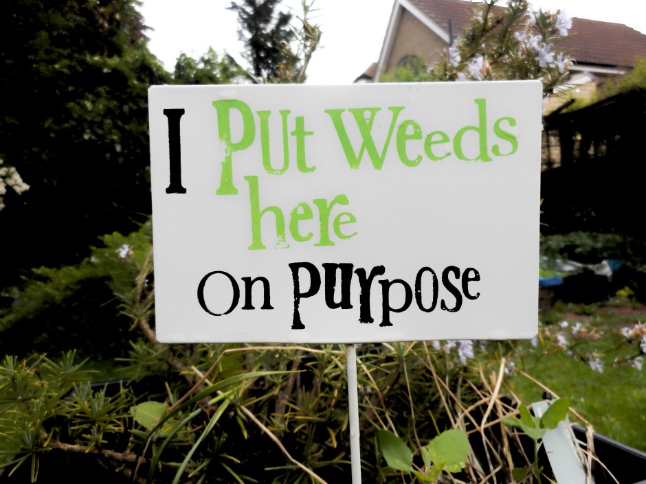
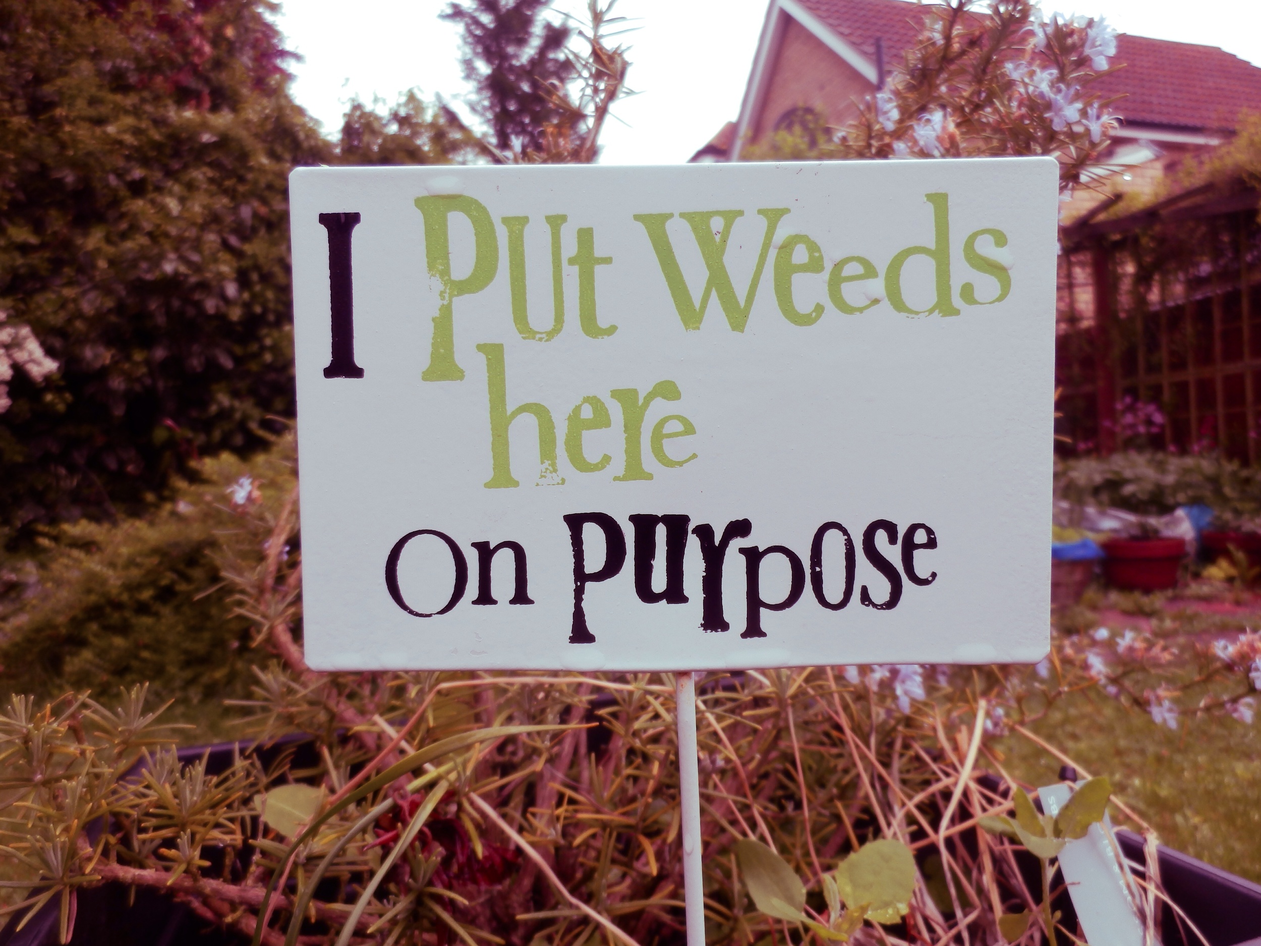
When I first downloaded Photoristic HD to have a go at some editing on an iPad, I was expecting an all-round editing package that would be great for my parents to use to make adjustments to their photos on their iPad. They use a point-and-shoot, record everything in JPEG, my mother has a proclivity to take wonky photos, and my father doesn't understand the concept of 'getting closer' no matter how much I try to impress it upon him. They need a simple but comprehensive editing app. Photoristic HD combines general editing functions (white balance, exposure, contrast, highlights, shadows, vibrance, saturation) with advanced colour adjustments and a barrel of filters. It can process images of upto 20 megapixel resolution, and saving and sharing is easy. It sounded promising. So much for my expectations. This was not an app that felt I could present to my parents to help them make their photos look better. It wouldn't meet their needs. But when I got past this disappointment, I realised that Photoristic HD offers something different for iPad editing and it might not be all that bad.
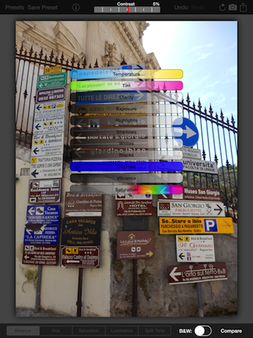
Photoristic is easy to use: you swipe left or right to adjust the values of whichever function you've selected, be it the like of contrast, shadows, or highlights underneath the balance tab, or one of the eight colours sitting beneath the hue, saturation, or luminance tabs. You can convert to black and white with the toggle of a button and you can apply one of a huge selection of filters—black and white options, selective colour choices, and colour filters—with two taps.
I'm not a frequent filter-fyer and I actually found many of Photoristic's too harsh or intense for my tastes. I wouldn't want to let my parents loose with these. All their photos would come out too brash, too sharp, too in-your-face. Photoristic does, however, let you save your own presets, which is moving well beyond the realm of my parents' use, but does present it in a different light.
This gives you the chance to combine its split tone function, colour controls, and the adjustments in the balance tab to create your own effects. Now that I've taken a step back, I wouldn't hesitate to name Photoristic's fine colour control and ability to save presets as its most valuable feature. No, it isn't an all-round editing package; it's something else. I was able to create my own cross-processed effects or add a bit of golden hour magic to a photo taken nowhen near sunset or sunrise. And I was able to save these as presets to apply to any photo I process through the app.
There are buttons that allow you to sequentially undo your previous edits or compare your current version to your original image. When you're content with your handiwork you can save your image to your photo library or Dropbox, email it onwards, send it to print, or share it to Facebook or Twitter.
Should you get a bit stuck, the help button is towards the top left corner.
The most critical omission that prevents Photoristic from being a comprehensive editing package is a crop and rotate feature. With every photo that I put through the app I felt frustrated that I was unable to straighten it or slice off a few extraneous pixels. And my parents, with their skewed horizons and distant subjects, definitely need it. It's all very well being able to bring out the blue of a sky, tone down the red of someone's nail polish, or help negate a green cast, but crop and rotate is one of the basic functions that we rely on in an editing suite.

I was so surprised by the omission that I emailed the developers to check that I hadn't missed it anywhere. They confirmed that there isn't a crop and rotate function yet, but it is expected in a future iteration.
When you realise that Photoristic isn't a basic editing app but instead offers more sophiscated controls to adjust colour and create your own filters for your photos, it takes on a different complexion. If you're looking for an iPad app to let you take control of your photos' colour effects and filters, then do consider downloading Photoristic. It's £2.99 in the UK and $4.99 in the US.
I shan't be showing my parents how to use it.
(All photos courtesy of my parents.)
The clocks go back this weekend in the UK. This means that winter is approaching, along with its longer nights and colder weather. I'm digging out my hats, scarves, and gloves and this year a new pair of gloves will be joining my wardrobe. They're made by MacWet and it seems as if they might be suitable to wear while wielding a camera. MacWet gloves are typically worn by sportswomen and men, people such as jockeys and golfers who prefer to retain the functionality of their fingers despite the cold, but also need to be assured of grip. Dropped reins and flying golf clubs are far from fun. They come in two flavours: the lighter-weight Micromesh and the fleece-lined Climatec version for much colder days.

Thinking that photographers might benefit from warmer hands with the added bonus of un-dropped cameras, they sent me a Micromesh pair to try out. I suffer from terrible circulation so have a goodly selection of gloves for the colder months; for photography purposes I use a pair of fingerless woollen gloves with a mitten topping that gives me a modicum of warmth without jepordising my control over my camera. Despite my huge scepticism about the potential efficacy of the MacWet gloves, my fingerless mittens have now been relegated to recreational wear.
My first concern was that a begloved finger would be too cumbersome and clumsy to afford me accurate control over the buttons and dials on my camera. So far, I've not experienced any problems at all, but I have been using the lighter Micromesh version. The gloves come in sizes 6 to 12, and the size 7s I've been wearing have been snug. No, a layer of fabric is never going to allow you the tactile responsiveness of your bare skin, but I've not been disappointed.
Second, what about grip? No concerns at all. My camera hasn't slipped through my grasp and neither have any lenses when changing them, whether the gloves have been wet or dry. The heavier-weight Climatec gloves are both water resistant and windproof, but my hands haven't felt uncomfortable when I've doused the Micromesh version. When they get dirty, you can chuck them in the washing machine at 40°.
If you are of the glove-wearing persuasion, you might want to think about a pair of MacWet gloves. The Micromesh gloves are £28 a pair; the Climatec gloves are £30.
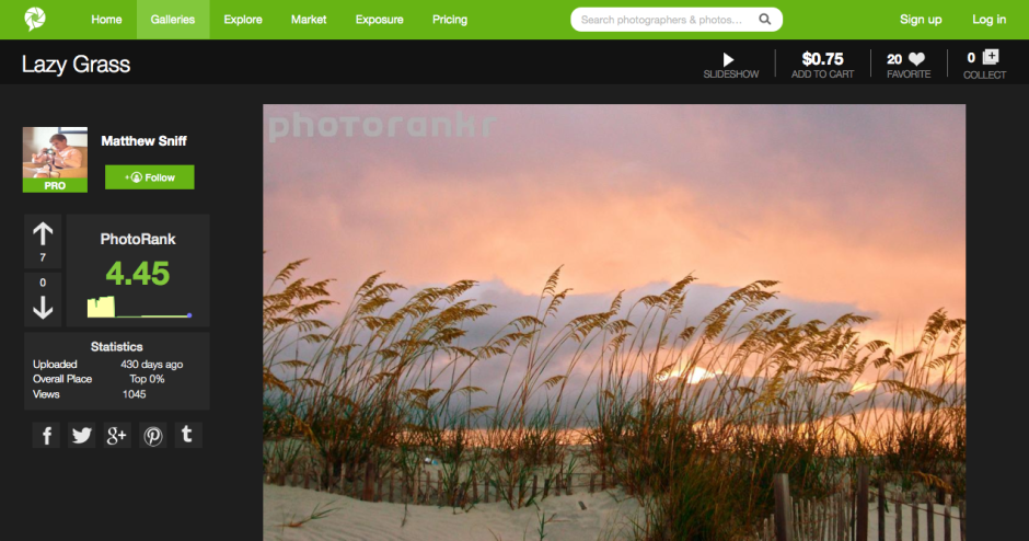
It's easy to think that there are far too many photo-sharing websites in the world. How many can you name in the next ten or twenty seconds? And how many of them meet your needs and expectations? For brothers Jacob and Matthew Sniff, the fact that these sites didn't meet their expectations inspired them to build their own; they called it PhotoRankr. It's a platform that gives photographers the ability to share and sell their work in one place. It's a social network where photographers can interact, learn from each other, and rate each other's images in a gamified setting. It's an online marketplace where they can sell their images at their own price. And it provides photographers with portfolio hosting to help them make the most out of their photography.
Does it work?
PhotoRankr was built by photographers who felt frustrated that their images weren't accepted for sale by the major stock houses. They wanted anyone who takes photos to have the opportunity to be able to sell her or his work. As Jacob Sniff puts it: 'It’s a fact that more people who [sic] have it [photography] as a hobby than as a profession, and the barrier to entry is low. Yet, no site openly allows for anyone to sell images today and this is a mistake.'
In addition, they've attempted to make it more appealing to photographers by building in the social elements that bring success to sites such as Facebook and Flickr. In particular, rather than having a picture editor determine whether or not a photo makes the grade, any photo is allowed to be displayed on PhotoRankr, but the community votes it up or down.
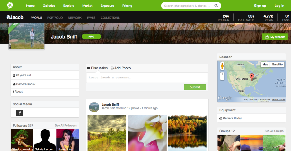
It's a reasonably priced platform, providing photographers with three subscription options. There's a free account to which they can upload 30 images each week, charge up to $20 for them, and retain 60% of sales. The 'Plus' account ($40/year) allows for 10GB of uploads, has a $100 price cap, and a 70% sales retention. Those subscribing to a 'Pro' account ($100/year) have no pricing limits, no upload limits, and retain 90% of their sales fee.
The aim is admirable, but being so photographer-oriented is also the site's failing. In constructing a platform aimed at photographers, they haven't paid as much attention to the buyer as they should have.
First, what type of buyer are they attempting to attract? Are they attempting to create a more stock-house model, with digital image files provided for professional use? Or are they aiming at the fine art market, with canvas prints? Not all images are able to be purchased as prints, but all are available as digital files; however, there's a distinct feeling that the collection is more skewed towards hanging on the wall than inclusion in corporate booklets.
Stock houses work because they provide a diverse spectrum of images; these images include subjects that aren't necessarily pretty or compelling, are perhaps obscure, but are still in demand. Examples would include factories, rotting meat, or ploughed soil. When you introduce the social element into ranking images, it's going to be those that are appealing and attractive that rise to the top, not necessarily those which are needed. You'll end up with a market where the photographers are at risk of serving themselves and their social ranking, rather than the customers.
If the intention is to allow people to hang images on their walls, there needs to be a more streamlined process that allows buyers to see more easily in which formats their chosen images can be purchased. Some are available as canvases, some as posters, some as postcards, some not at all. It isn't obvious immediately, though.
Second, searching for images suffers from a few hiccoughs, too, with duplicates appearing with alarming frequency.
Finally, the purchase interface requires some refinement. The licence agreements are buried away in the bowels of the terms and conditions section, rather than being a click away from each photo. Anyone buying an image needs to be able to identify how they're able to use it quickly and easily. Chashing through the website is not user-friendly. The shopping cart page does not render properly, which makes it unappealing for purchasers. And there is no easy means to access your shopping cart from the front page or a search page. This makes browsing after you've made a selection and then wanting to return to the cart without attempting another purchase impossible. It might be easy for a PhotoRankr photographer to sell her or his images; but it isn't easy for the public to buy them.
I think PhotoRankr needs to consider what it wants to be and what its priorities are. Is it a 500px-style community of photographers that offers sales on the side - in which case, they're already competing with an established market. Or are they a sales site where consumers can find what they want and need, purchase it easily, and provide photographers with a useful sales platform? If that's the case, they need to pay some more attention to the customers.
If PhotoRankr can decide on its direction, and clean up its sales mechanism, I do think that it has potential. And I don't want to see the work of a dedicated group of people come to nought.
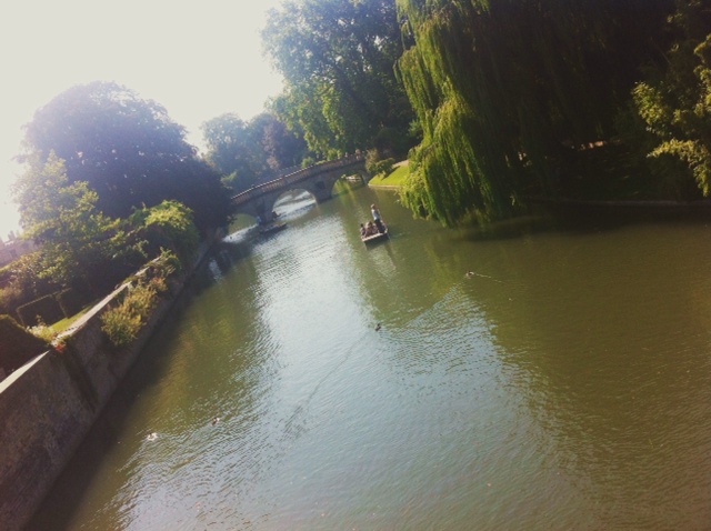
I spent a few weeks with Pentax's rugged 'adventure camera' with built in GPS, the WG-3 GPS. When this camera was released, I described it as cross between a toddler's teething ring and a training shoe in design. My opinion on its aesthetics hasn't changed, but what do I think of it as a picture taking machine? During testing it came out and about with me in every day life, went on a trip to Cambridge, and was subjected to 'general fiddling' at home.
The WG-3 GPS has a 16 megapixel CMOS sensor and a 4× optical zoom lens that has a maximum aperture of ƒ/2.0 at its widest angle packed into a body that can withstand water as deep as 14 metres, cold down to -10° Celsius, being dropped from two metres, and a crush force of 100kg. There's also GPS, a barometer, and an electronic compass.
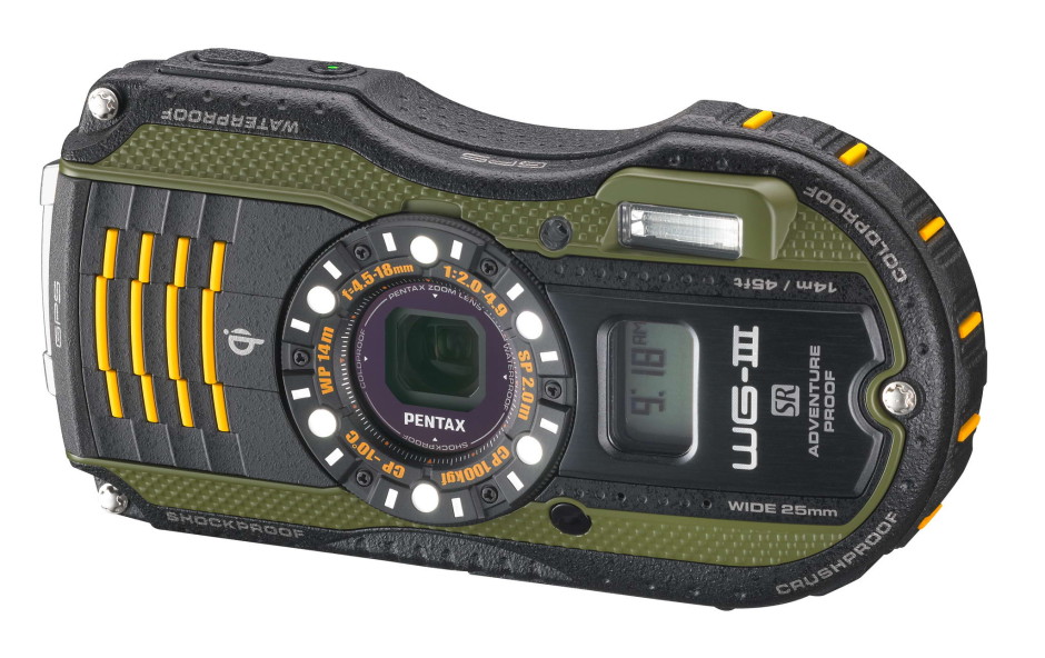
As can probably be expected, it has more scene modes and digital filters than you've had hot dinners this year. This includes a digital microscope mode, complete with five LED lights surrounding the lens, to help capture the smallest of small subjects.
At the moment you can pick one up for £235 if you shop around.
It's a rugged camera. It's designed to be dropped, soaked, and frozen. When you hold it, you get the feeling that it's perfectly capable of withstanding these torments. I wasn't brave enough to drop it or stand on it, mostly because I was concerned that I might damage my wooden floors. Still, I took it in the shower with me to be assured of its waterproof sensibilities and I wasn't disappointed.
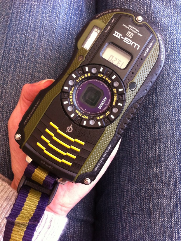
However, it hasn't strayed far from the obsession of making any and all adventure compact cameras look as if they've been designed by kindergarten pupils using crayons. I'm also inclined to think that the ruggedisation has had something of a negative impact, too. On occasions I found it quite difficult to depress the shutter release button without making the entire camera judder. There went any semblance of focus I had. Of course, this could just be me being a weakling and others might not have encountered anything similar.
If you're accustomed to recent model Pentax cameras you would not find the menus very different and even if you're not a Pentax user, they aren't difficult or complicated. You'd pick them up relatively quickly. As well as the plethora of scene modes and digital filters lurking beneath the mode and menu buttons, there's also the Green button to which you can assign your most-used functions. I opted for white balance, ISO, focus, and exposure compensation.
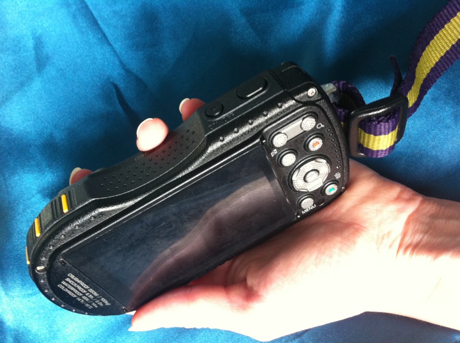
I was disappointed with the screen; I found it incredibly difficult to see in bright conditions, which makes me wonder how effective it would be when you're halfway up a mountain. I did appreciate the level indicator, however, as I have a prediliction to take wonky photos.
Images are recorded in 4:3 format at full 16 megapixel resolution, as well as 7, 5, and 3 megapixels. If you scale down to 12 megapixels you can choose between 16:9 and 1:1 formats. The 16:9 aspect ratio is also used for 5, 4, and 2 megapixel resolution images.
Slow autofocus is a problem that I've encountered with other Pentax cameras before now and unfortunately the WG-3 exhibited similar problems. It wasn't an issue in good light, but a hint of darkness leaves the auto-focus pecking around for its target, even with the assist beam. This was especially noticable when using the macro auto-focus or the digital microscope mode.
You have a choice of 28 different scene modes with the WG-3. They range from auto and programme through to underwater, surf and snow, and report, via landscape and food. In my opinion that's too many, especially when auto mode is intelligent enough to detect that the camera is photographing a flower and switch to flower mode, or a person and switch to portrait mode. A rugged camera would do well to provide auto and programme modes and then focus on the areas where it should be excelling: underwater and snow and bright conditions.

I gave the underwater setting a whirl in the shower, although doesn't really have the same effect as being submerged. It is meant to saturate the colours to compensate for the loss of light beneath the water's surface. However, you can see just how much it does do that. With no snow in my vicinity, I tried photographing a bright white surface in strong sunlight. I felt that it still needed exposure compensation, which rather defeats the object of the mode. You have to hope that people using it in these situations aren't relying on the camera's judgement in its entirety.
My ISO tests revealed a camera that produced no or little noise at ISO 125 and 200, but with some degredation appearing at ISO 400. There was significant graininess at ISO 800 and by ISO 1,600 I would be disinclined to make use of it. Combined with its disappointing auto-focusing ability, this doesn't bode well. However, at its widest point the lens has bright ƒ/2.0 aperture, which isn't to be sneezed at.
I was impressed by the photos the camera turned out when it used the macro auto-focusing mode, but the digital miscroscope was a disappointment. Apart from taking an age to focus, the five LEDS blew-out the white bed linen and the white flowers I tried it on. The macro focusing mode was far more effective.
The WG-3 GPS has eight white balance settings, including the auto mode that I found to be adequate. Occasionally it was a little too blue, but mostly it rendered colours accurately.
I was pleasantly surprised by the HDR function and felt that it really did make a difference in very bright situations without looking fake and over-cooked.
I didn't subject my test shot to every to every digital filter that the camera has to offer, but I did play with quite a few. It has everything that you'd expect, for example retro and toy camera, black and white and sepia, and miniature, as well as star burst and selective colour. You can see their effects over on my Flickr gallery.
Finally, I found the battery life very poor. It is supposed to manage 240 still shots on a full charge. I didn't manage anywhere near that.
Despite it being a camera that I find ridiculously ugly and it having some shortcomings that I found disappointing, there was also plenty to like about the WG-3 GPS, for example its ƒ/2.0 lens. It does take good photos in good conditions and it has the means to overcome unfavourably bright conditions, too. There are a lot of adventure cameras out there to be bought and I wouldn't necessarily write off the WG-3. I just wish that Pentax had focused on making it a great compact camera, rather than one with lots of add-ons.
Would I buy it? To be honest, if I'm scaling a mountain or snorkelling, I'm more likely to be concentrating on staying upright or breathing than taking photos, but I would consider it if I felt that I were able to split my faculties sufficiently.
Would I recommend it? There are a lot of rugged cameras out there and the WG-3 GPS is good value for money. It's worth investigating.
More photos are on Flickr.
With lots of clever features, and great ergonomics, Case Logic pulls a surprise winner out of the hat. When you're thinking camera bags, Case Logic may not be the first brand that pops to mind, but my recent experiences with one of their very reasonably-priced photo backpacks might just be enough to change your mind.
The not-really-that-creatively-named SLRC-206-BLACK is a good-looking bag that has a load of features I haven't seen on any camera bags in the past. For one thing, their 'SLR Suspension' system is incredibly clever: There are two straps of velcro that stop the zippers from opening beyond a certain point. If you open the bag like that, only the top part of the main compartment is available, and it has a clever 'suspension system' which enables you to put your camera away and grab it again in a matter of seconds. The main compartment of the backpack also has oodles of re-configurable space for lenses and other accessories. As you might expect, the bag also has several front- and side pockets for keeping filters, lens caps, and any other equipment you may be lugging around.
At the side of the bag, it has a couple of incredibly sturdy nylon straps for strapping down a tripod or similar. These are the biggest and most flexible I've ever seen on a camera bag, too - an absolute winner.
At the back, there's a large laptop pocket that should fit most laptops - and best of all, it's secured with zippers that make me confident of its water-resistance prowess.
The final cleverness is the bottom of the bag - CaseLogic decided to envelope the bottom in a sturdy rubberised plastic, resulting in a base that is rock solid (even when loaded with only a heavy camera, it wouldn't topple over), and water-proof. Perfect for photographers on the go.
So is it all heaven and butterflies? Well, no. Personally, I'd have wished they had attached the shoulder straps to the other side of the zips, so you'd have to move the straps aside to access the laptop compartment. As it stands, the entire weight of your camera rests on a zip that is perhaps a little bit too good, so on one occasion it zipped itself open. Because the straps are attached to the 'loose' side, it means that if the zip opens, the entire laptop compartment is pulled open by the weight of your cameras and lenses, leaving it a big gaping rain-trap, with your laptop reaching for the heavens. It's a minor niggle, of course, but I was surprised that Case Logic had missed such a simple thing, when they were so incredibly careful with the design of the rest of the bag.
Anyway; As I mentioned in the beginning of the article, if there's one thing I've learned from this review, it's that Case Logic is worth a closer look; They have an extensive range range of camera bags and camera cases, and if the build quality (and price tag!) of this one is anything to go by, they may well be a force to be reckoned with.