Photocritic can be found in lots of places of the Intergoogles. Did you know that we have a Tumblr, which covers competitions, exhibitions, and publications?
Top 3 edits you should make to every photograph
Earlier this week an infographic design agency, NeoMam Studios, sent us an infographic about 'smoasting' which they'd produced on behalf of print company Photobox. Once I'd got over the shock of awful elision of 'social media' and 'boast' to form the ghastly portmanteau word 'smoast', there was one particular statistic that caught my eye. Take a look at the infographic and guess which it was.
Despite the prevalence of Instagram, the host of editing features that are built into apps such as EyeEm, Facebook, and Twitter, and the plethora of free-to-download editing programmes, only 28% of photos are cropped or styled in some way? Wow! I am surprised. And it's something I think deserves remedying.
While Team Photocritic advocates getting as much right in-camera as possible—you'll certainly not be able to turn a sow's ear into a silk purse—we're not beyond a little post-processing, either. If it's good enough for Cecil Beaton and Horst, it's good enough for us, too. A snip here and a swipe there can elevate an ordinary image into something a bit more special.
This isn't about air-brushing away half of someone's thigh, but about making minor adjustments to three specific areas: the crop, the colour, and the contrast. Here at Photocritic we call them The Three Cs. They're not complicated and they'll make a world of difference.
Crop
However well composed you think your image is, it will almost certainly benefit from having a few pixels shaved off it. It might be a case of reinforcing the rule of thirds, removing a bit of unwanted background that crept into the frame, or getting a bit closer to your subject.
Being a purist, I tend to stick to traditional 4:3 or 3:2 ratios, but don’t feel limited by my prejudices. Select from any of the standard crops, from square to 16:9, or free-style it to adjust the crop any way you like.
At the same time as cropping, make sure to straighten your image, too. Unless you are deliberately tilting the frame for creative reasons, uprights should be upright and horizons should be level. When lines that are expected to be upright or level are wonky, it has an unpleasant impact on our sense of balance. By correcting wonky lines, you'll produce a stronger image.
Colour
Light has a temperature, and depending on the source of the light, or the time of day if it’s the sun, that temperature will vary. When the temperature varies, so does the colour of the light. As a general rule, we don’t notice the variation because our eyes cleverly adjust to the changes. Our cameras on the other hand aren’t quite so clever.
Have you ever noticed how white objects in your photos can show up with blue or yellow casts? That’s because the white balance in your photo was off.
It's a relatively easy correction to make using the 'Warmth' or 'White Balance' function in an editing programme. If you think the whites are looking a bit too blue (or if an image looks a little 'cold' over all), nudge the slider to the right. If the whites are too reddish in tone, or the photo looks a bit warm, slide it to the right. It's a case of trial and error to make the right adjustment, but the more that you practise it, the better you'll understand the shortcomings of your camera and how it reacts to different types of light.
Now if you want to intensify or tone down your colours, you can do so using the saturation slider. I don't recommend bumping up the saturation too much; it can result in a cartoon effect rather than a photo!
Contrast
Contrast is the difference between the dark and light tones in your photos. Images shot on bright sunny days tend to have a lot of contrast, with dark shadows and bright highlights, but those taken in fog won’t have a great deal of tonal variation and will be low contrast. From time to time, you’ll want a low-contrast image, but, generally speaking, your photos can be improved by increasing the contrast a touch. It brings definition and depth to them.
Don’t go overboard, though, as too much of a good thing can turn bad. You’ll find that if you over-cook the contrast you’ll lose too much detail and end up with an ugly image. Subtlety beats brickbats.
If you use Snapseed to make your edits, it's worth getting to know the ambiance slider, too. I've often found that this is a preferable alternative to the contrast slider.
Anything else?
At this point, any other adjustments are gravy. I'm a fan of Snapseed's 'centre focus' options and often apply one of those. You might want to play with a tilt-shift effect. Or there's the waterfall of filters you can try in any programme, but you might find that you prefer your own edits to prefabricated filters, now.
Oh, and don't forget that it all starts with a decent photo, so check out our eight tips for better smartphone photos, too.
Just because you found it on the Intergoogles it doesn't mean it's free to use
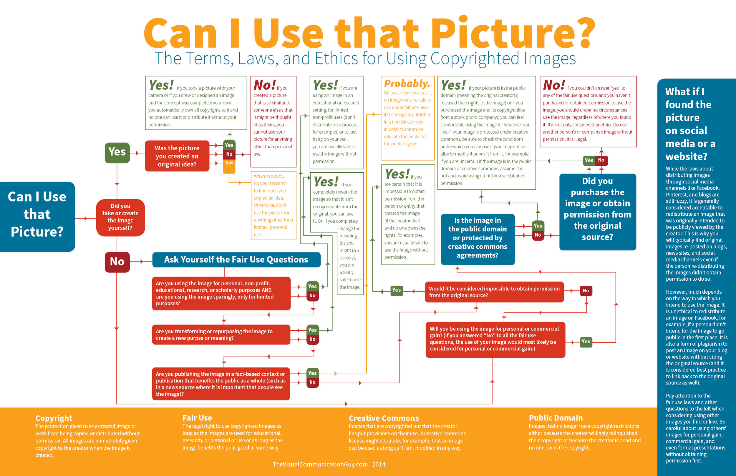
I was having a fairly good morning, until I took my lunchtime peruse of Feedly to see if anything interesting or exciting had dropped into it. Apart from a new post by my favourite film critic, nothing was outstanding until I reached Lifehacker. The Lifehacker team has just posted a link to a visual media usage rights flowchart created by The Visual Communication Guy. Excellent! Ignorance is no excuse when it comes to image theft and unauthorised use and reproduction of photos. While we're all perfectly aware that when you place something on Facebook, Flickr, or your personal version of Frankie's Funky Photos, there's a real chance that someone will try to use it improperly, the more that we can educate people about the right way to do things, the better. This one, however, was not quite so excellent.
You'll find the original here and the Lifehacker article here.
Apart from the fact that it's far too dense and word-heavy, it contains at least one humongous, glaring, verging on the unforgiveable fault for something that purports to advise on usage rights. Take a look and tell me if you can see it. (And tell me how many others you can see. There are plenty.)
Found it?
If you haven't, because it's a horrid thing to read, here it is:
While the laws about distributing images through social media channels like Facebook, Pinterest, and blogs are still fuzzy, it is generally considered acceptable to redistribute an image that was intended to be viewed publicly by the creator. This is why you will typically find original images re-posted on blogs, news sites, and social media channels even if the person re-distributing the images didn't receive permission to do so.
No, no, no, no, no, no. And for good meaure I'll say it again. No.
Images that are shared on social media aren't free for redistribution unless the creator has expressly said so. I put my images on Flickr and use them here on Photocritic and put them on my personal website to display them, to illustrate concepts, to tell stories. I do not put them on the Intergoogles so that anyone else can make use of them. And you should never assume that anyone else does, either.
The law regarding this is hardly fuzzy about the situation, either. There's been at least one monumental court case that supports this opinion, when photographer Daniel Morel sued AFP and Getty Images after they redistributed his images from the Haitian earthquake, which he'd shared via Twitter, without his permission.
Copyright exists from the moment that someone creates something, whether it's a photograph, a tune, a poem, or a piece of prose. It doesn't matter how a creator wishes to share her or his creation with the world, unless she or he has definitely signed away the rights to it, the rights remain theirs.
To be fair to the Visual Communications Guy, he does state 'My rule above all else? Ask permission to use all images. If in doubt, don’t use the image!' in the post that accompanies the flowchart, but that's not really good enough. It's the flowchart that people are going to share and see, not the article. When incorrect information such as this gains traction, we all suffer. Suddenly what's not right becomes commonly accepted. Or people who were doing their best to not be ignorant are in the wrong when they thought they were doing right.
So I'll say the mantra and everyone can repeat it after me: 'Just because I found it on the Internet, it doesn't mean it's free to use.'
Introducing Photocritic &c
Have you noticed anything a little different about Photocritic recently? Maybe that we're reporting fewer news stories? Or that the front page looks slightly different? Don't worry; you don't have to answer, but trust us when we tell you that things have changed around here. We set out with the intention of making Photocritic a resource of everything that you should know about photography. It even says so up there. If you think that sounds like an enormous undertaking, you wouldn't be wrong. But in addition to the mountainous workload, the scope of 'everything' carries with it the threat of the insignificant drowning out the significant and the ephemera overwhelming the fundamentals. This is of no benefit at all to you, and it's a waste of our time. Hence we've decided to make some changes.
We're diversifying our presence but consolidating our coverage. No, I'm still not sure how I came up with that statement. Too many press releases, probably.
Let's start here, with the Photocritic website. This will be for the everything that makes you a better photographer. And for everything that deserves analysis and commentary within the photography industry. It will be for tutorials and explainers, for reviews and op-eds. This is for long-tail writing.
For the everything that encompasses quirky news stories, exhibition announcements, competition calls for entries, and information about books written by people who aren't us, we've set up Photocritic &c. It's a Tumblr for the sort of everything that won’t necessarily be interesting in six months’ time, but is interesting now. It's more of a rolling news feed.
We've put a link to Photocritic &c in the navigation bar, there's also one in our social bar, you should be able to subscribe via your RSS feed, and if you've a Tumblr account, you can subscribe there.
And of course, there's the Photocritic Twitter account. That covers everything that you should know about photography in 140 characters. (Don't be shy of following Daniela on Twitter, either. She's @SmallAperture.)
We think this is a change for the better: a smoother, less cluttered Photocritic experience. We hope that you think so, too.
Finally, if there's anything specific that you'd like us to cover, please ask us. We have an extensive editorial calendar, but we want to know what you want to read. Do drop us an email.
The unlikely and serious consequences of teenage sexting
An 18 year old and a 19 year old are in a relationship. They're committed to and respectful of each other. They enjoy consensual sex and every now and again they share a naughty photo. A 16 year old and a 17 year old are in a relationship. They're committed to and respectful of each other. They enjoy consensual sex and every now and again they share a naughty photo.
What's the difference? Both couples are over the age of consent and no one is being forced into doing anything they do not wish to do. Yet the younger couple is breaking the law. By sharing photos of themselves, they're distributing indecent images of children. They are, of course, under the age of 18 and therefore still children. That they are accustomed to each other's bodies in the flesh means nothing when they're pixillated.
The penalty for distributing indecent images of children is much more serious than a slap on the wrists, too. It can result in being placed on the sex offenders' register. For anyone, that is a life-altering punishment; for someone who is 16, it could be life-ruining.
This issue has been brought into the public consciousness again (it raised its head towards the end of last year) after Nottinghamshire Police sent a letter to schools in the county asking them to advise their pupils about the potential consequences of 'sexting'. Recently, the police have dealt with several cases where sexting has taken a turn for the nasty, and while they've not prosecuted the young people involved, the outcome could have been different.
Much of what I've been reading around this topic today—for it seems to be overtaking the BBC—involves admonishing young people not to be so stupid or to consider the consequences of their actions should these photos make their way onto the Intergoogles; invokes despair that young people are capable of such recklessness and disregard for other people's feelings and reputations; or it criticises their lack of self-respect and gutter behaviour. There's also a great deal of concern about the pressure that might be applied to young people to take and share lascivious photos when they really don't want to.
Some of these concerns are valid. The teenaged equivalent of revenge porn can be deeply painful and horribly humiliating with tentacles that spread much further than school. While its perpetrators might be content to wreak harm and havoc on those whose images they share, I doubt that they realise just how extensive the consequences can be. As for coercing young people into sharing pictures that they probably wouldn't want to show their parents; it's another of those pressures of conformation piling up on young people: to be thin, to wear particular clothes, to smoke, to drink, to have sex. Between Snapchat and Slingshot and WhatsApp and any other means of sharing an image, we have for ourselves the social media age incarnation of 'I'll show you mine if you show me yours,' behind the bike sheds, except with potentially longer-lasting and farther-reaching consequences.
We cannot and should not tell young people what to do; it's about giving them the skills, the self-confidence, and the information to make their own choices and about providing them with non-judgemental support when they have to live through it. Vilifying them for a lack of self-respect is unlikely to achieve very much.
These are all pertinent points for anyone under 16 who's legally regarded as not being able to give consent. Indeed they remain valid for anyone over the age of 16; but there's a particular issue relevant to 16 and 17 year olds that seems to be overlooked.
There's a disconnect between the legality of their engagement in consensual physical sexual activity and the illegality of recording that same consensual physical sexual activity. A law that's designed to protect young people from exploitation has the potential to criminalise them. I hope that those who have to enforce it apply some common sense to any situations that come their way.
The handy-dandy social media photo sharing guide
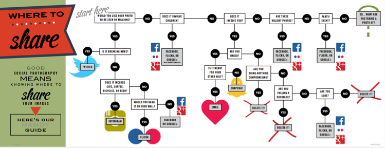
One photo, so many options. Where on this huge web of interconnected social media outlets are we best sharing our quick snaps, our painstakingly created works of art, and our selfies? Really, it all comes down to whom you want to see them. The chances are that different people follow you in different social media spaces, and if Twitter's mostly a work thing for you, selfies on the beach aren't all that appropriate a posting there. You're probably best putting those on your friends- and family-only Facebook account. It only takes a few moments of thought, really, but if you're new to the social media fandango, seeing all those apps lined up on your phone can be a little overwhelming. For a bit of fun, I drew up (quite literally, it involved an enormous sheet of paper and felt-tipped pens) this handy-dandy guide to sharing your photos via social media. Of course it isn't meant to be taken deadly seriously, but it's a pretty useful starting point all the same.
You can find it looking even more beautiful in print in the delicious-looking Social Photography, which is available now, either in print or to download!
Instafax: BBC news via Instagram video
Here in the UK, you'll hear the BBC referred to as 'Auntie'. There are a few different explanations flying around for the moniker, but the consensus is it derives from the slightly prudish and reserved, 'Auntie knows best' attitude that the corporation had in its early days and well into the 1950s. Now, 'Auntie' is far more a term of endearment, and it can't really be said that the Beeb doesn't innovate. Over the next month the BBC is experimenting with delivering news via Instagram, a venture it's calling 'Instafax', a reference to the late departed text news service, Ceefax. Three times a day it'll post a 15 second video to its BBC News Instagram account.
The videos feature news footage overlaid with text and a music backing. Even if you can't listen, you can still access the salient issues before following through to the full story on the BBC website, or moving on to the next image in your Instagram feed. I've noticed some commenters have found the text a distraction from the footage and would prefer a more news-dense voice-over. I'm going to whisper this because it probably makes me some kind of new media pariah, but I'm not a fan of video content as I find it instrusive. The Instafax hybrid seems to be compromise and one that I like. As BBC person put it:
The idea behind not having a voiceover is that you don't have to have the sound on to understand the video. Additionally, it significantly cuts down on the amount of time the videos take to produce. If we decide to continue producing these after one month, we may consider having both a voiceover and on-screen text.
Why three videos a day? No one wants a feed overwhelmed with BBC news stories.
Doubtless someone, somewhere will be lamenting the demise of longform journalism and decrying the dumbing down of the news, but I'm rather impressed by the BBC's diversification and willingness to embrace social media. It's a pilot that I'd like to see taken up. You can keep up to date by following the BBC's Instagram feed.
(Headsup to DesignTaxi)


