Two easy tips for helping with your lighting for food photography.

When you hear the term 'high-res' thrown about with such abandon when it comes to images for web use, have you ever stopped to think just how big or how high quality and image meant for the web needs to be?
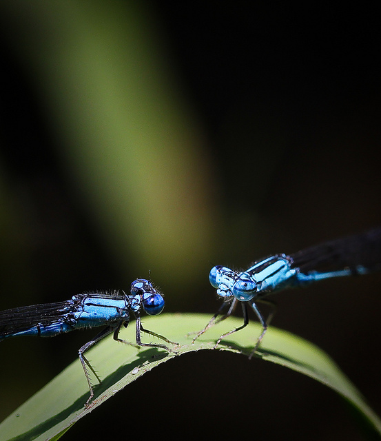
There's an assumption that high-contrast images are more dynamic, more compelling, more inviting. Have a go at some low-contrast photography. You might surprise yourself with the results.
Balance doesn't mean symmetry; it means an internal consistency and tension within your photos. And it's a vital element of composition.
Great photos might be down to a little bit of luck, but most of that 'luck' you make yourself. Don't believe us? Read on...
In December last year we featured a Kickstarter project called Lightstrap, which aimed to bring better lighting to smartphone photos. About a week into the campaign, Brick and Pixel, the team behind Lightstrap, pulled the plug on it citing that a better offer had come along. While quite a few people were disappointed by this decision, it has proved to be something of a small mercy for Ember, a new night photography tool that is looking for Kickstarter backing. Ember slides over your smartphone like a case. It comprises 56 LEDs and a diffuser, with the ability to adjust its brightness using a slider and a range of filters to control for light temperature. This should make for more evenly lit photos that don't wash-out people's skintones or give them evil red eyes.
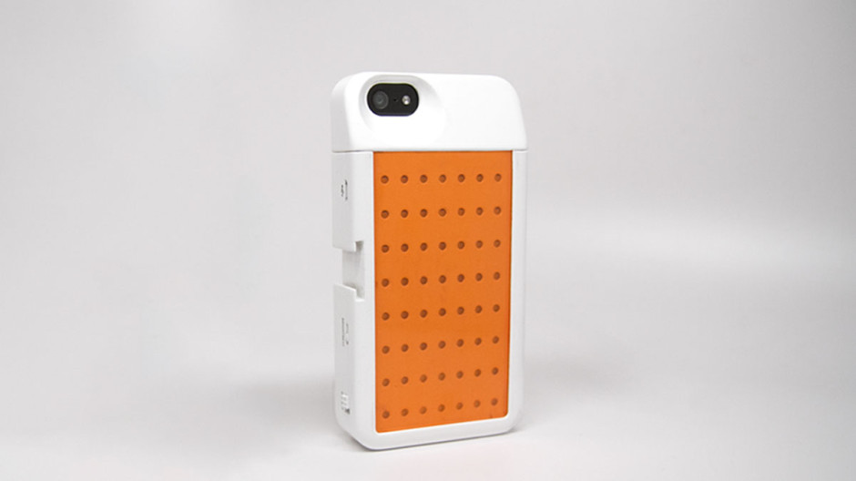
By removing the top of the Ember case, it's possible to continue to use add-on lenses, for example Olloclip or Moment. It's charged through a micro-USB port, making it independent of your phone's battery, and capable of providing light for about four hours of shooting.
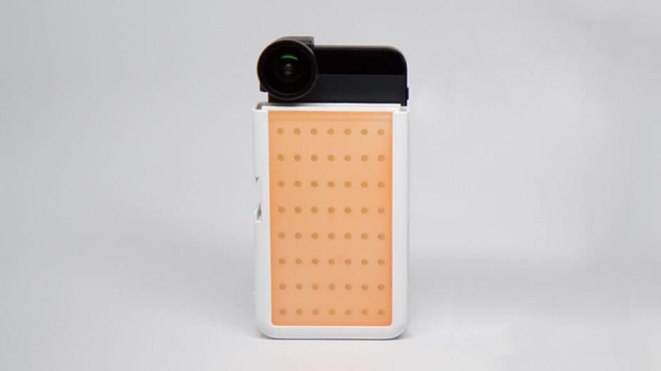
Embers are only iPhone 5 and 5S compatible, which is a shame for any other type of smartphoneographer; it's not as if we don't take photos or would appreciate some better lighting options. If, however, you're an iPhone 5 or 5S owner and interested, you can help make the Ember happen with an early-bird Kickstarter pledge of $59. Should you miss out on that level, it's $79 for one Ember.
Ember needs to raise $30,000 to make it a reality; with 25 days to go, it's raised just over $4,000. At this rate, it's touch-and-go if it makes it.
This week's Photography Fundamentals issue looks at key. Key is an element of the photography canon that crosses over with other artistic disciplines, most notably music and painting. I'm the least musically-talented person known to man, but even I manage to spot the similarities.
When we talk about the 'key' of an image we're talking about the range of tones or brightness that it comprises. Primarily we use it when we're describing images as being either 'high-key' or 'low-key', which are at the extremes of the range of brightness—light or dark respectively—and the feelings that these images convey. However, 'high-key' and 'low-key' can also be used to describe lighting set-ups, not just a style of photo.
High-key images are light and bright, either with upbeat and positive connotations or with dream-like, ethereal qualities. They will be low on contrast with very few, if no, shadows. If you look at a high-key image's histogram, it will exist mostly in the right half of the graph, with just about all of its pixels pushed above middle-grey and into the near-whites and whites.
The intensity of colours begins to fade as brightness increases, which means that high-key images are frequently black and white. If they are in colour, they tend towards pastels in tone. Or they could be the classic white-on-white.
It's easy to think of high-images as being 'just over-exposed', but getting them right is a bit more complicated than simply setting some positive exposure compensation. To achieve a good high-key image you need to bathe your subject in even light and keep everything about the image on the pale side. Unless you have deliberately blown-out the background to get it bright white, and with the exception of specular highlights, there will still be detail across the image.
I like to think of high-key images as the photographic equivalent of reading Jane Austen, but you can pick your own literary metaphor. Music-wise, it'd be a song composed in the major key.
Low-key images evoke feelings that might be sombre or miserable, or even fearful or threatening. Like high-key images, they're low on contrast, but this time they are predominantly dark or black in tone and their histograms are clustered towards the left-hand side of the graph.
Anything that needs to be portrayed with a sense of impending doom is perfect low-key material. Just as high-key images aren't all about over-exposure, low-key images aren't focused on grisly under-exposure. There will still be detail in the shadows. If you don't want to be too purist about how your histograms look, having the odd bright area can strenghten the feel of a low-key image by re-inforcing just how dark the shadows are.
If you want a literary comparison, think gothic horror novels, or the minor-key for a musical equivalent.
Cinematically, high-key or low-key lighting means something quite specific. High-key lighting has a low key-light to fill-light ratio that produces evenly lit scenes that are practically shadow-free. Low-key lighting, on the other hand, has a high key-light to fill-light ratio (yes, it's counter-intuitve) that creates pools of light and harsh shadows.
ISO << Photography Fundamentals >> Leading lines
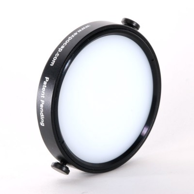 It may be purely coincidental, but over the last few days, I've heard a lot of buzz about various products that clip onto the front of your camera to help you white balance your images. The idea is that you place a special lens cap on your camera, snap a photo, and use that color as a reference color when you edit your photographs.
The devices come in lots of different types: full-covering caps, dome-shaped caps, home-made versions made out of coffee filters or Pringles caps, or any number of other surfaces.
It may be purely coincidental, but over the last few days, I've heard a lot of buzz about various products that clip onto the front of your camera to help you white balance your images. The idea is that you place a special lens cap on your camera, snap a photo, and use that color as a reference color when you edit your photographs.
The devices come in lots of different types: full-covering caps, dome-shaped caps, home-made versions made out of coffee filters or Pringles caps, or any number of other surfaces.
In theory, it's a great idea, but it has a flaw: A white balancing cap like this measures all light that hits it. Can you spot what the problem might be?
Imagine your lighting set-up is like this, for example
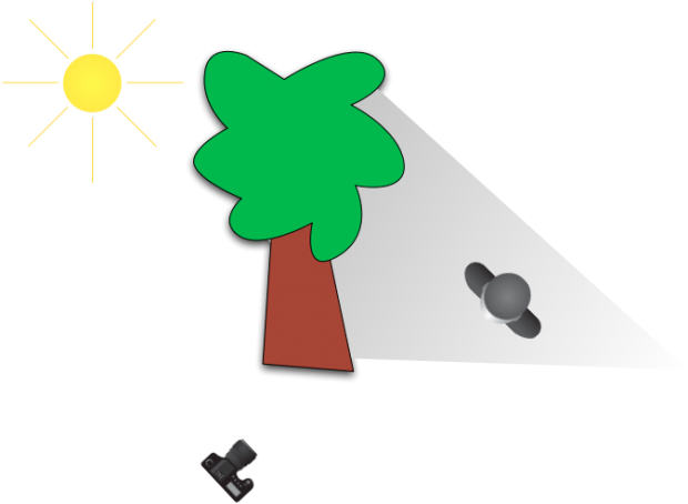
You are in the sun, but your subjects are in the shade. Your white-balancing cap will measure the light that's hitting your camera (direct sunlight - or around 5,500 Kelvin or so). However, your subject will be in the shade (around 7,000 Kelvin or thereabouts).
The outcome is utterly predictable: Your white balance is going to be miles off.
So, what's the solution? It's simple:
Don't white-balance where you are taking photos from... White-balance what you are taking photos of.
November's competition theme was wood. You presented us with so many wonderful images that we had a lot of fun looking for a winner. This month's prize, however, goes to Flickr used ludovi for his image Wounded Tree.
I was immediately drawn to the gorgeous variations in colour in this image. On top of that, it's technically great. We're very happy to award it a 12" Fracture.
There's an honourable mention, too, for Phil Walton and his Just Missed Bonfire Night. It's a fun twist on the theme, with great lighting, that made us laugh. Well done!

Congratulations, and thanks everyone for entering. If you feel like having a go this month, December's competition is up-and-running.

Coo-ee you made it tough for us to settle on a self-portraitastic winner for September! We saw so many different elements that we liked, finding a picture that we could agree on was an exercise in endurance!
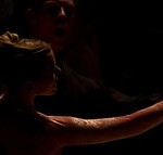
Eventually, though, we came to a decision. It was Milo Sees who walked away with the spoils for his Training in the Dark. Haje and I were both captivated by the lighting, and there was something about the juxtaposition of the sleek, smooth skin, the poise of the body, and oppressive darkness that made it my winner.

Congratulations, Milo! You've won a 12" Fracture!
Our runner up was Bubble Blastage by Kathleen Cassidy. Gareth thought that the idea was neat and he loved the high contrast look. It was the sassy attitude that blasted straight through my screen that I adored. Great stuff, Kathleen!

Thank you to everyone who entered. The theme for this month's competition is round. You can check out the details here. We're looking forward to seeing your pictures!
We asked for two-tone images in July. Maybe red against yellow; perhaps purple shot with green; how about orange sidled up against pink; or in the case of our delightful winner, Dim the lights: blue contrasting with green.
So why did we choose this cracker by Hooker771, apart from the juxtaposition of the blue and the green that so perfectly encapsulated the theme? The lighting is beautiful. We loved the story. The lines are fantastic. And it made us smile.
That's bagged him a 12" Fracture.
We'll be announcing August's competition tomorrow, so keep your eyes peeled, both here and on Twitter, for the details.
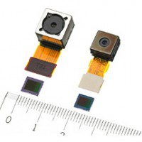
Oh heavens make it stop, please. We don’t need 17 megapixels of resolution on our mobile phones. The lenses are terrible, the lighting is rarely sufficient, and… urgh. Can someone please send a memo to Sony? Maybe even Samsung, too? Until a few of the basics in taking pictures have caught up with the sensor size in mobile phones, it looks just as if they’re embarking on a pointless megapixel escalation battle.
The rumours are the Sony has come up with a 17.7mp CMOS sensor for use in mobile phones. It might even have 120fps video. When it’ll be available, or how, isn’t known yet. Are they planning on using it in digital cameras as well as phones? Maybe.
Yes, it is awesome that they can squidge going on 18 million pixels of sensitivity into something so tiny. That really is a fabulous engineering feat. But right now they’re not especially useful because so much else about mobile phones is well below the spec that they need. Stop. Take a breath. Let everything catch up with itself. Then perhaps we really will be impressed.
Still, I’m waiting for Samsung to up the ante.
(Headsup to Engadget.)
(And that’s a picture of Sony’s 16mp sensor, announced in October.)

If you’ve ever wanted to turn off or dim a light in a photograph after you’ve taken it, or if you’d like to be able to adjust exposure as if you were still behind the lens but aren’t, then the people over at Oloneo might have just the piece of HDR software for you. What’s more, it makes the adjustments in real-time.
PhotoEngine allows you to alter the lighting in your pictures, for example to switch on or off light sources or adjust their white balance. It also gives you the capacity to recover details lost to over-exposure, or to restore areas that have been under-exposed. And there’s a noise reduction tool, too.
PhotoEngine is still in Beta and is only available for Windows, but you can learn more about it and download it for free from Oloneo.

Have you ever entered a photography competition and not won a bean?
Don’t worry, it happens to all of us. To help you along, we’ve collected together some of the best tips from some top judges to see if we can’t help you lay your hands on that so-far elusive first prize!
If you want some more insight, including tips from some competition judges, why not have a look at what Photocritic and PhotoRadar have to say, too?
Now, go forth and conquer!

The internet is absolutely full of guides about things you should and shouldn’t do to take ‘good photos’. Don’t over-expose. Remember the rule of thirds. Don’t cut people’s heads off. Watch your background. Use a shallow DOF in portraits to throw the backgrounds out of focus. 3-point lighting for portraiture, etc.
A lot of us just take all these rules for given, as if they are hard-and-fast rules that you have to stick to, because if you don’t, you’ll fail as a photographer. Break these rules, and you won’t take a good photo in your life. Your cat will die, your children will hate you, and your significant other will divorce you.
Truth, as you might expect, is slightly different. Don’t get me wrong, most of the time the ‘rules’ (which in any case should be seen as mere guidelines) make a lot of sense. Of course it looks silly if you cut people’s heads off. Of course your photos won’t look conventional if they are harshly over- or under-exposed.
Grossly over-exposing a photo doesn't have to mean it won't look good. (click for bigger on Flickr)
Read the sentence above. That’s all I really wanted to say with this article. So if you’re in a rush, or you think I use too many words to say something simple, then read that sentence a few times, and go check out XKCD for a while.
What I’m trying to say is that while the guidelines are there to help you, there’s no point in following any rules or guidelines unless you fully understand (or grok, if you’re geeky and/or well-read enough to be familiar with that concept) why.
The best reason to understand why a rule is there, is to break it. Some times, you might find that your photos actually come out more interesting – better, even, perhaps – when you break the rules. Other times, you’ll try to take the same photo twice; once whilst following the rule, and once whilst breaking it, and you’ll realise why it’s a good idea.
Just remember: Never follow a rule just because you’ve read somewhere that it’s the ‘right’ thing to do. Follow it because you understand it, and because you know what happens when you don’t.
Contrary to popular belief, your foreground doesn't have to be in focus (clicky for bigger)

DO cut their heads off at the top if it makes for more interesting and intimate photos (click for bigger on Flickr)

The Carlsberg Express: Of course your horizon doesn't have to be straight, if a non-straight horizon gives you better results! (click for bigger on Flickr)

Sometimes, getting in closer makes a photo more intimate. Don't be afraid to crop into people's faces.

The horizontals aren't horizontal. The verticals aren't vertical. The background is a mess. How could this photo ever be any good? But it is... (click for bigger on Flickr)
White balance? Hah? I spit on your white balance. (click for bigger)

Some times, the background adds to a photo - don't throw it out of focus on principle just because you have a nice, fast lens.
Do you enjoy a smattering of random photography links? Well, squire, I welcome thee to join me on Twitter - Follow @Photocritic
© Kamps Consulting Ltd. This article is licenced for use on Pixiq only. Please do not reproduce wholly or in part without a license. More info.
A couple of months ago, I had to eat my pride after my first foray into dance photography went terribly awry.
Since, I’ve spoken to Laurie, who is a friend, Ruby on Rails coder, dancer, and fellow photographer, who offered to write me an article explaining how to get dance photography done The Right Way™. His top tip: Learning about dancing makes you a better dance photographer!
Take it away Laurie…
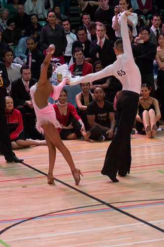 Ballroom dancing is the hardest photographic challenge I have personally come across. It seems everything is set up to make it hard, and nothing makes it easy. Everyone moves too fast, the lighting is horrible, and getting a spot to stand can be a challenge in itself. None the less, after years of working on it. I finally think I know enough to pass on some advice.
Photo on the right © Laurie Young – see it bigger on Laurie’s Flickr stream!
The first thing, as with any photographic trip is to know what you want to get. For me there are three different goals I can be thinking of. The first is to try and great stunning photos. The sort that i want to frame and maybe even sell as art. Secondly I want to document the dancing, including all the bits that don’t look so good, the mistakes and the moments in between the rehearsed lines. Surprisingly this is what most dancers are looking for when they ask to see my photos, as it helps them improve. Finally I want to capture the emotion of the day, the excitement and nerves before the competition, the release after coming off the floor, and the joy or disappointment that any competition brings. I’m not going to talk about this one today, as technically its similar to portraiture, and so off topic.
Like any demanding field of photography, the equipment you have really makes a difference. You are just not going to get really good photos with anything less than a semi-professional DSLR.
The biggest single leap I took was getting my hands on a camera with no shutter lag. If you are waiting between when you press the shutter and when it takes the photo, you have no chance of getting anything, dancing is ALL about timing, and so is dance photography. Hand in hand with this is a camera with fast autofocus. More than anything else you can spend your money on, no lag, and instant AF will improve your pictures.
For the choice of lenses, I like to go for the extremes, either a telephoto, or a wide-angle. Standard lenses have little to no place in my kit bag. Having said that, I use the telephoto to pick out just one couple or dancer, and if the competition is in a small room, then this job is done best by a slightly longer than standard lens like 70mm.
Either way, the lighting is going to be low, so the fastest lens is going to pay dividends. Personally I use a Sigma HSM 70-200 f/2.8, and this seems to be the lens of choice among the other photographers. For wide angle I like about 20mm, which i use mainly for the Standard (ballroom) dances from right up close.
Photo on the right © Laurie Young – see it bigger on Laurie’s Flickr stream!
Flash is a good next addition to your kit. You are going to be taking a LOT of photos, so it needs to recharge really fast. In a dark room you are going to be dumping a lot of charge with each flash. I use a Metz Hotshoe Mounted gun, charged from a Quantum battery pack, and even then can easily go through 2-3 full charges of it in a day.
The last thing you need is memory cards. Lots. If your shooting an all day competition, you are probably looking at between 1000 and 5000 photos. At full quality thats a lot of GB, so stock up, or bring a laptop to download onto.
When I arrive at the competition the first thing I do is get a feel for the light levels. Competitions are held in lots of different venues, from community halls with lots of windows and ample natural light, to the Winter Gardens in Blackpool, a massive hall with quite dim lighting. If you are lucky there will be some spots of lights from down-lighters, or even follow spots, which can make for some great photos. Personally I prefer not needing to use flash, it is hard to avoid flash shadows, but its not always an option.
I tend to meter manually, taking some sample shots till I am happy with the ambient light, then setting the flash on auto, (use the most advanced form of auto your camera supports) which will generally do a nice fill in. Because the dancers are moving so fast, and because the background at competitions is typically horrible, a wide aperture and really fast shutter speed is the best. Autofocus should be on, but if your camera can’t focus fast enough, then pre-focus on a specific part of the floor, and only take photos when people dance on that spot.
Next decide where to position yourself. My two favorite spots are on the balcony, looking down with a telephoto, or right on the edge of the floor, close enough to get hit by the girls dresses as they go past.
Photo on the left © Laurie Young – see it bigger on Laurie’s Flickr stream!
If you do this, be nice to the judges. They are competing for the same floor space, and often have to stand right in front of you to get their job done. It can often feel like part of the judge’s training is learning how to stand right in front of photographers, but I have been assured this is not true. Annoying as it is, its something you have to accept. If you are at the floor edge, then kneel down. Your camera should be at or below the dancers waist height. Otherwise you are going to foreshorten their legs, and no girl, and pretty much no dancing guy is going to be happy with that look. The lower the camera is the nicer the legs will look. Just don’t get so low you get accused of trying to take photos up the girls skirts!
Now its time to take photos. This is where your biggest problems are going to begin. At first it will feel like lots of random motion is going on, and you only ever see a good photo after you have missed the chance to capture it. To fix this, you need to learn more about dancing, and learn the individual couples routines. Here Latin and ballroom start to differ. Ballroom is all about motion, so still photos are always going to be difficult. Add that to the fact that each couple is effectively embracing each other for the whole dance, you will always get the back of one persons head.
Except in the “lines”, those moments when the dancers stay on the same part of the floor for a bar, and show how they can stretch, and create impressive shapes. Learn the routines. If you watch them for a lap or two of the floor you can start to see that they repeat the same steps each time. This lets you predict when such a line is about to happen.
In the Latin dances, there are lots of accents. Highlights in the music where the dances do something dynamic, powerful, or sudden. As you learn more about the music these become more predictable. In Cha Cha, its normally on count 1, in Rumba, its on 4. In Paso there are two specific highlights. Learn the music and you can tell when these accents are coming. If you have learnt the couples routines, you can know when they are about to go into a line, if not, assume they are going to do something that hits the accent. You will be surprised how often you are right.
You really have to listen to the music, and be as aware of it as the dancers are. Its the only way to get good photos of dancing.
Thank you, Laurie, for writing up your guide for us. If you liked Laurie’s writing, check out his website, and of course, give his Flickr stream some love, too.
As with so many other things in life, Flickr is great for inspiration for finding great dance photography. Plug in the name of the dance and search by most interesting, get a feel for what can be done!
Can’t be bothered searching yourself? Can’t blame you – here, let me help: Tango, Paso Doble, cha cha, Rumba, Salsa, Merengue
Other searches worth trying: Latin dance and dance, of course.
Do you enjoy a smattering of random photography links? Well, squire, I welcome thee to join me on Twitter - Follow @Photocritic
© Kamps Consulting Ltd. This article is licenced for use on Pixiq only. Please do not reproduce wholly or in part without a license. More info.