


People have been obsessing over composition – and the theory and maths behind it – for thousands of years. Pythagoras discussed it, Ancient Greek architects used it, and Fibonacci sequenced it. But what does it actually mean for you and me when we take a photograph?
Essentially, the resulting rules of composition help us to create pictures that please the eye and are easy to understand. Composition can make or break a picture, but is so often overlooked. Let’s look at some of the main ideas people are using.
Rule of Thirds
One of the oldest rules in of composition is known as the rule of thirds. It’s easiest to understand if you imagine a grid across your picture, splitting it into nine equal rectangles.
Basically, the rule says that placing your subject(s) on any of these lines will make for a better composition. Let’s look at some examples of the rule of thirds to help explain it:

The rule of thirds applies to landscapes...

...and to portraits
Roughly speaking, the horizon is placed on the bottom of the two horizontal lines (although it also works on the top) and lined up the subject with one of the verticals. You can also place extra emphasis on focal points of the picture by positioning them where the lines cross, such as the girl’s face in the second photo.
Maybe try imagining these lines next time you look through the viewfinder, and adjust your shot to see if it works better. It doesn’t have to be exact!
Symmetry
Almost the polar opposite of the rule of thirds, symmetry can change a photo from ordinary to extraordinary, especially when used in unexpected ways. Using symmetry in portraiture can be very unsettling, but also very effective! To get perfect symmetry in your photos, it’s probably easiest to use a tripod to frame the picture exactly as you want it to appear (and remember, a little ‘cheating’ in image editing software can also help you along the way).

Sharp Symmetry, by Scintt

Place of Contemplation, by Martin Gommel
Leading Lines
Leading lines are exactly what they sound like – they cut through the image, drawing your eye down them and into the picture. These are often used in landscape and architectural photography, and a favourite technique for photos of roads and railings. Often used to great effect when leading to a vanishing point, and frequently combined with symmetry, this can also have very dramatic results. Again, a tripod will help give you set up your shot for the composition you want.

Airport Symmetry, by Doris Hausen
Vanishing Point, by Luigi Caterino
Other techniques
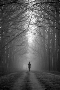
I’ve only scraped the surface of the different techniques used by photographers to give their pictures the composition they want. Try using elements in the composition to frame the subject (such as the trees in the picture with the runner), and maybe try different techniques on the same picture – it might be the easiest way to find the one that works.
Ignoring the Rules
The theory behind what makes a ‘good picture’ can certainly be off-putting for many. After all, isn’t a good photo about how it makes you feel rather than how perfect it is? Possibly. But understanding conventions helps us decide when to follow them, but also when to break them for dramatic effect. So go experiment with unusual crops, dead-centre subjects and skewed horizons – you might just discover something amazing!
All photos used in this article are used according to Creative Commons licences. If you have strong reservations against your photos appearing on Small Aperture, please contact us, and we’ll get them taken down. Please support the artists creating these photos by clicking on the photos to take a closer look at their work!