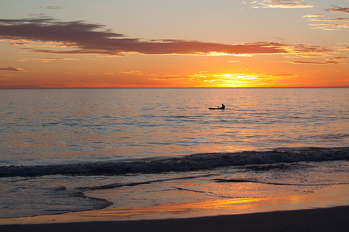
We've covered image size for the web. But what about if you want to hang a picture on your wall? Or sell it for use in print materials?

When you hear the term 'high-res' thrown about with such abandon when it comes to images for web use, have you ever stopped to think just how big or how high quality and image meant for the web needs to be?
There's an assumption that high-contrast images are more dynamic, more compelling, more inviting. Have a go at some low-contrast photography. You might surprise yourself with the results.
Balance doesn't mean symmetry; it means an internal consistency and tension within your photos. And it's a vital element of composition.
Great photos might be down to a little bit of luck, but most of that 'luck' you make yourself. Don't believe us? Read on...
Tell the truth, how often do you print any of your photos? And how often do you go to have a selection of your images printed only to be deterred by the prospect of having to upload them to a print company's website, which always seems to be a slow process, and then prevaricate about their sizes and formats? If the answer to the first question is 'not very often' and if the answer to the second question is 'more often than I'd like', then photo print service Printhug has an IFTTT-based solution to transfer images from digital to print with the minimum of fuss.
Should you have not heard of IFTTT, it's an automation programme that allows you to write 'recipes' to connect various apps and services in your digital life (IFTTT calls them 'channels') in order to do things. All recipes are based on the statement 'If this, then that.' If you do something on one channel, this prompts an action in another channel. If I publish a new article here on Photocritic, a tweet is posted on Twitter linking to it.
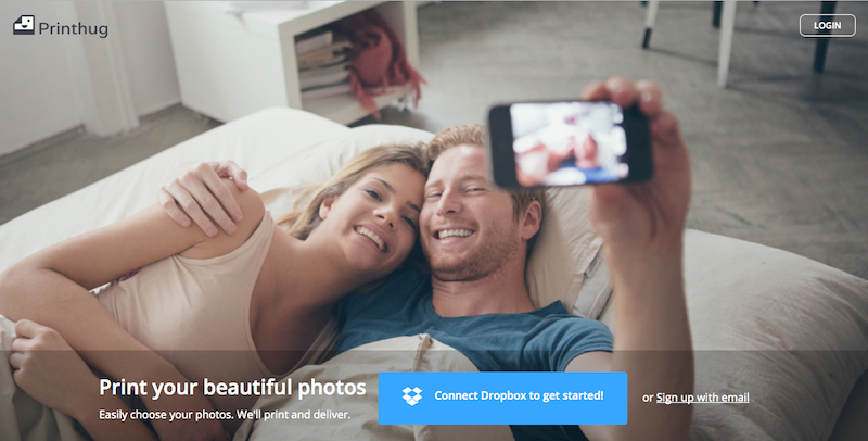
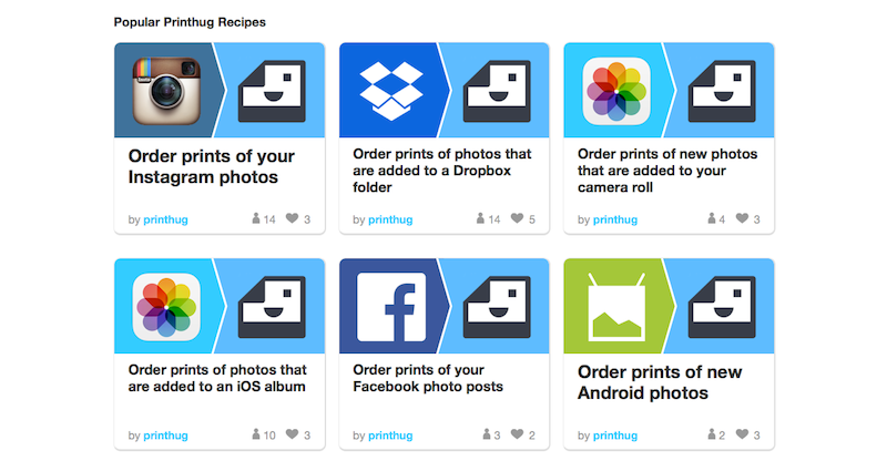
With Printhug, you extrapolate the IFTTT theory to 'If I post an image to Instagram and tag it #printhug, then Printhug will print it.' You can substitute 'Instagram' for 'Facebook' if you prefer. Or have the images that you upload to a particular Dropbox folder sent to print without any fuss.
Print orders can be aggregated from several different sources, for example Instagram, Flickr, and Facebook, and a minimum order can be set, too, ensuring that you accumulate a viable number of prints before they're mailed to you.
Square photos are automatically printed in 4×4" format (49¢ each), while you've a choice of 6×4" (49¢), 7×5" (89¢), and 10×8" ($3.49) rectangular prints.
Printhug ships to USA, Australia, Canada, France, Germany, Ireland, Italy, Mexico, New Zealand, Spain, and the United Kingdom. How much it'll cost will depend on how much you order.
Want to give it a go? Head over to the Printhug website to learn more and sign up. Or take a look at the Printhug channel on IFTTT.
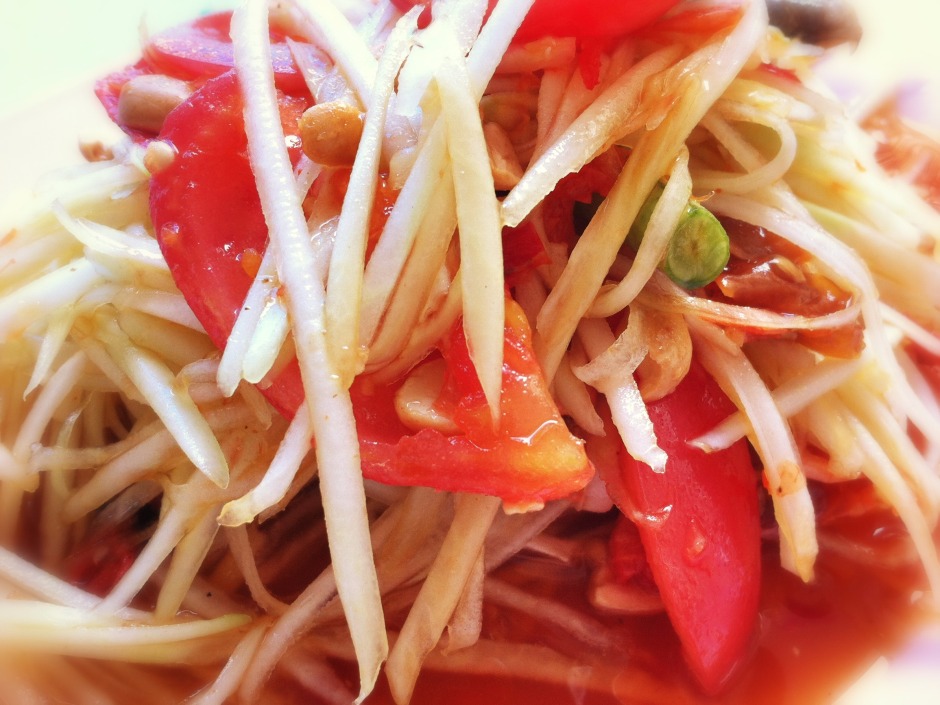
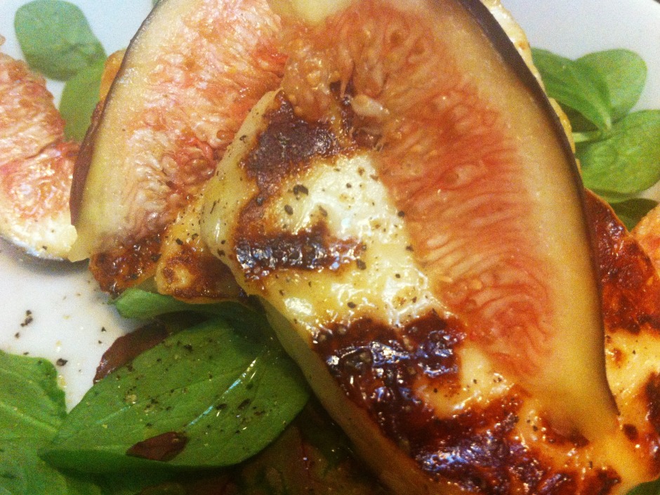
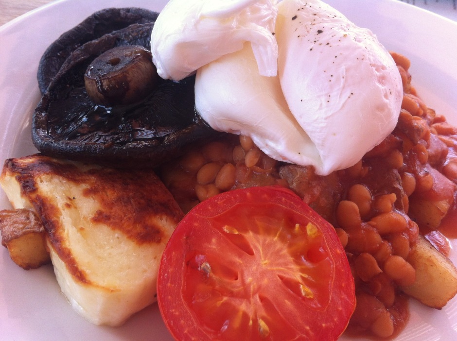
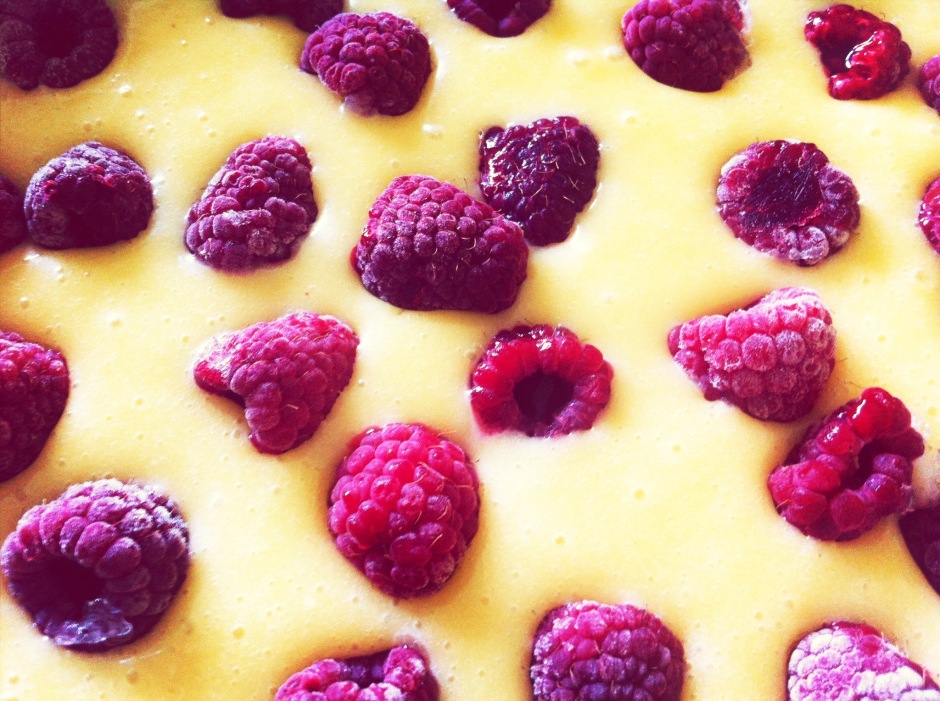
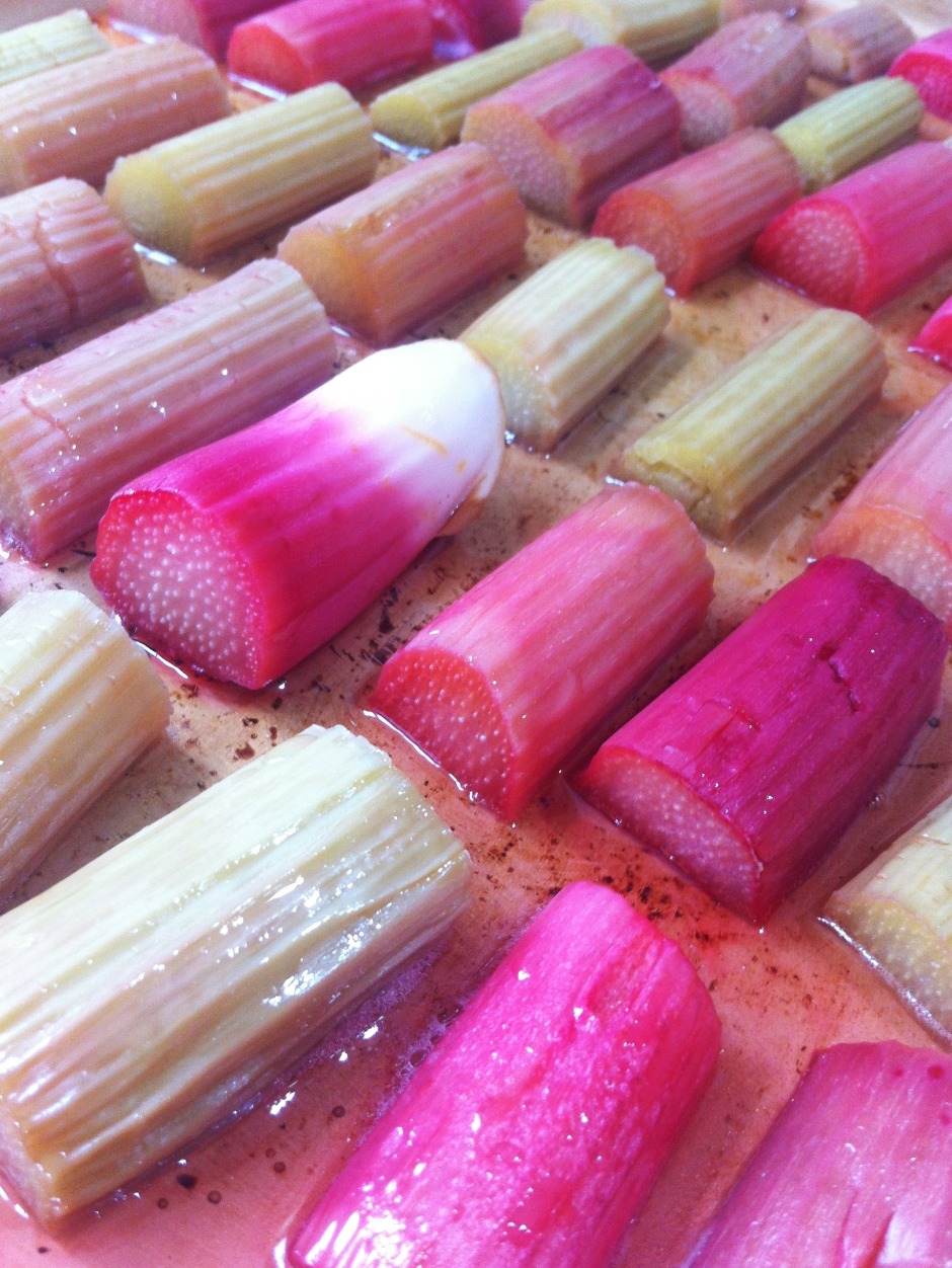
A bird has just tweeted in my ear that today is International Food Photography Day. We've already quite a few articles here on Photocritic that delve into the mystery of making brown gack look tasty and cold chicken appear hot. But seeing as most people aren't going to be pulling out their dSLRs in Le Gavroche or the French Laundry to take photos of their dinner (or at least, I hope not), we thought that we'd focus on smartphone food photography today, for when you don't have a controllable aperture or variable shutter speeds at your disposal.
We probably sound like a broken record here at Photocritic, urging people to get closer, but we really do mean it. And we definitely mean it for food photography. Lean in.
Use natural light, and lots of it, to photograph food. Avoid flash wherever possible, especially smartphone flash. It's rarely a good look.
Experiment with different angles when it comes to food photography. Up high, down low, looking across your food. Give it a whirl!
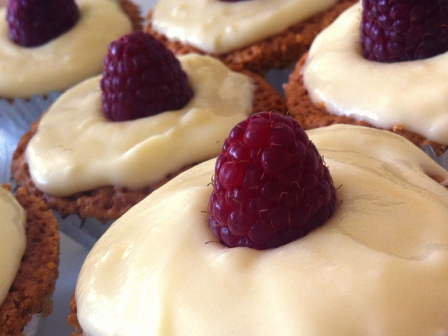
You really do not want clutter distracting from your food. So check for spills, crumbs, and cruet sets in the background. Think about using this tip in conjunction with getting closer and altering your angles for maximum impact.
Wobbly white balance can manage to make even the most delicious, fragrant, and beautiful dish look unappetising. Whites need to look white and not tinged with mouldy greens or unnatural blues. Fire-up Snapseed, load up your image, and push that 'Warmth' slider around until the colours look right.
As well as adjusting the white balance of your food photos, don't forget to give them a quick crop if they need it—especially to slice away anything extraneous or distracting in the background—and to increase the brightness and contrast a smidge. That will give your image a bolder and more appealing feel.
I don't tend to add filters to my food photos, but if that's your thing, Mayfair gives reliably good results in Instagram, I like Vanilla in EyeEm, and ColorVibe is good in Flickr. But it doesn't hurt to play around yourself!
It doesn't matter how tasty your chickpea curry actually is, making it look appealing can be very difficult without some serious styling. The colours are dull and the textures uninteresting. The best photos of food make you want to reach into the image and snatch the cherry off of the top of the cake. They tend to be bright and full of feeling. So be selective in what you photograph. Think about colour, texture, and pattern.
And now you can put your new-found skills to use by entering the Fujifilm and Pink Lady Snap the Rainbow competition!
I was having a fairly good morning, until I took my lunchtime peruse of Feedly to see if anything interesting or exciting had dropped into it. Apart from a new post by my favourite film critic, nothing was outstanding until I reached Lifehacker. The Lifehacker team has just posted a link to a visual media usage rights flowchart created by The Visual Communication Guy. Excellent! Ignorance is no excuse when it comes to image theft and unauthorised use and reproduction of photos. While we're all perfectly aware that when you place something on Facebook, Flickr, or your personal version of Frankie's Funky Photos, there's a real chance that someone will try to use it improperly, the more that we can educate people about the right way to do things, the better. This one, however, was not quite so excellent.
You'll find the original here and the Lifehacker article here.

Apart from the fact that it's far too dense and word-heavy, it contains at least one humongous, glaring, verging on the unforgiveable fault for something that purports to advise on usage rights. Take a look and tell me if you can see it. (And tell me how many others you can see. There are plenty.)
Found it?
If you haven't, because it's a horrid thing to read, here it is:
While the laws about distributing images through social media channels like Facebook, Pinterest, and blogs are still fuzzy, it is generally considered acceptable to redistribute an image that was intended to be viewed publicly by the creator. This is why you will typically find original images re-posted on blogs, news sites, and social media channels even if the person re-distributing the images didn't receive permission to do so.
No, no, no, no, no, no. And for good meaure I'll say it again. No.
Images that are shared on social media aren't free for redistribution unless the creator has expressly said so. I put my images on Flickr and use them here on Photocritic and put them on my personal website to display them, to illustrate concepts, to tell stories. I do not put them on the Intergoogles so that anyone else can make use of them. And you should never assume that anyone else does, either.
The law regarding this is hardly fuzzy about the situation, either. There's been at least one monumental court case that supports this opinion, when photographer Daniel Morel sued AFP and Getty Images after they redistributed his images from the Haitian earthquake, which he'd shared via Twitter, without his permission.
Copyright exists from the moment that someone creates something, whether it's a photograph, a tune, a poem, or a piece of prose. It doesn't matter how a creator wishes to share her or his creation with the world, unless she or he has definitely signed away the rights to it, the rights remain theirs.
To be fair to the Visual Communications Guy, he does state 'My rule above all else? Ask permission to use all images. If in doubt, don’t use the image!' in the post that accompanies the flowchart, but that's not really good enough. It's the flowchart that people are going to share and see, not the article. When incorrect information such as this gains traction, we all suffer. Suddenly what's not right becomes commonly accepted. Or people who were doing their best to not be ignorant are in the wrong when they thought they were doing right.
So I'll say the mantra and everyone can repeat it after me: 'Just because I found it on the Internet, it doesn't mean it's free to use.'
When the press release for Ricoh's newest camera fell into my inbox yesterday, I felt overcome by a sense of deja-vu as I scanned down it. The specification for the Pentax Q-S1, a pocket-sized EVIL camera, seemed very familiar: 12 megapixel 1/1.7" CMOS sensor; ISO 12,800, 5 frames-per-second; DR II dust removal mechanism; and Eye-Fi wireless LAN SD memory card compatibility. Isn't that the Pentax Q7 in all but name? Looks-wise the Q-S1 didn't appear exactly ground-breaking either. That might sound contradictory for a camera that comes with five different body colours (black, gunmetal, pure white, champagne gold, bright silver) and eight grip colours (charcoal black, cream, carmine red, canary yellow, khaki green, royal blue, burgundy, pale pink), but Pentax is famed for its swap-shop approach and the design is making the retro-but-not overtures that feel almost inescapable right now. It has very similar dimensions to and weighs almost the same as the Q7.

Try as I might, I couldn't pin-point any significant differences, save for the physical appearance, between the Q7 and the Q-S1. The Q-S1 is supposed to have a slightly improved auto-focusing system and has updated filters, but that's about it. Improved autofocus is always appreciated and quite frankly I can take or leave filters and toys, but I'm still scratching my head. What's the point of the Q-S1?
If Ricoh is of the opinion that the Q-S1 is there to offer consumers more aesthetic options and choices, that's a grimly disappointing approach to selling cameras. I admit that I have been known to go weak at the knees owing to the sumptuous design of a camera on occasion, but I part with my money because of their guts and performance. Cameras are tools, not fashion accessories and what truly interests me are technological developments that make a difference. Dressing up the Q7 with its tiny sensor that suffers from noise issues won't make it a better camera.

I'm desperately hoping that camera buyers aren't so superficial that everything rests of the look of the box that lets in light and not how well it allows the photographer to control and manipulate that light, or how well it records that light. I can't be sure but I blinking well hope that isn't the case.
So Ricoh and the Pentax people who work there, if you're listening, I'm sure that you can do better than this. There's the Pentax 645D on your roll, after all. And people who buy cameras: it's about making beautiful things, how your magical picture-making box looks isn't all that important. Not in the grand scheme of things.
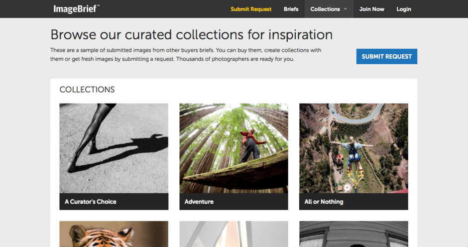
Control, commission, and contacts. If that sounds like a reasonable premise under which to sell your image online, you might want to check out ImageBrief. It's an online global image marketplace where buyers request specific images to meet their needs and photographers submit photos that they believe meet the brief. The average fee is $800 and photographers take upto a 70% cut. Interested?
Buyers, who are a mixture of art buyers, creative directors and editors at advertising agencies, brands, corporates and publishers, as well as freelancers, submit a brief describing exactly what they want in detailed but natural language. Photographers who are signed up to ImageBrief can then submit photos that they think meet the brief's criteria for consideration. Before any images are presented to buyers, however, they're all vetted by the ImageBrief staff to ensure relevance and maintain quality. For the successful photographers, there's a potential 70% of the commission fee available. I've not seen one brief below $200 and plenty in excess of $1,000.
Photographers are able to keep up with new briefs via email and an iPhone app notification. There's an Android app in the works.
It's all very well having a great model that serves buyers' needs without giving them photo-blindness from trawling through acres of potentiall suitable images, and gets photographers' images in front of buyers, but if no one knows about it, it doesn't benefit anyone. ImageBrief has found that word-of-mouth has worked in their favour, togetehr with social media and targetted email campaigns. Rainer Waelder was spotted by the ImageBrief team and invited to submit a portfolio for consideration.

The ImageBrief team is very keen to point out that its fresh approach is part of its appeal: 'The images are different, the process is different and the outcome for the brands and clients they represent is different.'
ImageBrief regards the curation model as critical to its success and integrity. 'It's what allows us to present such amazing, tailored content. Each of our photographers is reviewed upon registration and then images are curated every step of the way to ensure quality and relevance to the client.' The buyers aren't overwhelmed in their search and photographers making sales take better a better cut of a significant fee. It's win-win.
Uploading images to a stock agency and forgetting about them might seem like a relatively easy and stress-free option to sell your photos, but ImageBrief photographers are quick to point out that it doesn't offer nearly the return that an ImageBrief sale does. 'I’ve only made one sale so far with ImageBrief though I have been shortlisted several times. But that one sale was my biggest ever and more than made up for the effort expended on other briefs. One of the great things about ImageBrief is that it attracts high-profile clients still willing to pay a fair and proper rate for images. That makes us photographers feel it’s worth our while to submit images in the first place,' says UK photographer Matt Doggett.
A commissioning platform is in the works that is intended to allow clients to seek out a photographer when they haven't found the perfect pre-existing image. This can be tailored based on location, categories, or references. A new premium account structure will let photographers put themsleves forward for assignments and maybe develop relationships with clients that could go for ages.
It's free to sign up to ImageBrief and that's probably the fastest way to learn how it works. Look at the kinds of images that clients are buying in the 'Collections' section. Download the app so that you can keep on top of new briefs.
ImageBrief photographer Slobodan Blagojevic recommends being selective and making sure that you fulfil the brief to be in with a chance, but perhaps more importantly 'do not think of ImageBrief as just another stock library, i.e., do not submit typical stock imagery. Clients come to ImageBrief precisely because they want something different, something fresh, something unique.'
The terms and conditions under which photographers sell their images via stock agencies are frequently criticised and as a consequence the money that they can make from sales is often lamented. For one day only, however, iStock by Getty Images is trying to make photographers feel better about the deal and their contribution to the stock business. As part of its celebration of Small Business Week in the US, it has declared 14 May 2014 to be '100% Royalty Day'. 100% Royalty Day means that:
However, it's not quite the gold-plated celebration of small businesses that it appears to be at first blush. That pesky word 'exclusive' makes all the difference. If you're not afraid of a little stock agency promiscuity then you won't be eligible for any extra pennies accrued. And of course, it's not exactly easy to encourage people to select your content for download on 14 May; they'll download it at their convenience. Still, if you are an exclusive iStock by Getty contributor, it's better than a poke in the eye with a sharp stick.
Feature image: Amesy/ iStock by Getty Images
Back in the days of film, you didn't have much say over which of your photos were developed and printed, not unless you did it yourself. You took a roll of film, dropped it in at the chemist or local photographic shop, and waited for the prints to come back to you. We ended up with the duds along with the masterpieces, and shoeboxes of photos. Now, we can be far more selective about what we choose to print, and even if we want to print our photos at all. According to research conducted on behalf of Photoguard, a specialist photographic insurance company, 30% of people only ever look at photos online and about 55% of people who take photos have printed any in the course of the past year. Of those who do choose to print photos, it's people who prefer taking selfies who are most likely to send their images to print, with 82% of them doing so over the past year.
Of course, it's easy to assume the correlation between 'taking photos of themselves' and 'printing photos of themselves' but that's not necessarily so. They're just more likely to print photos that they've taken at all, and this might include coffee, cats, and kids, and beers, bicycles, and bumble bees.
Who's least likely to print their photos? It's the people who take 'art' photos (however that's defined) and photos of food. Apparently, 77% and 75% of people in those respective categories didn't send anything to print over the past year.
And why aren't people printing images? Apart from the 30% who only look at images online and the 20% who don't look at images at all, 37% of the survey's respondents found printing too expensive and 27% cited a lack of access to print facilities.
As someone who takes an enormous amount of pride in her photos and enjoys seeing her work in the flesh, it makes me quite sad that people either aren't quite sure how best to see their photos on paper so that they can hang them on their walls, put them on mantlepieces, or position them on desks, or find the cost of printing prohibitive. As Carly Wong, one of my Twitter friends put it: 'It's the test of a great photo too. If it's great it looks even better in print than it does on a computer screen.'
For the record, here are a few online print companies who'll run off 100 prints sized 6 by 4 for under £12 (and that's the top end), plus postage and packing. Some of them will give you free prints when you sign up, too.
If you want to know who was questioned for this survey, it was 320 professional photographers (UK adults who have been paid for photography work in the last three months) and 680 amateur photographers (UK adults who take photographs on a regular basis). The sample is broadly representative of the UK across age, gender and region. Respondents were interviewed between 13 and 17 January 2014.
Once you feel you’ve started to get the knack of pointing your camera at things and clicking the button, it’s time to start taking control of all the lighting in the scene. But, as it turns out, that’s bloody tricky.
I keep having to explain how to ‘visualise’ different types of lighting to people, and it turns out that it’s rather difficult – not because what I’m doing is particularly advanced, but because sometimes, it’s just tricky to make the connection between what is happening in a photo, lighting-wise, and how the lights are set up.
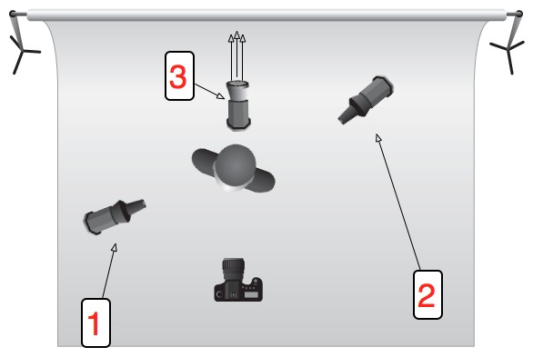
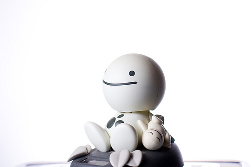
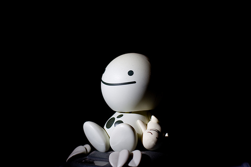
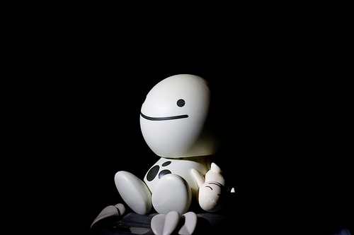
I’ve put together a collection of examples which I hope will help. For these photos, I’ve used a figurine with a nearly round head – this will be very useful to determine where the light is coming from; but remember that all of this is as valid with more complicated shapes, including people.
This picture of HappyHead is part of a series of photos designed to explain some basics of studio lighting.
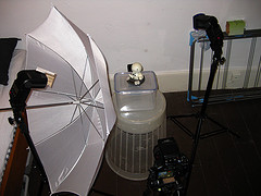
If you’re curious, this is the equipment I’m using throughout this post (and when I’m taking photos in general, for that matter).
For most of the photos, the lighting set-up is like this:
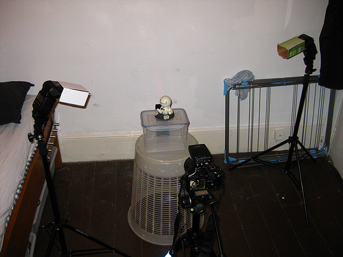
Check out the Flickr page for a detailed breakdown of everything you see in this photo.
Or, for additional clarity:

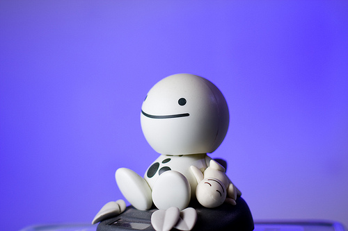
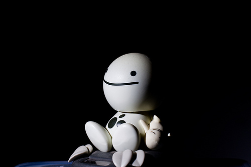 Picture 1 – Lit by a single 580EX II flash from top left (flash 1 on the schematic) at 1/32 power output.
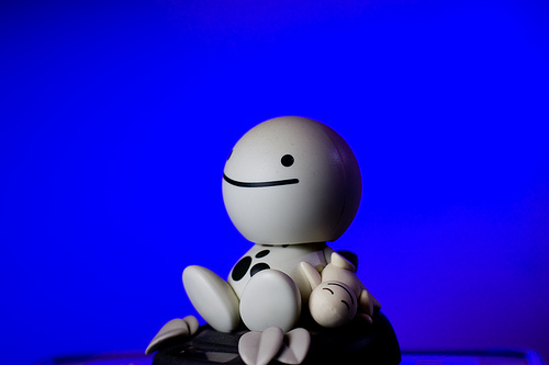
 Picture 2 – Same as Picture 1, but with an additional flash from the right (flash 2 on the schematic), slightly behind HappyHead, at 1/64 power, to lift the shadow a little.
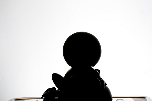
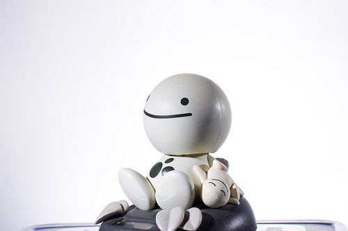 Picture 3 – Same as Picture 2, but with an additional flash at full blast on the background (flash 3 on the schematic). Note the light fall-off to the right, due to the flash being too close to the wall, and not aimed correctly.
 Picture 4 – Shows just the flash to the right (flash 2 on the schematic), slightly behind HappyHead.
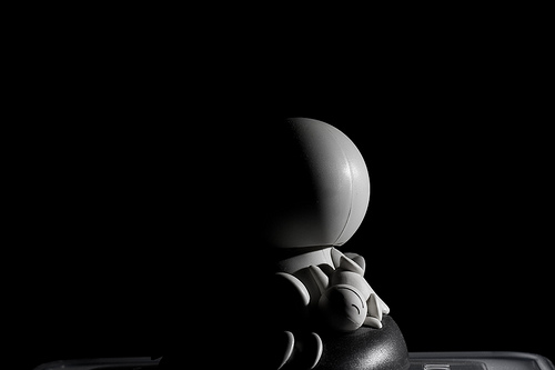
 Picture 5 – Shows just the flash behind HappyHead (flash 3 on the schematic), used to blast the background.
Troubleshooting lighting.
The observant among you will have figured out that Picture 1 + Picture 4 + Picture 5 = Picture 3. As a general rule, you can often just switch on one flash at a time to figure out which flash gives what kind of light – but only when they are in manual mode, obviously: In E-TTL mode, the flashes will attempt to compensate for the missing flashes.

When you’ve perfected this lighting setup with a figurine, it’s time to replace the doll with a real, live person. Take a close look at this photo – the lighting setup is exactly the same as that we used for HappyHead!

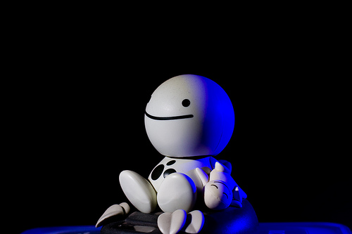 Picture 6 – introduces the use of coloured gels. This is basically Picture 1 plus the same set-up as picture 2. However, the gelled flash has a much higher power output (1/32) to help overcome the light loss from the blue gels

 Picture 7 – This uses the same flash setup as we’ve had so far, but with an umbrella on the left-hand flash to make the light softer. Notice how much gentler the light fall-off (i.e. how much less harsh the shadow is) is in this photo compared to the ones before in this series
 Picture 8 – Same as picture 7, but I have turned the right-side flash to the background, with the blue gels on it. Note how the blue in the background looks quite washed out. This is because the umbrella is great at spreading the light, but it also throws a lot of light onto the background, which causes the blue light to be ‘contaminated’ with white light
 Picture 9 – Same as picture 8, but here, I have added a piece of cardboard to the flash on the left, to ensure less of the light hits the left side of the umbrella:
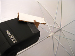
That, in turn, that means that less light is diffused onto the background, so now the blue flash can do its job better. Note that the flash output in Pic 8 and Pic 9 is identical – the only thing that changes is a tiny bit of cardboard. Incredible, eh?
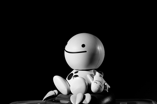
 Picture 10 – Okay, back to the original (this is a different picture than pic 1, but uses essentially the same settings, so should look very similar). See how dark the right side of HappyFace’s head is? In Picture 2, I fixed it by adding a flash, but you can be more economical with your flashes

 Picture 11 – is exactly the same photo as Picture 10, except I’m holding a reflector (that’s a posh word for ‘a piece of A4 paper’) just out of the frame on the right side of the image. The light from the flash is reflected off the paper and back onto HappyFace, causing it to look much less dramatic.
 Picture 12 – is quite similar to Picture 1, but has been set up to contrast with picture 13… Also note how the light has been moved further towards the camera (i.e. further to the front of HappyFace). This is so you can tell the edge of the head better – instead of getting the effect like in picture 7, where you can barely tell where the side of his head ends and the wall begins, here you get a clearer definition of his head.
 Picture 13 – The only difference between picture 12 and 13 is that in Picture 13, I have turned the flash lighting up the background off. Two completely different looks at the flick of a switch. It’s bloody magic, I’m telling you
 Picture 14 – is just showing off, really, and combines a whole series of lessons: The background is beautifully lit with a 420EX, the right side of HappyHead’s face is lit with the familar strobe, but with a red gel on it.
Iin retrospect, I wish I had umbrella’ed that strobe, because it’d have gotten rid of that bright red specular highlight just at the edge of HappyHead’s mouth.
This is only a very quick’n'dirty introduction to lighting, but it seems as if most people who e-mail me are actually struggling at this level – I’ll pick up with a more advanced lesson in a couple of months, I think.
Originally posted on 26 May 2011, but definitely worth dusting off and dragging out of the archives.
(Or, the non-photographer's guide to image use) It's a truth universally acknowledged that articles, newsletters, blog posts, posters, and basically anything involving blocks of text can be improved upon by the addition of an image. When you're writing about the local cycling club's criterium or producing a short introduction to crochet and macrame, you'll probably want some pictures to illustrate events or to explain techniques alongside your race report or detailed how-to. Can you take a look at the site of a local photographer and use some of his images from the cycle race? Can you conduct a Google Image Search for 'crochet' and download some photos of great examples of people's work?
The short answer is always 'No'. Just because someone has posted an image on the Intergoogles, it doesn't mean that it is free for other people to use. You can't use the china in John Lewis' window display without paying for it first, and a photo on Flickr is just the same. Images belong to the people who create them—or in some circumstances, to their employers—so they get to decide how and when they can be used and what the appropriate fee for using them is. We put them on our websites or on photosharing sites because we're proud of our work and we like to display our capabilities, but it's not an open invitation to filch them.
There are a few exceptions to this rule, but until you know better, work under the assumption that every photographer keeps the tightest control over the use of all of her or his images. Being confronted by an angry photographer wielding an invoice for unauthorised image use is not a pleasant situation, so remember: You can't use other people's photos. Mmm'kay?
Some people are happy to licence their images under Creative Commons terms. Creative Commons licences aren't designed as an alternative to traditional copyright, but a complement. They're easy-to-use copyright licenses that allow you permission to use a photographer's images under terms decided by the photographer. One photographer might let you modify and use his images commercially, but another might say that her images must be attributed, cannot be used commercially, and aren't to be modified. However, not all photographers use Creative Commons terms (you'll see it close to the photo if they do) and if there's no evidence of a Creative Commons licence, assume that you can't use the image.
If you receive an image in a press release or it's made available to you from the press section of a website, this will be free to use in the context of the product or situation. For example, when Olympus releases a new camera, it will make a bundle of images illustrating it available to me. Provided that I'm writing about that camera, I'm free to use them in an article. The National Portrait Gallery will supply a selection of images from each of its exhibitions so that if you're reviewing it or publicising one, you have photos to illustrate the article. But, you can only use those photos in relation to the relevant exhibition and they must be attributed under the terms set out by the NPG.
Some news agencies, for example AFP, are happy for you to use their photographers' images non-commercially and for personal use provided that you credit the photographer and agency and link back to the site. But, some agencies aren't. And you wouldn't want to face the wrath of AP or Reuters. Again, unless you're absolutely certain, assume that an image isn't free to use.
Get in touch with the photographer! Most of us make it easy to send an email: do just that. We don't bite. Mostly. Tell us who you are, why and how you'd like to use a photograph that we've taken, and ask if you can come to an arrangement. The worst that we can say is 'No'.
That's not so hard, is it?
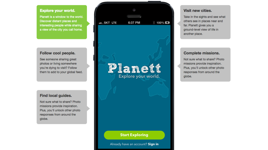
In December 2011 I took a look at an app called Wander (no, not that Wander; a different one) that aimed to let you explore the world through images. It was a bit like having technologically-based pen-pal. Wander allowed you to connect with people in any one of 80 countries and you could share your lunch, your journey to work, and what you do of an evening to get to know each other and where you live, through pictures. It seemed like a fairly neat idea that allowed you to explore and learn about new places while sharing yours. It didn't, however, catch on as the developers had hoped and Wander closed down on 16 August owing to financial difficulties.
Undeterred, some of Wander's original developers have gone on to launch Planett, a Wander-esque app that allows users to discover new places and people by featuring photos tagged with 'missions' from all over the world and organising them into 'city feeds'. Wander's one-to-one element has had to take a back seat for now, but the Planett team is hoping that it can be introduced soon.
I'm impressed by the Planett team's tenacity, but I'm left with some nagging doubts about the app's viability. If it failed on financial grounds the first time around, how will the revamped version fare? There are two underpinning factors here: either Wander didn't fulfil a gap in the market and wasn't popular with potential users; or the team weren't able to monetise it effectively.
Rehashing an app that people didn't want to engage with won't necessarily make it any more popular. If that's the case, then Planett is, sadly, already on a hiding-to-nothing.
Not being able to monetise the app effectively could have been because the developers simply didn't know how to do it. They couldn't see a way to make the app economically lucrative and therefore didn't. That's fine if you're able to bankroll an app as a personal project, but not if you need to transform it into a self-sustaining business. Given that Wander closed owing to financial shortcomings, it suggests that it didn't fall into the category of a developer's part-time project. Seeing the way that Wander went doesn't fill me with confidence that Planett can be maintained as a developer's toy, either. If that were the case, then Wander would still be meandering along.
I sincerely hope that the Planett team hasn't sauntered over from Wander thinking that they can monetise it 'somehow' without having thought it through. Attempting the same scheme but expecting a different outcome is somewhere between futile and fanciful. What I would like to know then is what's the plan, Planett? I have asked Planett's developers to elaborate on the app's monetisation potential, but I'm yet to receive response. Without one, I can only anticipate Planett will head towards the same pale blue yonder of Wander.
Alternatively, the Wander team did attempt to monetise their app, but it didn't raise enough revenue. That doesn't bode well for Planett, either: it casts doubt on the monetisation potential of the app. Sure, Planett might have a different vision to Wander, but there's no evidence of it yet. Planett's developers need to consider if their app is something that plugs a gap in the market and if people will be prepared to pay for it, somehow.
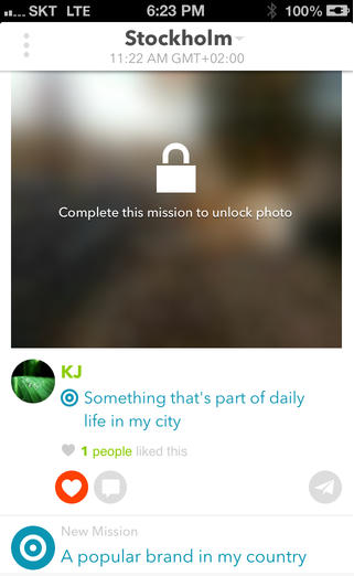 Planett's selling points are that it allows you to explore your world, you can follow 'cool people' who share photos from places you want to visit, you can visit cities pictorially and explore them 'at ground level', and it provides you with photo missions to inspire you and get your creative juices flowing. As you share more images of where you live, you can unlock more images uploaded by other people.
Is this enough to tempt people to join and to share their photos? After all, you can already explore the world photographically using geolocation information with Flickr, Instagram, and EyeEm, and you can follow heaps of people with varying degrees of coolness on all three of those sites. EyeEm has the photo missions element built in, too. The real kicker for Planett is that these examples are already well-established communities with billions of photos, and that they're free. Without something to set it apart, Planett is facing an uphill struggle.
Wander's unique selling point was the one-on-one relationships that it fostered. Planett is hoping to adopt this feature but it hasn't got there yet. Without it, or another appealing and original facet, Planett is trying to establish itself amongst already settled groups that might not be willing to shift (or at least join).
There are billions of photos on the Intergoogles and hundreds, if not thousands, of different ways of sharing them. But if a new kid on the block is going to survive against already well-established communities and ensure its sustainability, it has to know to whom it is appealing, and how. Does Planett?
The key thing to keep in mind is resolution. An image online that covers the entire width of the Quora page would be less than 1000 pixels wide. If that photo is as tall as it is wide, it's a 1 megapixel photo (1,000 x 1,000 pixels) If you take that photo and print it in high quality (300 dots per inch), it would be quite small (8.4 x 8.4 cm / 3 x 3 inches). So, if you are looking to buy / commission / create photographs that work both in print and on screen, then worry about print resolutions, not about the resolution on screen.
The second thing you need to worry about, is sharpening the image for its target output medium. Glossy magazines need the photos sharpened differently than if you want to show it on screen, or print it on newsprint. Cambridge in Colour has a great Guide to Image Sharpening.
The Photography Fundamentals roadshow has reached stop 'M', where we're taking a very brief look at macro. We've kept it brief because otherwise it would become an incredibly detailed exploration of the subject that wouldn't so much be an introduction, which is the guiding principle behind the Photography Fundamentals series, but a tome. Although we think of macro photography as being the art of caprturing tiny things, it's not quite that. It's actually about capturing things very close. When you photograph little things, like ladybirds or lily pollen, you obviously want to get in close to fill your frame and get the best detail. This is probably why we associate 'macro' with 'small'. You could, however, have a macro shot of a skyscraper. It wouldn't be the entire skyscraper, but a very detailed, up-close section of it.
Getting this close usually requires a specialist macro lens to achieve a photo, although there are ways around this using extension tubes, bellows, reversing rings, and other bits of kit. As for a macro lens, the technical definition is of a lens that can record an image on a camera's sensor that's the same size as the object being photographed. It has a magnification of factor of 1:1. Similarly, if the image of the subject on the sensor were half the size of the actual subject, the magnification would be 1:2; if the image on the sensor were a quarter of the size of the actual subject, that would be a magnification of 1:4.
That strict definition of what it takes to produce a macro image has loosened over time and lots of people are happy to say that 1:10 magnification counts as macro. Simply: you're really close.
All of that magnification means that macro photographs frequently have very shallow depths of field.
Leading lines << Photography Fundamentals >> Noise
Over at Gizmodo on Saturday, they asked the question 'What's so wrong about taking photos with an iPad?' I've covered the 'using the iPad as a camera' issue before, so I'm not going to rehash it because that would be boring and actually it rather misses my point because what caught my eye was the image choice to illustrate the article. It was of a young woman using her iPad to photograph impressionist paintings in a gallery. This. This is something that I just do not understand. Not specifically using an iPad to photograph multi-layered, complex works of art, normally exhibited in carefully controlled environments, but photographing them at all. What's the obsession?
It wasn't just the Gizmodo article that got me thinking this; it's something that I've noticed before now in various galleries. Rather than taking time to absorb a piece, to let its colours and its story and its brushwork wash over you, people seem to be intent on looking at it through their three inch—or in the case of a tablet, slightly larger—screens, grabbing a quick photo and moving on from it. I cannot determine any pleasure in that I'm not certain how appreciative it is of the artist's skill and talent.
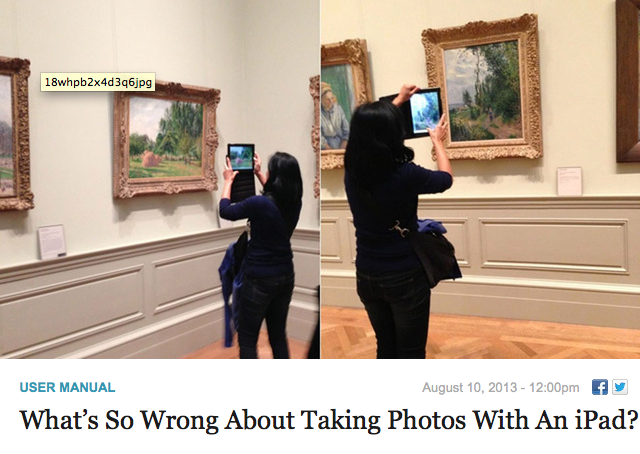
When you have a Renoir worth millions hanging before you, you pay it the attention it demands and the respect it deserves. That doesn't come from a photo snapped hastily with a miniscule-sensored camera that you'll probably never actually look at again. Even if you do look at your snapshot again, it'll never be able to entrance and captivate you in the same way that the original can. I promise you, a pefectly lit, carefully composed medium format reproduction of a Guardi, a Stubbs, or a Fantin-Latour cannot, in any way, compare to the real thing. So don't think that your iPad-snap or point-and-shoot shot will. You're in a gallery to observe the art, why not do that?
It's almost as if people are taking photos to remind themselves that they've actually seen something, rather than really looking at it and being able to remember it for how glorious it is.
Yes, I suppose that people can waste their time and money photographing delicate, intricate pieces of art with cameras of varying quality in far-from-optimal lighting conditions, rather than gazing at it, enjoying it, and absorbing it if they want to. But can they damn well make sure that they do not stand directly in front it, obscuring my view, when I'm trying to do just that?
Microstock megalith iStockphoto has announced that it's added another house to its stock photography village in the form of OJO Images. From today, all of OJO images 31,000 royalty-free files will be available exclusively through iStockphoto, which is in turn a part of Getty Images. They're expecting the number of files to increase to 45,000 by the end of October this year. Between its ever-expanding image archive and a new long-term pricing strategy, which prices half of its image library at half price, iStockphoto is claiming that acquiring content is now easier (and cheaper) than ever for those who need it. That's great for publications and companies, but not necessarily for photographers who sell their images as stock.
It isn't just iStockphoto that's owned by Getty; so are Jupiter Images, Thinkstock, Clipart.com, and Stock.XCHNG. As the centre of stock photography power gravitates closer and closer to Getty Images, we're drifting towards a situation that affords people who try to sell their images fewer options and fewer rights. The unpalatable Getty contract is one issue; so is the inability of smaller, more fairly priced stock houses competing against the image behemoth. Piled-high sold-cheap images from one of the biggest names in stock photography are easy for businesses in need of images to buy and use and harder for photographers to make a living by selling.
One man's tea is another man's poison, I suppose.
According to a piece of research commissioned by SmugMug and conducted by pollsters YouGov, we manage to take a quite astonishing 600 million photos every week here in the UK. Ah-ha, 600 million pictures of kittens, puppies, kiddies, and sunsets. Wondering how they got to that figure? It goes like this.
That's a lot of photos.
Roughly half of those photos are of people, about a fifth are landscapes, and a tenth are of pets and other animals. No one was brave enough to put a figure on how many of those portraits were selfies.
However, 56% of those questioned had lost images because of technical failure, theft, or even human error and almost three-in-ten didn't have a back-up routine of any description. That leaves me wondering, just how valued are images now? Are they becoming so ubiquitous that people aren't too bothered if a swathe of their photographic library suddenly disappeared into the cyber-abyss, or is it more a case that they've never stopped to consider what a catastrophic hard drive failure or a stolen phone might mean? These are slightly different prospects to the threat of fire or flood to printed photos.
The good news is that backing up your photos isn't that difficult and storage is cheap now, too!
Anyway, what do we think? Is 19 a fair number of photos a week? I'd totally skew the figures: I don't think that my potential response of 'Ehm... a few hundred last week,' really counts!