Use clever placement to emphasise a sense of movement in your subjects
Depending on how you use active space in your frame, you can tell completely different stories with the same photograph, depending on the use of active space.
Placing negative space around portrait subjects gives them room to breathe, and can make them seem more alive. But what would happen if you did the opposite?
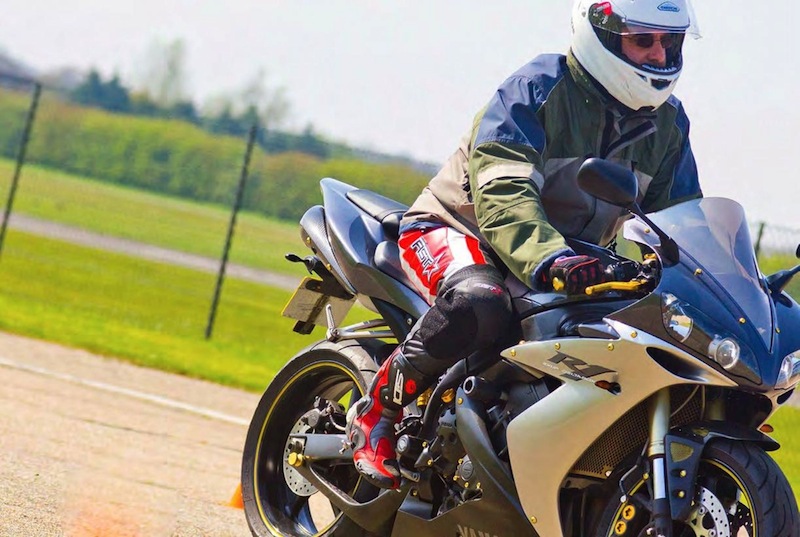
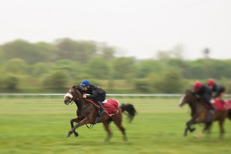
By having your subject look as if she, he, or it is moving out of the frame, you can induce a sense of 'nearly missed you' in the viewer. It’s a nifty little psychological trick: if people are moving out of the frame, we are conditioned (by television, films, and comic books) to think there’s a character leaving the scene. We can use the same effect in photography, and it works especially well with fast-moving objects.
The story of a runner
If you have a photo of a runner with a large amount of active space in front of her or him, you’re indicating that she or he has a long way to go. By reversing the active space, placing a large amount of space behind your subject, you’re telling a completely different tale.
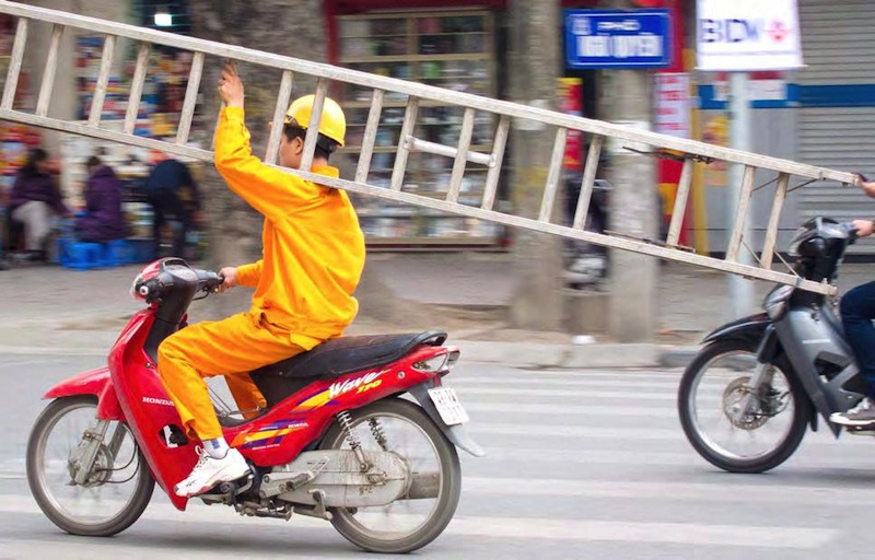
By placing the subject in such a way that they seem to be moving “out” of the photo, you get a dynamic feeling of speed. In this shot it adds to the sense of recklessness of this motorcyclist with his dangerous load.
A runner moving out of the frame seems to be running faster than one with lots of space ahead of them in the frame. After all, you nearly missed them with your camera!
Dealing with groups
Groups of people/subjects present you with a different problem, however. If you are shooting a NASCAR race and want to show the pack then obviously you can’t put more space in front of the lead car, as this would eliminate most of the other cars behind it. The same goes for schools of fish, flocks of birds, and similar. Anytime you are trying to illustrate a group of subjects, the active-space rule becomes less important, as the viewer’s eye will most likely be drawn to the group instead of following the lead object out of the frame.
What's behind your subject?
Additionally, anytime you want to see what’s behind your subject, active space becomes less important. Examples include the condensation trail of an airplane, a bride’s train or the cart a donkey is pulling. All of these secondary subjects help to bring the viewer’s eye back into the shot, so active space isn’t as necessary—and it might look a bit strange to cut off the cart behind the donkey, if that’s your main subject!


