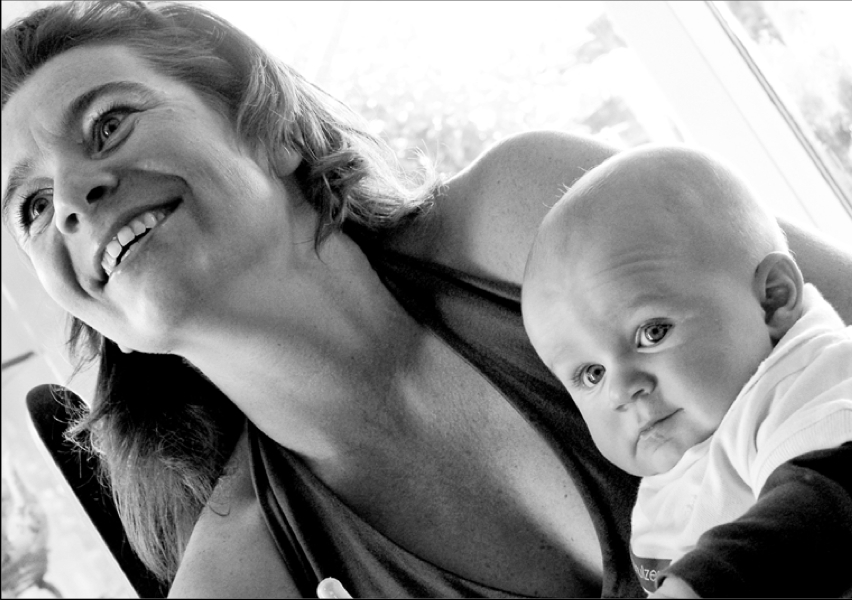
We're taught how to make our portrait subjects relax and act naturally in front of the camera, but how can photographers feel more confident when they're photographing people?

When you hear the term 'high-res' thrown about with such abandon when it comes to images for web use, have you ever stopped to think just how big or how high quality and image meant for the web needs to be?
There's an assumption that high-contrast images are more dynamic, more compelling, more inviting. Have a go at some low-contrast photography. You might surprise yourself with the results.
Balance doesn't mean symmetry; it means an internal consistency and tension within your photos. And it's a vital element of composition.
Great photos might be down to a little bit of luck, but most of that 'luck' you make yourself. Don't believe us? Read on...
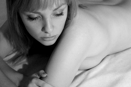
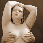
As your photographic interests progress, you are likely to try and take photos of somebody in the nude – It’s a very honest and challenging artform, which allows for a level of intimacy far beyond your regular portraiture. Of course, with the modern world’s paranoia about nudity, it’s not easy to know where to begin, so I’ve written a guide which I hope will come in handy to everyone, and give some insight into the hows and whys.
Needless to say, the photos behind the cut may not be entirely safe for work, but rest assured they are all relatively tasteful.
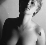
The problem with the definition is that people seem to attribute different things to nude. The most important part of an nude photo is that the person(s) in the picture is naked – and that this nakedness has a purpose.
 See Tina Nude II bigger on my Flickr stream.
This is probably going to be your biggest problem. It is difficult to take good nude self portraits, so you will have to find a model. A wife or girlfriend (or husband / boyfriend) might be able to help you out, but the problem here is that you are likely to know this body well already. One of the few exceptions to this Petter Hegre (see the links section below), who has taken an extensive (and very intimate) nude series of his wife – titled “my wife”
My point is that it would be better to take shots of somebody you have never seen naked before. That way, the picture taking process will be as much as an exploration for you (the photographer) as for the viewer
Finding a model can be difficult, especially if you do not have a photo studio or a professional business card (Neither those mean anything, as even people owning both can be psychos, but it helps when talking people into nude modelling). You could, of course, call a professional modelling agency, and offer to do a few nude shoots for new models who need a portfolio, but this is not likely to be cheap. Alternatively, using a online modeling agency such as OneModelPlace, you could find amateur models in your area.
When choosing a model, take somebody who has features that intrigue you. Don’t fall in the trap of picking somebody with a supermodel body – it removes much of the challenge. Instead, you want somebody who is different than average (making somebody who is not automatically associated with “pretty” look gorgeous is a lot more of a challenge than taking pictures of head-turners). A few pounds too much or too little is great.
 When working with nude photography – no matter how much time you spend getting the pictures to look nice, and hiding away everything you would prefer not to show – the models will be moving, and everything will show, to put it that way. What you want to do is to find a reasonably secluded spot to take the pictures. A photo studio is ideal, but outdoors or on location somewhere makes for great pictures.
Make sure that the temperature wherever the pictures will be taken is good though, because remember; Somebody will be naked, and being cold definitely does not help to make people relax!
Before you take the pictures, you will have to have thought about what you will want to do. Make some sketches, or have the model go through some poses with clothing on, to get some ideas as to where the shoot is going. Let the model have some ideas or set a theme to get going (a big black leather couch and a pale model or vice-versa can be very exciting)
When taking the pictures, take lots of pictures. This goes for any style of photographs, but particularly nude photography. If you believe you got a shot right – take two more just to make sure.
This also means that you will run out of film fast. Great. That means you can take frequent breaks while you load new film. Have a chat, take it easy, have a glass of wine (if the model is nervous, this can help LOTS)
 Try new stuff. Combine strange things. Have you seen the picture of Atlas? Recreate this with a big beach ball, or a TV receiver set or something. Use candles as light sources. Take black and white or colour shots (whatever you normally don’t). Use an overhead projector or a slide projector to project shapes onto your model.
Philip Greenspun has an excellent guide to nude photography on Photo.net, complete with lots of examples, practical tips, and interesting pointers. Not to be missed!
About.com has invited Peter Marshall to do A Beginners Guide to Nude Photography, which has a series of articles about nude photos, and how to go about photographing them
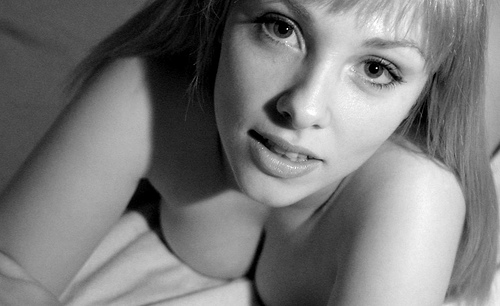 See Tina Nude I bigger on my Flickr stream.
Bodyscapes is a project by Allan Teger: set of photographs where bodies are seen as landscapes. Very clever, very sexy, but not rude.
Petter Hegre is a Norwegian photographer who specialises in nudes. In recent years he's strayed from the subtle to straight-up pornography, but one thing you can't take away from him: The man's got a great eye for a photo, and it's some of the classiest porn around. Is that a weird thing to say? Well, have a look and judge for yourself.
The Art Nudes blog has a daily update of an artistic nude photo – most of them are of world-class standard – sometimes provocative, sometimes a bit strange, but always of very good quality... And they've been going for the best part of 10 years, so there's plenty of content to get through.
Flickr is of course another source of nude photos – the “Tasteful nudes” pool is a great port of call for inspiration, mostly photos taken by amateur models, but a lot of it is rather good... Although it's not always the best moderated collection of photos. Nudes, yes, but 'tasteful' - not always.
A history of nude photography in the inter-war era.
And, of course, my own article 45 inspirational nude photographs
Good luck, and if any of my readers have galleries of tasteful nudes – please do post a comment, I’d love to feature your site!
Have you ever had someone take a photo of you and a friend, only to find out later that they cut off the tops of your heads? It looks ridiculous, and if someone’s head 'sticks out' of the composition, your photo is ruined. In other words, it’s not hard to imagine where the don’t-crop-people’s-heads rule came from. When you are working with people and portraits you will soon learn that there are good ways to crop people, and others that are not so good. Cropping heads is at the top of the naughty list. Don’t do it!
Except that, sometimes, cropping heads can be highly effective.
When can you break this rule-of-rules? When you've got in close—really close—to your subject. If your composition is focused only on somebody’s face, it can improve the shot to crop in close.
Don't be afraid to break the rule and crop in close and slice something off of the top, bottom, or sides of the head when the features of the face are the focal point of your composition. The reasoning is this: if you’re going to get in close, get in really close. By filling the frame completely with someone’s face it can make cropping her or his head unavoidable, but it also doesn’t look unnatural.
The key is to decide whether your composition is mainly about the body, upper body (shoulders and above), head, or just the face. Each type of shot has a different purpose, and only the face shots will look natural if you decide to crop the head. Otherwise it merely looks like you failed to plan your shot.
But in-keeping with the adage that if you're going to break the rules, break them properly, if you are going to crop into somebody’s head, make sure that you do it properly. A composition where only a thin sliver of someone’s head is cut off looks accidental. If you go even closer and cut them off across their forehead, the composition looks a lot more powerful, and at least nobody is left wondering whether or not you did it by accident!
Be bold!
 More unusual ways of looking at things, remembering rules, and then breaking those rules, are in my lovely book, The Rules of Photography and When to Break Them. It's available as an e-book and in a dead tree version (UK, US).
Getty Images is celebrating the ten year anniversary of its grants programme by offering a range of awards to photojournalists, portrait photographers, and non-profits working in collaboration with photographers to get their projects off the ground. There are five awards of $10,000 each being made available to photojournalists looking to pursue projects of both personal and journalistic significance as part of the Editorial Photography grants.
Previous recipients have included Paolo Marchetti, for his project Fever, which explored the re-emergence of European fascism and Lynsey Addario for the 2008 Darfur project.

Furthermore, a $10,000 Lean In-inspired grant will be awarded to a photojournalist looking to bring to light a significant but under-reported story focused on girls or women who've brought positive change to their communities or personal lives.
These awards will be judged by a panel including David Furst, International Picture Editor, The New York Times; Teru Kuwayama, Photo Community Manager, Facebook; Sarah Leen, Director of Photography, National Geographic Magazine; Jean-Francois Leroy, Director General, Visa pour l’Image; and Amy Yenkin, Director, Documentary Photography Project, Open Society Foundations.
Applications close on 15 May 2014, with more details available here.
Two grants worth $20,000 each will be awarded under the Creative Grants programme, allowing non-profits who do not currently have the resources to work with photographers or videographers to further their causes, but recognise their value, to do so. There's also a Lean-In inspired grant for this programme, which will be shared by a photographer and creative agency whose joint proposal is to develop imagery for a nonprofit they choose to support which focuses on issues related to empowering women, girls, their families, and communities.
Finally, the Contour award will offer $10,000 to support an up-and-coming portrait photographer. She or he must have fewer than five years' experience in the field, and the award will be based on their existing portraiture work. The judging panel for this will be chaired by Terry O'Neill and include Cheryl Newman, Director of Photography, Telegraph Magazine; Stuart Smith, Designer; and Michael Hirschl, Director of Creative Delivery, BergHind Joseph Agency.

More information, including terms and conditions and entry details, are available on the Getty Images InFocus blog.
If anyone had wandered along to the Maker Faire in the Elephant and Castle area of London (yes, it's really real; no, there are neither castles nor freely roaming elephants but both would be a vast improvement) on Saturday they would have found me, and the London division of Team Triggertrap, asking people if they wouldn't mind awfully screaming at the top of their lungs for us. Seriously.

You see, we'd set up the Triggertrap ScreamGrab studio because we reckoned that people summoning the exhaustive energy to scream like bellows, and then releasing it in one extended Aiouuuuuuu! would make for fantastic portraiture. And it would give Triggertrap with the sound threshold set to Very Loud Indeed™ a rather good workout. We weren't wrong!
Have a look at these if you need convincing:


And the rest you can see on Triggertrap Flickr stream.
Inspired? Want to know how we did it, so that you can give it a go yourselves? Read on!

At the least, what you need to do is to get an audio trigger that will take a photo when the volume hits a certain level, and a camera. In our case, we decided to use the Triggertrap Mobile app, but we discovered to our horror that the app itself was way too sensitive: Even with the sensitivity threshold all the way to the top, you didn’t really have to put your back into the scream to trigger the camera (in fact, speaking normally was loud enough to snap a shot). Uh-oh.
In the Android version of the app, there’s a separate slider for sensitivity, but we don’t have that level of control over the iOS app (and I did want to use the iPod Touch I had brought along, so that I wouldn’t have to tie up my phone all day).
After a spot of last-minute panicking, we discovered that there was a very simple, and delightfully low-tech solution to this: I simply stuck a small piece of packaging tape over the microphone on the iPod Touch. Hacky? Well, yes, but who cares – it did the trick!
With the tape in place, we were able to use the sensitivity slider to fine-adjust the triggering threshold. Perfect for what we were trying to do!
In theory, with the app configured and hooked up to the camera using a connection kit, that’s all you need to get the photo. Stick it on a tripod, and you’re good to go – really, everything else is showmanship. But to turn this into a far more fun experience, for us and for our sacrificial victims, we turned it into much more of a show.
For the ultimate ScreamGrab experience, I set up with the following:

Let's start with the lighting: I added a Canon ST-E2 infra-red flash transmitter to the camera’s hotshoe, and I set up a couple of Canon EX580 II flashes on super-cheap lighting stands with umbrellas. I fired the flashes on manual output (1/16 each), then set up the camera in manual exposure (1/180 second and f/10, ISO 640) and manual focus. This meant that all the shots were completely repeatable, and I wouldn’t have to make any adjustments throughout the day.
In fact, if it hadn’t been for people being different heights, there wouldn’t have been any reason to touch the set-up at all: even the batteries in the flashes, the flash transmitter, and the camera, lasted all day long. Impressive stuff – but then, battery consumption was the chief reason why I only set the flashes to 1/16 output – in my experience, in modern cameras, you may as well let the ISO do the work, and give your flashguns a break.
Finally, I wanted to ensure that the iPod Touch was clearly visible, so people would be able to see the black ‘needle’ move on the app – so they knew how loud they had to shout to trigger the camera. To achieve that, I used a Tripodclamps clamp. It’s simple: It bolts to the tripod, then squeezes the smartphone firmly to hold it in place. It looks good, and it makes it easy to demo the device, too, which is a bonus.
I should also mention at this point that the camera was shooting JPEGs rather than in RAW. The Canon 6D shoots enormous RAW files, and since I had a fully controllable lighting situation, I didn’t expect I’d need to do a lot of adjusting the images. More importantly, the JPEGs are much much faster to download via the tethered connection, faster to process in Lighroom, and it meant that my poor little MacBook Air didn’t slump to its knees. Having said all that, I do generally recommend shooting in Raw. Here is why, and I also wrote an article about why this particular situation (controllable light, need for speed) is an exception where JPEG is acceptable. Because, yes, I’m an insufferable nerd about this sort of stuff.
To show off the images, I decided I had to shoot ‘tethered’. I was in luck; my Canon camera comes with a piece of software called EOS Utility, which enables tethered shooting. In this case, I hooked up a27″ monitor to my MacBook Air. I made sure that all photos that were taken were shown on the audience-facing big screen as soon they were shot. Great for instant gratification – even the most reluctant screamers giggled their heads off when they saw their mugs on the big screen.
I anticipated (correctly) that people would want a copy of their photos – but how do you go about doing that? Quite a few people used Instagram and took a photo of their photo on the big monitor, but obviously we wanted something a little bit better than that. So, I devised a workflow.
I was running Lightroom 4, using the ‘auto import’ feature. In this way, the photos would be downloaded by the Canon EOS Utility to a folder, and Lightroom 4 would automatically import them from that folder into a library. The import script applied a preset to the image (white-balance, some vignetting, some extra contrast and some colour effects to make the photos pop out more). It also applied a description and title to the images, so it would be as quick as possible to publish them online.
From there, I only did one edit to each photo: A quick crop. This was necessary because we didn’t have a lot of time to frame people properly, and besides, a lot of people either jumped or hunched over as they were howling at the camera, so the framing was almost always off anyway.
After cropping, we just dragged the photo to the Flickr publishing tool within Lightroom, and hit the ‘publish’ button. With one person manning the computer, that meant that from squeal to Flickr, it could take as little as a minute or so, including the processing, resizing, and uploading.
We also had an IFTTT set-up, so that we could auto-tweet our ScreamGrabs. Except that Twitter sent us to Twitter Jail for too many tweets!
It would really have been awesome if we could have had a printer there, and printed out people’s ScreamGrabs as they were taken – but we didn’t really know how many people to expect, and we only had two people at our little stand at any time, so I suppose we wouldn’t really have had time to deal with the logistics of printing anyway — but it would have been amazingly good fun, so perhaps that’s something we’ll do next time.

The other idea that came up, was that perhaps we should have been recording people’s screams! Playing the screams, along with a slide-show of all the photos, would have been a fantastic project, I think – but it didn’t come up as an idea until someone mentioned it to us about half-way through the day. Again, I have no idea how you’d deal with the logistics of matching up the sounds to the pictures… But it would have been great.
In the Triggertrap ScreamGrab booth, everyone can see you scream!
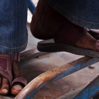
Do you remember the awesome shot of the rickshaw driver’s feet, which won our April photo competition? (If you don’t, there’s a pertinent reminder to your left.) I was thoroughly intrigued by the image, and where it came from, so I dropped an email to Sakshi, the competition winner, in the hope that she’d tell us a bit more about herself. Thankfully, she didn’t find me at all impertinent and gamely answered my roll of questions. Better yet, she said I could share.
Daniela: Where are you from, Sakshi?
Sakshi Kumar: I was born and bred in New Delhi, India. (And I’m 22, if anyone’s asking.)
DEB: When and how did you get involved in photography?
SK: My dad always loved to take my pictures. So even before I got into photography, I had the heart for it. My dad was my biggest inspiration though initially he didn’t support this decision of mine as he thought I was made for “bigger things.”
I took a degree in Journalism, which I followed with a postgrad in Photography. I also took an extra credit in photojournalism, which got me interested in opting for photography as a career option. Though I soon realized photojournalism is not my thing. I am too sensitive for that genre.
DEB: Photojournalism is definitely tough. So what sort of thing do you like to photograph?
SK: I mostly enjoyed landscapes, nature, wildlife, architecture, interiors and fashion. Astronomical photography is very intriguing and I’ve tried my hand at it, but not with much success up to now!
DEB: And the winning photograph? How did that come about?
SK: I was experimenting with portraiture. For me, portraits are more than pictures of pretty faces, they’re about someone’s character – a simple picture that could tell as much about a person’s life as her or his own words. So I went out on a shoot and started taking pictures of people’s feet in a more environmental setting. The winning picture was an outcome of it. The calloused feet belong to a rickshaw puller in a particularly poor part of Delhi. I think they express the hardships of his life.
DEB: Well, we definitely loved that picture! What’s your favourite photo that you’ve taken recently?
SK: Ah, this one! It’s a dog’s life!
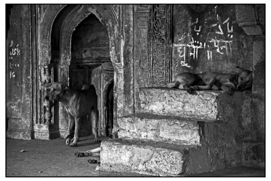
It's a dog's life! (Sakshi Kumar)
DEB: And finally, if you could go anywhere and photography anything, where and what would it be?
SK: Ooh! That’s a hard one. I’d love to capture the Aurora Borealis, so maybe Alaska or Sweden for that. And Death Valley, just for the sheer beauty of its barrenness. Oh, and I’d love to get the Milky Way from Mount Teide. It’s mesmerising.
Many thanks so Sakshi for answering my questions. We hope that she’s enjoying her prize!
Don’t forget, the deadline for this month’s competition is tomorrow (Wednesday 27 July); the theme is red; Fracture are providing the awesome prize.
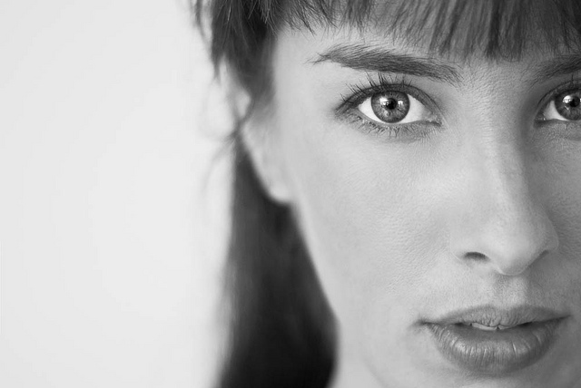
The very first thing you need to know about getting people to look awesome, is that their eyes have to be in focus. This is absolutely, completely non-negotiable. If they have their eyes open, get them in focus. If they have them closed – get them in focus. Is your model wearing sunglasses? Well, get them in focus. You see where I'm going with this.
The reason for focusing on the eyes is simple: Whatever your photo, this is really where you want your audience to be looking. In a good portrait, the eyes are a window into the soul, and if you want to move people with your shots, it's important to get (make) that 'connection'.
As you are starting out on your journey of improving your portraiture concentrate 100% on getting the eyes right. Trust me: everything else will eventually fall into place.
If the eyes are so incredibly important, how can you ensure that you get them in focus? Taking a photo is a multi-step process. First of all, check your camera settings. Is your camera in the right file format? Are you in the correct auto-focus mode? Is your camera in the camera mode you were planning to use? Is your ISO set correctly?
Next, Check your exposure. If you're shooting in Program, Aperture-priority or shutter-priority mode, you need to ensure that you haven't changed the exposure bias. If you have ventured into manual exposure, you should check whether you've dialed in a useful aperture. And if you are in a fully automatic mode, you should buy my book and turn to chapter 3 - and be deeply ashamed of yourself.
The final steps are to focus and compose your image:

The first step to get your focus right is to zoom in all the way on the eyes of your subject. This helps the camera's focusing mechanism get the focus right, and it reduces the risk of the camera focusing on the wrong thing. Obviously, if you are shooting with a prime lens (i.e. a non-zoom lens), this step doesn’t apply.

Now, half-press your shutter button. Your lens will attempt to focus. Since you've zoomed all the way in, it will be very clear when your subject is properly in focus. If your lens gets it wrong somehow, let go of the shutter button and half-press it one more time. Once your subject is in focus, keep the shutter half-pressed.

Now, whilst keeping the shutter button half-way down, you can zoom back out, and compose your photo. Take your time, there's no rush.

When you're happy with the way your photo looks through the viewfinder, all you need to do is to press the shutter all the way down, and your camera will take the photo.
Finally, you edit your photo to your liking, and bonza - you're ready to go. How you can edit your portraits for best effect is, of course, also covered in Focus on Photographing People.
If you enjoyed this quick tip, there's loads more where this came from. My newest book, Focus on Photographing People, is chocker-block with hundreds of photos, tons of tips, and fist-fulls of advice: All to help you become a better Photographer of People. Find out more about the book on my website, and then head to your nearest brick-and-mortar or online bookshop to buy yourself a copy!
Do you enjoy a smattering of random photography links? Well, squire, I welcome thee to join me on Twitter - Follow @Photocritic
© Kamps Consulting Ltd. This article is licenced for use on Pixiq only. Please do not reproduce wholly or in part without a license. More info.

As of late, I’ve become more and more drawn to portraiture which makes extensive use of the surrounding environment to tell us more about the subject themselves, to the extent that it is now creeping into my own work. Although I love the intensity that an intimate close up portrait can bring, the creative freedom that is afforded to you in an environmental portrait allows you to tell a story, to show more of the subject and who they are. This, amongst other reasons I will explore in this Closer Look, is what drew me to Rania Matar’s beautiful portrait series “A Girl and Her Room”.
Last week, I looked at Anastasia Taylor-Lind’s Women of the Cossack Resurgence – a look at a female-dominated society, photographed by a female photographer. I wanted to further explore this area with Rania’s work. Much of Rania’s work is focused on women and women’s issues, “A Girl and Her Room” being one such project. The project examines those difficult teenage years, looking at the strains associated with the transition from childhood into adulthood and the various pressures experienced by girls growing up in today’s society. One the one hand, they are children. On the other, there is pressure from peers, media and popular culture to move into adulthood.

Geneva, 22, Brookline MA, 2010
The series is excellent at exploring that confusing period of your life, where half of you desperately wants to grow up and be taken seriously as an adult and the other half doesn’t want to fully let go of childhood. Rania often portrays this in the series by juxtaposing themes of adulthood with themes of childhood. This is sometimes reflected in the subject’s choice of clothing, which indicate physical and social maturity – “going out” dresses, evening gowns and the like. Sometimes, it is reflected in their surroundings – a shelf full of various make-up, bags, shoes and posters of models and bands. In the same glance across the image, you notice paraphernalia associated with childhood: stuffed toys, bunk beds, colourful drawings and photos of themselves as a younger girl.
The very first image you encounter in the series – “Siena 17, Brookline MA, 2009″ – implements this juxtaposition extremely well. Siena’s wall is plastered with posters of models in bikinis and adverts for fragrance and cars, whereas her bedsheets are patterned with pictures of farmyard animals and a large stuffed teddy rests in front of her.
Siena 17, Brookline MA, 2009
There’s just so much to talk about here, I’m finding it hard to be concise (surprise surprise), but what I find really wonderful about the images is the different degrees of maturity and each girl’s unique response to growing up. Girls the ages of 12 through to 21 and 22 are photographed and it’s fascinating to see what items incrementally change in the room – a sort of battle for room space between objects of the past and objects of the future. It’s also interesting to note that there is no hard and fast rule to what stage of maturity a girl is at relative to her age – everyone goes through that change at their own pace, and this is demonstrated by the incredibly diverse personalities on display.
There are many themes running through the images: the extensive inclusion of the mirror and how it reflects the subject’s preoccupation and concerns with self-image: the inclusion of pregnant girls and the even greater gulf between being forced to grow up and accept responsibility and the desire to remain a child: the subjects who live in other countries whose rooms, although initially seemingly different, follow the same patterns and reflect the same anxieties, concerns and desires as those of the North American girls.
Aside from being rich in thematic detail, the individual images are also rich in physical detail. Rania includes dozens of little touches in each image. Initially, I consider the subject and her expression, then my eyes move around the room at every little detail, then back to the subject again. What is truly magic about Rania’s work is her composition – some of the rooms are absolutely packed with bits and pieces yet Rania manages to include all this without losing the subject herself in the background. That incredibly clever use of space is the master stroke that sets these portraits apart, as it would be all too easy for them to feel too busy and overloaded.
Shannon 21, Boston, MA, 2010
The series has inspired me to really look at and develop my own environmental portraiture, paying very careful attention to use of space. I urge you to go and look at the “A Girl and Her Room” project as a whole – it’s important to view the featured images here as part of the whole series, because not only is a story told in each picture, but a story is told as you progress through each image. Plus, they’re great, so why wouldn’t you go and look at them all?
The more observant of Small Aperture’s loyal readers may have noticed that my blogging on Small Aperture has increased as of late. Well I have further bad news for you: I’ll be looking after our dear litle blogging site for the whole week. As a portrait photographer, I’m kicking off the week by looking at one of many portrait photographers whose work I enjoy, in the hope to inspire you, help you get more out of portraits and, ultimately, explain to you and to myself why I am particularly attracted to looking at and creating portraiture.
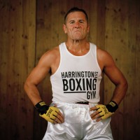
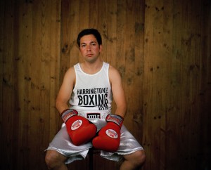
David Chancellor was the winner of 2010′s Taylor Wessing National Portrait Gallery Photo Prize – a wonderful exhibition which was displayed in, you guessed it, London’s National Portrait Gallery. I’m not going to look at his winning entry, “huntress with buck” – instead I’ll be looking at a portrait series of his, entitled “Boxers”.
Daniel 'the mover' Avenir #I, from the series boxers, before and after
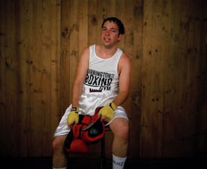
What I love about “Boxers” is the simplicity at the heart of the idea. It has that “why didn’t I think of that?” appeal to it. On the basic level, it’s a “before and after” spot the difference affair, showing each fighter just before their fight and immediately after their fight. This series has a quality that I see in many excellent pieces of portraiture (and any photography, for that matter): a simple, strong idea that has been executed exceptionally well.
From a technical perspective, they are absolutely beautiful – the lighting separates the boxers from the background so that they are especially prominent in the image. Another important detail is that the boxers are situated in the same position in the frame in their before and after shots (or, at least, those who were still able to sit up straight afterwards are!) which adds to the intensity of the “after” shot, as it almost seems like no time at all has passed between the two images, as they don’t appear to have moved anywhere in the interim.
So we’ve briefly examined the setup of the shots, but what takes a portrait from a pretty picture to something that holds your attention and gets you thinking beyond what you can initially see? To achieve this, we need a story.
The boxers in these images are not professionals. They are part of a phenomenon in South Africa known as “White Collar Boxing”, where men and women who have white collar jobs train for around three months to take part in a special boxing event against others of the same background. Not only that, but the boxers in this series are about to have their very first fight. Armed with this knowledge, whole new areas of intrigue are opened up to us, and this is where a well-lit, professionally composed image begins to turn into a real piece of portraiture.
Daniel 'the mover' Avenir #II, from the series boxers, before and after.
Now, we are scrutinising their expressions prior to their fights. You can see the nervous energy they are harbouring under the surface, the kind that only builds up prior to a tense situation such as a physical fight, especially your first ever fight. Look at how some try harder to hide that nervousness, or indeed tackle it head on, especially for the camera. In a way, to point a camera at you the moment before your fight is the non-verbal equivalent of someone saying “how are you feeling about your first fight?” to which they answer non-verbally. I know that sounds a little pretentious, but go back and look at them with that idea in mind – they’re answering the question for you with their expression. Isn’t that just magical?
The “after” shots are similarly rich with story and intrigue. Did they win, or lose? What injuries do they have? Some of the boxers look so utterly exhausted, it gives across a feeling of relief and release, especially when compared to their “before” images, packed with nervous energy. My personal favourite is Steve “the paratrooper” Burke: the expression of absolute defiance and confidence combined with the pose is incredibly imposing and powerful.
I’m pretty sure he won.
The final sign of a great portrait or series of portraits is what it leaves you with, or what questions it makes you ask that go beyond the initial image. What fascinated me is considering what drives these “ordinary”, office job people to step into the ring and do something that, in my opinion, is incredibly daunting and frightening. Were some attracted to the thrill of the idea and the danger involved? Was it a result of feeling bored and stuck in a 9 to 5 driving the need to do something different? Was it the need to challenge themselves to instil a sense of progress and improvement in their lives? Bearing in mind that David tells us that White Collar Boxing is hugely popular across South Africa, it brings you to ask questions about the human condition, about what drives us.

Steve 'the paratrooper' Burke, from the series boxers, before and after.
David allows us to come to these conclusions and ask these questions ourselves, which is an important distinction to make. I’m all for setting up a series of portraits with a little bit of flavour text to tell you what you’re looking at, but it’s important to strike a balance. I have an intense dislike for photo projects where the photographer has written three pages of text to accompany the photographs, telling you what colour schemes to look out for, how the images all link to each other and which of your preconceptions will be challenged. This should all come across in the image: you shouldn’t be told how to feel (or what your prejudices and preconceptions are, for that matter).
And that, dear readers, is why I love “Boxers” and why I love portraiture. I’ll be taking a look at another portrait story later in the week.
We’ve included a couple of David’s “Boxers” images in this article purely for editorial and critique purposes. I hope my article has already moved you to do so, but please go and explore the full set on David’s site. Here’s a direct link – http://www.davidchancellor.com/docs/photos.php?id=3:5
 Wow, that’s a really nice picture. It’s a shame about that big spot on her chin though. And she won’t thank you for that bit of hair she has on her lip there. Y’know, I think her hair is a slightly darker shade of red than that OH GOD IT’S WRONG IT’S ALL WRONG.
Now I admit, you can end up getting a bit OCD about image editing (see first paragraph). While this is true, take a portrait of anyone you know who is even the slightest bit vain and your vision of keeping them “just as they are”, complete with dark circles under the eyes from working late and that bit of spinach in the teeth from tonight’s dinner, might not be met with the standing ovation you were expecting.
Wouldn’t it be nice to be able to just tidy up those minor niggles that pop into your pictures sometimes? Wouldn’t it be nice to be able to do it without sacrificing central heating and eating nothing but rice and “no frills” tinned tomatoes for a month, just to save up enough money?
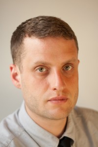
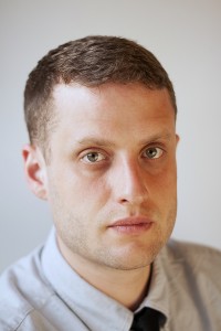
Well read on, budding image makers, for I have tried and tested four different lower-price solutions for you. (Cos, well, we’ve already looked at the free ones.) As a portraiture photographer first and foremost, I decided to take the same, straight out of camera, unedited image and try to get the most out of it using these four different packages:
I’ll be testing each one using the same four criteria: exposure tweaking / editing, retouching and sharpening, black and white conversion, and toys and fun filters. Here’s the image I’ll be using:
Upon first loading up, Corel had a fairly easy and clear layout, arranged logically. It’s essentially an organiser and image editor in one. After a bit of fiddling, I worked out how to bring up my image and start messing with it in the editor.
I adjusted the colour balance to make the image cooler, then used curves to alter the shadows, midtones and highlights. I have to say, there was little subtlety in the changes in tone and exposure. Another thing I noticed was that there isn’t instant feedback to the changes you make in the preview pane — it takes a good second, as if it were the victim of satellite delay on a news programme. It might be my poor brain being a useless, pickled mess but by that time I’d pretty much forgotten what my image looked like before the tweak.

Corel with sharpening
I used the clone brush to even out the skin tones, bringing the opacity down to even out skin tones and remove bags from under the eyes. This was fairly effective, but again not as subtle as I would have liked. There is a “makeover” tool which is fairly effective for removing individual spots and blemishes.
When sharpening, the high pass sharpen wasn’t too bad, but left the picture a bit grainy. The unsharp mask (which is often used for a slightly more dramatic sharpen) was nowhere near as subtle as I’d have liked it to be, and bringing the slider up to any remotely significant amount was creating a weird ring around the iris; I’m quite sure that “weird ring around my irises” isn’t the first thing my clients ask for in their portraits.
Your usual array of brush stroke effects and the like here but something I hadn’t seen before was quite a cool little feature called Time Machine. This runs you through a few different classic image making methods, from the Daguerrotype images of 1840 to a classic cross-processed look. And they don’t look half bad, to be fair. Plus there’s a paragraph explaining how each photographic method worked at the time, so you get a little history lesson, too!

Ooh, with toys!

Corel using even more toys!
You may have noticed that I didn’t include a black and white conversion section for Corel. That’s because there is a “black and white film” effect hidden away in the filters section, which oddly gives a much greater degree of control over black and white conversion than the other option on offer, which was a simple remove colour option. I found I made a better conversion using the black and white film filter.
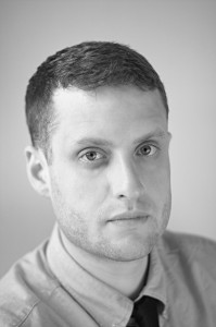
Corel does black and white
A good variety of tools available for image editing, but not enough power and subtlety in the tools themselves. A bit like borrowing an old toolbox from your grandad ñ lots of stuff in there, but most of it isn’t worth using.
I will be putting all of the categories together for this one, as they all sort of happen at the same time. Plus, there are no fun toys or filters to speak of, nor are there any black and white conversion options, apart from sliding the saturation to 0. This piece of software is a little different from the others in that it is designed specifically for portrait images.
After loading up my JPEG image, I had to define where the eyes, nose, edges of the face, chin, sense of humour, likes, dislikes, opinion on Jedward all are in the subject’s face (some of those aren’t true, I’ll leave you to work out which they are), to create what can only be described as what might pass for a death mask in the TRON universe:
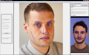
Portrait Professional
You are then taken to the editing suite, where everything is a slider. It felt a bit like create-a-character mode in a computer game, as I was able to adjust the shape of his mush in several ways, using a slider. None of them looked particularly natural, though.
The other sliders all deal with skin smoothness, wrinkle removal, spots and blotches, dark shadows under eyes and so on. Essentially, this program appears to be a piece of “quick fix” software to make portraits looks good. However, I’m really not sure who this software is aimed at – to professionally retouch an image requires a careful, complex level of attention, skill and patience, working on individual areas of the face for a significant period of time. There are no shortcuts, and this software can only do so much towards improving an image before the face you started with begins to look plastic and unreal.
Interestingly, I was also unable to save the image in the trial version. I decided to delve closer by zooming into the image and started to realise why they might not want us to save the image – the amount of detail lost when using the various sliders make the retouch job look amateurish.
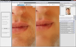
Portrait Professional not doing such a great job
It looked like I had taken a wire wool scouring pad dipped in hydrochloric acid, held my subject down, and proceeded to scour his face until it was featureless and sterile. Actually, maybe that would save me time after the shoot in retouching – anyone fancy a free portrait session? No?
Like anything in life, there are no “quick fixes”. I personally would avoid this particular piece of software. If you’re serious about using photo editing software to get more out of your pics, there are much better programs out there for similar prices.
What I immediately liked about NX2 was the fact that it didn’t take very long at all to load ñ it popped up on my screen and was ready and waiting without any fuss. I chose my photo and I was into the editing suite in seconds. There was a very clear and uncluttered layout and it almost felt like I had used it before. Each adjustment you made to the photo would be recorded as a “step”, so that could return to a step should you find it needed adjusting later on, which is a nice, non-destructive way of editing.
Editing exposure was very simple and effective. All was done from a simple “adjust” menu. The results were displayed very quickly, more quickly than in PaintShop Pro, which made it easier to make finer adjustments to the image. I was also impressed with the amount of fine control there was to be had over the exposure and other settings. As before, I used curves to edit the shadows, mids and lights and then altered the colour temperature to make the image cooler.
NX2 with sharpening
The auto retouch brush did a good job of removing blemishes without blurring the skin.Unfortunately, there was no clone brush I could use to smooth out skin tones. Looking in help, they suggested using a gaussian blur to smooth out skin tones. Unfortunately, this just gives you a picture of a dude with a blurry face. I used this in combination with the selection brush (works like a photoshop mask) in order to localise the blur to desired areas of the skin. Not the best solution, but it did help a little with skin tones and blemishes.
I used the same sharpening methods (high pass sharpen and an unsharp mask). There was a better fine level of control here than with Paintshop Pro but not as good as I’d have liked.

Black and white with NX2
There was a dedicated black and white conversion button, the sliders offering a good level of control again, although I felt the options were a little too simple. All in all, though, it was possible to get a good black and white conversion.
None. Zip. Nuttin’. NX2 seems to be pushing itself as a very serious digital darkroom type thing, and you are very silly for wanting silly effects. Silly Billy.
To conclude, NX2 feels a bit like a beginner’s Adobe Lightroom, in a good way. It offers a decent level of fine control and immediate feedback. Both of these factors are very important when tweaking an image to get it just so. It’s a great place to start when learning how to get more out of your images. A few sessions learning with this program would definitely benefit your shots but at £113, are things getting a bit pricey?
You knew it was coming, how could we not include Adobe? Photoshop Elements 8 (or PSE8 as I’ll call it from this point) is what you imagine it would be a sort of simplified, stripped down version of Photoshop. However, you are still able to make full use of a wide variety of tools and the layout was as clear and user-friendly as you would expect.
Retouched and sharpened with Elements 8
I initially loaded up my RAW file which loaded up Adobe camera RAW, a sort of pre-import tool that allows you to mess with colour balance, exposure etc before loading it up into the editing suite proper. There’s no mistaking the difference in the subtlety of changes you can make here, with instant feedback on how it’s looking.
Retouching was simple and effective. I used the clone stamp on various settings both to even out the skin tones and remove blemishes. Although there is a dedicated spot removal tool, I would recommend doing it manually with the clone stamp. No real complaints here. As before, I ran both a high pass filter and an unsharp mask on the image. Both were the most effective of all the packages. There really doesn’t seem to be any better software for portrait retouching and sharpening at this price.

Elements does black and white
As with its bigger brother, Elements has a dedicated convert to black and white tool. It’s slightly simplified but essentially very similar to the “full” version. It has some presets you can meddle with to see how different mixes harbour different results.
An extensive range of fun toys and filters to mess with your photos, from various sketch / brush effects to turning your image into a mosaic and adding clouds (for when you need that clouds-over-a-mosaic look). In case you were wondering, here is that much sought-after look:
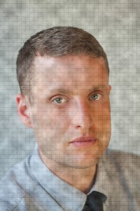
And Elements has toys, too!
To conclude, PSE8 has everything you need to start practicing enhancing and getting more from your images. The price is on a par with the other packages on offer here and it will give you a chance to see whether you really need the bigger, more feature packed full version, for a fraction of the price.
It was probably something of a foregone conclusion, but it seems that PSE8 has it, at least it does for me. Nikon Capture NX2 does a valiant job of providing an alternative to Adobe Lightroom at a slightly cheaper price, but not much cheaper than Lightroom 2, so I’m not sure it’s particularly worth dropping your pennies on, especially at over £100. In addition, I feel you can do most of what NX2 offers in Photoshop Elements 8.
And because I should probably warn you, it’s worth mentioning a program I downloaded the trial of which was going for around £25, called Pixbuilder. It was essentially MSPaint with (very bad) layers and curves options thrown in. If you’re wondering “how cheap is too cheap for my image editing software?”, the answer is “that cheap”.

If you thought portraiture was difficult, think about how perishable hot foods are. When you photograph it, you’ll want it looking fresh, happy, steaming, and appetising. A normal photo shoot – where you photographs something to perfection – takes a few hours, but the food will only remain good-looking for about 10 minutes at the most.
So what do you do? God knows, I’ve never tried. But my new friend L over at Still Life With laid down the gauntlet…
This month, I got inspired by Chez Pim’s post a week ago about “the ugliest food photo ever.” It’s stunning that a professional actually published this photo of Tuna Tartare in the New York Times, taking what sounds like a decent recipe and making it look just awful.
Of course, because this was a food article in the NYT, it also included a recipe. The challenge is obvious: Make the food (see, I knew there would be a DIY element to this, even though it is a food DIY rather than a photography DIY), and then take a photo that doesn’t look disgusting.
Read the challenge over at L’s blog, and then get cracking! If you get any good results, tell her, and me too!
Do you enjoy a smattering of random photography links? Well, squire, I welcome thee to join me on Twitter - Follow @Photocritic
© Kamps Consulting Ltd. This article is licenced for use on Pixiq only. Please do not reproduce wholly or in part without a license. More info.