Photography Fundamentals

Creating a photography portfolio

You are into taking photos, obviously – so what do you do with them? Many of you probably make online galleries, or you create prints to hang on your walls – or perhaps you even sell prints to others. Eventually, as photography progresses from a mild interest via passionate hobby and into the realms of what could be seen as a professional career, you are going to have to create a portfolio of your images, to show to prospective clients.

Heck, even if you have no clients, you will still want to make a portfolio. Imagine how great it’ll be to show the grandkids! 

So, you are a photographer, and you want to make a portfolio. I have had to do this a few times, and I have fucked up a few times, so I learned all of this the harshest way possible. Ah well – on with the show

Image selection

Galleries

Into the Mist (Territorial Army III) Into the Mist (Territorial Army III) by Photocritic.org, on Flickr

If you want to show your pictures in a gallery, you will need to make a selection of images around a theme of some sort. If you just run around and snap pictures, you will have to scrutinize them, to find out what they really are about. If there is no connection whatsoever between them, you might want to consider not making a portfolio, and rather concentrate on taking more pictures.

Why is a theme important? Well, although single pictures can be interesting, galleries tend to be interested in offering its visitors with a journey. Pick an emotion, and explore it visually, or perhaps a situation or a place. As long as there is some kind of “red thread” tying your images into a whole, you’ll be all right.

Make sure that the images are in a logical order – either cronological, or through mood development. Be prepared that you will probably have to talk the person you are presenting your portfolio to through all the pictures, so if you have some kind of story prepared, all the better. If you decide to mix colour prints and black and white prints, you’d better have a very good explanation as to why.

A good selection of images is 10-20. If you have several themes, make different portfolios, and present them separately.

Image libraries

This type of portfolio is the photographic equivalent of a “Best Of…” album.

Image libraries are the other extreme – here, it is okay to have a large batch of single, non-interconnected images, as this is not what the target audience is looking for. What they are looking for, however, is genericicity and perfection. The more generic the image is, the bigger the chance somebody will use it, as it is adaptable for many different situations.

If your image has a flaw, ditch it. If your image is only slightly out of focus, ditch it. If your image has brand names or visible logos in it, chances are it is worthless in connection with image libraries. If you do not have model releases for the people in your images, get rid of the pictures.

In short: Make sure you only show your very best images. It is better to pitch 3 perfect pictures than 15 good ones, but that don’t stand out from the mass. You should aim for 7-15 great pictures, however.

Commercial photography

Strongly emotive photos can help your portfolio shine

If you are making a commercial portfolio, be prepared to make it focussed. You might need to change your portfolio around depending on who you are pitching it to. If you are pitching fashion work, make sure you have 5-6 pictures from each series you have done, to show that you can consistently take good pictures. If you are doing product photography, make sure that you do the same: Same product from various angles etc.

If you try to pitch your general skills as a photographer, make sure that you make several portfolios. One for portraiture, one for nature, one for product photography, etc. That way, the person reviewing your portfolio can mentally prepare for something else. Also, it allows you to show only the portfolios that are relevant for the job you are doing.

If you have gotten pictures in print (especially viable if you are planning to do freelance news photography), include both prints and newspaper clippings – side by side on adjecent pages is good.

Portfolio Presentation

This is what people ask about most: How do you present your portfolio?

For School Use Only For School Use Only by Photocritic.org, on Flickr

First of all, make sure that your prints are of the best quality possible. This means that they should be of a decent size (approximate A4 / letter size is an ideal tradeoff between presentability and portability)

As for the actual presentation of the portfolio, the answer is difficult to offer. Although a nice leather folder with high-quality plastic inlays to keep your images in offers a good initial impact, it may not be ideal, as the plastic may introduce sheen and / or reflections on the images, making them difficult to see.

In the past, I have seen portfolios that are presented as pictures mounted on cardboard, even loose pictures in a rolodex-style folder. You could consider getting a mini- easel that you can place the images on individually. That allows you and the reviewer to take a few steps away from the images – an especially good bonus if that is how the images are meant to be seen.

Creativity is a big bonus – if you manage to come up with a good way to present your portfolio effectively, it probably means you are doing the right thing. Don’t fall for the temptation to show your images on a computer screen or data projector, however, unless this is how they are meant to be presented. If you only have slides, there is no way around showing it on a slide projector, but if there is any way you won’t have to bring and / or arrange a projector, it is better.

Oh, and it is all in the attitude. Go in there, be sure of yourself, talk, talk, talk, and don’t for a second let up that you had even slightly considered the possibility of them not liking your images. You’d be amazed what difference it makes.

Good luck!

What is zoom?

Z is for zoom. We couldn't finish off our alphabetical meander through photography's fundamentals anywhere else, could we? I've had a few people ask me, over the years, what's the difference between zoom and telephoto, and indeed is there one. Yes, yes there is a difference.

The simple explanation

Simply put, a zoom lens is one that benefits from variable focal lengths. For example, the 18-55mm kit lens that comes with an entry level dSLR is a zoom lens. At its widest point it has an 18mm focal length; at its narrowest, it has a 55mm focal length, and you can shift it to any focal length between the two. This means it spans from wide-angle to 'normal' focal lengths, giving it a fair degree of flexibility and making it useful as a first lens.

focal_zoom_v2.png

Telephoto lenses can be zoom lenses, too, for example a 70-200mm lens. Or you can have wide-angle zoom lens, for example a 17-35mm lens. Then there are zoom lenses with focal length ranges that stretch from wide-angle to telephoto, for example 24-105mm.

Sigma's 24-105mm ƒ/4.0

Whether the focal length range is wide-angle, telephoto, or spans the two is irrelevant; it's the fact that the lens covers a range of focal lengths that makes it a zoom. If you want to put it another way: a zoom lens is the opposite of a prime lens, which has a fixed focal length.

Advantages and disadvantages

The obvious advantage of a zoom lens is that it offers you flexibility. Being able to zip from 70mm right in to 200mm with the twist of the wrist is very handy, so is having wide-angle and telephoto capability in one place. And of course they let you mess around with zoom-bursting, which is always good fun.

Christmas is coming

However, that flexibility comes at a cost. The moving parts required to give zoom lenses their zoom can compromise their sharpness, give them more noticable aberrations, and limit their apertures. Whereas you'll readily find prime lenses with fast apertures, zoom lenses tend to be a bit slower and they often have variable maximum apertures.

The 18-55mm kit lens that we spoke earlier won't have a fixed maximum aperture across its focal range. Instead, it will have a maximum aperture of ƒ/3.5 at 18mm and at 55mm its maximum aperture will be ƒ/5.6. That's a bit of a difference to a 50mm prime lens that has a maximum aperture of ƒ1.4, isn't it? (There are zoom lenses with constant maximum apertures, a 70-200mm ƒ/2.8, for example, but they're much more costly than variable aperture zooms.)

Finally, the more moving parts that you have, the higher the chances of something breaking. That's not limited to photographic lenses, but just about anything that you can build. In this case, however, zoom lenses are more susceptible to damage or failure than prime lenses are.

And what about digital zoom?

So far, we've talked about optical zoom, or a change in focal length that is achieved by moving parts and adjustments to lens elements within the lens body. Some cameras, however, don't have optical zoom capability and instead rely on digital zoom to bring you closer to your subject. Digital zoom is standard in smartphone cameras, but you'll often find it in compact cameras as an augmentation to their optical zoom capabilities.

One orchid with digital zoom. Best avoided.

Digital zoom isn't really anything other than cropping: the centre of the frame is enlarged and the edges are trimmed away. As a consequence, images that are digitally zoomed are of lower quality than full resolution photos. If at all possible, avoid using digital zoom; it won't do your photos many favours.

TL;DR

  • A zoom lens is a lens with a variable focal length
  • Zoom lenses can be wide-angle, telephoto, or span the range
  • The advantage of a zoom lens is its flexibility, but disadvantages can include lower image quality and slower apertures
  • Digital zoom isn't really zoom at all, but a form of cropping. It's best avoided.

White balance << Photography Fundamentals >> Aperture

If you want to read a much more detailed explanation of lenses, do have a look at Haje's extensive Everything about camera lenses article.

What is white balance?

You may have spotted the lightbulb, cloud, electricity and woodshed symbols on your camera's screen or menus. You may have also ignored them as being yet another degree of complexity that you don't need to know about. Alternatively, you may have seen people on the Internet earnestly discussing colour temperature and swearing by all sorts of essential products that will guarantee perfect results, if you re-mortgage your house this one last time. And ignored it as another expense that you can probably do without.

Well that thing you're ignoring is one of the most powerful ways of making your photos convey the scene you wanted to capture: white balance.

All a question of balance

WB.jpgThe idea behind white balance is very simple: it's a way to correct all the colours in your image to take account of the light they were shot with. This is because not all light sources (bulbs, fluorescent strip lamps, conveniently nearby stars), produce light equally across the whole of the visible spectrum.

Midday sunlight pretty much does, but conventional tungsten-filament light bulbs don't – they mainly produce light down at the red and yellow end of the spectrum. This is why all you get rather muddy orange photos if you take pictures indoors without a flash. Fluorescent strip lights, street lights and camera flashes also produce limited ranges of colours.

The visual spectrum

WB2.jpg

Although this scale is only approximate, it gives an idea of how colors relate to one another. The visual spectrum are the colours that your eyes are sensitive to. Idealised midday sun will shine roughly equally across this whole range. Other light sources will only emit some of these frequencies, or will be biased towards one end of the spectrum.

Your eyes are good at compensating for this — amazingly good, in fact — but your camera isn't.

How it works

Although the maths behind it is pretty fiendish, the way cameras deal with white balance isn't too hard to understand. Your camera measures the amount of red, green and blue light that have been reflected onto its sensor. If the light source you're using isn't producing much at the blue end of the spectrum, then the blue bits of your sensor will receive much less light than they would in daylight. The green will be a bit muted and the red end of things will be quite happy.

Changing the white balance simply tells the camera to expect disproportionately low levels of blue light and makes sure it bears this in mind when deciding what colours things should be.

What do I do about it?

There are several ways of making sure you get the white balance right. The first is to choose one of your camera's presets that is designed for the type of light you're working with. Choosing the light bulb setting when you're working under conventional light bulbs should give a pretty good result, for instance. It won't be perfect, though, because light bulbs aren't all exactly the same, and one fresh out of the packet will produce whiter light than one that has been hanging around for a couple of years, so you may find that none of the presets give you the right result. Morning or afternoon sun won't match the ‘sunshine' setting, and particularly light or heavy cloud cover won't match the ‘cloudy' setting, so camera presets have to be averages and best-guesses.

A much better way of getting the right result is to set the white balance based on the actual light you're shooting under. Most cameras have the ability to set a manual white balance. This usually involves shooting a picture of a white (or, better still, neutral grey), object under the lighting that you're working under. This teaches it how to balance the levels of the red, green and blue information that it's recording. You must remember to do this every time the lighting conditions change, though.

The final way of getting the white balance right is to correct it later. Without wanting to get dragged into a debate about file formats (I can be as geeky and techie as the next man, often more so, but life really is too short), the best way of correcting the white balance after you've taken your shot is to save the RAW data coming from the sensor. Although some software will try to adjust the white balance of jpeg images, the results are simply not as good because there's a risk that the data the software needs to work with is exactly the data that's been thrown away in order to make the file so lovely and small.

jpgvsraw.jpg

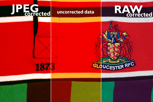
Let's look at this with an example — This raw and a jpeg files above are intentionally exposed with completely the incorrect white balance (see the middle bit). The raw was very easily corrected to give a realistic impression of colour. However, in spite of a great deal of tweaking, the same rendering of colour could not be pulled back out of the JPEG file. Note especially the areas in the intersecting area between the red and white: The RAW file renders this perfectly, while the JPEG file is obviously struggling.

However, if your camera doesn't let you save the raw data, don't worry, you can usually tweak the white balance a little bit before the quality suffers too much. As with every other aspect of photography, the best thing you can do is get the shot as perfect as possible when you press the shutter button. If you set a manual white balance before you take the shot, it will minimise or eliminate the need to correct later.

Buy buy buy

There are a variety of products available that can help you get your white balance right. They fall into two main categories: neutral cards and diffusers. Neutral grey cards can either be used as a known-neutral object for setting a manual white balance value, or can be slipped into the photo and used as a reference, when fiddling around on the computer later. Diffusers slip onto the front of the lens so that, when pointed at a light source, they spread the light out across the sensor and allow a manual white balance to be set.

That's it. No magic involved at all. They don't really add functionality, they just let you use your camera's built-in functions better.

What to do instead

Some people try to use the translucent plastic lids from various snacks as improvised diffusers. This can work, so long as the lid is neutral in colour. But most people find that they get good results using a piece of photocopier paper. You know, the white stuff. It's not always perfectly white and it can be a bit hard to get hold of half way up a mountain, but for most situations, it works very well. It won't guarantee that the bride's dress appears EXACTLY the right shade of off-white, but it'll make sure that your team's rugby shirts are recognisably cherry and white. Which is what's important.

WB4.jpg

For reasons that aren't entirely obvious, that icon just up there is a common symbol for manual white balance. Perhaps it is supposed to be a gray card? Only icon designers will ever know.

WB3.jpg

Although this scale is only approximate, it gives an idea of how the presets relate to one another, with the ‘tungsten' lightbulb correcting for very orange light and the ‘shade' setting compensating for very blue light.

No right answer

All the way through this article, I've talked about getting the white balance ‘right'. Well, just like the eternal question ‘which camera should I buy,' there is no definitive right answer. That's because, up until now, I've been talking about how to get white (and, as a result, colours), to appear as it would do under bright sunlight. However, there are lots of situations in which you don't want your photo to look like it was taken in midday sun.

Sunrises, for instance. Or sunsets. If you're going to spend three hours sitting in a cold field, waiting for the sun to rise or set and give you the perfect light, I wouldn't recommend that you then try to correct for the thing that made the light so good: the fact that it doesn't look like midday sun. So don't try to set a manual white balance and make sure the camera isn't trying to automatically correct the colour. So try using the ‘sunny' preset value, this will ensure the image shows just how different from midday sunshine the scene looked (which is presumably why you're taking it).

You may find, however, that this gives a more extreme orange or blue tinge than you expected. This is because your brain is very good at compensating for different colour temperature and still judging what colours should look like. That's why photos taken in orange-ish light come out astonishingly orange. So I'm afraid you still have to play around on the computer if you really want to convey the scene as you remember it or to tell the story you want to. Because, hell, this is photography, not a science.

How does White Balance relate to Colour Temperature?

In this section, we're getting geek-a-licious, and going into depth to find out why white balance is important, how it works, what colour temperature is, etc. If you're new to all of this, you can happily skip this, and know that the first half of this article probably made you a much better photographer. If you're a hard-core photographer, geek, or perhaps even both, however, you'll want to read the rest of this… Because geeks get all the hot chicks.

Depending on which camera and software you use, you may have found white balance described in terms of colour temperatures, using a scale marked K. Although it may seem like an odd way of describing the characteristics of light sources, there is actually a good reason for it.

The idea of colour temperatures comes from a simplified model used by physicists to show how energy is given off objects when they are heated. Think about how hot steel becomes red hot, then white hot: that's essentially what they're going on about.

Who is this Kelvin bloke, anyway?

lordkelvin.jpg
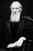
Colour temperature is measured in Kelvin (named after a rather clever physicist who was made Lord Kelvin in recognition of his work and, like all good Victorian scientists, had an excellent beard), which is pretty much the same as Celsius, but starts counting at absolute zero (-273 degrees C), rather than the freezing point of water. Its relationship to colour is actually the work of Max Planck who, being more recent German scientist, had a moustache, rather than a beard.

Basically, the idea is that as an object gets hotter, it gives off shorter, more energetic, wavelengths of light. So when it's relatively cool (a mere 1500K – 1773 degrees C), it gives off most of its energy at the red end of the spectrum and could be described as red hot. By 5500K, it will give off all frequencies in the visible spectrum equally – it will be white hot. As it gets hotter still, its output will increase and it will produce less red light, lots of blue and even some UV light, beyond the limits of human vision. You can think of it as the crest of a wave, rolling through the visible spectrum from red to violet as the temperature increases, if that helps.

halogen.jpg

A traditional lightbulb (‘tungsten light') has a low colour temperature, it produces most of its light at the red end of the spectrum. Boosting the levels of blue and reducing the levels of red will compensate for this.

d65.jpg

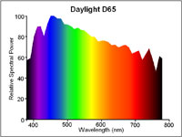
6500K (also known as D65) is the standard for midday sunshine. The entire visible spectrum is lit with roughly equal amounts of all colours and a neutral object would reflect red, green and blue equally. Many cameras use 5500K as their daylight setting because the sun in the morning and afternoon is cooler than D65.

It's worth noting that, rather helpfully, red and orange-tinged light relates to a colder temperature than blue-tinged light, which occurs at high temperatures. So be careful when you start talking about making pictures look warmer, because you could mean two completely contradictory things by saying it.

What does this mean for my camera?

Your camera measures light in RGB, which is a colour space which takes light measurements at three points along the visible spectrum, red at one end, green in the middle and blue near the other end.

As we have seen, under candlelight, there are far more red photons bouncing around than blue photons, so you have to tell your camera to adjust the levels of red, green and blue in relation to one another, so that they compensate for the low temperature of the light. More precisely, colour temperature actually adjusts the relationship between red and blue, with very little need to mess about with the green.

A different light

Now think about a situation in which your subject is sitting in mixed lighting. Take a picture of a person sitting under artificial light, but with daylight coming in from the window. Try to correct for the daylight and the artificial light goes orange, correct for the artificial light and the daylight goes blue. Unfortunately, there's nothing white balance can do about this. Even the most expensive white balance correction tool won't help, the best it will offer is an average of the light sources, depending on how you use it. The best thing to do is close the curtains or add some flash to ensure you have control over the dominant light source.

But that's not quite the end of the story, because there's more to white balance than just colour temperature. Colour temperature is based on the behaviour of heating an idealised material, which is a good approximation for light sources that generate light by heating things (lightbulbs, candles, the sun). The key property they share is producing light all the way across the visible spectrum; they are just biased towards one or other end.

This is not true of all light sources however and, consequently, not all light sources can be adequately described with a colour temperature. Fluorescent strip lights, for example don't work by being heated*, so don't behave like the idealised material and only produce light at certain wavelengths along the spectrum.

mercurybright.jpg

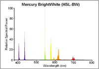
Even a modern, bright white fluorescent strip light will only emit light at very specific points along the spectrum. Note the large green spike. Correction for this peak requires more than a simple colour temperature, red/blue adjustment.

ceramichalide.jpg

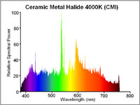
Exotic light sources (such as ceramic metal halide arc lights) produce an even output across the whole spectrum, making them excellent for judging colour. The pronounced green spike is still present.

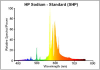
The same is true of street lamps. In fact, the low pressure sodium vapour street lights used by many countries to light motorways only produce light at two wavelengths along the spectrum, both of which are orangey-yellow. If you were to shoot a photo under these lights, no matter how you tweaked the white balance settings, you would never get the colours right because the only thing that your camera could tell you about the objects is how well they reflect orange. A black and orange image, rather than black and white.

slp.jpg

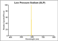
Low pressure sodium lights only emit light at two very specific wavelengths. It is impossible to interpret any colours under such a light.

shp.jpg

High pressure sodium lights tend to be used in town. They're still predominantly orange but produce enough other wavelengths to allow colour recognition.

That's an extreme example, though. Usually, the problem is just that there are gaps, here and there, in the light's emission spectrum. The way that your camera or software deals for this is to boost or reduce the level of green. This adjustment of the green, in relation to the red and blue you adjusted with the colour temperature, attempts to compensate for a peak or an absence in the middle of the spectrum. It can't work miracles, of course and, as we've seen with the low-pressure sodium lamp example, it can't create information about colours that weren't being lit in the first place, but in most cases, correct use of white balance will get your whites brilliant white. Though not at 303K (30 degrees C).

Footnotes

All diagrams with kind permission of lamptech.co.uk

*) Extra geekery: fluorescent light strips work by electrically exciting mercury until it emits UV light, which is then absorbed by a coating on the bulb that then re-emits the energy as a lower-energy, visible light photon in a process known as fluorescence. Well, you did ask…

This article was written by my good friend Rich. In his everyday life he's an engineer and a journalist, but after work hours, he becomes the uber-geek and highly talented photographer I know best :)

Vibration and camera shake << Photography Fundamentals >> Zoom

What can you do about vibration and camera shake?

Nice picture... shame about the blur. There are times when you expect to see some blur in a photo: panning shots, long exposures, and even in some short exposure photos when the subject is moving really fast (think the wheels on a Formula 1 car). But most of the time, we're looking for sharp photos without any evidence of fuzziness. In this photography fundamentals session, we're looking at vibration and camera shake, and how best to avoid it. Unfortunately, it's easy for the photography deities to conspire against us so that we end up with not-quite-sharp images. Often it's because our subjects move—about which there's little that you can do, especially if you're photographing children or animals—but frequently it's down to camera shake rather than motion blur. We might get the wobbles, we might need to use a slightly longer exposure to ensure that there's enough light on the subject and that means we can't hold the camera quite as still as it needs to be, or we might be using a lens that has a high magnification factor, in which case the slightest movement can show up as camera shake.

If you're not sure if a photo is exhibiting signs of camera shake or if you've just screwed up your focus, take a look at the nature of the blur. A plain old badly focused image will probably have at least one area in focus, but it won't be the right area. The blur will likely be quite smooth, too. A camera shaken photo, on the other hand, will be blurry all over, and the blur is probably sharp and jagged. You might have a double-exposure-like effect, with everything appearing twice in the frame. However it manifests itself, it isn't ideal.

Don't try shoot hand-held at 1/10 second. It's not a great result.

Camera and lens manufacturers have made it easier for us to capture tack-sharp photos with the introduction of stablisation technology. You'll often hear manufacturers claiming that their vibration reduction or image stabilisation mechanisms can offer however many stops advantage, or let you shoot with a slower aperture or shutter speed than you could manage only hand-held without noticing any camera shake. Still, there's nothing like going back to basics and doing everything that you can to produce a blur-free photo.

First of all, you can take the technical approach and reconsider your exposure. If you can, use a faster shutter speed and compensate for it using a faster aperture and a faster ISO. If you're concerned about noise, remember that a smidge of noise is better than a blurry photo.

Second, brace yourself. If you're hand-holding your camera, keep your elbows in, against your chest. Don't stand there trying to stop traffic with your arms out at 90° to your body. If I had a penny for every person I'd told to keep their elbows in, I'd be a few pounds to the better by now. If you're using a long lens, make sure that you have one hand on the camera and the other supporting the lens. The combination of a long lens' weight and its magnification factor makes it a camera shake party.

Without a tripod to hand, I propped my camera on a wall

Third, breathe right. Seriously. Inhaling or exhaling at the wrong moment can cause camera shake. Try not to inhale or exhale at the same time as you depress the shutter button. And while you're at it, depress the shutter button gently.

Four, use a stabilisation device. It doesn't matter if it's a tripod, a monopod, a brick wall, or a string tripod: get your camera stable. And trust me, the length of time for which you're capable of holding your camera steady is much shorter than you think it is.

Strobe, phone, or point-and-shoot

Five, use a remote shutter release. We've already noted that breathing at the wrong moment and an over-zealous trigger-finger can lead to camera shake. If you're in a very sensitive situation, for example you're using a macro lens, using a remote shutter release eliminates your need to touch the camera and with it the inherent threat from your lungs and muscles.

That should help to keep your photos sharp.

Time-lapse << Photography Fundamentals >> White balance

What is time-lapse photography?

This photography fundamentals session looks at the theory behind time-lapse photography: how it works and what you can use it to achieve. For a collection of time-lapse videos from across the world, housed in one place, check out Primelapse. If you feel inspired and want to have a go at trying it yourself, we've a tutorial on that, too!

Speeding up time

Anyone who has ever watched a nature documentary will be familiar with time-lapse photography, even if they couldn't identify the technique itself as time-lapse. When you watch an African riverbed flood and desiccate and flood again over the course of a year, but the footage has been condensed into a running time of thirty seconds, that's time-lapse. Seeing a plant grow, flower, and die within the space of ten seconds would have been achieved using time-lapse photography, too.

The Oxford English Dictionary's definition of time-lapse photography is:

the photographic technique of taking a sequence of frames at set intervals to record changes that take place slowly over time. When the frames are shown at normal speed the action seems much faster.

The difference is in the frame-rates

How about a photographically or cinematographically-oriented explanation? Video is made by shooting a series of photographs (or frames) in succession and then stringing them together so that they can be watched in sequence. Films shown in the cinema are usually filmed at 24 frames-per-second; depending on where you are in the world, television programmes will have a frame-rate of 24 or 25 frames-per-second. When they're played back at 24 or 25 frames-per-second it gives the impression of things happening in 'real time'.

The time-lapse sequences in the nature documentary, however, will have a much slower frame-rate with a significant period of time elapsing between each shot. They might have been 60 frames-per-minute, or six frames per minute, or 24 frames per day. When these frames are strung together and shown as a video replayed at 24 or 25 frames-per-second, it makes whatever was recorded appear to take place faster than it really did. It's an excellent technique for documenting change and a great first step into film-making.

Documenting change

For anyone interested in having a go at time-lapse photography, it will require identifying a subject that is going to change over time, taking a series of photographs of this subject as it morphs, and then piecing together these photographs to create a video. The result will be a video showing the change happening faster than it really did. You don't have to worry about recording sound, about focus-pulling or panning, or about directing your subjects. All you really have to remember is that the faster the change takes place, the shorter the interval between each shot will need to be. This is why a pregnant woman's swelling belly can be documented with one photo a day but a melting ice cube will need several shots every minute over the course of, say, 30 minutes.

Time-elapsed sequences can be as involved or as simple as you want. They can be shot over a matter of minutes, for example drifting and shifting clouds; the span of months, such as the construction of a building; the course of years, or anything in between. They can be taken on the move, for example in a car or on a bus. And they can involve shifting vantage points and changes in focus as you grow more sophisticated. The key is to have a subject that is changing.

If you were to reverse the time-lapse process and shoot hundreds or thousands of frames-per-second and replay them at 'normal' speed, or 24, 25, or 30 frames-per-second, you would create the opposite effect: slow-motion photography!

TL;DR

  • Time-lapse photography is a technique that is often used to document change
  • It works by shooting a series of images over a period of time but playing them back at 'normal' cinematic or televisual speed; this gives the impression that things happened faster than they did in reality
  • Time-lapse photography projects can take place over minutes, days, months, or years
  • The faster that something changes, the shorter the interval between frames is needed to document it

Speed << Photography Fundamentals >> Vibration and camera shake

How can a lens have a 'speed'?

This week's Photography Fundamentals column answers a question that came to me as an anguished plea in my Twitter feed from a relative newcomer to photography. In short: How can a lens have a speed? Whilst he knew that speed equated to aperture and that a 'fast' lens was one with a large aperture, the terminology felt far from intuitive. How could an opening behind a lens be described in terms of 'fast' or 'slow'?

I'm guessing that if he were perplexed by the use of the the word 'speed' in conjunction with 'lens', there are a few other people out there who find the concept that lenses can be 'fast' puzzling, too. Or illogical. Or something that's accepted terminology. Or something that made sense many years ago but has since become obsolete. This might help.

It's not actually as illogical as it sounds to refer to lens speed. It's more a case of joining the dots.

We know that large apertures are referred to as 'fast'. A lens with a large maximum aperture, let's say ƒ/1.8 for the sake of an example, is described as a 'fast' lens. We know that the larger the aperture, the more light is able to reach the sensor (or film, if you're old school). We know that by the virtue of the exposure triangle, the more light that is able to hit the sensor, the shorter the time the sensor needs to be exposed to capture the image and the faster the shutter speed we can use. The shorter exposure time is a direct result of the larger aperture. The larger aperture allowed for a faster image capture, hence a large aperture is a fast aperture.

If you were wondering, yes, it's for this reason that higher ISOs are referred to as fast ISOs: increased sensitivity allows for faster capture.

A lens can have a 'speed' then, because it refers to how fast it can allow you to capture your images, which I hope isn't nearly as illogical as it first seemed.

Rule of thirds << Photography Fundamentals >> Time-lapse

What is the rule of thirds?

This week's Photography Fundamentals column digs into composition, and one of the most-cited 'rules' of the discipline: the rule of thirds. Even if you don't know what it is, you've probably heard of it. We are, therefore, here to explain what it is and why it's useful. And then when you understand the rule and you know how to implement it, you can go ahead and break it properly. We have a natural tendency to place our subjects in the centre of the frame. It makes sense, logically, to have our point of focus right in the middle, being gloried by its surroundings and utterly unavoidable to the eye. Except that centred subjects don’t really make for very interesting images. There’s an unmistakable flat and dull quality to them. Compare this:

IMG_0347

With this:

Washed up copy

Next time you’re watching a film or TV, notice where the heads and the eyes of the people doing the talking are. I’ll bet they’re not in the centre of the frame.

Instead, they’ll be positioned slightly to one side. They’ll probably be making use of what’s called the rule of thirds.

Imagine that your frame is divided by four lines: two running horizontally and two vertically. They are equally spaced and split the frame into nine smaller rectangles. The points at which the four lines intersect create four ‘points of interest’. This grid is your guide for composing an image.

rule-of-thirds grid

Aim to position subjects that run upright through your image along one of the vertical tri-lines. Lines running across the image—especially skylines and horizons—should run along a horizontal tri-line. (Definitely not through the centre with a horizon.)

The horizon is sitting perfectly along the lower tri-line.

Aim to place anything that’s of particular significance to the composition, for example the eyes in a portrait and the sun in a sunset scene, on one of the points of interest.

The butterfly is sitting on the lower-right point-of-interest.

Variations

I often find that rather than using the rule of thirds to place my subjects, I have a natural predeliction for the Golden Rectangle. It's based on the mathematical princple of the Golden Ratio: an irrational number equal to approximately 1.618. It's also known as Phi (φ). If you want the technical explanation, it's

If you divide a line unevenly into two sections a (longer) and b (shorter), the ratio of these two sections will equal φ if a divided by b is equal to the sum of a plus b divided by a.

The Golden Ratio translated to Golden Rectangles. (Diagram thanks to Wikipedia.)

Yes. Ahem.

Rather than divide your frame using three equally spaced lines along each edge, as you would with the rule of thirds, you have two longer sections (a) either side of a shorter section (b). The ratio of the longer side to the shorter is the golden ratio.

It looks like this:

Her eyes are sitting on the Golden Ratio's points-of-interest.

Square crops

If you're using a square crop for any of your photos, you might find that the rule of thirds doesn't produce the sort of dynamic image that you're used to with a rectangular frame. That's because the eye tends to move around a square photo, rather than across it. For this reason, centred subjects often work effectively in square frames. Or try dividing the frame into triangles, and using those for balance.

Butterfly

TL;DR

  • The rule of thirds is a compositional aid that places two equally spaced lines across your frame, and two down it
  • The horizontal lines can be used for the strong placement of horizons and skylines
  • The vertical lines can be used to position key vertical elements in your frame
  • The four points at which the lines intersect are known as 'points of interest'
  • Use the points of interest to place significant elements of your composition, for example the eyes in portraits or the sun in sunsets, in your frame
  • There are variations on the rule of thirds, based on the mathematical principle φ
  • The rule of thirds doesn't necessarily work with a square crop; you might find a centred subject works better

Quality vs quantity << Photography Fundamentals >> Speed

Quality versus quantity

This instalment in the Photography Fundamentals series is a slightly cerebral departure from the norm. We're going to explore the idea of quality versus quantity. It's not a debate over the merits of digital compared to film, more a costs and benefits analysis of them both. Quality versus quantity; it's a purely digital conundrum. Back in the days of film, you had a given number of exposures per roll and that was that. Even if you kept a ready supply of film on you, having the rolls developed wasn't a cheap business, so you thought carefully about every image. You set upon the story, you nailed the composition, and you got the exposure bang-on. Or at least you tried to. The point was that you aimed for quality every time.

Red collared lorikeet

Now, memory is cheap—you can pick up an 8GB memory card for under £10—and you can shoot and shoot and shoot until your heart is content: I can get several hundred Raw images from my Canon 6D on said same card. If you fill up your memory card and don't have a spare, you can scan back through your files and delete those that are out of focus, horribly exposed, or just don't work. We're no longer hide-bound by physical (and economic) limitations of film, allowing us the ability to play, experiment, and get things wrong ad infinitum. The barometer has swung from quality to quantity.

This has to be a good thing, right?

Well… yes, and no.

Being able to take hundreds and hundreds of images off the reel is stupendous, especially when you combine it with the ability to shoot in high frame rate bursts. I was epically grateful for this last weekend, when I went out to photograph the final stage of the Tour of Britain. Not only did the cyclists racing around the central London circuit ten times give me ample opportunity to capture them as well as stand and cheer, so did my memory cards. I wasn't concerned that I'd waste rolls of film and not have anything to show for my endeavours; digital had me covered.

Sir Bradley Wiggins

However, there's also a possibility that the ability to shoot almost endlessly is making us lazy as photographers. We don't have the over-arching need to plan our photos properly anymore, we can simply 'hit and hope'. Are there elements of the craft that are being forgotten, lost, and ignored because quantity is ruling over quality? If I'd only had one chance to capture those cyclists on Sunday, as opposed to ten, would I have been able to get the shot because I'm too accustomed to being able to go back and try again?

Sauvignon Blanc

Does this make me sound like a curmudgeonly luddite who'd rather be shooting wet plates? Probably. But it isn't meant to. It's meant to highlight the balancing act that we need to perform between the limitations of restricted exposures and the potential for exploration and experimentation with virtually unlimited exposures. It's actually me saying that quantity is awesome, but we shouldn't worship at its altar to the ignorance of quality.

So why don't you try this as an experiment. Allow yourself 36 exposures, and no peeking at your LCD screen. How many shots from your 36 make the grade and what did you learn from the experience? Maybe you always under-expose, or perhaps you have a tendency to sloppy framing. Are you thinking about your aperture carefully enough? You might notice that your subject placement is something that you do consistently well. Perform the exercise on a regular basis and it could lead to an improvement in your photography. Then you won't need to take so many shots off the reel!

Prime lens << Photography Fundamentals >> Rule of thirds

What is a prime lens?

We've taken a jump over 'O' and landed directly on 'P' for the next part of the Photography Fundamentals series. Here, we'll be taking a look at prime lenses, what they are, and why you should have one. At least one. In fact, we reckon that until you've got a decent prime lens, you've not really lived, photographically speaking. Here's why.

Define prime

What's a prime lens? For once, it's a simple definition: it's a lens with a fixed focal length. They might be 35mm, 50mm, 85mm, 100mm, whatever, they just don't move. And yes, this can most definitely be a good thing.

A bit of history

Back in the infancy of photography, we never had anything but prime lenses. When you bought a camera body, you also had to buy a camera lens to go with it. A 50mm ƒ/1.8 was pretty much the slowest lens you could buy as a starter kit.

To this day, a 50mm ƒ/1.8 is the cheapest lens you can buy in the entire Canon EF lens arsenal. And if you don’t have one, you’re missing out.

Canon's 50mm ƒ/1.8 - a bargain at under £100

From your first prime, you move on. You might get a faster ‘normal’ prime, like a 50mm ƒ/1.4 or a ƒ/1.2 (or, if you’re intro your retro gear, the incredibly bright Canon 50mm ƒ/0.95. This lens is four times faster than the human eye, and is one of the fastest lenses in the world along with, for example, the lenses available for the Nikon 7 range finders in the early 1950s.)

If you’re into landscapes, a 28mm would be the natural choice. 85mm, 100mm, and 135mm prime lenses became the de facto standard for portrait photography all ’round the world.

Nikon's 85mm ƒ1.8

The first zoom lenses were patented in the early 1900s, and the first commercial production of zoom lenses for stills photography started in the early 1960s. All of a sudden, zoom lenses were all the rage.

Why would you limit yourself to a single focal length, when you can cover a whole range? So, manufacturers shrugged, and started creating zoom lenses.

What’s going on now?

Nowadays, all ‘kit lenses’ (lenses you get bundled with camera bundles) are consumer-grade zoom lenses. My dad recently got suckered into buying an 18-55mm and a 55-200mm lens (after I explicitly told him to buy a Canon 28-135 ƒ/3.5 Image Stabilised lens… Tssk, doesn’t the lad know I run a photography blog, or something?), for example, and he isn’t stupid. It’s just too tempting to get a wider zoom range, in the hope that the increased flexibility will get you the photos you need.

Tamron's 18-270mm offers a huge focal range, but is it as sharp as a prime lens?

The thing is, a zoom range is all good and well, but ultimately, it’s all about sharpness. Are your photos so crisp they jump out of the screen at you? If not, you’re probably doing something wrong. So what happens if I tell you that one of the sharpest lenses a consumer can buy is also the cheapest lens Canon makes? You’d be surprised, right? But it’s the truth. Time and time again, people are amazed when they review consumer-grade zooms against far cheaper prime lenses. But — as Tabaware explores — they aren’t even in the same league.

So why is this? Well, it’s damn simple, really… it’s far easier to mass produce a prime lens: Because it only has to be sharp at one focal length, the optics are a hell of a lot simpler. So they can concentrate on getting it to be really good, rather than just being good enough.

Why should I care?

It really depends, to be honest: What do you want out of your photography? If you are looking for convenience and holiday snaps, by all means, go for the first and best zoom lens. Hell, I've a few of them myself and love to use them, but still, there’s a certain feeling of zen about using prime lenses. They can be slightly limited, sure, but they’re also sharper than a surgeon’s scalpel, cheap as a bag of crisps, and they are just a better idea overall, especially as you are just learning about photography.

Peacock butterfly

So, if you’re in the market for a new camera, and the kit comes with some two-bit zoom lens, see if you can’t convince the salesperson to do you a deal. “So, you want to sell me this lens? How much does it normally cost? Interesting. I can see that you sell a 50mm ƒ/1.8 for less than that. Can you give me one of those instead?” Sure, money-wise, you’ll lose out. But your portfolio will thank you for it for years to come.

Are prime lenses really such a good idea?

Well, yes, I would argue so. I'm a frequent traveller and it isn't unusual for me to get on a plane with just my camera body, a 50mm ƒ/1.4, and Canon PowerShot S95.

Check out the gallery from one of my trips to Vietnam, or a bigger collection of my photos taken with the humble 50mm.

Convinced yet? Good. Head over to your favourite photographic retailer, and buy yourself a lovely little prime. Lazy? Okay then - Canon users, click here. Nikon users, click here. Pentax users, you can click here. Sony users, click here. And Olympus users, click here. You're welcome.

TL;DR

  • Prime lenses are lenses with fixed focal lengths
  • They are usually sharper than zoom lenses because they have fewer moving parts
  • And fewer moving parts also makes them cheaper to manufacture and less likely to suffer from a fault

Noise << Photography Fundamentals >> Quality versus quantity

What is macro?

The Photography Fundamentals roadshow has reached stop 'M', where we're taking a very brief look at macro. We've kept it brief because otherwise it would become an incredibly detailed exploration of the subject that wouldn't so much be an introduction, which is the guiding principle behind the Photography Fundamentals series, but a tome. Although we think of macro photography as being the art of caprturing tiny things, it's not quite that. It's actually about capturing things very close. When you photograph little things, like ladybirds or lily pollen, you obviously want to get in close to fill your frame and get the best detail. This is probably why we associate 'macro' with 'small'. You could, however, have a macro shot of a skyscraper. It wouldn't be the entire skyscraper, but a very detailed, up-close section of it.

Reversed 28mm lens

Getting this close usually requires a specialist macro lens to achieve a photo, although there are ways around this using extension tubes, bellows, reversing rings, and other bits of kit. As for a macro lens, the technical definition is of a lens that can record an image on a camera's sensor that's the same size as the object being photographed. It has a magnification of factor of 1:1. Similarly, if the image of the subject on the sensor were half the size of the actual subject, the magnification would be 1:2; if the image on the sensor were a quarter of the size of the actual subject, that would be a magnification of 1:4.

That strict definition of what it takes to produce a macro image has loosened over time and lots of people are happy to say that 1:10 magnification counts as macro. Simply: you're really close.

Que? (Macro)

All of that magnification means that macro photographs frequently have very shallow depths of field.

TL;DR

  • Macro photography is extremely close-up photography
  • The strict definition of macro photography is an image with a magnification factor of 1:1 - the subject will be at least the same size in real life as it is recorded on the sensor
  • The looser definition of macro photography is of images with a magnification of 1:10. It's still close!

Leading lines << Photography Fundamentals >> Noise

What are leading lines?

The Photocritic Photography Fundamentals magical mystery tour has reached 'l', for 'leading lines'. It's time to join these vital compositional tools in their seductive tango. Lines, they're important things. Train lines get you from A to B (occasionally via Z), cricketers are always looking to bowl good lines, and in photography they can make or break your images. Lines can be confrontational and restrictive, creating borders and boundaries, but they can also be alluring and sultry, drawing you into an image and not letting you go. These are 'leading lines' and they're powerful tools in your photographic arsenal.

There are, broadly speaking, four types of leading lines that you can introduce to your photos to give them depth and interest. There are both naturally occurring and man-made leading lines, and as a general rule, once you've seen one, you can't un-see it.

The first type of leading line is a path or roadway that creates a sense of depth in your photos. Parallel lines will naturally converge at a point owing to perspective, which means that any road will draw you into a photo and give you a sense of motion. These types of leading lines will make you feel as if you're going somewhere in your photo.

Etna ii

Next are leading lines that pull your eyes across the image and deposit you firmly at your subject. These lines don't have to be straight and they can be single or multiple, but they're just as effective as but more attractive than a neon sign flashing 'The subject is here!'

Dovecote

There are also lines that take you on a journey through an image, forming a narrative. These lines can be straight or curved as they lead you from one point to another.

Arizona 2003

Finally, look out for invisible lines that send the viewer from one point to another. If that sounds a bit elusive, think of people's eyelines. Humans are curious by nature and once we've made eye contact with someone, we'll automatically look to where she or he is looking, too. If your subject isn't looking directly at the camera, the viewer will follow her or his eyeline to see what's so interesting.

7

Roads and paths form obvious leading lines, but so do walls and fences, bridges and bricks. Nature's leading lines are formed from rivers, branches, stems, shorelines, and light and shadow. Lines don't have to be unbroken, but can be formed from several points, for example lamp posts or trees.

Once you start to use them, you realise what a powerful compositional feature they are, directing the eye, joining the dots, and completing the narrative.

TL;DR

  • Leading lines are a compositional tool used to bring interest to your image
  • They can add depth and perspective to a photo
  • They can direct the eye to the photo's subject
  • They can lead the viewer on a narrative journey through the image
  • They can be implied lines, for example sightlines
  • Leading lines can be created both naturally and by man-made objects

Key << Photography Fundamentals >> Macro

What is key?

This week's Photography Fundamentals issue looks at key. Key is an element of the photography canon that crosses over with other artistic disciplines, most notably music and painting. I'm the least musically-talented person known to man, but even I manage to spot the similarities.

When we talk about the 'key' of an image we're talking about the range of tones or brightness that it comprises. Primarily we use it when we're describing images as being either 'high-key' or 'low-key', which are at the extremes of the range of brightness—light or dark respectively—and the feelings that these images convey. However, 'high-key' and 'low-key' can also be used to describe lighting set-ups, not just a style of photo.

High-key

High-key images are light and bright, either with upbeat and positive connotations or with dream-like, ethereal qualities. They will be low on contrast with very few, if no, shadows. If you look at a high-key image's histogram, it will exist mostly in the right half of the graph, with just about all of its pixels pushed above middle-grey and into the near-whites and whites.

The intensity of colours begins to fade as brightness increases, which means that high-key images are frequently black and white. If they are in colour, they tend towards pastels in tone. Or they could be the classic white-on-white.

Lily

It's easy to think of high-images as being 'just over-exposed', but getting them right is a bit more complicated than simply setting some positive exposure compensation. To achieve a good high-key image you need to bathe your subject in even light and keep everything about the image on the pale side. Unless you have deliberately blown-out the background to get it bright white, and with the exception of specular highlights, there will still be detail across the image.

I like to think of high-key images as the photographic equivalent of reading Jane Austen, but you can pick your own literary metaphor. Music-wise, it'd be a song composed in the major key.

Low-key

Low-key images evoke feelings that might be sombre or miserable, or even fearful or threatening. Like high-key images, they're low on contrast, but this time they are predominantly dark or black in tone and their histograms are clustered towards the left-hand side of the graph.

Hendricks

Anything that needs to be portrayed with a sense of impending doom is perfect low-key material. Just as high-key images aren't all about over-exposure, low-key images aren't focused on grisly under-exposure. There will still be detail in the shadows. If you don't want to be too purist about how your histograms look, having the odd bright area can strenghten the feel of a low-key image by re-inforcing just how dark the shadows are.

If you want a literary comparison, think gothic horror novels, or the minor-key for a musical equivalent.

High-key and low-key lighting

Cinematically, high-key or low-key lighting means something quite specific. High-key lighting has a low key-light to fill-light ratio that produces evenly lit scenes that are practically shadow-free. Low-key lighting, on the other hand, has a high key-light to fill-light ratio (yes, it's counter-intuitve) that creates pools of light and harsh shadows.

TL;DR

  • Key refers to overall tone of an image
  • High-key images are light and bright with a general sense of positivity
  • Low-key images are dark, brooding, and can even feel menacing
  • Although high-key and low-key images rely on technical over- or under-exposure to achieve them, this is controlled and does not negate details in the highlights or shadows respectively

ISO << Photography Fundamentals >> Leading lines

What is ISO?

We know that exposure is controlled by the holy triumvirate of shutter speed, aperture, and ISO. You give with one and take with another until the light hitting your sensor is just right for the image that you want. We also know that whilst these guardians of our sensors have practical applications, they can be creative. Aperture has already been cross-examined in our Photography Fundamentals series; this week it's the turn of ISO.

Sensitivity to light

Once upon a time, in days of old, when we shot on film and had to fend off dragons simultaneously, we also had to choose the ISO of our film when we bought it. 100? 200? 400? Huh? Now it's just a button on our cameras and we can change it every shot. But that doesn't mean that ISO is any less significant now than it was then. In fact, changes to ISO have been one of the major breakthroughs in modern photographic technology.

Back in those old film days, ISO referred to how sensitive a film was to light. Depending on the conditions that you thought you'd be shooting in primarily, you'd have to select the ISO of your film and be done with. (If you want to really geek out on ISO trivia, Haje has you covered.) Now you can push a button and see it increase from roughly 100 to anything as high as 102,400 (but that's extreme). That's a lot of numbers but they still mean the same thing: it's how sensitive your sensor is to light. (Or, technically, how much the signal from each pixel on your sensor is amplified.)

Flash in an aquarium? Bad plan. ISO 800? Gets the shot!

The higher the number, the greater the sensitivity to light.

Low vs High

The general rule is that the brighter the conditions, the lower you want your ISO to be. As conditions become dimmer, you can increase sensitivity to help you get a good exposure. However, even if it's a low-light situation, you still want your ISO to be as low as possible.

There's a trade-off, you see. As you increase sensitivity, you also increase the tendency towards digital noise, or the graininess you see in some photos. Now we do have a full Photography Fundamental on noise lined up for you but the low-down is that too much noise can make images look poor. It's best to avoid too much of it.

Whilst too much noise does give me a headache, I'm more than prepared to sacrifice a bit of image quality in order to secure my shot. Yes, I'll take a smidge of noise over motion blur almost any day. (Unless I really want motion blur, that is.)

Yes, it is a bit noisy, but I'd rather the noise than no photo

Which ISO to use

Well, seeing as ISO forms part of the mighty triumvirate with aperture and shutter speed, you'll need to consider those in order to get the exposure that you desire. But do stick with the rule I mentioned earlier: as low as you can get away with.

Equivalent exposures

It's really easy to leave your camera to automatically select the ISO for your shots, but it is a really useful tool. And the more control that you take over your own images, the better. Don't just concentrate on aperture and shutter speed.

TL;DR

  • ISO refers to the sensitivity to light of film or the digital camera's sensor.
  • The higher the number, the greater the sensitivity.
  • A low ISO generally offers the best image quality, and great for brightly lit situations.
  • A high ISO setting may be required to capture images in low light situations, but can cause noise to show up in your photos

Histograms << Photography Fundamentals >> Key

What is a histogram?

H is for histogram! This week's Photography Fundamentals installment explains the graph that you can draw up on your camera for each image, or appears in the top right corner of your workspace in Lightroom or Photoshop. What does it depict and how is it useful?

It's a graph

A histogram is a graph that shows the tonal range, or the distribution of brightness, of an image's pixels. On its X-axis it runs from black to white, 0 to 255. On its Y-axis it charts the number of pixels at any brightness value.

Screen Shot 2013-07-17 at 17.21.13

Lots towards the left, but a few specular highlights, too

By looking at a histogram you'll have a feel for the exposure of an image. If the majority of the pixels are sitting in the left-hand side of the histogram, the image will have a lot of darker tones. An image with plenty of bright tones will have a histogram that's predominantly situated in the right-hand side.

A perfect histogram?

There's no such thing as a perfect histogram. Instead, you need to use it as a tool to help you judge if you've exposed your image how you want it exposed. Sure, if your image has a histogram that's concentrated towards the left, it might be under-exposed. It might also be a low-key image with predominantly dark tones.

However, the majority of images will have histograms that peak around the centre, in the mid-tones, but taper out towards the blacks and the whites.

Screen Shot 2013-07-17 at 18.52.27

A broad sweep from left to right

If you've any 'blown highlights' or catasrophically over-exposed pixels that are pure white and don't contain any detail, you'll see those peaking right up against the right-hand side. These are sometimes called 'clipped highlights'. You can expect to see some if you've the sun in the frame, or specular reflections on water or metal, so don't think that they're always a bad thing!

And contrast?

Histograms also indicate the contrast found in a scene, too. A narrow peak will mean a lower contrast image; a broader peak is indicative of an image with high contrast.

Screen Shot 2013-07-17 at 18.44.17

A narrow peak towards the right hand side - lots of brights and not much contrast

Where to find a histogram

All dSLRs and EVIL cameras will have a histogram included in their menu functions; higher end compacts often have them, too. On my Canon it's just a case of viewing an image in playback and then hitting the Info button twice.

When you're editing, the histogram is usually in the top right corner of your screen, but it will depend on your programme, obviously.

TL;DR

  • A histogram is a graph displaying the distributon in brightness of an image's pixels
  • There's no 'perfect' histogram; they're tools to help you assess exposure and contrast in an image
  • Darker images will have histograms with data concentrated towards the left hand side of the graph
  • Brighter images will have histograms with data concentrated towards the graph's right hand side
  • High contrast images will have broad peaks in their histograms; low contrast images will have narrower peak

Golden hour << Photography Fundamentals >> ISO

What is focal length?

Having made it through a, c, d, and e (we skipped b), the photography fundamentals cruise ship's next port-of-call is f, where we'll be exploring focal length. There's a lot to take in here, so I hope that you're wearing comfortable walking boots.

Your camera's lens works by refracting the light from what it can 'see' and converging it at a single point, the focal point, to create an image. Just how much the lens is able to 'see' depends on its focal length.

The distance between the lens and the imaging sensor (or film, if you're old school) is what determines focal length. It's measured in millimetres.* A shorter focal length means a wider angle of view, so the lens 'sees' more. These are called, somewhat unoriginally, wide-angle lenses. By the same token, increase the focal length and the angle of view decreases and pulls you closer to your subject. Lenses with larger focal lengths, roughly over 135mm, are known as telephoto lenses. Those in between, around the 50mm mark, are 'normal' lenses.

focal_4.png

Here you have a wider angle of view that takes in more of the scene.

focal_5.png

A narrower angle of view draws you closer to your subject.

* Long lenses don't really measure 20, 30, or 40cm; they create the telephoto effect by a complex series of elements thatwork together to create that same effect.

The crop factor

When we talk about focal length, we're usually doing it with reference to a 35mm, or full-frame, sensor camera. If you're using a camera that has a sensor smaller than full-frame, for example a Nikon D5100 with an APS-C sensor or an Olympus PEN with a Four Thirds sensor, it will have a magnifying impact on the focal length of your lenses. The smaller sensor is only able to detect a portion of the entire field of view, making it appear as if you're closer to your subject.

This is known as the crop factor. Multiply the sensor's crop factor (for example 1.5 for a Nikon APS-C sensor) by the lens' given focal length and you'll have the effective focal length. (It doesn't actually change the focal length, but it looks that way.)

This can be very useful when you use a telephoto lens, because your 200mm lens on your Nikon D5100 suddenly becomes the equivalent of 300mm; but it can be a bit of a pain when you're using wide-angle lenses as they will lose some of the impact of their increased angle of view.

So that we're all straight, I'm going to be referring to focal lengths as if they apply to a full-frame sensor.

Rough-and-ready guide to focal lengths

  • 22-35mm - Wide-angle - Landscapes
  • 35-70mm - Standard or normal - Street, documentary, some portraiture
  • 70-135mm - Medium telephoto - Portraiture
  • >135mm - Telephoto - Sports and wildlife

Wide-angle lenses are good for...

Wide-angle lenses might be the go-to lens for landscapes, but there's more to them than that!

3255378073_6c6f44d3df

Emphasising the foreground

You’ve probably noticed that if you take a portrait with a wide-angle lens, the subject’s nose looks comically large and her or his chin juts out further than Brighton pier. Why? Well, the lens' wide angle of view means that in order to get in close enough to fill the frame with your subject, you have to get in very close. The closer that you get, the larger whatever is in the foreground will appear. As those objects are likely to be a nose and a chin, in a portrait, they are going to look huge compared to the rest of the face.

Tower_wide_angle

If you were to photograph a building close-to and from below, this same foreground-emphasising effect would make the base of the building look stupidly large and the entire structure ridiculously tall. Being close, the foreground is emphasised and the lens' wide angle of view gives the entire scene the illusion of somehow being stretched or exaggerated.

Enclosed spaces

When you're taking photos in an enclosed space, using a wide-angle lens will ensure that you can include everything in your scene that you want to be there. This is why estate agents use wide-angle lenses to photograph inside properties, so that the rooms can be shown in their entirety.

Converging verticals

Whatever lens you use, including your own eye, perspective means that parallel lines will appear to converge eventually. Just think of train tracks coming to a point as they streak away into the distance. When you use a wide-angle lens, this convergence happens faster than it would with a normal or telephoto lens.

You can use this convergence effect creatively, to envelop people in trees or give buildings an odd look. But of course, you might not always want your buildings to tip backwards or their parallel walls to converge. Standing further back from your subject and not tilting your camera upwards can help to overcome the problem, but sometimes this isn't always possible. I don't know about you, but I find that standing in the middle of a busy road to take a photo doesn't do me many favours. Thankfully, there are lens correction effects available in most editing suites!

Telephoto lenses are good for...

You might associate telephoto lenses with hardened sports photographers and weather-beaten wildlife photographers, but they're good for a whole lot more.

Kites_again

Normalising

Having a narrower angle of view means that the subjects fill the frame more; giving the impression of being closer together and closer in size.

Focal length diagram 2 copy

Instead of objects in the foreground looking larger, as would happen with a wide-angle lens, telephoto lenses make their background objects appear comparatively larger. It's because of the narrow angle of view: things in the background take up proportionally more of the frame, which makes them look closer in size to things in the foreground. It's called the normalising effect.

This then is why portrait photographers prefer longer lenses, often around 85mm.

Density

By giving the impression of compressing scenes and bringing subjects closer together, you can use a telephoto lens to make it look as if more is happening in your image, and that it is somehow more dense. For example, a moderately busy street scene could become bustling when shot through a telephoto lens.

Layering

Classically, it's a wide-angle lens that is used for landscape shots, so that everything in a sweeping vista gets in the frame. However, I've taken some of my favourite landscape photos with a telephoto lens. They have this beautiful stacked look that can emphasise the different layers in the environment.

Depth-of-field

You often hear it said that telephoto lenses have a shallower depth-of-field. This isn't strictly true. It would be more accurate to say that because telephoto lenses are mostly used to magnify subjects, and the subject will then fill more of the frame, the depth-of-field appears to be shallower. Not that there's anything wrong with that; it allows you pick out your subject from a beautifully blurred background.

6839779191_fbb311c4c6

TL;DR

    • Focal length is the distance between the lens and the sensor
    • It is measured in millimetres
    • Shorter focal lengths produce wider angles of view, that capture large scenes
    • Longer focal lengths bring you closer to your subject and have a magnifying effect

Exposure << Photography Fundamentals >> Golden hour

What is exposure?

The next stop in our (mostly) alphabetical journey through photography's fundamental principles is at 'e', for 'exposure'. Are you ready? Excellent! Onwards!

Exposure

Without an exposure, we wouldn't have an image (that's how fundamental this principle is) because it's the action of revealing your sensor, or your film if you're old-school, to light in order to record an image. Introducing too much light to your sensor will result in over-exposure and a too-bright image. Conversely, under-exposure is the result of not exposing the sensor to enough light, rendering a too-dark image.

Under-exposed to the left; over-exposed to the right; just right in the middle. (Image by Haje)

So far, so simple.

ExposureTriangle

Exposure is measured in 'stops' and controlled by three variables in your camera: aperture, shutter speed, and ISO. As well as determining how light or dark your images will be, they all have other aesthetic effects on your images, which is why you need to understand and be able to manipulate them to produce the images that you want. We started this series with aperture, which controls depth of field. We'll get to shutter speed and ISO and their respective abilities to freeze or blur motion and to introduce noise into our pictures. But for now, we'll concentrate on the impact of varying aperture, shutter speed, and ISO on exposure.

Equivalent Exposures

By giving and taking from aperture, shutter speed, and ISO, you can keep your relative exposure the same, but change how your image looks.

You might've set up shot to get a 'good' exposure, but you decide that you want a greater depth of field so need to use a smaller aperture. A smaller aperture allows less light to hit the sensor, so if you change only the aperture, your photo would be under-exposed. How can we solve this? You can use the other two adjustments to compensate for the lack of light captured by using a smaller aperture: maybe you want to use a slower shutter speed, to expose the sensor for longer? Or perhaps increase the ISO to make the sensor more sensitive? You could even do a bit of both.

Equivalent exposures

Let's look at an example with some numbers. We’ll start with an exposure of 1/200 second, ƒ/8.0, and ISO 400. What would happen if you were to change your shutter speed to 1/100 second? That would let twice the amount of light into your camera compared with 1/200 second, because the shutter was open for twice as long. Your photo will now be brighter.

Now you change your ISO to 200. This halves the sensitivity of the sensor, and the photo will come out looking like it is the same overall exposure. The photo won’t be identical, but from the point of view of brightness, it will be about the same. It’s possible to change any of the settings to compensate for any of the other settings.

A faster shutter speed can make up for a larger aperture, a lower ISO can make up for a slower shutter speed, and a smaller aperture can make up for a higher ISO. They’re all related.

TL;DR

  • 'An exposure' is the action of revealing your sensor (or film) to light to create an image
  • Too much light results in an over-exposed, too bright image; too little light produces an under-exposed, too dark image
  • Exposure is controlled by three variables: aperture, shutter speed, and ISO
  • Exposure is measured in 'stops'

Dynamic Range << Photography Fundamentals >> Focal length

What is dynamic range?

The Photocritic Photography Fundamentals series continues with dynamic range. No, we're not talking about high dynamic range (HDR) photography here, we're going back a step. Dynamic range and HDR are linked but before you can have HDR you need to have dynamic range, and whilst HDR is a tool, dynamic range is a basic principle that underpins photography.

Not just about photography

Dynamic range isn't a concept that's restricted to photography. It's something that we make use of every day, with our eyes and our ears. It's what allows us to hear someone mounting the stairs at the same time as listening to the radio, or be able to see both the sunny and shady areas of a garden simultaneously. Being a 'range' it does have its limits, though: when you're in a dark room that has a brightly lit window, you won't be able to see the view through the window and the room interior simultaneously. One will be over- or under-exposed when the other is properly exposed. The tipping point is the extent of your eyes' dynamic range.

Dynamic range is the maximum difference between bright and dark or high and low that you're able to absorb simultaneously.

So it relates to photography how?

In photography terms, dynamic range is how much difference in contrast your camera is able to record. If you imagine a landscape picture with bright white clouds that are almost over-exposed, the more detail you are able to detect in the shadows is indicative of a wider dynamic range. It follows then that a camera with a wider dynamic range will be of more use than a camera with a narrower dynamic range: it has the ability to record more data and therefore produce images with more detail.

Being able to see highlight and shadow detail is down to dynamic range

Measuring dynamic range

There's no strict measurement for dynamic range in cameras. Sometimes you'll see it referred to as 'EV', sometimes as 'stops'–as in ƒ/stops–and even as 'bits'. In fact, you often won't find it referred to on a camera's specification and you have to go to independent testing and review websites to get a dynamic range measurement.

If you're anything like Team Photocritic and like amassing geeky facts, you'll want to know that the dynamic range of the human eye is approximately 24 stops; cameras have a dynamic range of between ten and 15 stops.

Making the most of your camera's dynamic range

The huge caveat to dynamic range is that you can only make the best of it if you shoot in Raw. Shooting in Raw records vast amounts more data than if you shoot in JPEG and allow your camera to make decisions about what information should be kept and what should be discarded. The bucket-loads of data and the accompanying flexibility that comes in a Raw file is as a result of your camera's dynamic range. Shoot in JPEG and you'll miss out.

TL;DR

  • Dynamic range is the maximum difference between bright and dark (or high and low acoustically) that you can absorb simultaneously
  • Photographically, dynamic range is the maximum degree of contrast that your camera can record
  • Dynamic range can be measured in 'EV', sometimes as 'stops'–as in ƒ/stops–and even as 'bits'
  • To make the most of your camera's dynamic range, you need to shoot in Raw

Contrast << Photography Fundamentals >> Exposure

What is aperture?

Learning anything new comes with a whole spectrum of principles, terminology, and practices that have the potential to boil your brain, leave you mildly confused, or anywhere in between whilst you're getting to grips with them. Photography definitely comes with its own theories, vocabulary, and conventions and not knowing what people are talking about when they refer to 'noise' or 'speed' can make you feel about a pixel tall. To try to ease people's paths in photography and prevent eye-swivelling, mind-frying, and either mild or acute embarrassment, we're running a series on photography fundamentals, throwing a bit more light on the things you need to know. I could say that we're starting with aperture because it begins with a, but I'd be lying. We're starting with aperture because it was the first thing that sprang to mind.

Aperture: it might be basic, but it can also be a bit of a stumbling block for people who are just beginning in photography. For a start, altering aperture doesn't have a single effect on your images, but a dual one. As if that isn't enough to confound people, its scale isn't exactly intuitive. Still, understanding aperture is critical for both exposure and composition—the bedrock of photography—so we'd best crack on.

Aperture and light

Aperture means ‘hole’ or ‘opening’. In a photography sense, the aperture is the gap that allows light to pass through the lens. The bigger the opening, or the aperture, the more light passes through. That’s pretty intuitive. When you’re taking pictures in low-light settings, a bigger aperture will help you to take a photo where you can see something.

In order to get enough light onto my sensor, I used an aperture of ƒ/1.8 here

If you’re taking pictures in bright sunlight, using a smaller aperture will help to prevent the image being one mass of white.

Aperture and depth of field

The second effect that aperture has on photographs concerns depth of field, or how much of an image is in focus. If you use a small aperture, you will notice that the depth of field in your photos will increase: more things in the background and foreground will be in focus. Landscapes often benefit from small apertures. In this case, ƒ/11 was used to photograph Mount Etna

Conversely, by increasing the size of your aperture (and allowing more light to reach your sensor), you will decrease the depth of field in an image. That means that less of the scene will be in focus.

Sanguinello

An aperture of ƒ/1.8 meant only a sliver of this blood orange was in sharp focus

Measuring aperture

When you hear people throwing around numbers such as ƒ/1.8, or ƒ/22, they are referring to aperture. Aperture is measured in ƒ-stops, with ƒ/1.4 being a very big aperture and ƒ/22 a very small aperture.

That the large number represents a small aperture and the small number indicates a large aperture can be more than a bit confusing. It will probably help to think of the ƒ-stop scale like this: those numbers correspond to fractions; the fraction being how big the aperture—or the opening—is. Thus ƒ/4 corresponds to a quarter and ƒ/8 to an eighth. An eighth is obviously smaller than a quarter; this means that it is a smaller aperture, it lets in less light and it gives a greater depth of field.

Finally, perhaps you're wondering what those fractions are fractions of? They’re fractions of the length of the lens you’re using. The aperture of a 28mm lens at ƒ/1 will be 28mm. Similarly, the aperture of a 50mm lens at ƒ/4 will be 12.5mm. The bigger the ƒ-stop, the smaller the aperture.

TL;DR

  • Aperture means hole, gap, or opening
  • A smaller aperture lets in less light, good for shooting on sunny days; a larger aperture lets in more light, good for shooting when it's dim
  • A smaller aperture gives a greater depth of field, bringing more of the background into focus; a larger aperture gives a shallower depth of field with less in focus
  • Aperture is measured in ƒ-stops
  • F-stops correspond to fractions
  • The higher the ƒ-stop number, the smaller the fraction, and the smaller the aperture

You know what, go out and take some photos altering the aperture value on your camera. Then you’ll see what we mean!


Photography Fundamentals >> Contrast