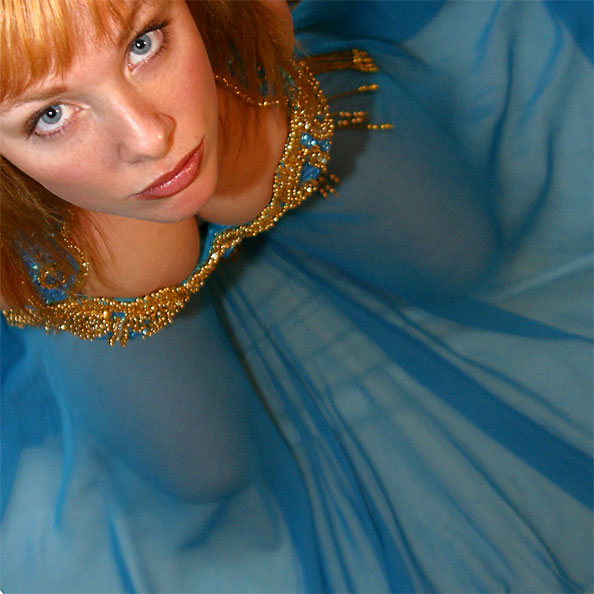
This week's Photography Fundamentals column digs into composition, and one of the most-cited 'rules' of the discipline: the rule of thirds. Even if you don't know what it is, you've probably heard of it. We are, therefore, here to explain what it is and why it's useful. And then when you understand the rule and you know how to implement it, you can go ahead and break it properly. We have a natural tendency to place our subjects in the centre of the frame. It makes sense, logically, to have our point of focus right in the middle, being gloried by its surroundings and utterly unavoidable to the eye. Except that centred subjects don’t really make for very interesting images. There’s an unmistakable flat and dull quality to them. Compare this:

With this:

Next time you’re watching a film or TV, notice where the heads and the eyes of the people doing the talking are. I’ll bet they’re not in the centre of the frame.
Instead, they’ll be positioned slightly to one side. They’ll probably be making use of what’s called the rule of thirds.
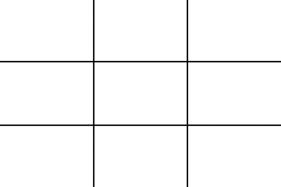
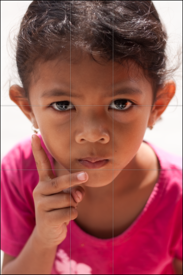
Imagine that your frame is divided by four lines: two running horizontally and two vertically. They are equally spaced and split the frame into nine smaller rectangles. The points at which the four lines intersect create four ‘points of interest’. This grid is your guide for composing an image.
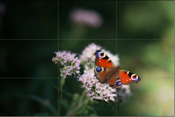
Aim to position subjects that run upright through your image along one of the vertical tri-lines. Lines running across the image—especially skylines and horizons—should run along a horizontal tri-line. (Definitely not through the centre with a horizon.)
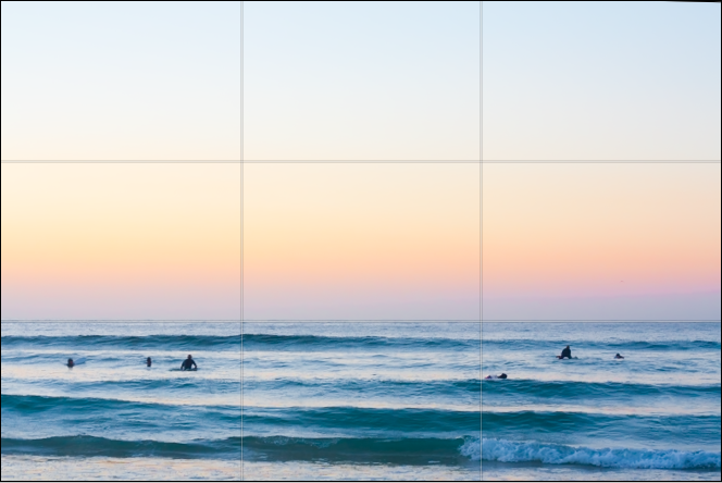
Aim to place anything that’s of particular significance to the composition, for example the eyes in a portrait and the sun in a sunset scene, on one of the points of interest.
Variations
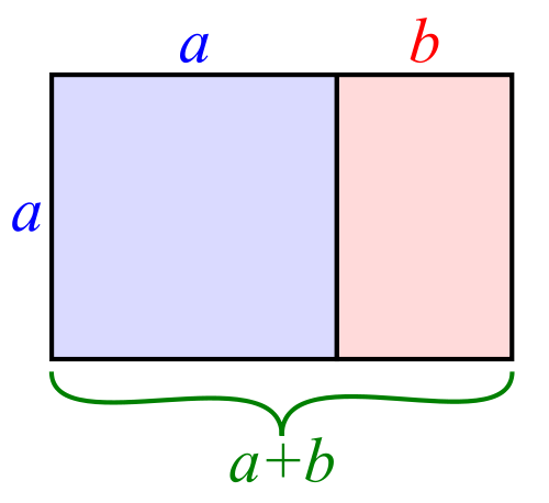
I often find that rather than using the rule of thirds to place my subjects, I have a natural predeliction for the Golden Rectangle. It's based on the mathematical princple of the Golden Ratio: an irrational number equal to approximately 1.618. It's also known as Phi (φ). If you want the technical explanation, it's
If you divide a line unevenly into two sections a (longer) and b (shorter), the ratio of these two sections will equal φ if a divided by b is equal to the sum of a plus b divided by a.
Yes. Ahem.
Rather than divide your frame using three equally spaced lines along each edge, as you would with the rule of thirds, you have two longer sections (a) either side of a shorter section (b). The ratio of the longer side to the shorter is the golden ratio.
It looks like this:
Square crops
If you're using a square crop for any of your photos, you might find that the rule of thirds doesn't produce the sort of dynamic image that you're used to with a rectangular frame. That's because the eye tends to move around a square photo, rather than across it. For this reason, centred subjects often work effectively in square frames. Or try dividing the frame into triangles, and using those for balance.

TL;DR
- The rule of thirds is a compositional aid that places two equally spaced lines across your frame, and two down it
- The horizontal lines can be used for the strong placement of horizons and skylines
- The vertical lines can be used to position key vertical elements in your frame
- The four points at which the lines intersect are known as 'points of interest'
- Use the points of interest to place significant elements of your composition, for example the eyes in portraits or the sun in sunsets, in your frame
- There are variations on the rule of thirds, based on the mathematical principle φ
- The rule of thirds doesn't necessarily work with a square crop; you might find a centred subject works better
Quality vs quantity << Photography Fundamentals >> Speed

 There are a lot of ideas around regarding what size things should be. ISO 7810, for example, specifies the size and shape of a credit card, the aspect ratio of which many people find is a comfortable, conceivably because its official size (85.60 × 53.98 mm) is pretty close to the aspect ratio of a
  4:3 is the aspect ratio of a normal television, which is of course another size we have become used to over time, and it is the aspect ratio used by most computer monitors. Some digital camera manufacturers took to – including Canon: my Digital Ixus / Elph takes photos in the 4:3 aspect ratio. Some cameras – including the