How can you bring a feeling of three dimensionality to a two dimensional medium?

When you hear the term 'high-res' thrown about with such abandon when it comes to images for web use, have you ever stopped to think just how big or how high quality and image meant for the web needs to be?
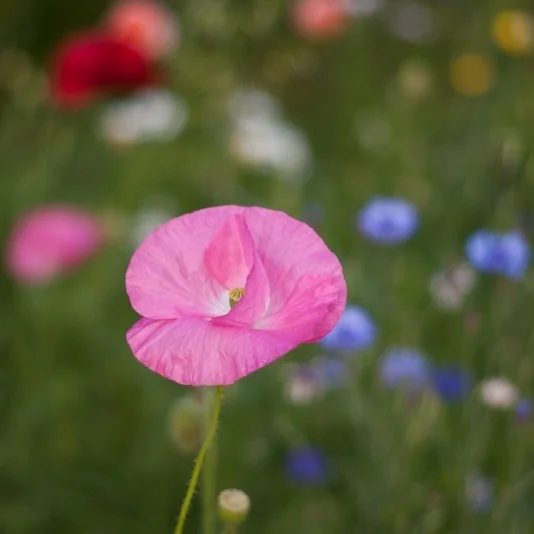
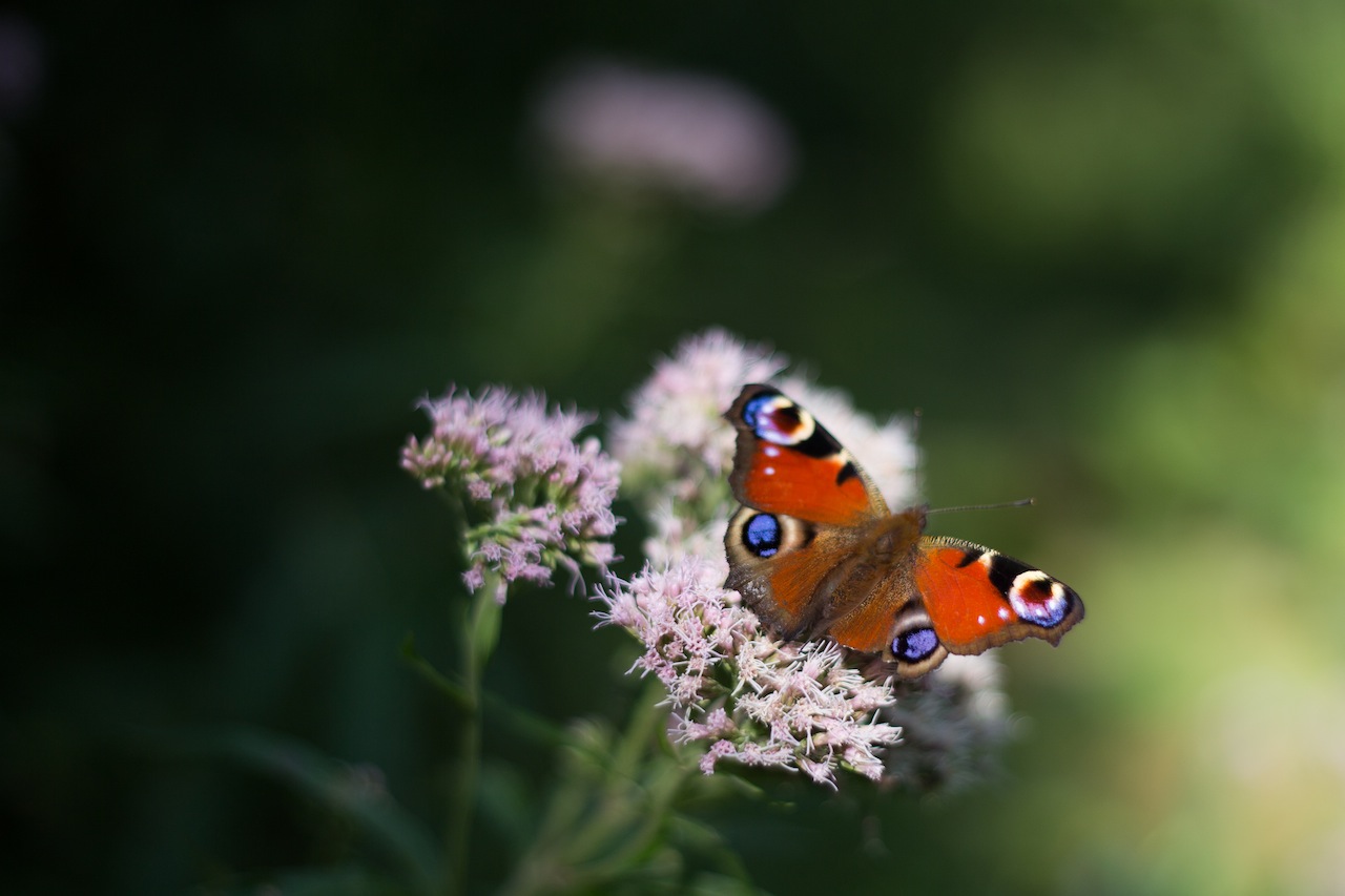
There's an assumption that high-contrast images are more dynamic, more compelling, more inviting. Have a go at some low-contrast photography. You might surprise yourself with the results.
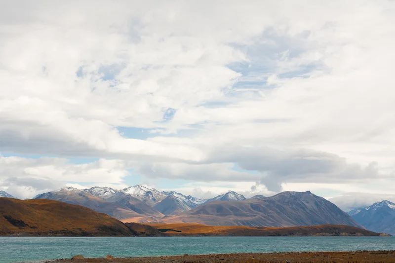
Balance doesn't mean symmetry; it means an internal consistency and tension within your photos. And it's a vital element of composition.
Great photos might be down to a little bit of luck, but most of that 'luck' you make yourself. Don't believe us? Read on...

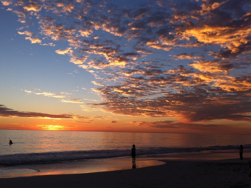
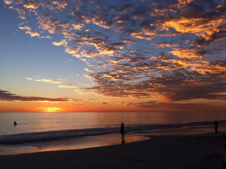
Earlier this week an infographic design agency, NeoMam Studios, sent us an infographic about 'smoasting' which they'd produced on behalf of print company Photobox. Once I'd got over the shock of awful elision of 'social media' and 'boast' to form the ghastly portmanteau word 'smoast', there was one particular statistic that caught my eye. Take a look at the infographic and guess which it was.
Despite the prevalence of Instagram, the host of editing features that are built into apps such as EyeEm, Facebook, and Twitter, and the plethora of free-to-download editing programmes, only 28% of photos are cropped or styled in some way? Wow! I am surprised. And it's something I think deserves remedying.
While Team Photocritic advocates getting as much right in-camera as possible—you'll certainly not be able to turn a sow's ear into a silk purse—we're not beyond a little post-processing, either. If it's good enough for Cecil Beaton and Horst, it's good enough for us, too. A snip here and a swipe there can elevate an ordinary image into something a bit more special.
This isn't about air-brushing away half of someone's thigh, but about making minor adjustments to three specific areas: the crop, the colour, and the contrast. Here at Photocritic we call them The Three Cs. They're not complicated and they'll make a world of difference.
However well composed you think your image is, it will almost certainly benefit from having a few pixels shaved off it. It might be a case of reinforcing the rule of thirds, removing a bit of unwanted background that crept into the frame, or getting a bit closer to your subject.

Being a purist, I tend to stick to traditional 4:3 or 3:2 ratios, but don’t feel limited by my prejudices. Select from any of the standard crops, from square to 16:9, or free-style it to adjust the crop any way you like.
At the same time as cropping, make sure to straighten your image, too. Unless you are deliberately tilting the frame for creative reasons, uprights should be upright and horizons should be level. When lines that are expected to be upright or level are wonky, it has an unpleasant impact on our sense of balance. By correcting wonky lines, you'll produce a stronger image.
Light has a temperature, and depending on the source of the light, or the time of day if it’s the sun, that temperature will vary. When the temperature varies, so does the colour of the light. As a general rule, we don’t notice the variation because our eyes cleverly adjust to the changes. Our cameras on the other hand aren’t quite so clever.

Have you ever noticed how white objects in your photos can show up with blue or yellow casts? That’s because the white balance in your photo was off.

It's a relatively easy correction to make using the 'Warmth' or 'White Balance' function in an editing programme. If you think the whites are looking a bit too blue (or if an image looks a little 'cold' over all), nudge the slider to the right. If the whites are too reddish in tone, or the photo looks a bit warm, slide it to the right. It's a case of trial and error to make the right adjustment, but the more that you practise it, the better you'll understand the shortcomings of your camera and how it reacts to different types of light.
Now if you want to intensify or tone down your colours, you can do so using the saturation slider. I don't recommend bumping up the saturation too much; it can result in a cartoon effect rather than a photo!
Contrast is the difference between the dark and light tones in your photos. Images shot on bright sunny days tend to have a lot of contrast, with dark shadows and bright highlights, but those taken in fog won’t have a great deal of tonal variation and will be low contrast. From time to time, you’ll want a low-contrast image, but, generally speaking, your photos can be improved by increasing the contrast a touch. It brings definition and depth to them.
Don’t go overboard, though, as too much of a good thing can turn bad. You’ll find that if you over-cook the contrast you’ll lose too much detail and end up with an ugly image. Subtlety beats brickbats.

If you use Snapseed to make your edits, it's worth getting to know the ambiance slider, too. I've often found that this is a preferable alternative to the contrast slider.
At this point, any other adjustments are gravy. I'm a fan of Snapseed's 'centre focus' options and often apply one of those. You might want to play with a tilt-shift effect. Or there's the waterfall of filters you can try in any programme, but you might find that you prefer your own edits to prefabricated filters, now.
Oh, and don't forget that it all starts with a decent photo, so check out our eight tips for better smartphone photos, too.
This week's Photography Fundamentals issue looks at key. Key is an element of the photography canon that crosses over with other artistic disciplines, most notably music and painting. I'm the least musically-talented person known to man, but even I manage to spot the similarities.
When we talk about the 'key' of an image we're talking about the range of tones or brightness that it comprises. Primarily we use it when we're describing images as being either 'high-key' or 'low-key', which are at the extremes of the range of brightness—light or dark respectively—and the feelings that these images convey. However, 'high-key' and 'low-key' can also be used to describe lighting set-ups, not just a style of photo.
High-key images are light and bright, either with upbeat and positive connotations or with dream-like, ethereal qualities. They will be low on contrast with very few, if no, shadows. If you look at a high-key image's histogram, it will exist mostly in the right half of the graph, with just about all of its pixels pushed above middle-grey and into the near-whites and whites.
The intensity of colours begins to fade as brightness increases, which means that high-key images are frequently black and white. If they are in colour, they tend towards pastels in tone. Or they could be the classic white-on-white.
It's easy to think of high-images as being 'just over-exposed', but getting them right is a bit more complicated than simply setting some positive exposure compensation. To achieve a good high-key image you need to bathe your subject in even light and keep everything about the image on the pale side. Unless you have deliberately blown-out the background to get it bright white, and with the exception of specular highlights, there will still be detail across the image.
I like to think of high-key images as the photographic equivalent of reading Jane Austen, but you can pick your own literary metaphor. Music-wise, it'd be a song composed in the major key.
Low-key images evoke feelings that might be sombre or miserable, or even fearful or threatening. Like high-key images, they're low on contrast, but this time they are predominantly dark or black in tone and their histograms are clustered towards the left-hand side of the graph.
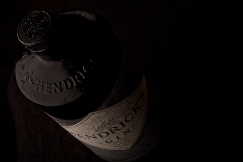
Anything that needs to be portrayed with a sense of impending doom is perfect low-key material. Just as high-key images aren't all about over-exposure, low-key images aren't focused on grisly under-exposure. There will still be detail in the shadows. If you don't want to be too purist about how your histograms look, having the odd bright area can strenghten the feel of a low-key image by re-inforcing just how dark the shadows are.
If you want a literary comparison, think gothic horror novels, or the minor-key for a musical equivalent.
Cinematically, high-key or low-key lighting means something quite specific. High-key lighting has a low key-light to fill-light ratio that produces evenly lit scenes that are practically shadow-free. Low-key lighting, on the other hand, has a high key-light to fill-light ratio (yes, it's counter-intuitve) that creates pools of light and harsh shadows.
ISO << Photography Fundamentals >> Leading lines
H is for histogram! This week's Photography Fundamentals installment explains the graph that you can draw up on your camera for each image, or appears in the top right corner of your workspace in Lightroom or Photoshop. What does it depict and how is it useful?
A histogram is a graph that shows the tonal range, or the distribution of brightness, of an image's pixels. On its X-axis it runs from black to white, 0 to 255. On its Y-axis it charts the number of pixels at any brightness value.
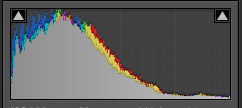
By looking at a histogram you'll have a feel for the exposure of an image. If the majority of the pixels are sitting in the left-hand side of the histogram, the image will have a lot of darker tones. An image with plenty of bright tones will have a histogram that's predominantly situated in the right-hand side.
There's no such thing as a perfect histogram. Instead, you need to use it as a tool to help you judge if you've exposed your image how you want it exposed. Sure, if your image has a histogram that's concentrated towards the left, it might be under-exposed. It might also be a low-key image with predominantly dark tones.
However, the majority of images will have histograms that peak around the centre, in the mid-tones, but taper out towards the blacks and the whites.
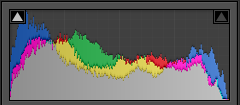
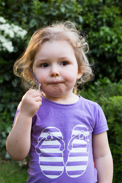
If you've any 'blown highlights' or catasrophically over-exposed pixels that are pure white and don't contain any detail, you'll see those peaking right up against the right-hand side. These are sometimes called 'clipped highlights'. You can expect to see some if you've the sun in the frame, or specular reflections on water or metal, so don't think that they're always a bad thing!
Histograms also indicate the contrast found in a scene, too. A narrow peak will mean a lower contrast image; a broader peak is indicative of an image with high contrast.
All dSLRs and EVIL cameras will have a histogram included in their menu functions; higher end compacts often have them, too. On my Canon it's just a case of viewing an image in playback and then hitting the Info button twice.
When you're editing, the histogram is usually in the top right corner of your screen, but it will depend on your programme, obviously.
Golden hour << Photography Fundamentals >> ISO