
The second instalment in our Photography Fundamentals series—where we explain the basic principles, terminology, and practices of photography—is looking at contrast. We started with aperture, so moving along more-or-less alphabetically seemed sensible.
Contrast is the scale of difference between black and white in your images. Without contrast you wouldn't have an image because there wouldn't be any differentiation between light and dark; everything would be black, white, or a single shade of grey somewhere in between.
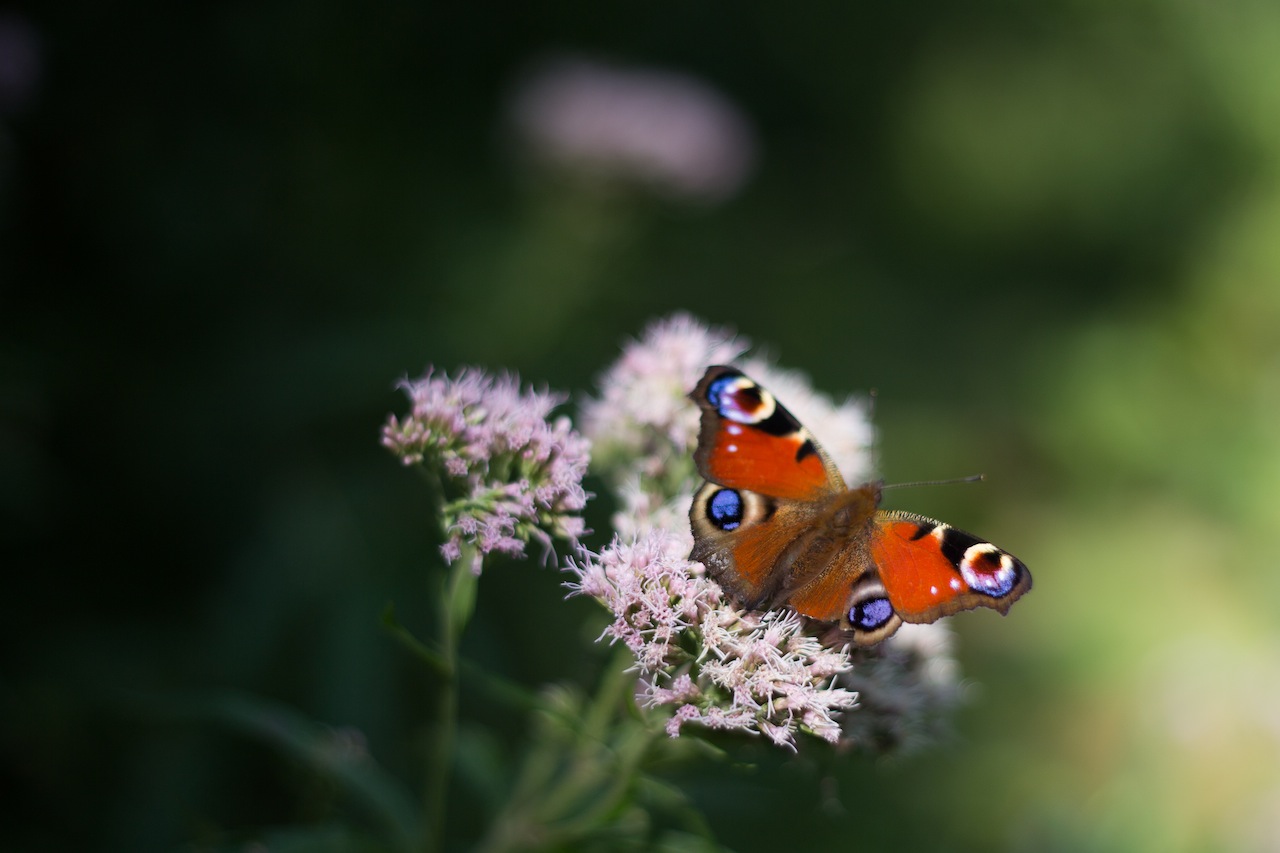
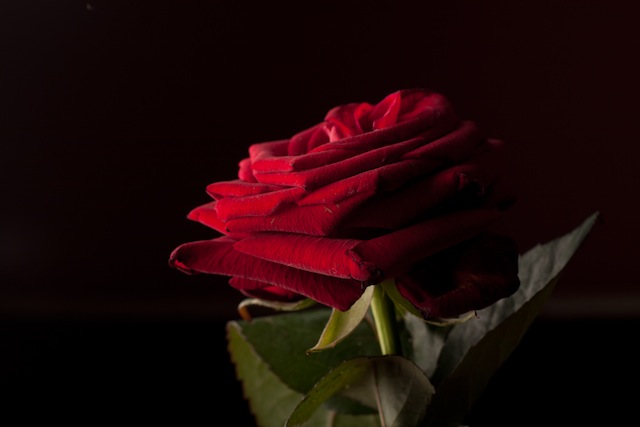
High contrast
An image with high contrast will exhibit a full range of tones from black to white, with dark shadows and bright highlights. If you shoot in bright sunlight, you'll produce images that are 'contrasty'. Typically, high contrast images will enjoy strong, bold colours and textures will be emphasised. You might think of them as being deep and interesting.

Low contrast
A low contrast image, on the other hand, won't exhibit a great deal of difference between its lights and darks, and as a consequence, it might appear flat or dull. Photos that you take in the fog or mist are perfect examples of low contrast images. That lack of difference between light and dark will also give you muted colours.
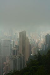
Don't write off low contrast images, though. Pictures in the fog can be incredibly evocative! And some images will be low contrast by design. If you're shooting high-key or low-key photos, these will both be low on contrast. The high-key image will contain a lot of brighter tones; the low-key image will comprise mostly shadows. You won't find a broad range of tones across them, but they might well be interesting.
Adjusting contrast
When it comes to post-processing, adjusting the contrast in an image is one of the basic edits that you should probably consider making. Unless you're deliberately aiming for low-contrast scenes, a small increase to the contrast can make your image a bit more exciting. All editing packages have a contrast slider that you can nudge up by a few points, but if you're working with a more sophisticated package you can make more nuanced adjustments to increase or decrease the highlights or shadows as you think necessary.

TL;DR
- Contrast is the difference between light and dark in an image
- High contrast images will have bright highlights and dark shadows, bold colours, and show texture in the subject
- Low contrast images will have a narrow range of tones and might therefore feel flat or dull
- High-key, low-key, and photos taken in the fog are all examples of low contrast images
Aperture << Photography Fundamentals >> Dynamic range