Photography Articles — Photocritic Photo School

Stay in touch on Twitter - find us on @Photocritic

photographer

Portraits that make you go 'Ooh!'

IMGP7665(2)

For a little under a year, The Guardian has been running a Sunday feature ‘The 10 Best…’ It has covered everything from fashion blogs to female comedians via mathematicians. Yesterday, it was the turn of photographic portraits. I was thoroughly surprised by the 10 photos selected by Eamonn McCabe. There was a mixture of candid shots, street photography, and posed portraiture. Some were of celebrities, some weren’t. Most, but not all, were black and white. And they weren’t necessarily what I would attribute as the ’10 best’.

But then it occurred to me: what exactly was it that surprised me in his selection, which you can check out here, and why should I be surprised at all?

The point is, of course, that these portraits are his personal opinion of what constitutes the ‘best’. Just because I disagree with, or am surprised by, his selections doesn’t invalidate them. In fact, it’s a bit of an eye-opener. What is it that he sees in a portrait that I don’t? If anything, I’d like a bit more commentary on what it is about these portraits that ‘does’ it for him, rather than the background to photographers who took them. (Don’t get me wrong, I am interested in that, I’d just rather be discussing the photo.)

I took this photo a few years ago. Why do I like it so much? It says something about my subject that, at the time, was important to her.

If I’m going to become a better photographer, knowing how other people interpret pictures is pretty useful. It doesn’t have to mean that I’ll stop taking the kind of photos that I like, more that trying to see a picture through someone else’s eyes shows me something new, a different angle, an alternative perspective. I’m not asking for anyone to justify her or his choices, more try to explain to me what it is that makes it outstanding.

And of course, from time-to-time we put up a ’10 of the best..’ here on Small Aperture. For us, these selections are very much about finding 10 shots that we hope will inspire you to go out and take some pictures. But for now, I’m kinda interested in knowing what are your favourite portraits. You don’t have to offer ten. One, or three, or five, will do. But what is it about that portrait that makes you go ‘Oooh!’?

(Thanks to Catherine for the image of me. Why do I like that one so much? It captures the day that it was taken perfectly. I look relaxed. We had sunshine and showers.)

Bigger gifts for the photographer in your life

IMG_0064 copy

We’ve looked at little gifts for photographers, we’ve had a peek at books for photographers, but what sort of thing could you splash out on for a much-beloved photographer if you’ve a little bit more to spend? I’ve come up with some ideas that range from around the £50-mark, to potentially into the £1,000s, and cover those new to photography and more experienced hands, as well. (And yes, if you’re reading, Ma, there are a couple of things here that I wouldn’t mind.)

Lenses

Buying lenses is a hugely personal thing. In fact, unless I were to be taken into a shop and asked, ‘Which lens would you like?’ I think there’s only one person on the planet I’d trust to give me a lens. That said, if your favourite photographer is not in possession of a 50mm prime lens, stop what you are doing right now and go buy her or him one. Really.

Lots of lovely prime lenses available from Amazon UK or Amazon US.

If your photographer is perhaps a bit more experienced and wants to try having some fun, then have a look at a lensbaby and be prepared for tilt-shift-a-go-go.

Lenbabies from, ehm, Lensbaby.

Tripod

Swiftly following a prime lens, comes a tripod on the new photographer’s must-have list. There are quite a few different types out there: little ones, big ones, travel-weight ones, super-expensive ones, and fairly cheap ones. I’ve a Velbon 347. It cost me about £70. It isn’t super-tiny and it isn’t super-light. However, it does fit in my backpack and I can shlep it around. I’d recommend it. You can spend less if you want to, or you can spend more on a Giottos or a Manfrotto. This one’s middle-of-the-road.

Velbon 347 tripod about £60 from Amazon UK or around $130 from Amazon US.

In addition to a tripod, a gorillapod is a genius piece of kit. You can wrap its legs around almost anything to secure it – and your camera – almost anywhere. They don’t weigh very much and they aren’t ludicrously expensive, either. Superb!

Gorillapod for dSLRs, around £30 from Amazon UK or $40-ish from Amazon US.

Camera bag

Sloop camera bag (via Photojojo)

Me, I don’t want my camera bag to look like a camera bag. I’d rather that the dodgy guy sitting opposite me on the Tube didn’t know that my bag contains a few thousand pounds-worth of camera kit. For that reason, I’m rather partial to bags by AHA, Sloop, and Timbuk2. No, they’re not cheap, but my kit is more expensive. (Alright, I admit it, my thing for bags is almost as serious as my thing for shoes, too.)

AHA camera bags from Amazon UK, around £40.
Sloop camera bags from Photojojo for $149.99
Timbuk2 camera bags around $130.

Remote shutter release with timer

Earlier this year, we published a tutorial on making a time-lapse. It’s not something that’s easy to accomplish without a timer, though. Having a remote shutter release (great for self-portraits, too) and timer is a rather nifty addition to the kit collection.

Hähnel Giga T Pro 2.4GHz Wireless Timer Remote for Canon (also covers Pentax and Samsung, according to website), Nikon, Olympus, or Sony, around £60 from Amazon UK.
Hähnel Giga T Pro 300′ Wireless Shutter Release Timer Remote for Canon (also covers Pentax and Samsung, according to website), Nikon, Olympus, or Sony, around $100 from Amazon US.

Editing software

We’ve done a few reviews of editing software here at Small Aperture. For the occasional photographer, using one of the free options is absolutely fine, but for someone who is more serious about her or his photography, it’s worth investing in some software. For Team Small Aperture, it’s all about Adobe Lightroom 3 (but other editing suites are available).

Adobe Lightroom 3 from £232.65 or $299.

Compact camera

SLRs are wonderful, awesome, and amazing. But they’re not exactly pocket-sized. Having something that is pocket-sized is also wonderful, awesome, and amazing. The compact camera market is absolutely flooded right now, but if you want something that truly is pocket-sized and won’t leave a seasoned dSLR-user wanting to scratch out her or his eyes, then the Canon S95 seems to be a good pick.

Canon S95 available from Amazon UK for £302 at the moment, or Amazon US for $389!

Time away

One of the best presents that I’ve been given recently was a long weekend away with my best friend, our cameras, lots of fabulous food, and somewhere new to explore. We came home with awesome memories, fabulous experiences, and beautiful photographs. (And very full tummies, too.)

It’s the sort of present that can be organised for £250, or much, much more. Pick somewhere!

Any other suggestions? Let us know!

RHS Young Photographer of the Year winners

Something exotic at Kew Gardens

In July, I got a bit excited about the Royal Horticultural Society Young Photographer of the Year competition. I thought that it offered a great incentive to get young people taking photos, and to get them out in gardens and parks and looking at the world around them. But enough waffle. The results have just been released. And these kids can put to shame quite a few far more experienced photographers.

Young Photographer of the Year (under 18) went to Sam Kaye

Children’s Photographer (under 11) went to Anastasia Kapkin

To see the runners up and commended entries, mosey on over to the RHS site.

Gallery exhibitions? I don't get 'em.

As computer screens get better, and the interactivity of photo sharing websites get better, this is becoming a less attractive way of exploring photography.

“Hey”, they’ll say, “You’re a photographer! We should go to this really great photography exhibition”. I stick on my best grin, nod with feigned enthusiasm, and go along. Over the years, I’ve grown to learn that (with a very few notable exceptions), I’ll regret that decision.

It’s not that I don’t like photography. Quite the exact opposite, in fact. I live, breathe, write and occasionally sing photography. I love looking at photographs, nothing makes me happier than seeing a friend (of which I have several thousand) achieving a new milestone in their development as a photographer, and I do a 1980s-style punch-the-air whenever I get a particularly good photo myself.

So why the disenfranchisificationated feeling about photo galleries and exhibitions?

As with all good stories, we’ll need to begin at the beginning. And that’s not why go to an exhibition, it’s why I take photos and love photography.

The things that drive me to take photos

Photos like these - holiday snaps - mean a lot to me; but I don't expect anyone else to get excited about them.

Truly, I would be the first to admit that I’m not that great a photographer. I occasionally get stuff in focus, and I guess I’ve developed an ‘eye’ over the years, but take a look at my Flickr gallery, and you’ll see that I still have a lot to learn.

The difference between myself and many other photographers is that, really, I’m a writer and technologist at heart. I take photos because it drives me to write. I learn new techniques because I’m deeply fascinated by the physics (and, as a subgenre, the optics) that are part of photography. I’m happiest when I’m exploring how to build a laser trigger for my camera, how to make my own macro lens, experimenting with studio lighting, or exploring how to photograph smoke.

So if being an inquisitive geek is what drives me to take photos, why do I want to look at other people’s photos?

I want to see photos I couldn’t have taken myself

My favourite type of photo is where I can't tell how the hell they've achieved the photo

So, as a technologist and amateur physicist and writer who has photography as a serious hobby, there’s no way I should be able to take the photos I see in galleries, right? Sadly, that’s not the case. I rather frequently see photos that are on par with – or not as good as – my own. It makes me uneasy, how big-shot photographers with big budgets and celebrity models deliver work which is, frankly, disheartening.

I suppose I’m in a strange position anyway; As a ghost writer, I write books for other photographers (there’s a different post in that, somewhere), which means that I’ve trained myself to ‘read’ photos. “Oh, in this photo they’ve used a soft light source from the top, a slight kicker from the left, and a gelled flash from the rear to highlight their hair, combined with a wind machine to give their hair a bit of motion”. I don’t even have to think anymore, stuff like that comes to me naturally.

Photos that really impress me are the ones where I can’t quite figure out what they’ve done; like this incredible portrait Gregory Heisler shot of NYC mayor Rudy Giuliani back in 2001. It’s an incredible shot that took several days worth of preparation. If you’re curious, Heisler explained how he did it in a YouTube video – a good way to spend six minutes of your life.

Gregory Crewdson. What a legend. (click to see more)

Another photographer who consistently impresses me is Gregory Crewdson – he frequently hires a full film crew to create deliciously elaborate photos; with so much attention to lighting and every detail in his photos, it’s inspirational stuff. And something I probably wouldn’t be able to recreate – certainly not with the same quality, vision, and sheer amazingness.

Anyway; in gallery-world, you often get photographers who – through hard work, dumb luck, or a delicious mélange of both – have caught someone’s eye in such a way that they have been invited to put on an exhibition.

I’m not bitter – I know my photography isn’t gallery-worthy; but the sad truth is that whenever I go look at photography exhibitions, I walk away with the impression that what I’ve just seen isn’t gallery-worthy either.

An analogy from another world

I would be hard pushed to cook something that tastes this nice; and if I could, it certainly wouldn't look this good. This way, a restaurant offers something beyond what I can do myself, and makes it worth my while. I expect the same from a gallery exhibition.

My good friend Daniela (who edits my Small Aperture site for me), points out that my take on photography is similar to her take on food. “I’m not a chef, but I’m pretty bloody damned competent in the kitchen. Not only do I have the technical skill to be able to pull off interesting feasts, but I’m blessed with a mind’s palate: I know what things will taste like in my head before I’ve even tried them,” she explains, in a way that is eerily close to my take on photography. “Not only do I know how to make ice cream, but I know what flavours will work well in the ice cream and I know what to pair with this ice cream to make the perfect dessert.”

Of course, being blessed with a gastronomical mind doesn’t come without its downsides. “Taking me out to eat is a minefield,” Daniela admits – and I can testify to the same. “I do not want to pay for food that I can make myself, and in many cases almost certainly make better than is presented to me on a plate,” she explains. “I never order risotto in a restaurant”.

With good reason. I’ve had her risotto. It’s epic.

Why gallery photos don’t stack up

So not only do I want to be looking at an exhibition of pictures that somehow inspire and intrigue me, and with which I have some emotional connection, there’s another important element that cannot be overlooked. Curation.

As computer screens get better, and the interactivity of photo sharing websites get better, this is becoming a less attractive way of exploring photography.

To all those exhibition curators out there: do it properly. I would much rather look at three very good photos that tell a short story together, than 30 so-so shots that embroider a full-length novel. I’m not the only one who thinks this: I’ve frequently seen my fellow photographer friends rip to shreds badly curated exhibitions, even if they contain individual photos containing much awesomeness.

I don’t think I’m lying if I say that I’m disappointed more often than I’m impressed by photo galleries and their exhibitions. Of course, it’s often very impressive what they are doing, but I think I may be spoiled. Between my 2,000+ Flickr contacts, Boston.com’s The Big Picture, and the hundreds of photos I come across via my 100-odd RSS feeds, I’m spoiled rotten.

Some would argue that these photographers wouldn’t be so good as they are if it hadn’t been for the great and famous photographers; the ones who invent new techniques, or perfect the old ones. That’s true, of course, but even when you turn to our great contemporary photographers, like Rankin and Liebowitz, I find that they fall short.

So what kind of photos do I want to look at?

Y’know, a while ago I started a photography course for newbies. I have to admit that I haven’t given it the attention it deserves recently, but the photos my complete n00bs have been creating have been impressive. They have been orders of magnitude less impressive (both technically and creatively) than the stuff Heisler, Liebowitz and Rankin do, of course, but that’s not the point: These are photographers I have a relationship with: I know them. I know what they are capable of, and I see them improve their photography as they progress through the course.

There’s something magical about seeing photos taken by people you know; I’m willing to forgive them for a lot of the things I’m complaining about above; much in the same way that you would tolerate sitting through your friend’s photos from on holiday, but you wouldn’t give two hoots about the vacation snaps from a complete stranger.

The lack of interactivity

The final problem I have with gallery shows is that there is no way to show your appreciation of a photo. On Flickr, I’ll favourite photos that impress me in one way or another. I’ll leave constructive criticism of pictures I feel could be improved. I’ll link to photos via my Twitter stream if they impress me extra much, to share them with the 8,000-odd people who follow me there.

Unless the photographer happens to be present (which happens only on opening night, generally), a gallery is a passive experience. “A time to reflect”, you might say, but I say bollocks to that – if a photographer has made a strange choice about framing or focus or lighting, I want to talk to them about it. I want to know whether it was done intentionally, and if so, why. I want to congratulate them on their finest works and – by means of exclusion – show them which photos I’m less impressed by. If they’re interested, I’ll even tell them why.

My 2000-odd favourites on Flickr are a pretty impressive photo collection; personal to me, full of the photos of my friends and people I admire. That's a gallery exhibit I'd go to in a heartbeat!

Don’t get me wrong; I understand that some people don’t give two flying fornicative efforts about what some random opinionated dude on the Internet has to say about their photos. Perhaps they’ve done everything in the photo exactly the way they planned; and that their slight under-exposure was intentional, to explain something or other about how society works. I totally get that. And it may work for others. But I don’t buy it anymore: my world has become too interactive to waste my time on one-way communication. It’s why I don’t watch television anymore; it’s why I rarely read paper newspapers. (The one outlier here is music and movies; I have no inclination to comment on music tracks or cinematic experiences: I suppose they’re too far removed from the bubble where I feel that my influence has any insightful meaning).

I think I’m going to give gallery shows a bit of a rest for now. I’ve been disappointed too often. Instead, I’m going to make Flickr my world-wide image gallery; it does everything I want and need from a photo-viewing experience.

And if I don’t like a photo, I can click on to the next one without feeling bad about it.

Maybe that’s the crux of the matter: Having to take physical action to walk away from (or straight past, with a sideways glance) a photograph. It feels as if you’re going out of your way to be left unimpressed by a photo in the way a quick click with a mouse doesn’t.


Do you enjoy a smattering of random photography links? Well, squire, I welcome thee to join me on Twitter -

© Kamps Consulting Ltd. This article is licenced for use on Pixiq only. Please do not reproduce wholly or in part without a license. More info.

Budding photographers wanted by the RHS

Something exotic at Kew Gardens

We like to get photographers started young and a bit of competition along with the chance to win a digital camera can’t hurt. Little Ones and Slightly Bigger Ones can test out their garden-related photography skills in the Royal Horticultural Society Young Photographer of the Year competition.

Under 11s can submit up to five photographs on anything that catches their eye in the garden, from squirmy tadpoles in a pond to super-tall sunflowers. Under 18s can also submit up to five photos, but theirs have to fall into one of six different categories: a garden plants study; abstract; the seasonal garden; garden wildlife; gardens and gardeners; and fruit and veg.

The overall winner bags a digital camera as well as the title RHS Young Photographer of the Year. Come second or third and receive some photography vouchers. Not bad!

Entries are being accepted now until 31 August 2010. Head over to the RHS website for more information, an entry form, and The Rules.

Lens Flare - and how to avoid it

lenshood.jpg

I get a lot of people sending me images with ‘mysterious’ problems, and I figured it was only fair if I run a series of articles about how you can alleviate these problems. The most frequent problem is actually a lens-flare related problem, and there seems to be some confusion as to what lens flare actually is.

I suppose the first thing we should discuss is just what lens flare actually is. Most commonly seen in photographs, lens flare can appear as bright circles, smears of light or glimmering lines.

On some occasions, it can even appear as a thin film over the entire picture that makes the image itself lighter.

lensflare-2.jpg

Why does this phenomenon occur? Lens flare is normally seen because the photographer took the picture into the general direction of the sun. The basic idea is this – some sunlight gets into the camera lens at just the right angle that it bounces around the interior of the camera until some of it ends up on the film.

If that’s the case, then how can you test your camera to see how it deals with the lens flare issue? First and foremost, there is the obvious way of aiming it right at the sun and taking a picture. This is the most common way to get your lens to produce lens flare, but not the only way. In fact, some lenses have no problem taking photos towards the sun, but fail miserably in other tests.

lensflare-1.jpg
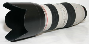
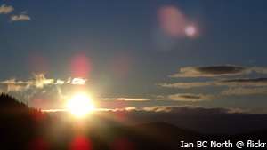
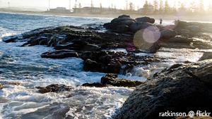
A second way to test for lens flare is what is known as the ‘window test’. Aim the camera someplace indoors, but have a bright window just out of the view of the lens. If your image, upon developing ended up with the tell tale signs of lens flare, you know your camera can’t handle that sort of situation so well.

Another way that you can test your lens is the ‘bird in a tree’ approach. For this, aim your camera at a bird (or something of similar size and detail) against a bright sunny sky, but without aiming directly at the sun. Check for contrast loss at the edges of the bird or object. Generally, what you will see is the light ‘swallows’ up the outer edges of the bird. The more of the bird that is ‘swallowed’ up, the more lens flare is occurring in this case.

These aren’t the only ways to come up with lens flare. In fact, you don’t even need to have lens flare show up in your original photo to have it appear later. But why is this? Well, Photoshop has come up with its own ‘lens flare effect’ that you can apply to your images long after you’ve originally taken them. It offers a wide range of options to choose between to get you the look you are after.

lensflare-3.jpg
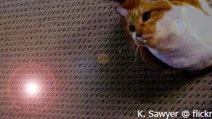
Okay, so I thought we were trying to avoid lens flare. Why would Photoshop come up with something people try to avoid? For the simple fact that lens flare shouldn’t always be avoided. In fact, it can a little something extra to your images when used in the right circumstances.
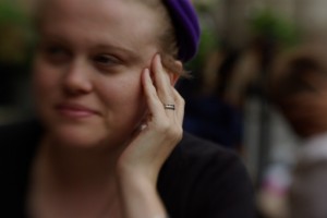
Thing is, well, there are very rarely ‘right circumstances’ for lens flare: There’s an excellent reason for why photographers have been trying to avoid them for dozens of years, and it’s a bit daft to try and use software to put ‘em back in…

Is there an easy way to avoid lens flare?

Why yes, there’s a very easy way: Keep your lens-cap on your camera when you’re taking photos!

Okay, so maybe that’s not the most convenient piece of advice. It does have a kernel of truth, though: If you can stop direct light (from flashes, reflections, or sunlight) hitting the front element of your lens, the lens flare effect will be reduced significantly, or even eliminated altogether!

lenshood.jpgTo keep the light out of your lens, you can block it out with your hand (not particularly convenient, as you’ll need both hands to operate your camera most of the time), you can get a friend to block out the light with a reflector, or just by standing in the sun so the front of your camera is in the shade.

Alternatively, you can use a lens hood (it’s one of those attachments that go onto the front of your lens – on the picture above, it is the flowery-shaped attachment), which will go a long way to blocking out stray light. You can also get straight lens hoods (without the flower-shape), or you can even make your own.

Guest article by Amanda Stachowski (thank you, Amanda!). Photos are all CC photos from Flickr, by Ian BC North, Yuan2003, ratkinson and K Sawyer.


Do you enjoy a smattering of random photography links? Well, squire, I welcome thee to join me on Twitter -

© Kamps Consulting Ltd. This article is licenced for use on Pixiq only. Please do not reproduce wholly or in part without a license. More info.

Using Shallow depth of field

raincoat.jpg

So, you’ve got your exposures down pat, and your framing is getting better by the day. Excellent. What is next? Well, the lovely Andrew Ferguson, who I know via LiveJournal, submitted a couple of photos for critique that illustrate the next logical step forward: Using shallow depth of field in a creative context. 


The first hurdle for many photographers is to get stuff in focus in the first place. The next hurdle is to get the things you want to be out of focus, err, out of focus. Awesome. So how do you go about doing that? Well, let’s learn from Andrew:

Andrew-Ferguson-2.jpg

This photo, which he asked me to take from his overall rather nifty Flickr stream, serves as an excellent example of how you can use DOF to create a multi-layered image.

The eye is automatically drawn to the parts of the photo that are correctly exposed and in focus, whereas the over-exposed background, which is blurry to boot, gets less attention. If this image had been pin-prick sharp all the way, it would not have had any impact whatsoever: The messyness of the people in the background would have seriously detracted from the overall impression of the photograph.

As it stands, I have no idea what the item of jewelry is, or if it means anything. Quite apart from that, the choker the person in the foreground is wearing is vicious-looking, and her black dreaded hair strengthens the impression of a person who has embraced the ‘goth’ lifestyle.

The foreground is rather strongly contrasted with the background, in that it is a very unusual portrait, which can in fact be interpreted in several ways. The two that sprang to mind:

1) The phrase ‘show me your friends and I’ll tell you who you are’ springs to mind with this photo: Instead of showing a full-on portrait of the person who is in focus, the photographer chooses to express her personality through that of her friends, despite the fact that the friends are out of focus.

2) This person is ostracised from her group, and her alternative clothing style, her going-against-the-grain type personality and what comes across as a strong personality is rebelling, but she is paying the prize in the form of loneliness.

If the people in the background had been in school uniforms, or otherwise ‘conformist’ clothing, I would have leaned towards option 2. I believe that this would have made a stronger photograph on an emotional level, too. However, one of the people in the background has blue hair, and the guy standing up seems to have blond dread-locks, which leads me to conclude the 1st explanation.

Obviously, this photograph has a lot going for it in terms of ‘showing a little, hiding a lot’, with multiple possible explanations. It is one of the things I quite like about it, but what really makes this image is how it goes about creating this illusion: By using a very large aperture (f/5.6 at ISO 200 and 24mm focal length, in the case of this photograph), there is only very little of the image that is actually in focus: The foreground model’s jewelry and the far-most locks of hair.

In the beginning of this critique, I explained how this image could easily have been completely rubbish, but I hope that the long-ish monologue (which really wasn’t meant to be quite that long, honest) serves to illustrate how the limited DOF has helped pull this image up. It isn’t perfect — If it were, I would have been able to come up with a more consistent story as to what is going on in this image, and why the people in the background are relevant — but it’s a very fine photograph because it allows the viewer to spend some time thinking, making up his/her mind.

If I were to come up with any ways to improve this image, it would be to use different people in the background, perhaps dressed as jocks, nazis, or even as circus clowns. The point is that they need to serve as either a connection or a contrast, and at present they are too similar, yet too different to offer an unified message in the photo.

Bokeh

bokeh.jpgShallow DOF and bokeh go hand-in-hand as two rather important concepts in photography, and it is something that is worth keeping in mind when you are working with limited depth of field: The type and quality of the lens you are working with has impact on how the out-of-focus parts of your image look. In Andrew’s photo above, the out-of-focus elements of the image are works of impressionistic art in themselves (See the crop to the left, for example).

Because of the beautiful out-of-focus qualities, this image works well. If you experiment with the same, but discover that your out-of-focus backgrounds don’t look as expected, try it with one of your other lenses. If you have any cheap lenses, try with them as well – I have a couple of no-brand, cheap-as-chips lenses that are nigh-on useless for any quality photography, but I keep them around beccause they have tremendous qualities for shallow depth of field photography.

The only real way to find out which lenses work and which ones don’t is to experiment, so have a go!

Andrew’s second photograph is this one, of an old motorbike:

Andrew-Ferguson-1.jpg

… Which I’m not going to say a lot about, other than the fact that it is – yet again – an excellent example of careful use of depth of field.

The photo was taken with a Canon Digital Rebel XT and a moody old 24-105 EF lens at 50mm, 1/250 sec, f/4.0 at ISO 400, and I really enjoy what the increased grain at ISO 400 brings to the photograph. With these kind of lighting conditions, you could easily have shot it at 1/125 ISO 200, or 1/60 ISO 100, but the trade-off of faster shutter time and increased grain works very well, perhaps especially because it’s such a gritty topic of photography.

As a personal preference type thing (i.e lots of people would disagree with me), I think the photograph is too bottom-heavy. The sticker on the fork of the bike is disturbing, and while the dirty, oily rag over the bike, combined with the indicator and the reflector of similar, yet different shades of orange really lift the photo, I think there’s too much going on, and too little of a focal point. I like how you’ve used the rule of thirds in the composition of this photo, and it is fine just the way it is.

Because this is my photo critique, however, and because I can’t let a photo stand without a few suggestions for improvement, I’ll go in line with my usual demands: I would have loved this photo to be a lot tighter, and higher impact.

A humble re-crop suggests the following, for example:

raincoat.jpg

This version uses a different approach to the rule of thirds: it breaks the image by using diagonals. The rain-cover is the only things that stands out in the image because it is teh only thing that is straight down. Everything else is at a diagonal: The rain grid in the background, the boke itself, the outline of the rain cover on the left side, etc. As I say, it’s very much a taste thing, and I would most certainly not insist on an approach such as this one, but I feel that the re-crop also highlights the strength of the original photo – the tack-sharp focus on the bike itself, and the out-of focus-ness of the background.

Finally, the out-of-focus areas on the last photo here shows how much of a difference a different lens can have: The small stones in the asphalt and the slats in the rain grid in the background are not particularly aesthetically pleasing in their own right. Everything else being equal, this photo would have looked rather differently if you had taken it with the same lens as the one you used for the first image.

So, what’s the lesson to take home from this critique? Use a limited DOF to offset your foregrounds effectively, but beware of how different lenses can make the background highlights (‘Bokeh’) look very different from each other. Finally, remember that expensive lenses don’t necessarily have a more pleasing out-of-focus experience.

Andrew, thanks for sharing your photos, and good luck with your future photography!


Do you enjoy a smattering of random photography links? Well, squire, I welcome thee to join me on Twitter -

© Kamps Consulting Ltd. This article is licenced for use on Pixiq only. Please do not reproduce wholly or in part without a license. More info.

First steps in Portraiture

sunglassesintro.jpg

My entry into Photography was a very gentle and gradual one. As such, I don’t actually remember much of how it all came about, nor do I remember the specific steps I took, nor in what order I learned the lessons, or why.

Handy, then, that there are people out there who are just coming to terms with their disease, errr, affliction, errr, passion that is photography. In this case, my dear friend Anna went on a rant-a-licious rampage, which might help some budding photographers gain some self-esteem and follow a new-ish photographer in her first footsteps towards what’s promising to become a life-long obsession: Taking good portrait photos.

Without further ado, I’ll hand you over to Anna! 


This last year I’ve become very interested in taking photos of people. There are several reasons for this; firstly I actually have some friends now and want to take photos of them that they genuinely like and secondly, because it’s a damn difficult thing to do and I like a proper challenge. I don’t do conventional portraits (you know the ones; sit up straight, smile for the camera etc.). You can look at those once, put them in a drawer or on your grandma’s wall and they don’t tell you anything at all about the person. When I take a photo of someone, I want it to convey something about their character and in some cases, when it’s someone I know and care about, I want it to reflect that as well.

monochrome-portrait.jpg
Photo by Anna Badley

guitarplayer.jpg
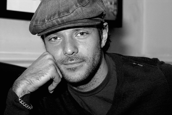
The first proper portrait I did was April this year. The friend in question was highly suspicious of my abilities, hugely hungover and rather lined and crumpled (he used to smoke 20 a day and had recently given up). I only had a compact digital camera with me at the time and the light was fading rapidly. I put it into sepia and made it look old fashioned because he’d insisted he didn’t want to look ginger on it, the awkward bastard. He was actually quite chuffed with his portrait and has merrily posted it on websites to show people. More importantly though, it stands as a record of how crumpled he actually was, and now, 9 months on, I’ve taken some more photos where he looks a lot less crumpled and he’s pretty pleased about this. This is what giving up smoking does for you.

Since then I’ve taken a lot of photos of people. Most of them have been fairly reluctant to let me point a camera at them but glad they did when I show them the results. I’ve found that women are more difficult to photograph than men because they are more worried they will look awful which is a bit of a self-fulfilling prophecy really. If you are anxious about being photoed, the photo will inevitably look crap. This has proved to be the case with my mother. She has the ability to grin inanely in an alarming way that she only ever does when someone points a camera at her. I even managed to capture the stages of facial contortion that lead to the inane grin by taking four photos over the course of a second – normal, anxious having noticed the camera, attempting to form grin, GRINNING ANXIOUSLY.

sunglasses.jpg
Photo by Anna Badley

I suspect this anxiety people instantly develop when a camera is pointed at them is because of too many bad pictures taken in the past – rabbit-in-headlights, blinded by flash, cheesy grinning forced posing type shots that never see the light of day again. Let’s face it, there’s nothing like a crap portrait to knock your confidence about how attractive you are and photos can be horribly unkind because they catch you for the tiniest split second where you might be laughing and thus showing off your crooked teeth.

portraitsalma.jpgThere was a point to this post (I’ll get there in the end, honestly) and it was that as Christmas has just been and gone there are a lot of people out there who have been let loose with new cameras, or new lenses for old cameras. Basically, the world is not a safe place right now if you’re nervous about having your photo taken. However, for all those new camera owners, you might get a photo worth sticking on your wall if you try out these five things:

1. Try and shoot in daylight rather than indoors. This will stop the flash going off and giving people red eye. Red eye makes people look mental. Of course, if this is the aspect of their character you are trying to capture, then that’s fine.

2. Photograph one or two people at a time instead of trying to get large groups together; you’ll never get everyone smiling nicely at once and also big group photos rarely look good when printed because you have to stand further back to take them so everyone looks smaller and blurrier.

portraitjames.jpg
Photo by Haje Jan Kamps

3. Never ask anyone to smile. It never works because it makes them think about what their mouth is doing – disastrous. Tell them a joke or pull faces at them if you must, or take a non-smiling photo for a change. In fact, if you can catch them when they’re not aware you’re taking a photo that’s even better; for example if they are engrossed in doing something they enjoy doing. You could even take a photo of them from an unusual angle – from the back, perhaps? For the truly camera-shy, there is always the option of snapping them whilst they sleep. This is probably a bit ethically dubious, however, and you might want to show them the photos when they wake up and check they’re okay about it.


4. Timing. With a digital camera you can afford to get a bit carried away and blast off fifteen or so shots of one person on the off-chance one will come out right – a great way to learn what works and what doesn’t. There is no shame in this; even the professionals get a bit trigger-happy sometimes. You can also check the photos you’ve just taken to see if people have their eyes closed etc. which is a major bonus. However, whether you’re working with digital or film, it’s still worth watching and waiting for a potentially good shot and not just panicking and pressing the shutter button the moment you’ve got your victim (er…I mean model) where you want them. Talk to them a bit. Give them time to relax. Ply them with drink. Chloroform them if needs be (only kidding).

5. Failing all else, you can hide all sorts of atrocious things by changing your photos to black and white or sepia. This is very easy in digital – quite a lot of digital cameras actually have these options on the camera itself – sometimes under the manual settings. This means you can actually go all arty and shoot in black and white or sepia if the mood takes you. Not so easy in film of course – you have the options of starting off with a black and white film in the first place, or scanning your photos and adjusting them in an art package. Black and white is a wonderful way of hiding spots, disguising drink-related red faces…and getting rid of purple and pink anoraks.

Good lord I went on a bit there. Sorry about that. I’ll shut up now.

Some of the pictures in this article were taken by Haje, because Anna didn’t send me any before she vanished for her Christmas break. If you like her photos, why not check out Anna’s DeviantArt page or her Flickr stream?


Do you enjoy a smattering of random photography links? Well, squire, I welcome thee to join me on Twitter -

© Kamps Consulting Ltd. This article is licenced for use on Pixiq only. Please do not reproduce wholly or in part without a license. More info.

Respectless photographers?

I seem to be months behind on this item of “news”. I actually spotted it a couple of weeks ago, but didn’t think it was that interesting. It seems as if people didn’t agree, as the topic is getting some serious discussion. Basically – a picture of a photographer in the middle of a marathon race is pissing off a lot of people.

On one hand, I can kind of see what is going on here. As Robert Capa said: “If the picture isn’t good enough, you’re not close enough”, and getting in the middle of a race is one way to get closer, I suppose… 


On the other hand, you are guest on somebody else’s path, and getting in the way of runners who are at the limit of their tiredness, and only want to make it to the finish line, is at best rude.

Now, I don’t know the circumstances around this photo, but would like to talk about it a little bit anyway. My reaction is different, based on if she is a commissioned photographer or an amateur. If the latter, she’s in the wrong place, and someone should have told her to shove off. I’m not sure about the outraged calls of “getting ticketed… or worse” in the Flickr discussion, though – a bit harsh, I feel. If there were so many people who were outraged about this behaviour, why didn’t they just tell her to move out of the way?

One commenter mentions:

To all of you taht seem to think that she has the right to do somehting like this…… WAKE UP!!

I mean really now, I don’t recall having ever seen a race of ANY sort that is INTENDED for photographers. If there were, I’m sure that it would be around the block and not 24k (or whatever). If you had the right as a photographer to do this, the nice telephotos would be cheaper, the sporting events would be shorter, and a good photo would be a dime a dozen. It’s just not a good shot if you ruin the event that would in fact MAKE it a good shot.

I agree to a large degree, but if she was, in fact, a press photographer, things could have been slightly different: This was in New York City, and if this was a photographer for the New York Times, I believe she had a bigger ‘right’ to be in the way, than Joanna Q Random, amateur photographer. Why? Well, photographers should never be part of the story, so those two photos in the Flickr stream shows she’s in the wrong, but perhaps she was photographing the event all day long, and that was the only time she was in the way?

Or maybe not: This is what the original poster said:

The whole thing took around 3 – 4 minutes and around 30 runners were inconvenienced (or that is how I saw it).

Having said that, though, Magnum agency sent a photographer along as well, and their photos look as if their photographer was on the road as well…

Obviously, the Flickr comment stream turned into a random slagging-off match, as one of the commenters notes:

All of these message boards and websites for photographers…and it seems like there’s a direct correlation between the level of professionalism exhibited in the comments and the actual professional status of the “photographer” posting. The cattier the comments, the less likely the poster is really a professional photographer.

Ultimately, I believe it all boils down to why you are there. If you are shooting for an important newspaper or magazine, your job is to represent the publication honourably (because you are their face to the world. If she was wearing a huge National Geographic jacket, people would have been more careful with their comments, but that doesn’t mean what she is doing is any better, from the runner’s viewpoint), but also to get the best photos possible.

If a wartime photographer has to risk his life for the best photo, that’s what he has to do. If a sports photographer has to inconvenience a runner or two in the course of her job, well then so be it.

Personally, I hate pissing people off, but there have been situations where the only way I could get the best shot was to elbow another photographer, push a policeman out of the way (!), and block off a road with my car. Granted, that was a one-off, and I seriously angered about 30 people that day, but I was the one who came home with the best photo, and nobody else’s pictures got used. Some times, being rude is a business decision…

What do you guys think? Good behaviour or bad behaviour, on her part? Vote in the poll, and leave a comment here or in the Flickr stream.

n

The NYC marathon photographer... Is she in the wrong or not?

View Results


Do you enjoy a smattering of random photography links? Well, squire, I welcome thee to join me on Twitter -

© Kamps Consulting Ltd. This article is licenced for use on Pixiq only. Please do not reproduce wholly or in part without a license. More info.