


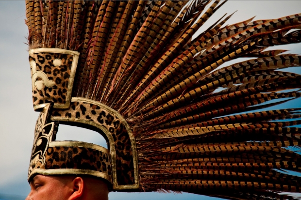
It's time for another round of video photo critiques! This week, it's Pheasant Feathers Headdress by Greer Brooks.
So, check out the critique below, and if you want to have one of your own photos critiqued, check out this post!

When you hear the term 'high-res' thrown about with such abandon when it comes to images for web use, have you ever stopped to think just how big or how high quality and image meant for the web needs to be?
There's an assumption that high-contrast images are more dynamic, more compelling, more inviting. Have a go at some low-contrast photography. You might surprise yourself with the results.
Balance doesn't mean symmetry; it means an internal consistency and tension within your photos. And it's a vital element of composition.
Great photos might be down to a little bit of luck, but most of that 'luck' you make yourself. Don't believe us? Read on...
It's time for another round of video photo critiques! This week, it's Pheasant Feathers Headdress by Greer Brooks.
So, check out the critique below, and if you want to have one of your own photos critiqued, check out this post!

Peter's original image...
It's time for another round of video photo critiques! This week, it's Portrait by Peter Dahlgren. He has helpfully done a blog entry on the photo as well, to help you get a feel for how he's done it.
So, check out the critique below, and if you want to have one of your own photos critiqued, check out this post!
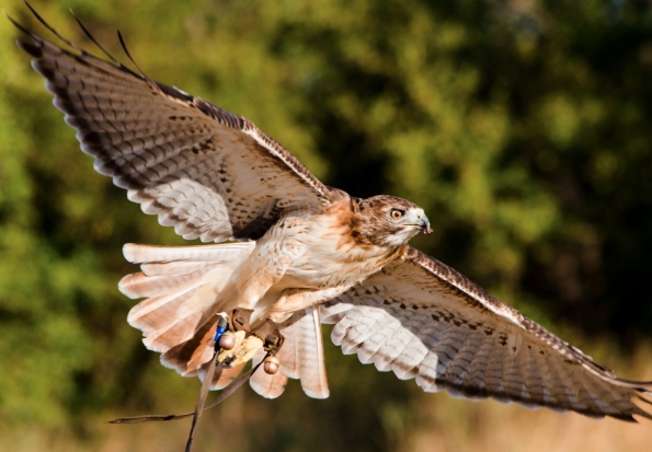
It's time for another round of video photo critiques! This week, it's Eagle, by Latrell Olner that's going on the proverbial chopping block.
So, check out the critique below, and if you want to have one of your own photos critiqued, check out this post!
Enjoy!
It can often be incredibly tempting to try and fit more information into a photograph. Understandably so – wherever you turn, you find a barrage of information. Minimalism truly is a lost art in photography, and you’d be surprised to find that it’s actually quite difficult to get right.
In this photo critique, I am doing things in a slightly new way, and I’m cherrypicking some of the best photos that have been submitted to me over the past couple of months. Together, we’ll explore photographic minimalism, and how you can make hellastrong photos with less.
Showing emotions
 Minimalism is one of those concepts that’s difficult to wrap your head around – In one way, it can be described as just keeping it simple, but there’s a lot more to taking a good minimalist photograph.
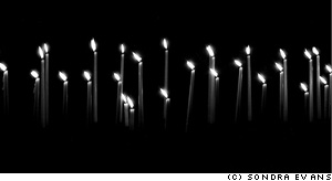
Take this photo taken by Sondra Evans, for example: On the surface, it is just a photo of a series of cake candles on a black background, but look closer: despite of its deceptive simplicity, the image is telling a story… Some of the candles are burned down further. Why? Also, all the flames are pointing to the left, which gives me, personally, a feeling of longing. I read from left to right (as do you, I would hope, esnes yna ekam dluow siht fo enon ,esiwrehto), so the fact that the candles are left-oriented makes me feel as if they are pining for the past. I associate candles with romance, birthdays and love, but given the blackness and the sombre settings, I’m thinking candles of mourning: Are the candles on a grave? Or on a coffin? Is the photographer mourning the loss of a loved one?
So many ideas, thoughts and feelings, invoked by such a simple photograph. I love it.
Surrealism
 The minimalist movement started in the late 1960s, which sort of makes sense: I’m all for the music of the era, but tie-dye would do my fucking nut – no wonder people were striving for simplicity. As a stepping stone to post-modernism, minimalism works very well when combined with surrealism – and that’s where Grzesiek’s photograph comes in…
Photographing a light-bulb upside-down, combined with the strong patterns created by the walls around it is a stroke of genius – and I love how the image causes you to re-think perspective, lighting, and photography itself. It has often been said (by myself, but more importantly, by people who actually know a lot about photography) that photography is all about light (hell, the word itself means ‘drawing with light’). Photographing a light source, then, becomes a documentation both of the method and the result of a photograph at once – that goes both for the photo of the candles, and this photo of the lightbulb.
This is a particularly good example of how you can use clean, simple lines, and a philosophy of ‘less is more’ to great effect. I’d be proud to have this hanging on my wall – wouldn’t you?
Playing with light
 To me, minimalism is all about doing creative things with lighting: by being selective about what you light and how you have a fantastic opportunity to pick out details from a scene.
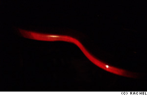
Rachel’s photo to the left, for example, illuminates the side of a coffee table (is it? or is it a chair? A cane? An electric guitar?). This particular photo has quite a bit of noise in it, sadly, and I would have cropped it entirely differently, for effect.
If you light something to make something disappear, or to allude that there is something more to the image, I always feel it is more useful to actually include the blank space in the image.
 Rather than making what you’ve carefully lit the center of the focus of the image, you’re essentially drawing the onlooker’s attention on what isn’t there – check out the image to the right.
What you are looking at is the same basic photograph as the one Rachel sent me, but re-coloured, and re-cropped in Photoshop. The large area of nothingness adds to the interest of the photo, because it’s practically jumping up and down, screaming ‘look at me! I’m mysterious! I’m an enigma! Try and solve me!’. Dunno ’bout you, but I find that strongly appealing.
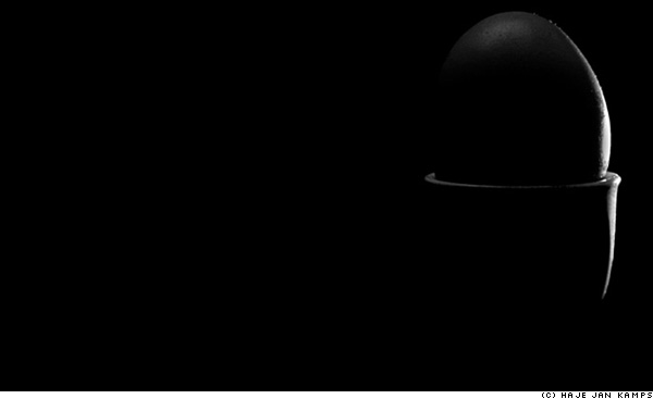
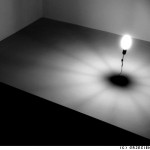
The photo above is a simple egg in an egg-cup. Lit from the right and behind the photo, I’m particularly fond of this image (but then I would be – I took it), because around 96% of the frame is pure black – yet the 4% that aren’t give enough ‘feel’ that it’s perfectly possible not only to know what, exactly, you are looking at, but also add a sense of mystery and very strong visual lines.
 The egg-in-eggcup is an odd one as well, because it conforms quite strongly to the rule of thirds, but the elements that fall on the dividing lines are not actually visible in the image. In effect, your eyes are ‘filling in’ the bits of the photo that are missing, and creates a pleasing visual image out of something that ain’t there. Call me a geek, but stuff like that makes me smile on the inside.
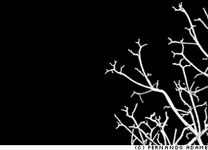
While we’re in the mood for crazy lighting schemes, do realise that side-lit subtlety is but one way of getting powerful images. The photo on the left, taken by Fernando (you might know him as MonkeySensei if you hang out on DeviantArt much), is a cheeky little example of how to do things differently. This image is almost Sin City-esque in its simplicity, but I love it.
The technique applied for taking this photo is so easy it’s almost embarrassing: Go outside on a dark night, find a tree, blast it with your flashgun on full pelt, et voila – a perfect photo. The composition in this image is what really gets me though – it’s almost as if the branches create a gradient feel to the image, as if they are cracks in an ice surface, propagating throughout the photograph. Especially amazing is that this photo barely has any grays in it: Everything is either pure white or pure black – you can’t get much plainer than that. Fantastic.
 Colour in minimalism
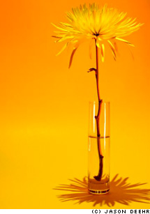
Of course, if you’re trying to keep things simple, going black-and-white is the easy way, but you can get some really stunning results by using colour, too. Jason Deehr, for example, sent me a photo which was minimalism with a twist: By using a background and a subject that are of very similar colour, suddenly the photograph becomes a celebration of colour, life, and warmth.
The tonality of ochre, light orange and yellow plays a careful, intricate game, turning what would be a rather sombre black-and-white image into a vibrant ode to life. There isn’t much of a story in this photograph, no pretenses, no deeper meaning, but it all just doesn’t matter – it’s gorgeous, simple, and full of optimism and innocence.
Of course, by varying the colours, you can create a whole series of moods – a yellow, an orange and a red panel in a triptych, anyone? It would make a great way to greet visitors to your house – hang three next to each other in the hallway!
While strong colours are a good option, a larger degree of subtlety can also have desirable effects – take this photo by Paul Mongan, of an unusual building, for example:
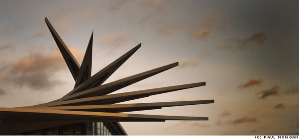
 I was torn as to whether the photo can be labelled as ‘minimalist’ or not – but similarly, it’s easy to see how the very same scene could be photographed at a different time of day, for a much stronger impact.
The high contrast between a clearer sky (or, perhaps, just overexpose the sky so it becomes much paler) and the distinctive shape of the building roof, could be a strongly striking, and visually appealing, impactful image. Of course, in my mock-up (to the right) you do lose much of the colour, but you do re-gain a lot of the oomph that I feel an image like this should have: washed-out colours and low contrast don’t cut it when you have source material which is crying out for drama.
People, but less
 Obviously, there’s nothing to stop you from including people in your adventures in minimalism either – It’s just far more difficult.
One of the main reasons is that people are complicated shapes – faces are anything but minimalist, and there’s hair, ears, legs, arms – by the time you’ve taken a shot, you’ve got enough clutter in there that it’s difficult to fill an image with the tranquility and simplicity that minimalism is characterised by.
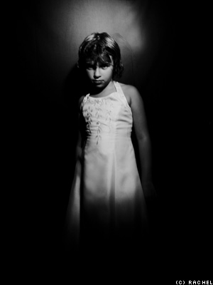
 Rachel’s experiments in keeping portraiture simple, however are particularly effective. The style of the image on the right remind me of the work of the amazing Katie Cooke (who runs the Slowlight pinhole photography website), and is a good example how slight motion blur can actually smooth out an image quite a bit – certainly something worth further experimentation.
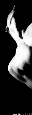
One way of simplifying portraiture is to go the high-contrast, slightly surrealist route (like my photo to on the right), but none but the nuttiest among us would concede that the picture is minimalist as such.
Challenge
So, it’s challenge ‘o’ clock, folks – can you take a portrait of a person that leaps off the screen, which is simple – even minimalist – yet captures a characteristic of the person you are photographing? If so, post it on DA, Flickr, or similar, and post a comment to this post with the link – I’d love to see it!
Do you enjoy a smattering of random photography links? Well, squire, I welcome thee to join me on Twitter - Follow @Photocritic
© Kamps Consulting Ltd. This article is licenced for use on Pixiq only. Please do not reproduce wholly or in part without a license. More info.

In a recent photo critique, I went off on one about the aspect ratios I prefer, when I look at photos. But have you ever thought about why you would prefer a particular image ratio? Is there a rule about what size photos should be, and if so – who decides the rules?
I’m just sharing my own thoughts here, but I’d love to hear your opinions on the matter as well!
 There are a lot of ideas around regarding what size things should be. ISO 7810, for example, specifies the size and shape of a credit card, the aspect ratio of which many people find is a comfortable, conceivably because its official size (85.60 × 53.98 mm) is pretty close to the aspect ratio of a golden rectangle (related, of course, to the golden ratio. See also the silver ratio, which is used, among other things, to determine the shape of an A4 sheet of paper).
So why do most photographers operate with 3:2, 4:3 or 1:1? Well, truth be told, it’s a historical thing: The modern 135 film (also known as 35mm – referring to the width of the film – or 36mm – referring to the width of a negative frame – film) was 36mm by 24mm in size. The past 80 years or so, we have become so accustomed to the 36×24 (that is to say, 3:2 aspect ratio) photos, that it just looks… right.
 4:3 is the aspect ratio of a normal television, which is of course another size we have become used to over time, and it is the aspect ratio used by most computer monitors. Some digital camera manufacturers took to – including Canon: my Digital Ixus / Elph takes photos in the 4:3 aspect ratio. Some cameras – including the Canon Powershot G7 – even support both image ratios, selectable in the menu system. If you are curious which cameras use which aspect ratio, check out Digital Photo Review. Since the dawn of time (well, since Phil Askey has had the the stats on his site), they’ve kept track of which camera uses which.
The last aspect ratio that is popular is 16:9, because it is used in cinemas as ‘wide screen’, but there are dozens of others in use, too.
So, err, do you use a calculator when you crop your photos?
Oh, not at all! The marquee tool in Photoshop has a powerful function which is called ‘fixed aspect ratio’. As you probably know, if you use the marquee tool and hold the shift key, the selected area is forced to be a perfect square. You can also select your own aspect ratio, however, in the tool menu that shows up when you select the marquee tool:

Here, you can type in whatever aspect ratio you prefer, and the select tool will lock on to it. If you want to switch between 3:2 and 2:3 (for example, if you want to crop portrait instead of landscape photos), you can just click the button with the two little arrows: It swaps the numbers over for you.
Nifty, yes?
What makes you choose an aspect ratio over another?
So, why do I refuse to crop images to anything other than either 3:2? It’s an odd one, I’m fully aware of that, but to me, there’s something almost holy about 3:2. I like my photos to be photo-shaped, and to me, the 3:2 shape just looks the most right. I find it peaceful to look at, and there is something exciting about working to the arbitrary and dated restraint of 3:2.
At the same time, I did a photo shoot about 4 years ago which opened my eyes to shooting square photos. I had a few photographs that were very successful, but that just didn’t quite want to work out as photos. In the end, I spotted that perhaps it would work if it was square, and this was the result:
Ultimately, I can’t tell why I decided to stick to those two formats. Perhaps it looks tidier. Perhaps it saves time if and when I decide to have the photos printed. Or perhaps I’m just an old-fashioned has-been, who refuses to let the fact that you can crop your image to whatever the hell you want to break on through.
So… What about you? Do you have hang-ups about aspect ratios of your images? Leave a comment!
(can you spot what all the aspect ratios in this post were? The girl is 1:1, the glasses and sleepy person is 3:2, the flower is 4:3, and the brown stuff, which actually is tobacco from a cigarette, magnified 6x, is 16:9)
Do you enjoy a smattering of random photography links? Well, squire, I welcome thee to join me on Twitter - Follow @Photocritic
© Kamps Consulting Ltd. This article is licenced for use on Pixiq only. Please do not reproduce wholly or in part without a license. More info.