


This is a guest post by Danny Groner, who is the manager of blogger partnerships and outreach at Shutterstock. Here in the northern hemisphere, autumn is upon us, which means that we've already started to see some of the red, orange, and yellow colours of the season crop up. Marketers and advertisers know how to appeal to our autumnal eye, sprinkling these bright colours everywhere possible. For photographers looking to cover the autumn season, that poses a challenge: How do you shoot these natural settings in new, innovative, and vibrant ways? Here are five suggestions for how to add some flavour to the autumn season:
Apply traditional colours unconventionally
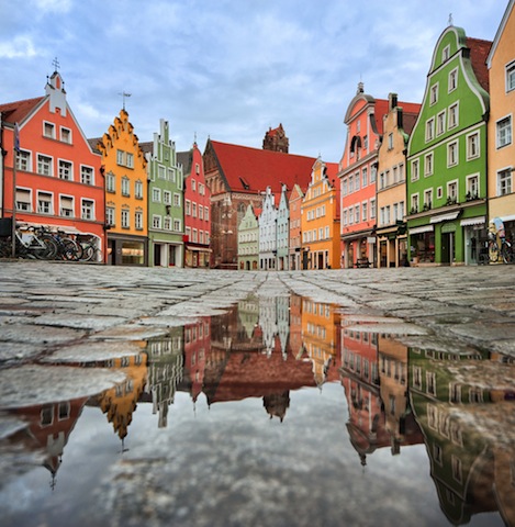
Keep close to what is proven to work this time of year, but adapt your style to show these colours in another way. For instance, a row of houses, instead of forestry, might offer the same feelings of seasonal foliage without leaves piling up. It's about the season after all. Discover an urban forest beyond the trees.
Bring it indoors
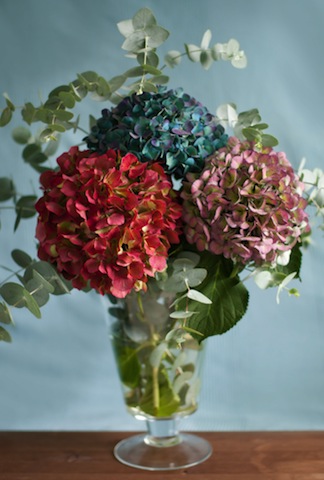
Flowers and plantlife may grow predominately outdoors, but that doesn't mean that you can't bring their vivacity inside. A well-placed bouquet, taken with the right light and proper angle, can give the same punch as inside its more natural setting. Moreover, solid colored walls can complement the flowers, adding a nice backdrop to your pictures.
Go minimal
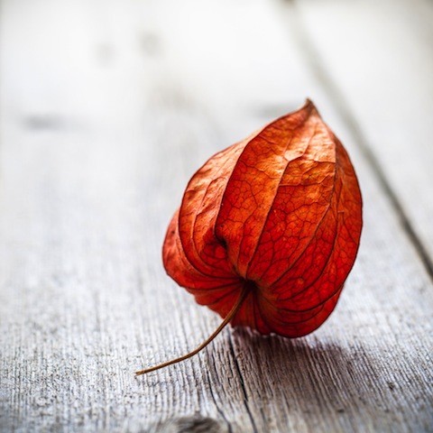
If you do decide to use leaves to help tell your story, you don't have to do it with so many. Sometimes, less is more. In this case, you can see more expression from a lone leaf than you may find inside of a pile of them. It's a living being, and focusing on one will help convey some emotion that can get lost in transit otherwise.
Be abstract
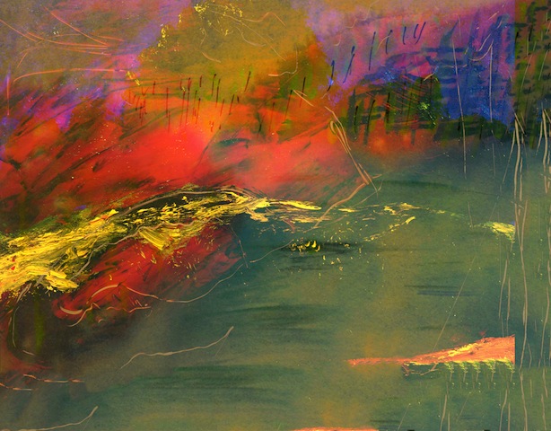
Your favourite colours can go further if you allow them to blend and dance. Inside pieces of artwork, there's more flexibility and movement than what is naturally created. Reds and oranges can look and feel remarkably louder when paired with some darker colors. Art and photography have a similar relationship worth exploring.
Use non-traditional colours
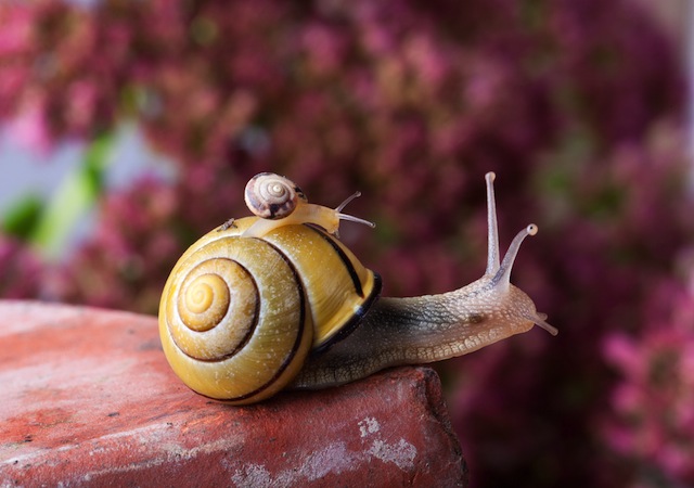
Nature has so much more to offer than the most traditional colours. Surprise your audience with some other colours, like purples, that show up this time of year but may take a little more digging. It's worth pursuing a shot through a slightly different lens. Even if you don't know what you're looking for as you trudge through piles of leaves, you'll recognise it when you see it. It may not look as familiar at first, but it'll surely be at peace with the season at hand.

 How does having your photos printed on glass sound to you? A minimalist photo-and-frame-rolled-into-one deal, if you like. It’s what the guys over at Fracture can do to your pictures. No, there’s no paper involved; the image goes on the glass. No, I’ve not a clue how they do it. But I really wanted to know what they’re like, so I checked them out.


