

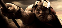
Movie audiences of the world are vastly and completely amazed by the beauty of the new movie 300. With its extremely distinctive style, quick-moving plot and — like Sin City, another of my favourites — relatively closely based on one of Frank Miller’s graphical novels, it’s got it goin’ on.
If you’ve seen the film, you can’t have failed to notice the amazing quality of the artwork involved: The CGI is amazing, of course, but even the live-action bits of the film is nothing short of stunning. So, how, exactly, can you recreate the effects? We interviewed graphic artist Jason Niedle to find out more…
 300 was shot entirely using blue- and green-screen, which is a technology which allows you to create the backgrounds digitally. Of course, the actors use props etc, but the fact remains that nearly 90% of all the footage used in the film involves various types of visual effects. The film was in post production for nearly a year — ages, in film industry terms.
Oh, so you’re a tech geek, are you? Well, let’s find out what IMDB tells us about the technology used:
Err, right. If anyone fancies translating that into English, feel free to post a comment. That’s totally not why we’re here, though, and I’ve let my mind wander way off track (it does that a lot recently, I blame the fact that I’ll soon be visited by my lovely girlfriend, who I haven’t seen in more than two weeks. It does weird things to my mind. Oh, I’m waffling again. But then again, as a regular reader, I’m sure you’re used to that from me by now… Right?)
How did they achieve the special look of the film? As it turns out, the directors and film editors decided to do a ‘crush’ technique. This means that you extend the blacks (‘crush’) to up the contrast and make a scene look eerie.
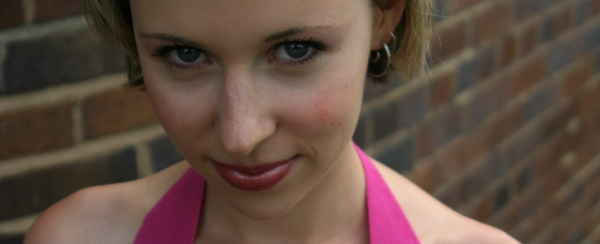
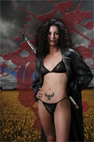
Let’s illustrate. Starting with a straight-up photo of the lovely Christine, where she’s looking ever-so-slightly devious:
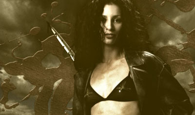
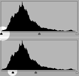 Now, to apply the ‘crush’ technique, you need to adjust the levels on your image so the black comes out stronger. Obviously, you need to do these changes only to a selection of your image, otherwise, it’ll come out way too dark.
Now, with some careful selections and some drastic image editing, you can turn this photo into something that has far higher impact and offers up a lot more contrast to work with. This is important, especially because the contrasty style of 300 would be impossible to recreate without, err, contrast.
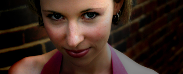
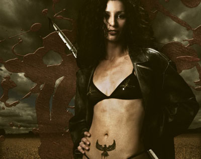
 When you’ve got the contrast right, you’ve got to start playing with the colour — it’s got to be right, after all.
When Jason saw the movie, he explains, he wanted to re-create the effect. Re-visiting a photo he took a while ago, he combined the photograph with some stock stuff, and came up with the image to the right.
“I spent a little time balancing the brightness of the images”, he recalls, such as darkening the background and making the model stand out properly. Subsequently, he added a Sepia tone to the image:
… Which brings the photograph in line with the colour feel of 300, apart from the whole ’300 being in colour’ bit. What next? “Well, I liked the effect quite a lot, but it didn’t quite cut it. For one, it wasn’t nearly colourful enough”, Jason explains, “so I took the base image, made a copy of the layer and put it right back on top”. By using the ‘multiply’ channel layer and fine-adjusting the opacity of the new layer in Photoshop, it adds some of the colour back into the image, and amicably imitates the ‘crush’ feel of 300.
We’re getting close now, but the lighting- and director of photography of 300 had shot the film with rather dramatic lighting. In addition, a lot of the scenes in 300 has the models oiled up (or, at the very least, sweating like pigs. Wouldn’t you, in the heat of battle?), so the powerful lighting reflects off the models in a wicked way. “Basically, I added a motion blur to the background, and added it as a separate layer to the Photoshop file”, Jason explains.
The final result? Judge for yourself:
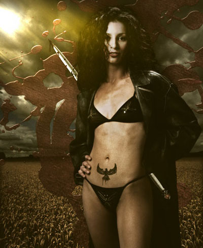
Jason suggests that the original photo could have done with more powerful, side-on lighting, but the basic feel of the 300 movie posters is there… Wouldn’t you agree?
Jason is a graphic designer and photographer based in Orange County, California. Read more of his stuff on Jasontopia. The first three images in this article are used courtesy of Warner Brothers under Fair Use / Fair Dealing, for illustrative purposes. For full-res versions and more info about the movie, check out the official 300 website.