


Today’s topic came about after I was sent some fabulous images from Ben Darfler, as part of our photo critique series. He sent me four excellent photos, and I picked two that illustrate a common theme: How to expose a photo correctly.
You would think that exposing a photograph correctly would be easy – you just point the camera at what you want to take a picture of, and let the machinery take over from there, right? Well, most of the time, that will give pretty good results, but if you have ambitions of developing as a photographer, manual exposure is where it’s at.
The way you choose your exposure is one of the biggest differences between film and digital photography. When photographing with film, you want your shadows to be drawn as well as possible; because of this, my high-school photography teacher would drone on about “Expose for the shadows; develop for the highlights.” Well, digital changed all that…
Perhaps surprisingly, a digital imaging chip works much like slide film does: The more an area is exposed, the brighter it gets. Up to a point. Beyond this point, you get ‘burnt out’ images, where a larger area of the image is pure white. This is because your film is beyond its dynamic range. If you think of a film as a continuous light-meter gauge, (which it is, essentially), ‘burn out’ is where the light meter has gone off the scale: If you are putting water into a 1 litre measuring jug, and the jug is full, it will still read ’1 litre’, even if your entire kitchen floor is full of water.
Which brings us to the first picture:
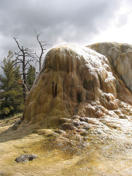
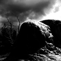
Thanks for submitting it, Ben! Right, in this photo, we have an awful lot of interesting things going on. The unusual shape of that rock, combined with the gnarly trees, the interesting sunlight, and the stream at the bottom are all competing for attention. My first advice, then, would be to tighten up the focus of your image. What was it that intrigued you about this particular scene? Why did you decide to take the photo? That is what you need to decide on, and that’s where your focus needs to be.
Composition
Personally, the barren-ness and the alien landscape appeals to me, while the evergreen(?) trees in the background draw my attention away from these particular aspects. Perhaps you could take about five steps to the left of where you were standing, and eliminate the green from the image that way?
 The second thing you could consider is if your cropping makes sense. There’s an awful lot of space at the top and bottom of this image that doesn’t tell a story. Why is it there? Walk, or zoom, in closer to get rid of it, or just chop it off in Photoshop. I’m all for negative space, so in this particular photo, I’d probably go for a square frame – like the crop shown to the right.
Sharpening
A little side note: When taking a closer look at your photo, I see that it’s sharpened quite a lot – either in-camera or with image editing software – to the point that it is actually quite disturbing to the overall image. You can see this has been done by the white ‘halo’ around the barren trees in the background.
Exposure / burned out highlights
The biggest problem in the photo is that you are plagued with serious burn-out on the rock, which detracts from the overall photo. This is a technical issue, not necessarily a creative one. If this image was in the beginning of your portfolio, and I were an art director or a gallery director, I’d close the portfolio right there and then, and send you on your way, instantly losing interest.
It’s a typical beginner’s mistake, and that’s why I’m happy you decided to submit this photo, because now I have an excuse to explain how you can avoid it!
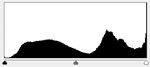 What you are looking at in the white areas, is the ‘burn out’ I started talking about in the beginning of this post. You can actually see it digitally too: Open up your photo in Photoshop, and choose “Levels” from the Image – Adjustments menu. You should see a curve which looks a lot like the one seen to the right of this paragraph.
Discovering overexposure
The Levels tool shows a graph of the presence of the brightness of the pixels in your photo. Left is perfect, pitch black, and right is complete, perfect white. As you can see from the graph, you haven’t got a single perfect black pixel, and a sharp spike to the far right of the graph. This indicates that quite a few pixels are ‘off the chart’ – which is why you can see the white stuff in your final image.
Many cameras have built-in histograms (that’s what that graph is called – on Canon cameras, click the ‘info’ button a few times, I’m sure Nikons have the same function), so you can inspect the tonal values of your photos in the field.
Avoiding overexposure
So, now that you know what the problem is and how to spot that something has gone wrong, how do you avoid it? The answer is in the title of this post: Expose for the highlights. In your case, I can’t tell from the photo what shutter time and aperture you used. The solution is simple: You should have used a faster shutter time, or a smaller aperture (ie. a larger aperture number). This makes the whole photo darker, which means that you capture more detail in the highlights. As you can see from your graph, however, you have no ‘black’ pixels, so no harm would have come from exposing the image a little less.
If you prefer to shoot fully automatic, you can force the camera to take a light metering from the lighter areas of the frame by aiming your camera at the lighter area, pressing the Exposure Lock button (marked with a star on Canon cameras, with EL or AE on some other cameras), then framing your image, and finally clicking the shutter to take the photo.
If you don’t wish to do that, you can use EV compensation to force your camera to underexpose, you can use AEB (Auto Exposure Bracketing) to hedge your bets on getting the right exposure, or – the most recommended option – you can just use manual exposure settings, check the result, and adjust accordingly.
Now that you have exposed for the highlights, you can use the Levels tool discussed earlier to bring out the detail in the shadow parties of your photos. You’ll be amazed how much detail is hidden there: Just open a few of your photos and play with all three of the sliders. The leftmost black point slider discards dark tone information from an image, the rightmost white point slider discards light tone information, and the middle mid point slider can be used to induce a bias towards bright or dark photos. For an excellent tutorial on what the Levels tool is and what it does, check out this tutorial over on the Cambridge in Colour site.
Can the photo be saved?
 For your particular photo, I don’t think there is a lot of hope of ‘saving’ it… Or is there? I had a play around with it. I turned it into Black and White (using the channel mixer), and increased the contrast ridiculously (by pulling the black point and white point sliders towards the middle of the histogram) – as seen to the right. It isn’t a great solution, but the result is striking, if nothing else.
Try a polarizer
Finally, in this photo, it appears that the highlights are, in fact, sunlight reflected of a moist surface. If I were you, I would have tried using a polarizer filter (more about those on the Luminous Landscape website) to see if you can filter out the reflections. If this would have been possible, you could have gotten away with this photo with similar brightness levels, whilst avoiding much of the reflected sunlight.
Learn more…
If you want to learn more about exposure, you’ll want to have a look at the Zone System (try Norman Koren’s website, or Wikipedia) – it is a tried and tested system explaining all of this in great detail.
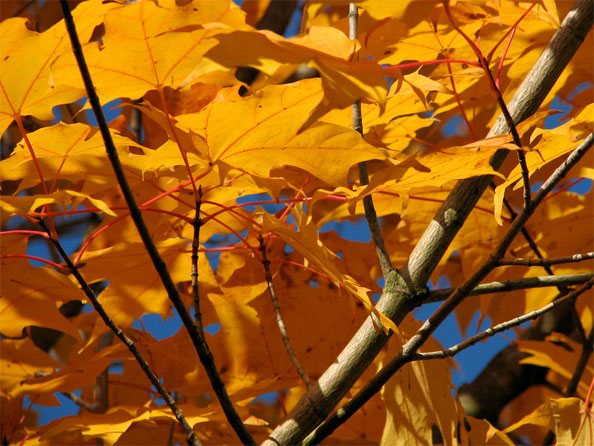
Ben’s 2nd picture:
Ben, your second picture is – rather obviously – a drastic departure from your first shot. It has a limited depth of field, which leads the leaves and the branches in the background to be out of focus. This helps the foreground leaves get pulled in as the natural biewing points in the image – a very cool effect indeed.
I love the near-perfect chronographic opposition between the blue background and the orange leaves (open your image in photoshop, then invert the colours of the photo to see what I am talking about), and the lighting is perfect. As is the exposure, the framing is interesting, and there isn’t a lot to detract from the photo itself.
There isn’t much of a message in this photo – it isn’t a love note, an emotive photo, or anything like that, which means it won’t appeal to all people. It isn’t even very original: Sure, I could go out and photograph an image exactly like this on a late summer’s day, as could any other competent photographer out there, but – and here comes the important bit – that is not the point of this photo. It is a technically perfect photo with vibrant colours. If I had taken this photo, I’d have it printed out, and hung it on my wall. It’s one to be proud of.