


In our newest instalment of the photo critique series, I’m taking a look at a series of black and white photographs taken by Kevin Bost. In the process, I’ll be exploring why Black and White photography still has a valid place in today’s colourful society…
Black and white photography is very much the cradle of photography: Before colour, there was black and white. Before that, there was paint brushes and paint. Many photographers saw the introduction of colour photography as the death of black and white, but they were wrong: In fact, even today, a lot of photographers work largely — even exclusively — in monochrome. Why?
To me, black and white has an amazing quality to it — Seeing something in monochrome allows you to give it a detachment from reality.
Seen at its very simplest, any photograph has four elements: shape, texture, lighting, and colour. Think about a tennis ball: The basic shape is round. The texture is fuzzy and hairy. The colour will often be yellow, and lighting will determine how you perceive it all. The interesting thing is that of all of these qualities, you can’t strip many of them away: You can ignore the shape by getting in close enough to focus on the texture (using macro to capture the small hairs on the tennis ball, for example). You can ignore the texture by getting far enough away that the texture doesn’t matter, or by adding a motion blur (a spinning tennis-ball photographed with a long enough shutter time will have no texture). Without lighting, you wouldn’t be able to see the ball at all.
Colour falls in a completely different category: By stripping it out of your photography, the other qualities of a photograph — especially textures, which often are drowned out by colours — become more apparent. Stripping away colour, then, abstracts yet familiarises a photograph.
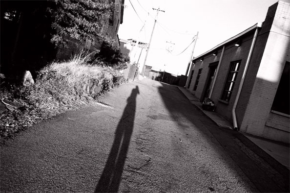
Going to Kevin’s first photograph is a phenomenal way of illustrating how textures suddenly become vastly more important. The reason why this photo appeals to me is the way the asphalt on the road springs out at you. The lovely contrast in the top-right of the image, combined with the relatively lower contrast in the rest of the photo adds a touch of drama.
To me, this appears to be a photograph commenting on aspects of mental health: The deep black of the trees contrasting against the blown-out highlights on the horizon. The way the photographer takes up a significant part of the photo without really being visible. I don’t know the photographer, and I don’t know how accurate my interpretation might be.
While the general principe of the photo is exciting to me (I loved the angled composition), it does have some serious flaws. I wouldn’t have minded the vastly blown-out horizon so much — it’s one of the charms about black and white photography, that strong contrast and even going outside the dynamic range of your film / imaging sensor / printing paper can look damn hot — but the building and the plants along the road on the left side are a bit peculiarly exposed. The old adage of exposing for the highlights and developing for the shadows (as discussed in an earlier photo critique) would have come in handy here, as it would have allowed you more data to work with, so you can either keep the telegraph poles on the horizon, or so you can edit them out successfully in Photoshop.
If I personally had taken this photo, I would have gone back with a tripod and had a shot at turning it into a High Dynamic Range photograph, just to have some more data to work with to help it along.
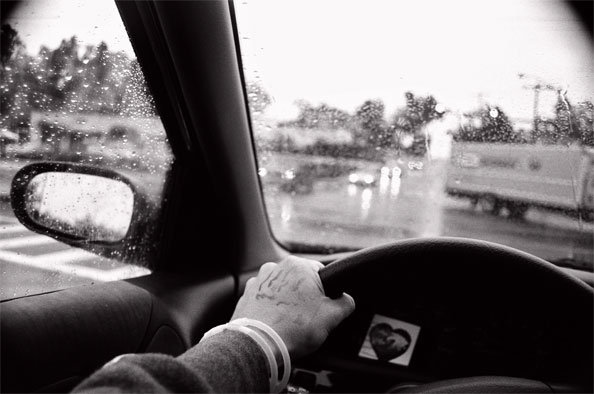
Kevin’s second photo had me a little bit baffled. Mostly, I just can’t figure out what’s going on here. Sure, it’s some guy driving a car in the rain, but what intrigues me is the hand. The thing around the wrist — is that a hospital tag? What is the liquid on the driver’s hand? That looks a lit like it could be blood. Is it a doctor, on their way to an emergency? Is the heart-shaped item on the dashboard a radiogram? Is the guy about to be a father?
It is a really simple photo, which interestingly enough draws its focus, yet again, from its wild and varied contrast. The sky is completely blown out. The dashboard is pure darkness. And the hand is the only part of the photo that stands out as being ‘correctly’ exposed. A very fascinating photo that raises a ton of questions.
The real question, though: If I hadn’t done a critique of this photo, would I even have looked at it a second time? Probably not: it’s a guy in a car. I would never have noticed the heart, the armband or the blood(?) on his hand. Personally, I think this would have been a better photo if the background had been a lot calmer. A long, open motorway, perhaps, or a forest, or even a hospital in the background… Anything to stop you from looking out of the wind shield, wondering what you’re supposed to be looking at.
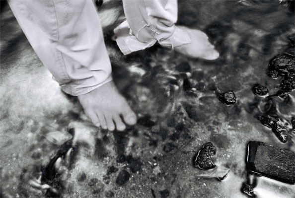
Of all the photos Kevin sent to me, this is by far my favourite, and it also rather clearly embodies what I feel black and white photography is about. The photo comes across as an impressionistic piece, in that his toes are in a blur (is it because he’s in a river, and the refractions work as a motion blur? Maybe…). The torn trousers and the fluid motion of the water bring holiday-type-thoughts to my mind. While this photo might have a lot less of a message than, say, the previous photograph, it is a much more appealing photo to me, visually. This photograph wouldn’t be out of place in a trendy restaurant or an edgy art gallery: It’s obviously not a snapshot of someone’s feet: Deliberation, planning, and exquisite exposure comes together to create a powerful visual image.
In addition, it’s worth noting that this photo doesn’t look as if colour would have added much to it: It’s all about the motion and texture.
On a personal level, I would probably have treated the photograph to a slight re-crop. It’s a personal preference thing, which doesn’t necessarily add much to the photo the way the photographer intended, but I’m very much a ‘get into the action’ kind of guy: In artistic photos, I find you often don’t need the context that is added to a photo. As such, with a bit of re-cropping, I landed at this:
So, why should people still bother with black and white in the digital age? Well, in many ways, black and white photography has become easier than ever. By using the digital darkroom (and especially by using the channel mixer to turn a colour photo into monochrome), you get a lot more influence and control over how your photograph is rendered.
That, and what is there not to love about monochromatic art? If it was good enough for Ansel Adams, it’s good enough for me…
Do you enjoy a smattering of random photography links? Well, squire, I welcome thee to join me on Twitter - Follow @Photocritic
© Kamps Consulting Ltd. This article is licenced for use on Pixiq only. Please do not reproduce wholly or in part without a license. More info.